

14 Essential Things to Consider When Painting a Room
Paint your way to a perfectly coordinated room with this step-by-step guide to redecorating your interior
Jennifer Chong
11 July 2019
Interior designer, Houzz contributor and champion of local businesses in Cambridge.
I have a passion for all things beautiful combined with a meticulous eye for detail. Through my company, Feioi, I offer an affordable in-home consultancy design service. I believe everyone deserves to live in a beautiful, functional home and smart design concepts can be applied to any space, no matter the size or budget.
Interior designer, Houzz contributor and champion of local businesses in Cambridge.
I... More
A lick of paint is one of the easiest and quickest ways to update a room and the effect can be anything from a simple freshen-up to a complete transformation. From a design point of view, colour can evoke a mood or establish a style, whether as a subtle backdrop or by taking centrestage. In a more practical sense, it can enlarge a space, give the impression of height, and highlight features.
There are countless ways you can use paint and colour to achieve a desired style, so a little thought and preparation can take your design to the next level. With far more to consider than merely which shade to go for, here are all the things you need to think about when redecorating a room.
There are countless ways you can use paint and colour to achieve a desired style, so a little thought and preparation can take your design to the next level. With far more to consider than merely which shade to go for, here are all the things you need to think about when redecorating a room.
1. Start with a colour scheme
I know I said there’s lots to think about besides colour, but it’s still important and a perfectly good place to start. If you’re planning a complete refurb, you’ll probably already have a design scheme, and therefore a colour, in mind. If it’s purely a redecorating job, then you have the choice to freshen up with a similar shade or go for something completely different. Time to get the paint charts out.
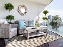
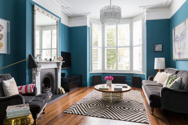
It’s important to plan the whole scheme and look at all the colours and textures to see how they work with each other. Consider this gorgeous living room. Out of context, the wall colour would appear to be very bold. However, as part of the whole scheme, it looks fantastic and is in no way overpowering.
How to Choose a Paint Colour for Your Home
I know I said there’s lots to think about besides colour, but it’s still important and a perfectly good place to start. If you’re planning a complete refurb, you’ll probably already have a design scheme, and therefore a colour, in mind. If it’s purely a redecorating job, then you have the choice to freshen up with a similar shade or go for something completely different. Time to get the paint charts out.
It’s important to plan the whole scheme and look at all the colours and textures to see how they work with each other. Consider this gorgeous living room. Out of context, the wall colour would appear to be very bold. However, as part of the whole scheme, it looks fantastic and is in no way overpowering.
How to Choose a Paint Colour for Your Home
2. Look at the light
The quality and level of light in a room is a key factor to consider when choosing a paint colour.
Rooms with big windows will benefit from lots of natural sunlight, so pale shades will help to enhance that bright and airy look. However, if you’re looking for a colour, you may need a stronger shade than you initially imagined to prevent it from appearing washed out.
Consider your paint colour before you start any renovation. It’s often left until the “big stuff” is out of the way, but it’s worth thinking about sooner. The reason is twofold. Firstly, it’ll give you a more accurate representation of the colour; bare plaster has a habit of sucking all the light out a room and making it feel much smaller than it actually is. You may also have no lighting part of the way through a renovation, which means you can’t judge a colour under artificial light and this is just as crucial as natural light. Looking at paint colours before your renovation begins will allow you to assess colours properly.
Secondly, it means you won’t be making a decision under pressure. Pulling out paint charts with a decorator by your side, brush in hand and waiting for a decision, is not ideal for choosing a colour you’ll have to live with for a long time. Decisions made under pressure can be impulsive and sometimes lead to regrets. No one wants that.
3. Work with what you have
It’s a common misconception that you can brighten a room simply by painting it white. Sometimes, a dark room will struggle to be lifted by white as it needs light to bounce off it to look bright. Whether it’s the direction it’s facing or the fact it has small or no windows, some dark rooms will never look bright and airy.
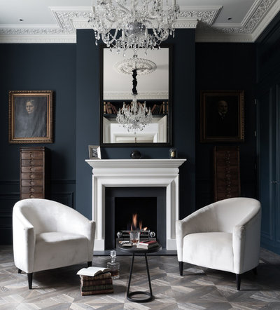
Instead, play with the contrast between light and dark by going for a moodier hue. In this gorgeously inky living room, the intense wall colour highlights the light coming into the room from the left, as it contrasts with the shadowy alcove on the right. This not only allows you to notice the light, you can actually appreciate it. The pale floor, ceiling and furniture give the scheme a lift and the result is far from gloomy.
You don’t need to go as dark as this if you’re not feeling brave, but try a deeper shade of something. Add some good lighting and it will be so wonderfully cosy and inviting, the word “dingy” won’t even enter your mind.
Find painting services near you
It’s a common misconception that you can brighten a room simply by painting it white. Sometimes, a dark room will struggle to be lifted by white as it needs light to bounce off it to look bright. Whether it’s the direction it’s facing or the fact it has small or no windows, some dark rooms will never look bright and airy.
Instead, play with the contrast between light and dark by going for a moodier hue. In this gorgeously inky living room, the intense wall colour highlights the light coming into the room from the left, as it contrasts with the shadowy alcove on the right. This not only allows you to notice the light, you can actually appreciate it. The pale floor, ceiling and furniture give the scheme a lift and the result is far from gloomy.
You don’t need to go as dark as this if you’re not feeling brave, but try a deeper shade of something. Add some good lighting and it will be so wonderfully cosy and inviting, the word “dingy” won’t even enter your mind.
Find painting services near you
4. Test it out
Tester pots exist for a reason and now is not the time to skimp. It’s well worth picking up a tester pot of your chosen colour, even if you think you’re really sure. Still deliberating? Narrow it down to a few and purchase your shortlist.
Firstly, do not paint directly onto the wall. Waste of time, waste of paint. Paint up a sheet of card, at least A4 but the bigger the better. Make sure you apply at least two coats. Now you can lay it out with your other samples of tiles, flooring and fabrics to see how they work together. With the card swatches, you can easily try different colours to see which one works best. It’s also very useful when you’re shopping for other items, as you can just take it with you.
Stick the painted sheet onto the wall to see how it will actually look in the room. You should leave it there for a few days to see how you feel about it over time. If you’re unsure about a colour, living with it for a few days usually results in you loving or hating it. Move it around the room at different times of the day, too, and consider how it looks in natural light, artificial light and shadow.
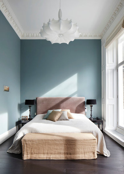
Just look at how the paint colour differs in the various points in this bedroom. Compare the tone where the sunlight hits it above the bed to the top corner where it gets less light. The colour will vary so much, and you need to make sure you’re happy with it in every position.
Tester pots exist for a reason and now is not the time to skimp. It’s well worth picking up a tester pot of your chosen colour, even if you think you’re really sure. Still deliberating? Narrow it down to a few and purchase your shortlist.
Firstly, do not paint directly onto the wall. Waste of time, waste of paint. Paint up a sheet of card, at least A4 but the bigger the better. Make sure you apply at least two coats. Now you can lay it out with your other samples of tiles, flooring and fabrics to see how they work together. With the card swatches, you can easily try different colours to see which one works best. It’s also very useful when you’re shopping for other items, as you can just take it with you.
Stick the painted sheet onto the wall to see how it will actually look in the room. You should leave it there for a few days to see how you feel about it over time. If you’re unsure about a colour, living with it for a few days usually results in you loving or hating it. Move it around the room at different times of the day, too, and consider how it looks in natural light, artificial light and shadow.
Just look at how the paint colour differs in the various points in this bedroom. Compare the tone where the sunlight hits it above the bed to the top corner where it gets less light. The colour will vary so much, and you need to make sure you’re happy with it in every position.
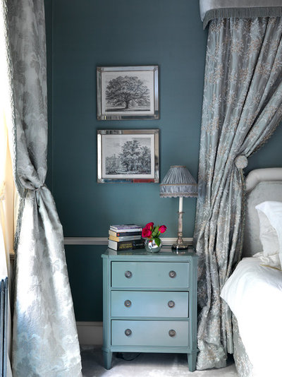
5. Decide on a feature wall
If you fall in love with a bright or bold colour, but just paint one wall because you’re a bit scared of doing the whole room, it will just look as if you were too scared to paint the whole room! By adding colour to one wall, it draws attention to that area and that hue, therefore making it more noticeable. The colour is more likely to overpower other elements, which perhaps should be the main focus of your room.
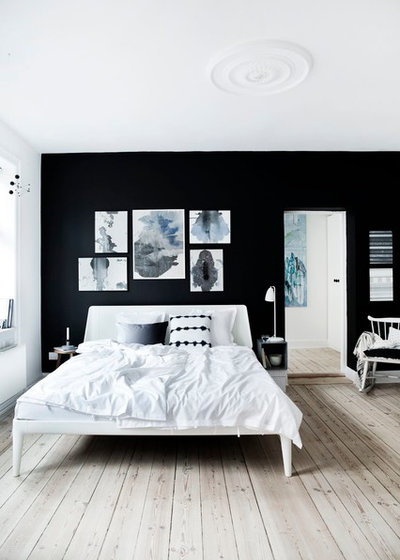
The role of a feature wall is to create a spotlight, so make sure there’s something to look at. A feature wall should have intent, a real purpose. Take this beautiful monochrome bedroom. The black wall provides the perfect background for the artworks. It also highlights the bed and allows it to stand out in this otherwise white and neutral room.
If you are not creating a feature, consider painting all the walls. There are many splendid examples within this feature and all over Houzz to prove it isn’t scary. Having all the walls the same means the colour sits in the background, allowing your focus to rest elsewhere.
If you fall in love with a bright or bold colour, but just paint one wall because you’re a bit scared of doing the whole room, it will just look as if you were too scared to paint the whole room! By adding colour to one wall, it draws attention to that area and that hue, therefore making it more noticeable. The colour is more likely to overpower other elements, which perhaps should be the main focus of your room.
The role of a feature wall is to create a spotlight, so make sure there’s something to look at. A feature wall should have intent, a real purpose. Take this beautiful monochrome bedroom. The black wall provides the perfect background for the artworks. It also highlights the bed and allows it to stand out in this otherwise white and neutral room.
If you are not creating a feature, consider painting all the walls. There are many splendid examples within this feature and all over Houzz to prove it isn’t scary. Having all the walls the same means the colour sits in the background, allowing your focus to rest elsewhere.
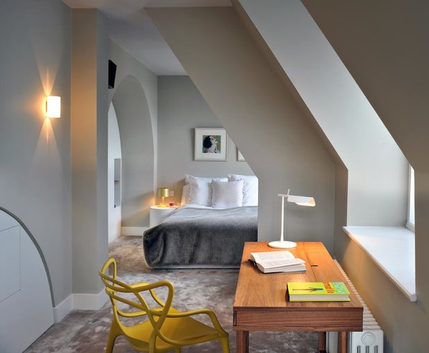
6. Don’t forget the “fifth wall”
Deciding on a colour for the ceiling is just as important as your walls. Your eye is drawn to contrasts, so any significant changes in colour or texture are going to catch one’s attention. If you have low or sloping ceilings, painting all of the surfaces in the same colour will give the illusion of height, as you don’t immediately notice where the wall ends and the ceiling begins.
Alternatively, go for a contrasting colour if you want to create a feature ceiling to highlight a stunning chandelier or an ornate ceiling rose.
For those who are wedded to the tradition of painting your ceilings white, I’d recommend either a complementary off-white with similar undertones to your walls, or to go for one or two shades lighter than the walls for a softer, more tonal look. You’ll still achieve the classic “white ceiling” effect, but avoid the harsh tones of brilliant white.
8 Tips to Creating a Statement Ceiling
7. Focus on the details
Once you’ve decided on the walls and ceiling, think about the other painted details, such as woodwork and mouldings. These can include skirting boards, architraves, doors, windows, cornicing, fireplace surrounds, radiators, picture rails and dado rails.
Again, like ceilings, the traditional approach would be to paint them white. However, as with ceilings, brilliant white can be discordant with other colours. Usually, an off-white or a couple of shades lighter is a more flattering and harmonious way to achieve the same look.
Alternatively, if these details are to be admired, consider contrasting them, or going darker, as here. This works well in both contemporary and traditional settings, and there’s the added practical benefit that darker paint will withstand grubby fingermarks and shoe scuffs.
8. Consider using one colour
Using a single shade on walls, ceiling and woodwork can create a cohesive look. It will also give the illusion of height and space.
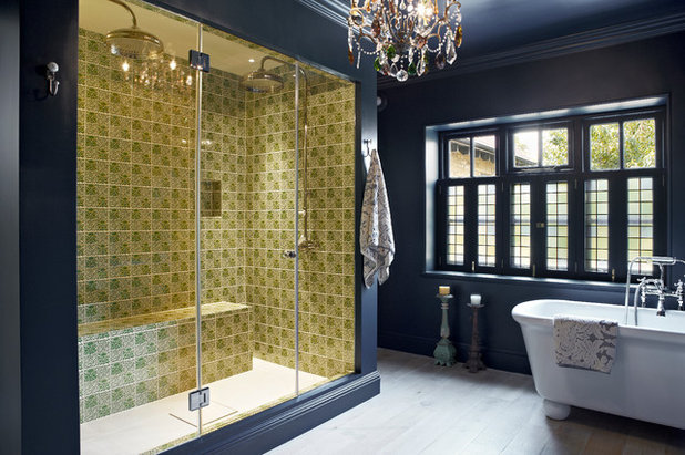
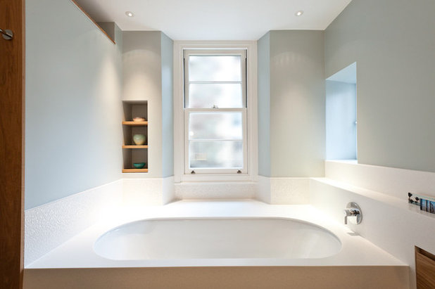
In this stunning bathroom, the deliciously dark colour is unbroken from floor to ceiling. This creates a tall, grand look and is a great example of how dark doesn’t mean drab. By using one colour, despite its dramatic boldness, a backdrop is created for the incredible shower, the true focal point of the room.
Browse more bathroom ideas
Using a single shade on walls, ceiling and woodwork can create a cohesive look. It will also give the illusion of height and space.
In this stunning bathroom, the deliciously dark colour is unbroken from floor to ceiling. This creates a tall, grand look and is a great example of how dark doesn’t mean drab. By using one colour, despite its dramatic boldness, a backdrop is created for the incredible shower, the true focal point of the room.
Browse more bathroom ideas
9. Highlight a feature
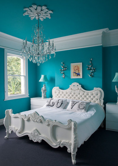
The all-white furniture in this eclectic bedroom looks so fresh against the vivid wall colour. As well as the magnificent bed, one of the first things you’ll notice is the beautiful ceiling rose and the smart-looking cornice and picture rail. Using a contrasting white paint to highlight these features enhances them and draws the eye up.
Turn it on With Turquoise Interiors
10. Choose where to change colour
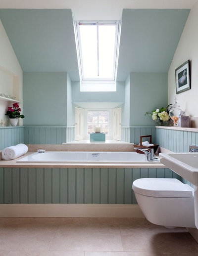
As I mentioned earlier, the eye is drawn to where colour changes, and we’ve looked at the visual effect of both contrasting and continuing colour on different surfaces. You can use this to great effect in both ways, as demonstrated in this tranquil bathroom.
The back wall is painted in soft blue, with the panelling tying it all together. By taking the colour up the sloped ceiling, it gives the impression of a taller room, as well as drawing the wall forwards so the space appears less narrow.
In addition, the side walls are painted in a creamy shade, which provides a contrast with the blue. This accentuates the eaves as an inherent and lovely characteristic of the room.
11. Create decorative details
As well as highlighting existing features, paint can be used to enhance and create interesting decorative details, such as this panelled effect on the walls.
Try using paint to create shapes, patterns and effects to add interest to walls and ceilings.
As well as highlighting existing features, paint can be used to enhance and create interesting decorative details, such as this panelled effect on the walls.
Try using paint to create shapes, patterns and effects to add interest to walls and ceilings.
12. Select your finish wisely
Now that you’ve chosen all your paint colours and decided what goes where, you need to specify the finish for each section. Most walls will be fine with a flat emulsion, and a completely matt look is the best way to make the most of all that pigmentation. However, areas prone to moisture and high traffic, such as bathrooms, kitchens and hallways, may require a more hard-wearing finish.
Specific finishes should also be used for other surfaces, such as wood or metal. The popular choice for woodwork is eggshell, which is hard-wearing with a subtle sheen. Gloss is also an option; it’s probably more durable than eggshell, but the high shine is not for everyone.
Each brand offers its own range of paint finishes and can advise on the best one for your room or space.
How Do I… Choose a Paint Finish?
13. Prep the surfaces
Before you (or your decorator) get any paintbrushes out, you need to ensure the surfaces are prepped. At a minimum, they’ll just need a quick clean and you’re away, but in many cases a little more is required to achieve that flawless look.
You may need to strip old wallpaper or, if you’re painting over bright or dark walls, a primer will be needed to neutralise the colour. If the room is to undergo any renovation work, the walls are likely to be subject to damage. Electrical chases, the relocation of pipework, installation of new skirting boards – these all create holes, lumps and bumps on your walls and ceiling.
Minor imperfections can be made good by you or your decorator with the help of some filler and sandpaper, but anything major may require replastering or skimming.
Be aware of light beams from windows or light fittings that can be quite unforgiving of blemishes. A wall light like this one will show up every imperfection on your walls, so make sure they’re lovely and smooth.
Preparation can cost time and money, so make sure you factor this into your budget and schedule, including drying time for new plaster if necessary.
14. Write everything down on a decorating specification
Putting all the details down on a specification ensures nothing is missed and minimises the chance of mistakes. It also makes things very easy when hiring a pro, as you simply hand over your spec and let them handle the rest.
List every area and write down the brand, colour/reference and the finish for each one. Include all areas, just to make sure, even if they’re not to be painted. For example, if you’re leaving your woodwork as it is, then include woodwork in your spec and put “do not paint” to avoid any confusion.
That just about covers it. I hope you found this guide useful and that your newly painted room will be exactly how you imagined it, or possibly even better. Happy painting!
Tell us
Are you planning to redecorate? Or have you just finished a project? Share your experiences and photos in the Comments section.
What are you working on?
Related Stories
Renovating
How Do I… Know What I Can and Can’t Do in an HDB Renovation?
By Niki Bruce
When it comes to renovating your flat, you need to know what you can and can’t do before you get started.
Full Story
Renovating
How to Feng Shui Your Apartment
By joeyyap
How can this traditional technique be used for apartments, condominiums, and other high-rise buildings?
Full Story
Lighting
8 Steps to Do an Electrical Walk-Through of Your Home
By David Warfel
To create the best lighting plan for your home and avoid common mistakes, take these steps before you renovate
Full Story
Architecture
An Architect Tells Us How to Read Floor Plans
Understanding floor plans is a must when building or doing an A&A. Learn how to in the first of our two-part guide
Full Story

Renovating
8 Steps to a Great Renovation
Get your renovation to go as planned with this guide
Full Story
Renovating
7 Ways to Make Low Ceilings Look Higher
By Becky Harris
Well-chosen paint finishes, lighting, wall mouldings and other details can give your rooms a visual lift
Full Story
Renovating
How to Choose the Right Ceiling Fan
Ask these questions before choosing a ceiling fan for your home
Full Story
Renovating
How Do I… Save Money When Painting My Home?
By Niki Bruce
Painting experts share budget-friendly tips for doing it on your own
Full Story
Renovating
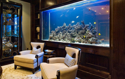
Tank Up on These 5 Pointers Before You Set Up an Aquarium
Use this beginner's guide to get you started on an awesome aquarium
Full Story
The choice of 'paper' is the issue there. It comes in grade, colours, thicknesses and is generally 'bleached' in some way. I have found that buying A3 foam backed art boards from the Range (or similar) achieved the best results. Using a 4" roller I was able to achieve a very true colour representation.
I've been caught out by tester pots and shade cards quite a lot recently......be careful if you buy a tester pot (Dulux especially) from a retail outlet, then your decorator buys the trade version! Not the same. Also there seem to be different recipes for the colours mixed by the retailers, and they aren't identical. E.G. I bought some Satinwood paint from a independent shop, then bought a second tin from a large chain (both mixed in the shop). One used a light base, the second used a medium base. Result - close, but not identical colours. Also I've found Colour charts very misleading, so yes, do use tester pots, but remember that it's no guarantee that that is what you'll get on your walls!
@LakeOne Sorry, have only just seen your comment. Thank you. After much deliberation and looking at some expensive brands of wallpaper, this was from NEXT! It was just the gentle geometric pattern that I was looking for.