
Colour Mixing: Mix it Like You Know it
If you're tired of neutrals but lack the braves to embrace colours, then this is for you
tidgboutique
23 January 2017
Toronto Interior Design Group is a trusted one-stop-shop residential interior design concierge boutique-style firm crafting timeless interiors.
Toronto Interior Design Group is a trusted one-stop-shop residential interior design... More
White on white, white mixed with grey and, hmm, maybe a little more white? It’s certainly an in-demand look, but some people want a bit of bold colour in their palettes. To help you mix colour with more colour to get the look you crave (without going totally overboard), here are some of my top tips for what hues to mix, how to combine them and how to bring the whole look together.

Semi-neutrals
In recent years, the trend of embracing semi neutrals has returned. These are colours that can’t be considered true neutrals, but are still easy to combine and work with. Blues and greens, being such natural hues, tend to be the most cooperative of colours, and this is especially true when you choose midtone shades with a hint of grey in them.
When combined, such hues feel lively, but when neither is very aggressive on its own, the resulting pairing isn’t over-the-top.
10 Rooms That Prove Eau de Nil is the New Neutral
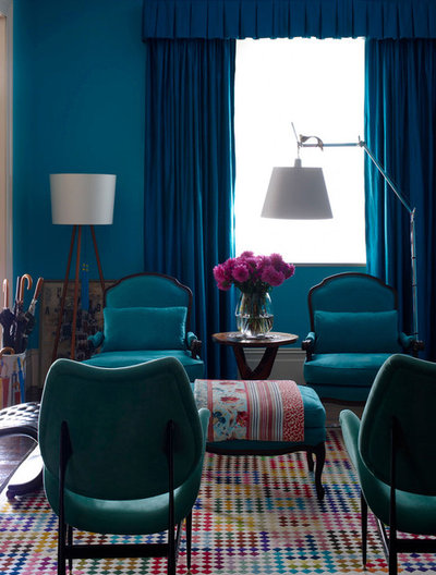
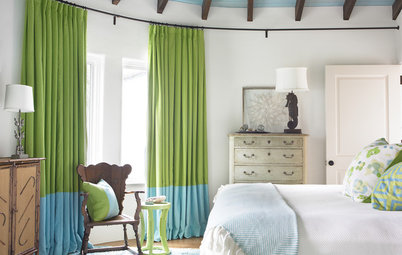
Tone on Tone
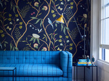
An even more vibrant blue is still an easy colour to mix. It works beautifully in a tone-on-tone scheme to give the sense of a lot of colour even when most of it is essentially the same hue.
Try combining pure, chilly blues with green-blues or blue-indigos to get subtle variation while keeping the hues tied together. Include a few hot accents for contrast – flowers are a great way to add a red or violet counterpoint.
Colour: Take a Shortcut to Style by Choosing a One-colour Scheme
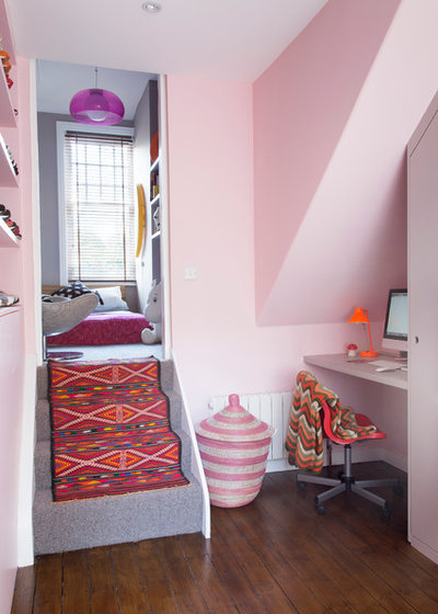
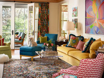
Warm colours can also make for engaging tone-on-tone looks, although with hot hues, it’s usually safer to stick to lighter shades for walls and large pieces to avoid colour overload.
Soft pink walls paired with vivid accents creates a strong colour statement, but the punchy focal pieces, such as a patterned rug, actually make the walls feel less dramatic by comparison. Again, notice that the central pure pink is offset by shades that are more orange and purple to give variety while staying grounded.
Soft pink walls paired with vivid accents creates a strong colour statement, but the punchy focal pieces, such as a patterned rug, actually make the walls feel less dramatic by comparison. Again, notice that the central pure pink is offset by shades that are more orange and purple to give variety while staying grounded.
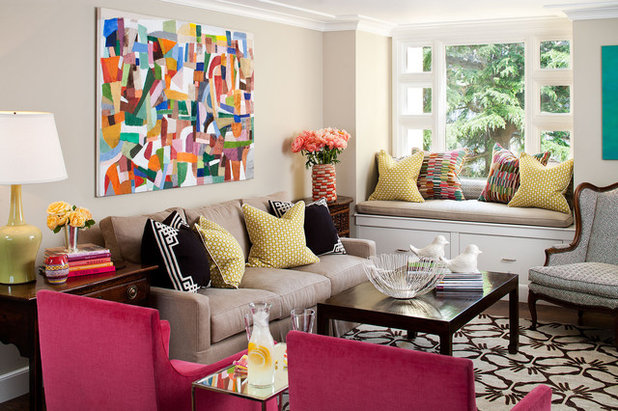
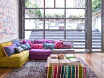
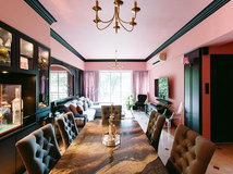
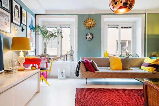
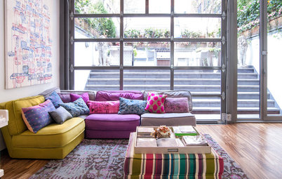
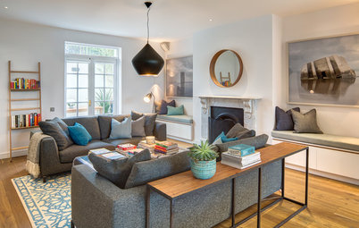
More Is More
In total contrast to the tone-on-tone look, another approach is to actually use a bit of every colour imaginable so that no one hue feels too overpowering.
Try choosing a very colourful piece of art to use as inspiration for your palette. Then pick up fabric accents that echo a similar palette, such as the toss cushions on the window bench seen here.
This room feels exceptionally colourful, even though most of the other pieces are neutral, save for the pair of vibrant pink chairs.
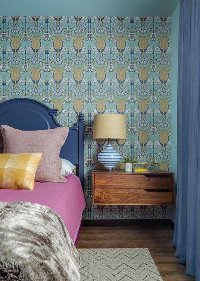
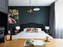
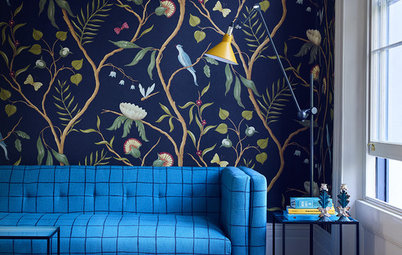
Wallpaper
Another way to get a rich palette is to choose a bold wallpaper print that already has a terrific colour combo assembled for you.
In this case, the dark blue shades in the paper are picked up for the headboard and drapery, while the yellows are echoed in the pillow.
A bed sheet is a great opportunity to try a risky colour, like this perfect contrasting pink. Since high-use linens can expect to wear out and need replacing in the future anyway, it’s not an extremely long-term commitment.

Patterns With Solids
Notice how this room and the previous two use a mix of small-scale patterns with chunky solids. Specifically, each piece either carries many diverse hues or just one (or just one mixed with a little white).
Keeping each piece to this rule of extremes isn’t necessary, but it does make it easier if you’re not confident about mixing. The very colourful pieces combine well because they don’t have a singular hue that stands out (which might clash with another), and the solids are drawn from the art so that they have something to relate back to.
Tip: When pulling colours from art to use as wall hues or solid fabrics, it’s generally safest to pick slightly greyer or paler versions to keep them from looking overly vibrant. However, some of these looks ignore that rule, and if you’re feeling bold, you certainly can too.
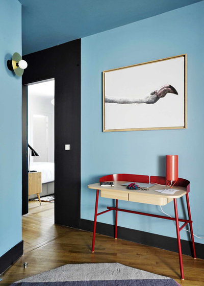
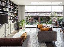
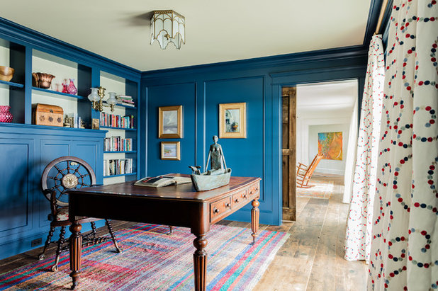
Breaking It Up
When you mix colour with colour, often the neutral elements end up becoming emphasised. Breaking up this blue wall with artwork in mostly white gives a bit of visual breathing room and really makes the art sing.
You can achieve a similar visual break by adding a framed photo with deep white matting, or even many in a grid. That the walls are a bright hue makes the room feel alive, but you can use this trick to reintroduce as much white as you need to tame the look to your liking.
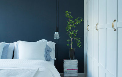
White Trim
Thick white trim (and similar elements like doors and even white floors) can eat up a lot of wall space.
When you paint walls in a case like this, the actual amount of square footage painted is often surprisingly low. The result feels very colourful, but in an easily liveable way.
Notice how this room also uses the previous tricks of layering art with lots of white and using a semi neutral green on the walls. Even with the addition of hot red accents, the room feels balanced and approachable.
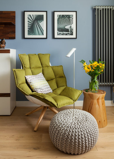
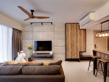
Wood
Another great way to diffuse a colourful look that may be starting to feel overloaded is to add a little wood.
An elegant wood desk or dining table, countertops, side tables, chairs, exposed floors, or coffee tables can break up a vivid colour combo and add natural warmth to balance out powerful man-made hues.
Cushions
If you don’t want to invest in art and upholstery just yet, an easy way to inject lots of colour is through a pile-on of throw cushions.
You can easily mix in many colours, building the look up or down by moving pieces around until it feels just right.
Tip: You can find fabrics to use as a colour palette inspiration by borrowing a swatch from a fabric showroom or simply taking a photo of one you like. Even if you don’t end up using that particular fabric in the space, it can beautifully guide your other colour choices.
Colour in Soft Furnishings: How to Mix and Match
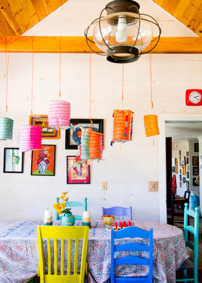
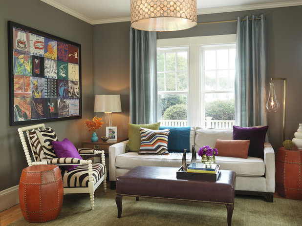
Small Splashes
You may not have a pile of cushions in every room, but you can still add lots of playful colour.
Eclectic art, mixed chairs and fun casual lighting provide lots of colour here. Try printing interesting images from online, or cropping out great magazine photos, to fill a gallery of frames. You can always change the images later to go back to a less colourful collage, but I bet you won’t want to.
Styling: How To Pick the Right Picture Frame For Your Art
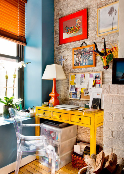
Texture
When working with lots of colour, don’t forget to add interesting texture, especially if the colourful pieces are mostly painted and therefore flatter.
A bit of rich or rough texture lends depth that bright lacquered pieces can lack on their own, which keeps the look feeling sophisticated.
Don’t happen to have a brick wall handy? Try a cement-effect side table, linen drapery, woven baskets or anything with a rugged appeal to balance out pristine pretty colours and bring your dreamy palette back down to Earth.
TELL US
Are you ready to give colour mixing a go? Or have you done so already? Share your thoughts and photos in the Comments below.
MORE
Perfect Pairs: 8 Colour Palettes That Won’t Let You Down
What are you working on?

Related Stories
Interior Design
Does Your Home Need a Colour Consultant?
By Janet Dunn
Engaging a colour consultant could be one of the smartest moves you make, to help your home to look its best
Full Story
Interior Design
How Do I... Use Dark Paint Colours in a Small Apartment?
By Niki Bruce
You don’t have to stick to white if you have a small apartment; dark paint can add luxury and depth to tiny spaces
Full Story
Interior Design
Picture Perfect: 26 Dark Blue Rooms From Classic to Contemporary
Our coffee-break escape offers you five minutes' worth of images to inspire and delight. Jump right in...
Full Story
Interior Design
How to Find Your Spirit Colours
Dressing your home in colours that embody your personality calls for reflection, inspiration and a readiness for risks
Full Story
Interior Design
8 White Paints That Show Which White is Right
By Kelly Porter
This simple colour comes in an array of tones that offer different looks
Full Story
Bathroom Ideas
10 Ways to Come on Strong With Colour in Your Bathroom
Set your bathroom apart from the rest of the pack with a shot of strong colour or pattern
Full Story
Interior Design
Colour vs Neutrals: 10 Tactics to Solve Colour Conflicts
One of you lives for colour, the other loves the safety of neutrals. Here's how to meet in the middle.
Full Story
Interior Design
A Grey Sofa is a Great Neutral That Plays Well With Others
By tidgboutique
See 11 reasons to love a grey sofa and how this neutral shade can take on anything you mix with it
Full Story
Interior Design
Does Bedroom Colour Affect How Much Sleep and Sex You Get?
The colour of bedroom walls have a surprising effect on sleep and sexy time
Full Story
A framed piece of art, a textile pattern - as you said - or a carpet is a great way to find your color scheme. I was happy to find this one for my project:
I love using colour in my rooms, I usually start with some feature to work around
I'm changing the subject completely here, but does anyone actually use two showers next to each other? I looked at the photo (photo 2, Tone on Tone) and first of all thought, wow, how cool. Then I thought, in reality, would I want to be cleaning 'my bits' while watching my husband cleaning 'his bits'? The answer was a definite no. Maybe I need a hunkier hubby? ;)