France Houzz Tour: Cosy Pied-à-Terre for a Dad and his Teenagers
A father's small one-bedroom apartment in France was reworked into a comfortable Monday to Friday home for his family

If you haven’t been to the old town of La Rochelle, France, you’re missing out on the joy of strolling through its cobbled lanes and vaulted arches. Designer Coralie Bizot of Décoralie Concept in France shows her latest renovation, a small apartment that stands just in front of La Rochelle’s New World Museum, surrounded by greenery. All it’s missing are horse-drawn carriages, and it would feel like history brought to life.
The owner lives outside the city but works in the centre of town, so he wanted a cosy pied-à-terre to share with his two high-school kids during the week. Having previously worked with Bizot on a professional project, he entrusted her with his own apartment, which he’d bought in 2017.
The owner lives outside the city but works in the centre of town, so he wanted a cosy pied-à-terre to share with his two high-school kids during the week. Having previously worked with Bizot on a professional project, he entrusted her with his own apartment, which he’d bought in 2017.
“As soon as I visited the apartment, I immediately felt the serenity of this place in the old town,” says Bizot. “Bright and with large windows in two directions, the apartment was already very pleasant to live in, and we had to make sure it would stay that way.”
Bizot worked on everything from the renovation of the space to the furniture selection and decor. She made sketches, one of which is pictured here, to help the owner visualise the final product along the way.
Bizot worked on everything from the renovation of the space to the furniture selection and decor. She made sketches, one of which is pictured here, to help the owner visualise the final product along the way.
Before. “The apartment was really old and hadn’t been renovated for a good twenty years,” says Bizot.
These photos of the entrance show something of its previous state. Moreover, the entrance had been dark and closed-in, and separated from the kitchen by a plain door.
These photos of the entrance show something of its previous state. Moreover, the entrance had been dark and closed-in, and separated from the kitchen by a plain door.
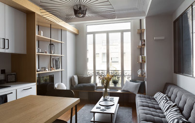
After. The feel of the space has changed completely. Just past the powder room – the door on the right here – a sliding door with inset windows now leads to the kitchen and dining room. A separate entrance to the living/dining room is around the corner.
“To hide the boxing and make the entrance functional, I thought it would be more interesting to install a mirror or something the owners could use to get ready before going out,” says Bizot.
Cork pouf and pendant light: La Redoute
“To hide the boxing and make the entrance functional, I thought it would be more interesting to install a mirror or something the owners could use to get ready before going out,” says Bizot.
Cork pouf and pendant light: La Redoute
Conceptual drawings of the entrance and living/dining room
“The concept was to keep the idea of a dark entrance with a chic twist that would contrast the diaphanous light of the main room,” says Bizot. “The dark transition zone recedes to better introduce the main area. The dark grey that covers all the surfaces has a uniform shine under the orange, coppery glare of the matt-black pendant light.”
The sliding door that partitions the kitchen from the entrance is stylish and saves space. Its glass panel separates the entrance without completely obscuring it.
Sliding door: Leroy Merlin
Sliding door: Leroy Merlin
Before. Although the kitchen was dated and not very functional, it had a beautiful floor that’s typical of old La Rochelle apartments. It also boasts a three-metre ceiling.
However, it had been separated from the living room with an unsightly arch.
After. The owner wanted a Scandinavian-style kitchen, so Bizot used light-coloured oak throughout. The family have breakfast at the bar counter on the left. The bottom parts of the arch were kept in place to support both the oak top and the matching timber battens, which visually separate the two zones without obstructing the flow of the space.
The light, natural charm of oak is a good match for the bright white surfaces. “The original kitchen was not functional at all. The whole interior structure was replaced with a custom-made solution made by a carpenter who specialises in kitchens. The main objective was to provide maximum storage by taking advantage of the entire height of the room.”
Eglo’s Townshend pendant light: Leroy Merlin
Eglo’s Townshend pendant light: Leroy Merlin
Bizot handled all of the technical and aesthetic choices in the kitchen, working with trusted craftspeople. “To start a project, I draw and propose the layout for cabinets and household appliances, and I discuss the choice of materials with the owner. Here, it was oak countertops and white lacquered-cabinetry doors with stainless steel handles.”
The backsplash is faux-marble laminate, which is both more economical than other alternatives and easy to clean.
The backsplash is faux-marble laminate, which is both more economical than other alternatives and easy to clean.
Conceptual drawings of the living/dining space
In the living room, Bizot took advantage of the apartment’s historical features, preserving the mouldings on the walls and ceiling.
After. The dining room, which overlooks the building’s private garden, is a tranquil haven and a place for the family to come together after a long day. At the back of the room, an existing niche was repainted dark grey to display a painting and decor items. The artwork was painted by the owner himself: it’s a copy of American painter Edward Hopper’s Nighthawks.
The white table is extendable. Its rounded edges and white-and-timber frame pick up on the kitchen’s Scandinavian style. The black-metal chair is the odd one out. This was deliberate, to make the space feel less uniform.
Chairs and pendant light: Maisons du Monde
Chairs and pendant light: Maisons du Monde
The walls are all painted in a smoky white that preserves natural light and visually unifies the spaces.
Tripod floor lamps: La Redoute
Tripod floor lamps: La Redoute
Before. The original living room was very impersonal. A small door led to the bedroom and bathroom.
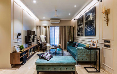
After. The part of the room that houses the living area is a bit larger than the dining area; the change in size helps highlight the separation of the two zones.
This is where the owner sleeps Monday to Friday, so Bizot chose a very comfortable sofa bed. It can be unfolded without changing the room’s layout.
This is where the owner sleeps Monday to Friday, so Bizot chose a very comfortable sofa bed. It can be unfolded without changing the room’s layout.
Sofa: La Redoute
The height of the ceilings in this space allowed Bizot to go for a gallery effect on two walls of the living room, with a running blue section framed by white. Wooden boxes display a number of objects that change constantly as the family find new things they like, or with the changing seasons.
Set of three oak cube shelves: Leroy Merlin; rug: La Redoute
Set of three oak cube shelves: Leroy Merlin; rug: La Redoute
Bizot had to reconfigure the apartment’s single bedroom to fit in two beds and private space for each of the teenagers. She also had to include an office area and simple, space-saving storage.
For the sake of space and to preserve a fluid path from the bedroom to the bathroom, Bizot went for beds with minimalist frames.
A large, custom-made floor-to-ceiling wardrobe provides storage. Bizot proposed this trendy design but, on the carpenter’s advice, decided to make it out of softwood in order to save budget. A strip of bright yellow paint running across the top of the room gently catches the eye and keeps the space from feeling cramped because of the large wardrobe.
Beds: La Redoute
A large bookcase made of wooden boxes sets apart two private areas and creates an asymmetrical game of positive and negative space.
The two zones are set off with different wall colours: Ficus green and Stockholm grey.
Portable lamps: La Redoute
Portable lamps: La Redoute
Before. The earlier curtain set-up left the room dark and uncomfortable.
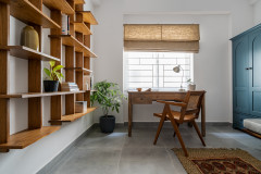
After. This small corner was made into an office. Roller shades make it easier to adjust the light in the room.
Solid-birch Mauricette chair and lamp: Maisons du Monde
Solid-birch Mauricette chair and lamp: Maisons du Monde
Conceptual drawing of the shower and laundry
Before. In the back corner of the apartment, the original bathroom needed an update.
After. Bizot immediately spotted the value of having a window overlooking the shower. “The shower booth was replaced with a walk-in shower that extends the whole width of the bathroom. A large-format tile floor with a textured matt finish were chosen for the shower. Everything has been made to measure. We placed a large mirror on the wall between the two sources of natural light, and a vanity floating over a faux-cement-tile vinyl floor lends the bathroom some character.”
Booster Vinyl floor: Saint Maclou
Tell us
What do you love about this home? Tell us in the Comments below, like and share this story, save the images and join the conversation.
Booster Vinyl floor: Saint Maclou
Tell us
What do you love about this home? Tell us in the Comments below, like and share this story, save the images and join the conversation.


House at a Glance
Who lives here: A father and his two teenagers
Location: La Rochelle, France
Start of renovation: February 2018
Completed: May 2018
Size: About 50 square metres
Interior designer and decorator: Coralie Bizot, Décoralie Concept
Budget: About EU45,000 including taxes, labour, kitchen and furniture