French Houzz Tour: A Stylish Mezzanine Expands a Small Apartment
Bold décor and a smart mezzanine addition turned this L-shaped space into a functional home full of personality

Florence Bouillot and Alisvey Portuondo Fuentes already lived in Montreuil, near Paris, France, when they started looking for a new home. They were willing to consider any option. “We were about to buy an apartment in the neighbourhood when I came across a planning permission sign on my street. I immediately called the company selling the property. It all happened very quickly and we became the owners of an empty, 47-square-metre expanse,” Florence says.
But time was running out: the couple had already sold their previous home, so they needed to move into their new place as soon as possible. The challenge for Lynn Pennec (pictured with Florence, below), the architect in charge of the project, was to completely transform the couple’s empty, raw space in just four months.
But time was running out: the couple had already sold their previous home, so they needed to move into their new place as soon as possible. The challenge for Lynn Pennec (pictured with Florence, below), the architect in charge of the project, was to completely transform the couple’s empty, raw space in just four months.
The property was exactly what Florence was looking for. However, there were some challenges. “The original blueprints were not completely correct, so they tripped us up during the work,” Lynn says.
“Florence asked for a loft that wouldn’t look too industrial. So we started with the idea of a New York-inspired apartment, which would be white with a few decorative touches and would also remain warm,” Lynn says.
“I bombarded Lynn with inspirational photos, while she proposed others from Houzz Ideabooks to figure out what I really wanted,” Florence says.
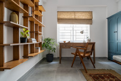
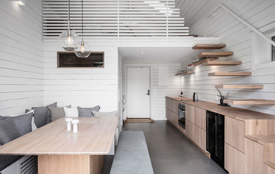
To gain some square footage, a new mezzanine was added above the bathroom (in the upper-right corner in the photo). A footbridge connects it to the bedroom, located in an existing room. This way, they added an extra 10 sq m to the apartment.
“I bombarded Lynn with inspirational photos, while she proposed others from Houzz Ideabooks to figure out what I really wanted,” Florence says.
To gain some square footage, a new mezzanine was added above the bathroom (in the upper-right corner in the photo). A footbridge connects it to the bedroom, located in an existing room. This way, they added an extra 10 sq m to the apartment.
Formerly a garage and then a cabinet-maker’s workshop, the building had been divided into four parts, each of which was left unfinished, with no décor.
“The plumbing and electricity was there, but we had to do everything else – it was a blank page,” Florence says.
“The plumbing and electricity was there, but we had to do everything else – it was a blank page,” Florence says.
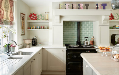
The entrance to the apartment is under the stairs and opens directly into the kitchen. The latter was placed as close as possible to the plumbing in keeping with the natural layout of the space.
“Lynn suggested going to Ikea with me on a Sunday morning to buy the kitchen furniture, which was part of the loft’s overall design concept, so she could make sure everything would match,” Florence says. So all the lower cabinets are standard pieces, except for one that was cut to make sure everything would fit perfectly into the space.
The high storage units, though, were made to measure. “We didn’t want them to extend out too far, as that would have blocked the light coming in from the glass panels just above,” Lynn says.
To make the living room and kitchen brighter, the architect suggested a glass footbridge to the mezzanine to let in light from the spotlights installed in the dropped ceiling. “Without Lynn’s help, I would never have thought of all these lighting issues,” Florence says.
Kitchen: Ikea.
The backsplash was a subject of much back-and-forth between the architect and owner. “We went through all possible materials and colours before deciding on this patchwork of faux cement tiles,” Lynn says.
In order to limit the total budget of the renovation, Florence bought the extractor hood, oven, hob and other appliances on Le Bon Coin, a French classifieds site.
Backsplash tiles: Equipe Cerámicas.
In order to limit the total budget of the renovation, Florence bought the extractor hood, oven, hob and other appliances on Le Bon Coin, a French classifieds site.
Backsplash tiles: Equipe Cerámicas.
Originally, the plumbing was in the shorter part of the L-shaped apartment, so the kitchen and bathroom were tucked into this space.
In addition, the 4.1m-high ceiling also made it possible to build a mezzanine here.
In addition, the 4.1m-high ceiling also made it possible to build a mezzanine here.
Two industrial-style doors lead to separate toilet and shower rooms. Grey hexagonal faux terracotta tiles run along the L formed by the kitchen and bathroom.
The tiled floor frames the dining area, with its unconventional dining table. “I bought it from a friend whose wife is an artist. He was selling it and I just found it mind-blowing!” Florence says.
Behind it, a Smeg fridge stands near the bathroom door. It’s a little treat the owner gave herself. “The goal was not to build it into the kitchen furniture, but to showcase it,” Lynn says.
Mate floor tiles: 41zero42.
Behind the door is an about 3.8 sqm bathroom. The walls are finished with different shades of metro tile: taupe behind the basin and a paler colour in the shower.
Florence already owned the basin – she’d bought it for her old apartment – but she bought the vanity unit it now sits on at the same time as the kitchen. Its black front echoes the mirror frame and taps.
“It wasn’t easy to find a shower head of the right dimensions, because the room is nestled under a mezzanine and has a low ceiling,” Lynn says.
Showerhead: Treemme.
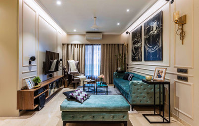
The only window in the living area had been put in by the original developer.
Today the large window brings light directly into the living room.
Lynn and Florence discussed the wall colour extensively. “At first, Lynn wanted to paint it blue, but I found that too mainstream. So we went through red, yellow, khaki and mint green before a colour-expert friend proposed this [teal],” Florence says. The oak floor helps to really bring out the colour.
Lynn and Florence discussed the wall colour extensively. “At first, Lynn wanted to paint it blue, but I found that too mainstream. So we went through red, yellow, khaki and mint green before a colour-expert friend proposed this [teal],” Florence says. The oak floor helps to really bring out the colour.
The bespoke curtains were another topic of discussion between Lynn and Florence. “We went to the Saint-Pierre market in Paris together to find them. Florence spotted a fabric with parrots, but we went for this one instead. Its pattern [difficult to see on the photo] echoes the green tones of the wall, and the reflective parts echo the sofa,” Lynn says.
The wall behind the sofa is covered in a finish that mimics the bricks of the original posts opposite. “The company that did the work had to scrape the two posts to expose the bricks,” Lynn says.
The wall behind the sofa is covered in a finish that mimics the bricks of the original posts opposite. “The company that did the work had to scrape the two posts to expose the bricks,” Lynn says.
The ceiling fan was Lynn’s idea. “We needed something to help air circulate and create a source of ventilation in the main room,” she says. The blades of the fan resemble aeroplane wings, a reference to Florence’s job.
“We found it on a German website and had to ask a friend who speaks the language fluently to contact the seller, and then customer services, because a piece was missing on delivery,” Florence says.
Artemis fan by Minka-Aire: Vam. Sofa: La Redoute. Heater: IRSAP.
“We found it on a German website and had to ask a friend who speaks the language fluently to contact the seller, and then customer services, because a piece was missing on delivery,” Florence says.
Artemis fan by Minka-Aire: Vam. Sofa: La Redoute. Heater: IRSAP.
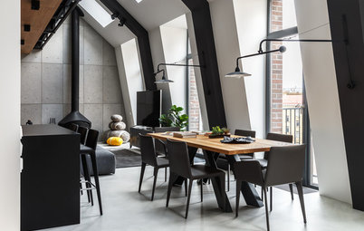
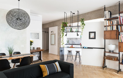
Lynn designed the staircase, which is the centrepiece of the décor. It offers plenty of storage space for the kitchen, the living room and the entrance, and extends along the entire wall to transform into a TV stand.
“I wanted it to flow all the way around the room without making it look cramped,” Lynn says. So she left the space under the first three steps empty and designed storage cupboards that are shallower than the steps themselves.
Emphasised by a simple handrail on the wall, the piece looks as if it’s floating in the air. “As we’re a couple with no young children, the absence of a handrail isn’t a problem for us,” Florence says.
Made of oak and laminated MDF, the staircase was built by Jose Reis de Matos of Escaliers Zazou, a former architect now specialising in the installation of stairs and custom-made furniture.
“We exchanged our 3D files and our ideas, and he presented some options,” Lynn says. “The beauty of this staircase lies in the fact that you don’t see all the constraints we had to take into consideration, like the fact that we had to build the footbridge simultaneously, and resize the electrical panel that’s in one of the cupboards.”
Shelves with both open and closed storage complement the staircase. This juxtaposition of filled and empty space stops the interior from becoming overwhelming.
Yellow lamp: Made.com.
Florence is not particularly attached to the objects she owns. For example, she sold her previous apartment along with nearly all of the furniture and accessories. The bust of iconic comic-book character Corto Maltese is an exception: she’s had it since she was 25.
The second floor originally consisted of a 16 sqm space above the entrance with no access points. Today, it hosts the master bedroom and a second, 9 sqm bedroom, both of which are connected to the stairway by the footbridge.
The glass footbridge lets light through and echoes the transparent bricks that connect the interior to the outside.
“The location of the footbridge was measured to the last millimetre to fit the structure of the apartment,” Lynn says. “For example, the layout of the glass panels had to be in line with the hob, because the beam that holds the glass floor panels also serves as a support for the extractor fan.”
“The location of the footbridge was measured to the last millimetre to fit the structure of the apartment,” Lynn says. “For example, the layout of the glass panels had to be in line with the hob, because the beam that holds the glass floor panels also serves as a support for the extractor fan.”
The bedroom was originally just as empty as the lower floor. Apart from the installation of the window, it had remained untouched.
Today, one of the walls is completely covered by custom-made wardrobes that form a large dressing room. They are cabinet units from a large retail store and were adapted to the dimensions of the space.
“I wanted doors without handles, but we found these that I like a lot and that match the floor,” Florence says.
In France, the Carrez law regulates reporting of apartment surface area and defines liveable space. It does not count any space with a ceiling height lower than 1.8m as liveable space, and therefore excludes it from the official floor area of an apartment.
To ensure the room would still fit under the law’s definition, the team had to forgo laying a wood floor here. So Florence and Lynn chose a natural cork floor, which is thinner than parquet and offers very good thermal and sound insulation.
Cork floor: Carrelage Parquet 29.
As the bed is situated under the window, a headboard was out of the question. The space is enhanced by a patterned wallpaper instead. “Again, it took a lot of back and forth between Lynn and me,” Florence says. “We finally went for this black-and-white design that goes well with any colour.”
The bedside tables are pieces by a Montreuil-based artist from the workshop Mademoiselle Fraise. They were re-covered with copper sheets, which are echoed on the bedside lampshades.
Wallpaper: Farrow & Ball.
The bedside tables are pieces by a Montreuil-based artist from the workshop Mademoiselle Fraise. They were re-covered with copper sheets, which are echoed on the bedside lampshades.
Wallpaper: Farrow & Ball.
The chair in front of the bed was one of several Florence bought at the shop Les Tatas Flingueuses in Montreuil. “I was lucky, because they weren’t very expensive, and they were delivered the following day,” she says.
Across the footbridge is the guest bedroom, nicknamed “the aquarium”, which the team designed from scratch. This about 9 sqm room above the dining area is just large enough to accommodate a double bed.
Partitioned by a large glass wall, the room is bright despite having no external windows. “The glass wall features openings to lessen the aquarium effect and blinds for privacy when needed,” Lynn says.
One wall in this room is finished in the same faux brick as in the living room, embellished with imitation Serge Mouille wall lamps.
“It was a project that had a lot of constraints, but ended up being very enjoyable, because Lynn and I were on the same page. I often sent her emails on weekends with the subject ‘Do not read before Monday morning’, but she always answered immediately after receiving them,” Florence says.
Thanks to this fruitful collaboration, Florence and her husband were able to move in after just four months of work.
Wall lamps: La Redoute.
Tell us
What do you love about this home? Tell us in the Comments below. And don’t forget to save your favourite images, save the story, and join in the conversation.


Who lives here? Florence Bouillot, a chief flight attendant, and her husband, percussionist Alisvey Portuondo Fuentes
Location Montreuil, France
Size About 505 sqft (47 sqm) before the renovation and about 615 sqft (57 sqm) after the addition of a mezzanine
Budget About €70,000
Duration of work Four months
Architect Lynn Pennec of IF Rénovation
Photos by Jerome Coton
When she was figuring out how to complete her project, Florence, pictured here on the left, turned to Houzz: “When I was looking for the apartment, I made it a habit to read the Design Dilemmas in the Stories & Advice section of the website,” she says. “So I just went for it and created my own discussion to ask for advice on the layout of this empty space.”
Architect Lynn Pennec, on the right in the photo, is always happy to share her expertise and offered some pointers. “I hadn’t planned to work with an architect, but the constraints imposed by the space and Lynn’s valuable tips convinced me,” Florence says.
The architect proposed three potential layouts, and the two women had a long discussion on Houzz before meeting.