
Comments
Get the Denim Drift (and its Co-stars) for 2017
There's no singing the blues with this versatile palette of cool blues from paint brand Dulux
Anita Yee
21 November 2016
Houzz Singapore Contributor.
Just the name itself, Denim Drift, evokes images of slightly overcast days, cool evenings, early winter mornings, long languid walks in a park… It’s a palette that’s comforting, gently uplifting and familiar. And as these interior design experts share, it’s a palette that adapts itself and pairs well with strong colours or those borrowed from the same family hue. You decide!
Photos courtesy of Akzonobel unless indicated
Welcome to 2017, Denim Drift
“This beautiful, timeless and versatile grey-blue fits into all life and interior styles…” shares AkzoNobel, manufacturer of Dulux paints, which was inspired by the “everyday elements of life … [like] family and friends, work, connecting with nature, and the pleasure of real and authentic experiences”.
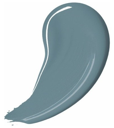
These are some ideas on how to use Denim Drift (also known as Smoke Grey) and an accompanying palette of 10 complementary blues.
Welcome to 2017, Denim Drift
“This beautiful, timeless and versatile grey-blue fits into all life and interior styles…” shares AkzoNobel, manufacturer of Dulux paints, which was inspired by the “everyday elements of life … [like] family and friends, work, connecting with nature, and the pleasure of real and authentic experiences”.
These are some ideas on how to use Denim Drift (also known as Smoke Grey) and an accompanying palette of 10 complementary blues.
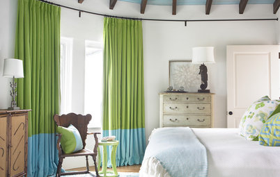
So versatile!
“I love this shade [Denim Drift] and have personally used this paint colour in many home makeovers,” says interior decorator Caroline Chin-Geyler at Arete Culture. “It’s sophisticated, soothing, and inviting, and the fact that it is complementary to both warm and cool colour palettes makes it easy to incorporate in almost any room.”
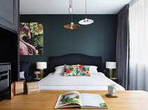
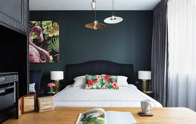
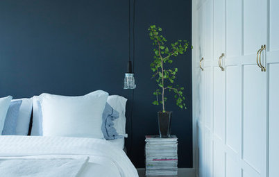
This bedroom: According to research, people who have blue rooms get more sleep than any other colour.
What colour theory says about blue
“I love this shade [Denim Drift] and have personally used this paint colour in many home makeovers,” says interior decorator Caroline Chin-Geyler at Arete Culture. “It’s sophisticated, soothing, and inviting, and the fact that it is complementary to both warm and cool colour palettes makes it easy to incorporate in almost any room.”
This bedroom: According to research, people who have blue rooms get more sleep than any other colour.
What colour theory says about blue
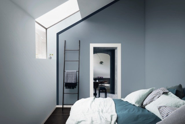
Spare bedroom
This restful shade of barely-there grey-blue is the perfect foil for bed covers and pillowcases in several shades darker of the same tint. Your guest might not want to leave!
More ways to add blue accents to bedrooms
This restful shade of barely-there grey-blue is the perfect foil for bed covers and pillowcases in several shades darker of the same tint. Your guest might not want to leave!
More ways to add blue accents to bedrooms
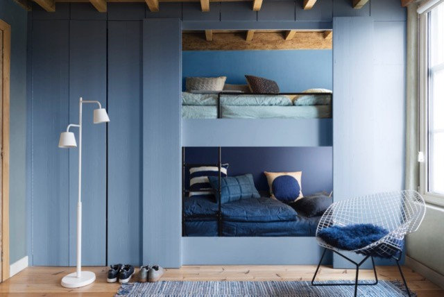
Blues are for girls too
“I love the Denim Drift shade along with the 10 Dulux blues … [which can be used] in children’s bedrooms,” says Chin-Geyler. She suggests layering several shades for depth and adds that nurseries will benefit from the more muted colours, such as Earl Blue or Sash Blue. “You can also easily use [either one of] these shades of blue as an accent colour in girls’ rooms.”
A more diluted shade will soften the look while a brighter shade will brighten and energise a room, she adds.
See more of this project
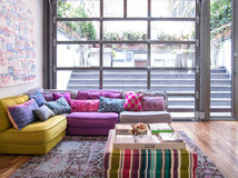
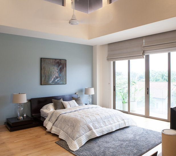
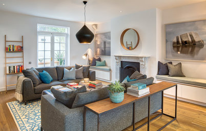
Light and bright
This bedroom exudes an oasis of calm. Adding throw cushions in the same colour group is a good way to start bringing this new colour to your current decor, shares Chin-Geyler. A rug in a tonal shade of blue-grey will add another dimension of texture too.
This bedroom exudes an oasis of calm. Adding throw cushions in the same colour group is a good way to start bringing this new colour to your current decor, shares Chin-Geyler. A rug in a tonal shade of blue-grey will add another dimension of texture too.
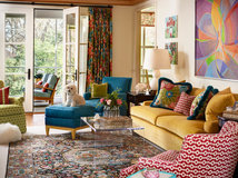
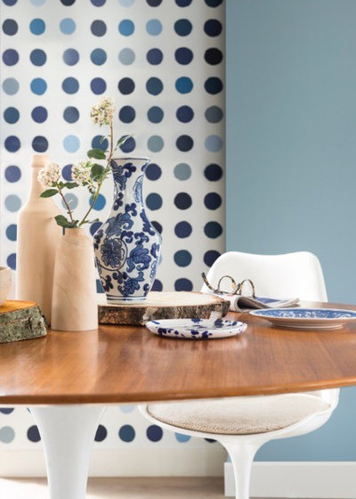
Which blue?
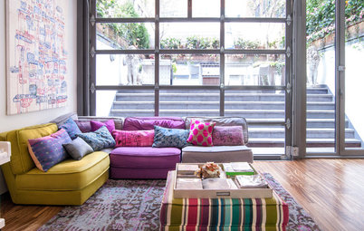
Can’t decide which blue you’d like to start with? Try a few at the same time and have fun with spots. Large spots in several shades of complementary blue link hands with a cool blue wall.
Another interior designer who loves the blue-toned palette is Priya Naik, design director of Interior Design Journey. “I love the Denim Drift palette. It’s proving to be very popular with our clients at the moment,” she says.
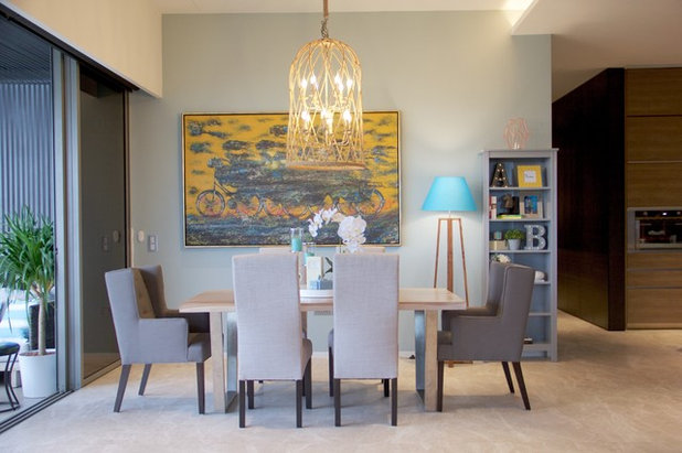
Dining area
The palest tones of blue and grey gently beckon in this space for convivial gatherings.
The palest tones of blue and grey gently beckon in this space for convivial gatherings.
Have fun with the palette
With a palette that stretches a spectrum of blues, Naik says, “I’d personally use this colour palette anywhere in the home.”
This is a sentiment that Chin-Geyler shares too, “I think this is a universally flattering colour; however, my advice is to use it with restraint, that is, to have a feature wall and tie in the colour with several complementary accents, or used tonally in various shades.”
Read this for more inspiration
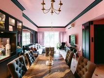
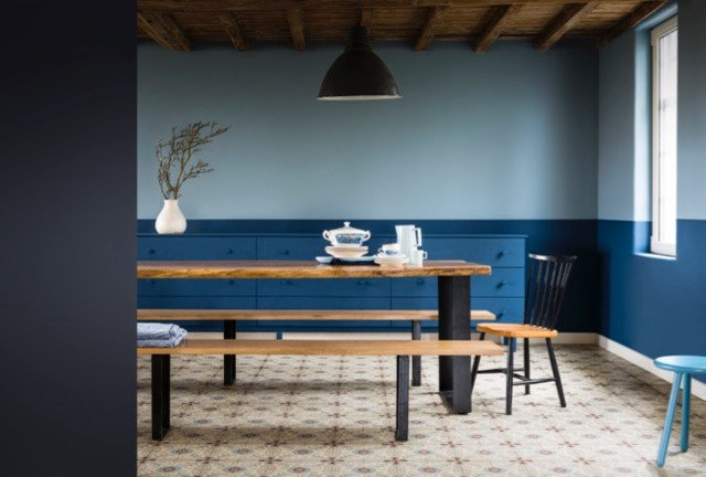
Colour blocking
“We are using this colour palette a lot at the moment. We have recently completed many rooms with greys and blues; all have a unique colour combination. For example, grey with a pop of aqua, or grey and midnight blues, or pale blues and greys with champagne,” shares Naik.
Cool blue and warm cream sit side-by-side in quiet harmony. Where the strong lines of the side console gently draws attention to the subtle division between the two colours, swap it for a large, tall vase in a solid colour for a decor statement.
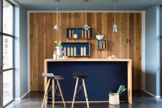
Anchor it
The use of navy for the back of this wooden bar table offers a smart contrast to the light woods of the furniture and the warmer tones of the wood panelling on the feature wall. Cosy!
The use of navy for the back of this wooden bar table offers a smart contrast to the light woods of the furniture and the warmer tones of the wood panelling on the feature wall. Cosy!
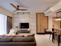
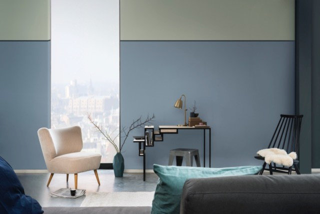
Mix and match
The versatility of this palette is only limited by one’s imagination. And it also offers practical options.
“I used pale grey as the neutral backdrop for two walls in a nursery and playroom for a client recently … For renters, the colour could be used [on an] accent wall in a room while leaving the other walls white or beige,” Naik says. She also recommends pale blue shades in the same way.
If you’re still not sure how to go about it, Naik has this to share, “Transforming a space can be done [by] updating your throw pillows, rugs and accessories.” However, she cautions that one “must ensure the right balance of textures and colours.”
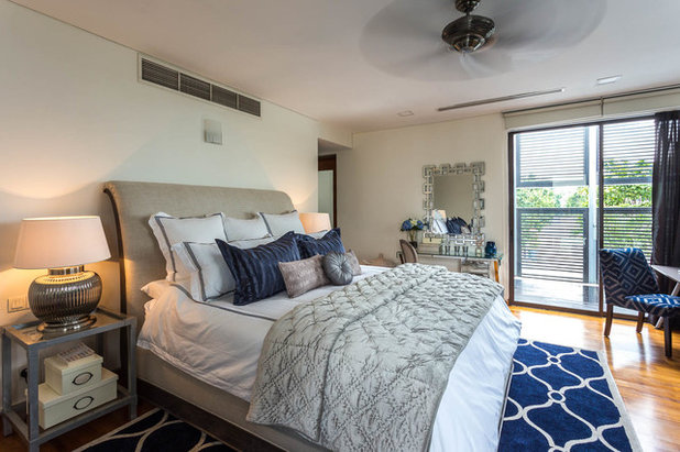
As she has done with this master bedroom makeover of a rental home at Dunsfold Drive, pale greys are accented with midnight blue soft furnishings and accessories.
The versatility of this palette is only limited by one’s imagination. And it also offers practical options.
“I used pale grey as the neutral backdrop for two walls in a nursery and playroom for a client recently … For renters, the colour could be used [on an] accent wall in a room while leaving the other walls white or beige,” Naik says. She also recommends pale blue shades in the same way.
If you’re still not sure how to go about it, Naik has this to share, “Transforming a space can be done [by] updating your throw pillows, rugs and accessories.” However, she cautions that one “must ensure the right balance of textures and colours.”
As she has done with this master bedroom makeover of a rental home at Dunsfold Drive, pale greys are accented with midnight blue soft furnishings and accessories.
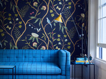
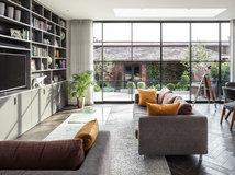
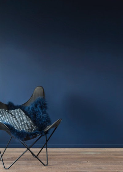
In the dark of night
Midnight shades of blue offer a versatile canvas for pairing. Add unusual finds from your travels for a bit of eclecticism; pair with other jewel tones or a touch of gold for decadence; or perhaps with clean-and-simple crisp whites. You decide!
TELL US
Do you have a blue space you’re particularly proud of? Share your photos or tips with us in the Comments below.
MORE
Renovations through blue and black boxes
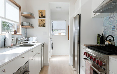
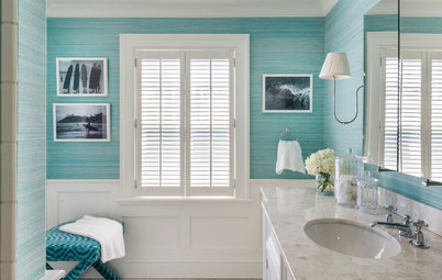
And don’t forget this space, the bathroom!
Midnight shades of blue offer a versatile canvas for pairing. Add unusual finds from your travels for a bit of eclecticism; pair with other jewel tones or a touch of gold for decadence; or perhaps with clean-and-simple crisp whites. You decide!
TELL US
Do you have a blue space you’re particularly proud of? Share your photos or tips with us in the Comments below.
MORE
Renovations through blue and black boxes
And don’t forget this space, the bathroom!
What are you working on?
Related Stories
Interior Design
Does Your Home Need a Colour Consultant?
By Janet Dunn
Engaging a colour consultant could be one of the smartest moves you make, to help your home to look its best
Full Story
Interior Design
How Do I... Use Dark Paint Colours in a Small Apartment?
By Niki Bruce
You don’t have to stick to white if you have a small apartment; dark paint can add luxury and depth to tiny spaces
Full Story
Interior Design
Colour Mixing: Mix it Like You Know it
By tidgboutique
If you're tired of neutrals but lack the braves to embrace colours, then this is for you
Full Story
Interior Design
Picture Perfect: 26 Dark Blue Rooms From Classic to Contemporary
Our coffee-break escape offers you five minutes' worth of images to inspire and delight. Jump right in...
Full Story
Interior Design
How to Find Your Spirit Colours
Dressing your home in colours that embody your personality calls for reflection, inspiration and a readiness for risks
Full Story
Interior Design
8 White Paints That Show Which White is Right
By Kelly Porter
This simple colour comes in an array of tones that offer different looks
Full Story
Bathroom Ideas
10 Ways to Come on Strong With Colour in Your Bathroom
Set your bathroom apart from the rest of the pack with a shot of strong colour or pattern
Full Story
Interior Design
Colour vs Neutrals: 10 Tactics to Solve Colour Conflicts
One of you lives for colour, the other loves the safety of neutrals. Here's how to meet in the middle.
Full Story
Interior Design
A Grey Sofa is a Great Neutral That Plays Well With Others
By tidgboutique
See 11 reasons to love a grey sofa and how this neutral shade can take on anything you mix with it
Full Story
Interior Design
Does Bedroom Colour Affect How Much Sleep and Sex You Get?
The colour of bedroom walls have a surprising effect on sleep and sexy time
Full Story