Interior Design
Get to Know Beige Again
If you dismiss this old classic, you're missing out on beige's infinite subtleties and versatility

Oh, beige. So overused, so undervalued. Beige is like the plain, dutiful city clerk. She keeps the town running smoothly, but no one throws her a parade. But boring old beige doesn’t have to be boring. It’s just that it is too often used as a default, with no real thought about tone, hue, value and what other colours might look great with it. It’s slapped on cheap apartments and homes about to be put on the market.
Beige is nearly infinite in its subtlety. Which beige you choose can alter the entire mood of a room. It looks different depending on the architecture and kind of light.
Beige is also known as tan, buff, cream and even khaki. It varies from nearly brown to very pale cream. It can have warm yellow undertones or pink undertones or be nearly grey. ‘Greige’ seems to be the It neutral at the moment.
Warm, yellowy beiges look great with teals, turquoises and other yellow-blues. True red looks vivid and elegant next to darker warm beiges. Beige and pink also looks lovely, no matter the undertone.
Layering beiges creates a soft, calming look; it makes you feel like you’re walking into a room made of cashmere. And all beige tones, no matter how light or dark, work with bright white trim; nothing looks crisper or more traditional than this combo.
Beige is a favourite of traditional styles, but it is really everywhere – even in wide-open modern spaces and wild, eclectic boho spaces. It’s the unsung workhorse of the decorating world. And if you can see past its bad reputation, you can appreciate its subtle beauty.
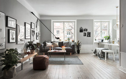
Layers of beige – from a very light cream to a dark tan – add to the airy, calm feeling of this room.
The beautiful architectural details in this stairwell are enhanced by the contrast between the beige walls and the white trim.
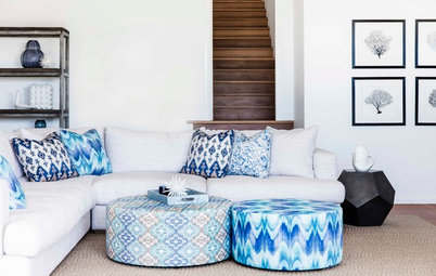
A warm, dark beige with a light, warm blue. Sand and sea, a classic combination.
A light, creamy beige with glossy true-black trim. It’s elegant and less predictable than white.
These subtle and chic beige and cream stripes are a great alternative to the pink and blue nursery. So soft and calming.
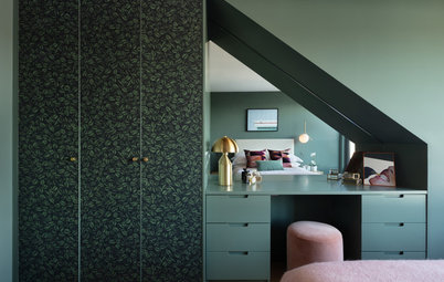
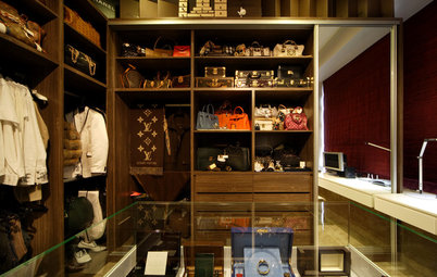
Beige doesn’t have to be just the wall colour; it can be the door colour as well. These dark beige doors look great in this luxurious walk-in wardrobe.
Beige in the Bathroom
The beige tiles behind this tub are rich and caramel-like. I think I would have continued the white from the ceiling onto the upper wall, to create even more contrast.
The beige tiles behind this tub are rich and caramel-like. I think I would have continued the white from the ceiling onto the upper wall, to create even more contrast.
Beige gets modern. I love this shiny foil finish for a modern and sophisticated bathroom.
Beige in the Kitchen
Beige cabinets and appliances are a nice alternative to bright white. Everything is still crisp and clean looking, but a little less severe.
Beige cabinets and appliances are a nice alternative to bright white. Everything is still crisp and clean looking, but a little less severe.
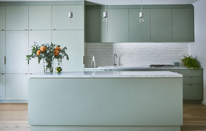
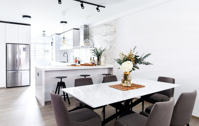
Here, light greige walls set off the white cabinets and appliances.
A creamy sofa, walls and rug with blushing pink curtains make this room is so refined and lovely.
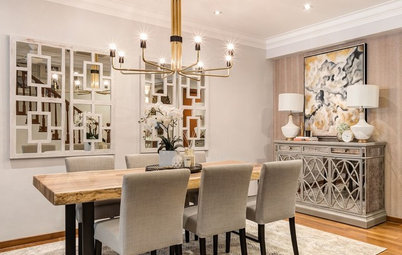
Beige as an accent with warm white. Used like this, beige becomes a colour full of possibilities.
Traditional chairs upholstered in various shades of beige linen. The word ‘beige’ comes from a type of undyed cotton. This room has a very airy, stately feel. It’s shabby chic in the best way.
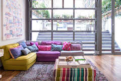
Beige but not boring. All the different shades of beige here are the perfect backdrop for the multicoloured wall of books and the various pops of bright colour.
TELL US
Do you use beige in your home? Share your photos in the Comments below.
MORE
Serial Renovators On How to Work With White, Grey and Beige
8 Paint Colours to Try if You’ve Got Greige Fatigue
TELL US
Do you use beige in your home? Share your photos in the Comments below.
MORE
Serial Renovators On How to Work With White, Grey and Beige
8 Paint Colours to Try if You’ve Got Greige Fatigue

A light, cool beige in this giant room adds a little warmth but remains steadfastly modern. Light beiges are a great alternative to bright white in modern spaces.