Interior Design
'Greenery' is Pantone's New Colour of the Year
It's going to be easy being green in 2017 as suppliers and designers pick up this trend forecast from the colour expert

Whether you like this shade of green or not, Pantone’s Colour of the Year for 2017, Greenery, is a welcomed symbol of renewal and hope coming on the heels of 2016’s topsy-turviness.
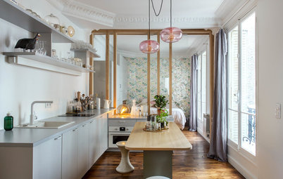
A similar shade of green works great in this eat-in kitchen with light-hued wood, and accents of black and white. It evokes good health and freshness.
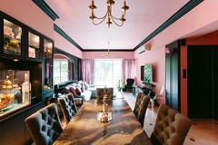
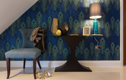
In this dining room, yellow-green contrasts beautifully with the deep peacock blue and other jewel tones for a bold yet sophisticated look.
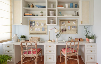
For a more subdued yet still fresh bedroom, work it with neutrals for that resort look.
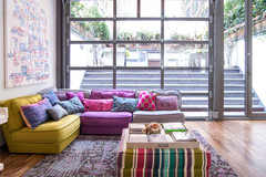
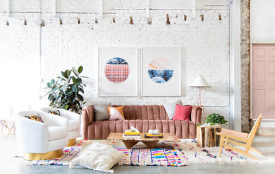
‘Greenery’ is quite versatile as a pop of colour, too. Use it on anchor pieces of furniture such as the four-poster bed and couch here.
Or use in a feature wall to make a small space feel fresh and bright.
Use it as an accent colour to complement blues.
If you prefer less of it, use it with white, yellow and a darker shade of green for that spring feeling. It goes really well as little accents on a table setting.
Feeling bold? You can even use it in graduated shades for a statement-making exterior!
TELL US
Do you ‘Greenery’ is hot or not? Vote in the poll or share your thoughts in the Comments section.
MORE
What about Dulux’s Colour of the Year for 2017, Denim Drift?
TELL US
Do you ‘Greenery’ is hot or not? Vote in the poll or share your thoughts in the Comments section.
MORE
What about Dulux’s Colour of the Year for 2017, Denim Drift?

Find inspiration on how to use this zesty, yellow-green shade below.
How Colour Trends are Forecast