Condo / Apartments
Houzz Tours
Houzz Tour: A 3-Bedroom Condo's New Twist on Hollywood Regency Glam
This home of a young family hits the high notes with ornamentation, bold pattern and grandeur

The owners, who had spent almost 10 years studying and working in the US, love the look of the Hollywood Regency era. “They appreciate glamour, gold accents and geometry, so we used these more formal leads and modernised the style with a couple of decorating accents,” says Caroline Chin-Geyler, head stylist of Arete Culture. “This project was a very interesting one for us because the aesthetic is quite different from our usual projects,” she adds.
The couple wanted something luxurious and cosy but also baby-friendly. “Our key priority when styling a space is to ensure that the design vision is aligned with what the clients want and how they live. We worked very closely with the homeowners to ensure the pieces we selected – from wallpaper to cushion covers and even refurbished pieces – were in a style they appreciate while still adhering to what we stylists had in mind.”
The couple wanted something luxurious and cosy but also baby-friendly. “Our key priority when styling a space is to ensure that the design vision is aligned with what the clients want and how they live. We worked very closely with the homeowners to ensure the pieces we selected – from wallpaper to cushion covers and even refurbished pieces – were in a style they appreciate while still adhering to what we stylists had in mind.”
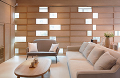
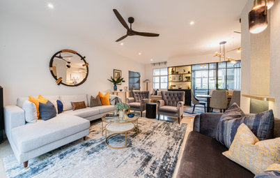
A vertical view of the dining area shows the play of textures in the space. “The main priority was to lighten the ambience of the dining space because of the dominance of dark wood,” she says. The seating arrangement was reconfigured – the visually heavy chairs were placed against the wall, and a sleeker bench brought to the fore. To soften the wood tones, a bench seat in luxe velvet and midnight blue piping was added. This also establishes a consistent colour palette that is used throughout the home. The metallic finish of the wire pendant lamp mirrors the glided chairs while its lines parallel the black and white wall accent (a feature that came with the apartment).
The clients shipped home most of their furniture from the US. Chin-Geyler worked with these existing pieces: industrial grey wallpaper, a blue velvet armchair, bookshelves and a sofa. “While the pieces were beautiful on their own, they were quite overwhelming together,” she says. The zesty red-and-pink artwork in the middle of the room brings the energy and juicy pop of colour needed to contrast against the dark furniture. New throws and printed cushions add softness.
The gilded open bookshelves are positioned to flank the sofa while a TV console was commissioned. It sports a pearlescent finish and gold hardware to continue the Hollywood Regency theme. “Metallics reflect light and make the space feel bigger. We incorporate different metallics in the room to keep the feel fresh. Too much of a single metal can make the room feel stifled and old quickly,” the designer explains.
The gilded open bookshelves are positioned to flank the sofa while a TV console was commissioned. It sports a pearlescent finish and gold hardware to continue the Hollywood Regency theme. “Metallics reflect light and make the space feel bigger. We incorporate different metallics in the room to keep the feel fresh. Too much of a single metal can make the room feel stifled and old quickly,” the designer explains.
Since the Hollywood Regency style is all about avant-garde and exotic touches, Chin-Geyler saw to it that there’s a stylish mix of unique details, from unconventional prints to fanciful accents. Even the trolley brings a dash of Old Hollywood glamour.
“The first thing we did for the outdoor balcony was to deck it with dark wooden panels. This not only opened up the space by bringing the indoors and outdoors together, but also helped to ‘luxe up’ the balcony while keeping within the budget,” says Chin-Geyler. The screen provides some privacy and hides the view of the neighbour’s laundry.
The space is made entertaining-ready by pairing the two-and-a-half seater sofa with a smaller side table and ottoman. They serve as extra seating without adding bulk. An outdoor rug makes the space feel cosy.
The space is made entertaining-ready by pairing the two-and-a-half seater sofa with a smaller side table and ottoman. They serve as extra seating without adding bulk. An outdoor rug makes the space feel cosy.
The master bedroom was generously sized, but wasn’t used to its full potential. The bay window, for example, was dead space, so window seat cushions were added to create a cosy reading nook for the book-loving couple. Muted blue cushions were chosen for the bed to maintain the overall colour scheme.
“In a small apartment like this, it’s important to establish good spatial flow so that the home feels cohesive and hence larger. A simple way to achieve this is through colour. The bedroom already features a lot of earthy brown and gold, so bringing in the blue helped to lighten the look,” says Chin-Geyler.
“In a small apartment like this, it’s important to establish good spatial flow so that the home feels cohesive and hence larger. A simple way to achieve this is through colour. The bedroom already features a lot of earthy brown and gold, so bringing in the blue helped to lighten the look,” says Chin-Geyler.
To make up for the lack of built-in storage that afflict many new apartments, the team built boxes above the bay window. This adds useful storage space and acts as a vanity counter. “It also gives the couple space for their family to grow into,” she says.
Diverse patterns in the same colour family are layered for a tactile experience.
The master bathroom is styled for relaxation and luxury through the addition of scented reeds, candles, and flowers.
Of course, the team made sure the home is ready for its newest resident. Books and toys line up neatly on picture ledges.
“While the project departs significantly from our signature aesthetic, we’re thrilled to have been challenged (in a good way!) and have our portfolio broadened. The clients were so pleased with the result, they sent us a bunch of beautiful blooms after the makeover!” Chin-Geyler shares.
TELL US
What feature do you like best in this home? Share in the Comments below.
TELL US
What feature do you like best in this home? Share in the Comments below.

Who lives here: A young professional couple and their newborn
Location: Farrer/Holland district
Size: 111 square metres (1,200 square feet)
Project duration: 38.5 hours for the installation, although the entire project took about 5 months from the first consultation
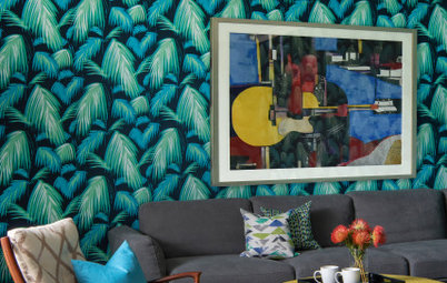
Geometric wallpaper with a reflective finish is the first hint of glitz. The circular mirror adds even more reflected light that opens up the space.
The client’s outdated shoe cabinet was given a fresh coat of paint in rice and blue. It is adorned with a pair of lamps with quatrefoil print shades. “I love using statement-making lamps in entryways as I never leave a space without adding ambient lighting. It’s important to establish that warm, cocooning feeling from the start of the home,” says Chin-Geyler.