Condo / Apartments
Houzz Tours
Houzz Tour: Dramatic Changes For A Couple's Cosy Nest
After living in this apartment for seven years, the owners decided it was time for a major overhaul

“A bigger kitchen and wardrobe, more storage space, and functional areas for entertaining” were among the essential modifications that the owners wanted for the rehaul of their two-bedroom condo unit, says designer Elden Lim, director of Minimology by Minimo. It wasn’t, however, a typical straight-up reconfiguration of spaces. The home had an oddly-shaped layout, with some rooms almost triangular in shape. “The existing unit was full of corners that created plenty of wasted space,” Lim says.
The solution was to knock down all non-load-bearing internal walls in the apartment and put up new ones to “square off” the redesigned spaces. “We tried to align all new carpentry and fixtures to create a straight visual,” he says.
The solution was to knock down all non-load-bearing internal walls in the apartment and put up new ones to “square off” the redesigned spaces. “We tried to align all new carpentry and fixtures to create a straight visual,” he says.
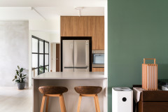
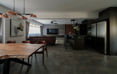
The kitchen underwent the biggest change. It was moved from an enclosed tight space on the right of the foyer to take over the former study. The couple now have an open-concept kitchen that overlooks the living area. Shifting the whole kitchen also enabled them to have an additional space for a pantry.
The bigger, well-equipped cooking space meets the entertaining needs of the couple, who like to cook and have friends over. It is hardworking as it is sleek with its clean profile and well-thought out cabinetry options.
Countertop: KompacPlus
Countertop: KompacPlus
The framed glass partition puts natural lighting to good use. The visual connection between the entertaining spaces imparts a cosier feel to the place.
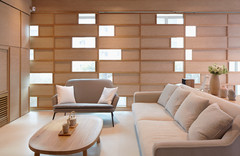
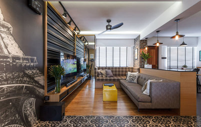
The tufted sofa, one of the few pieces kept by the owners, is the perfect spot to relax and hang out. The eye-catching fibreglass skull sculpture is a sure-fire conversation starter.
The tufted sofa, one of the few pieces kept by the owners, is the perfect spot to relax and hang out. The eye-catching fibreglass skull sculpture is a sure-fire conversation starter.
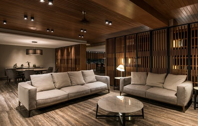
Lining the living room is a wood-laminate TV feature wall, which helps visually extend the height and width of the space. Colours from the artwork, books, and furnishings play up the neutral palette.
The designer also extended the entertaining function to the balcony, where a glass ledge was installed to give guests a perch for drinks while looking out to the scenery. A pair of sculpted wooden stools completes the al fresco area.
The designer also extended the entertaining function to the balcony, where a glass ledge was installed to give guests a perch for drinks while looking out to the scenery. A pair of sculpted wooden stools completes the al fresco area.
“The floor tiles laid out in an angle, starting from the foyer all the way to the balcony, enhances the depth of the unit,” says Lim. Ample daylight from the balcony warms up the elongated living space.
Carpet: Ling’s Carpet; Sofa: Ikea; Chair, stools, and accessories: Pols Potten; Cushion from Robinson, Artwork: Ode to Art
Carpet: Ling’s Carpet; Sofa: Ikea; Chair, stools, and accessories: Pols Potten; Cushion from Robinson, Artwork: Ode to Art
The vibrant tones of the Moroccan-patterned tabletop and the colourful stools lend a cheery mood to the dining area. “We chose stools instead of typical dining chairs to emphasise the colour accent of the table top, as well as the angular custom table base,” says Lim. He also built display ledges under the ceiling to draw the eye upward.
The reconfiguration of spaces made way for a narrow hall to be created. It leads to the common bathroom (right) and the storage room (left).
The master bedroom and the adjacent common bathroom were oddly shaped and resulted in wasted spaces. Lim redesigned the two rooms to be more straight and square to reclaim some of the footprint.
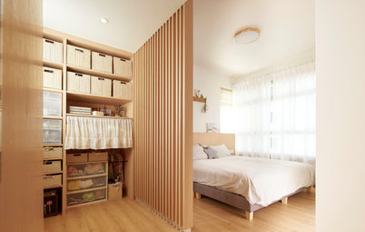
Instead of bedside tables, the designer opted for wall-mounted shelves to save on space in the bedroom. Full-height wardrobes with glossy white doors occupy an L-shaped layout in the room and provide the owners with plenty of clothing storage.
Instead of bedside tables, the designer opted for wall-mounted shelves to save on space in the bedroom. Full-height wardrobes with glossy white doors occupy an L-shaped layout in the room and provide the owners with plenty of clothing storage.
With full-height windows bringing in generous light, the master bedroom is bright and cosy. An abstract painting placed over the headboard lends colour and texture to the neutral-toned room.
The same airy feeling makes the resized and fully-tiled master bathroom an inviting space.
TELL US
What feature did you like best in this home? Share in the Comments below.
TELL US
What feature did you like best in this home? Share in the Comments below.
Who lives here: A 30-something couple and their dog Dijon
Location: Dover
Size: 1,000 square feet (93 square metres)
Project duration: 10 weeks