


Comments
Houzz Tour: Merging the Old and the New with a Creative Screen
A spatial divider ties together the existing and new looks as well as the private and communal spaces
Verlaine Marquez
27 January 2017
Houzz Singapore Contributor. Former editor for a home and design magazine for five years, and now a full-time freelance writer for various online and print publications for the past decade and counting. Part-time crafter, wannabe gardener, and breast cancer thriver.
Houzz Singapore Contributor. Former editor for a home and design magazine for five... More
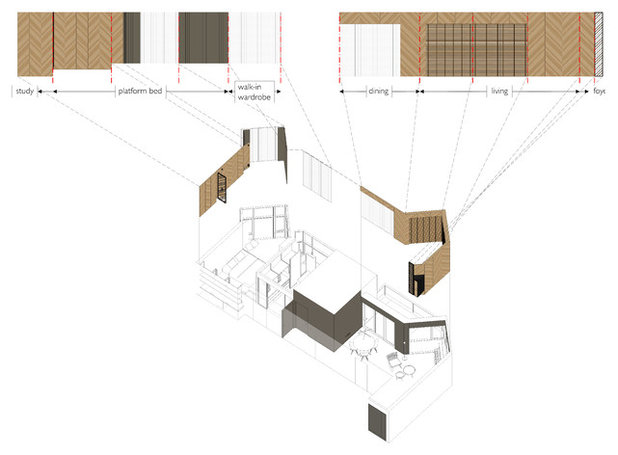
Creating a new interior in an outmoded apartment often involves a novel strategy to give the space a different perspective, with as minimal intervention as possible. In the case of this condo unit, a timber screen becomes the defining design intervention. “The original apartment was appointed in a palette of materials comprising white marble flooring, dark woods, and white plastered walls. The overall look and feel was formal,” says William Ng, principal architect of Studio Wills + Architects.
The new homeowner – a very meticulous person who likes a clean-lined, fuss-free home – prefers a lighter look for the interior. Hence, Ng and co-designer Wu Shan Yat inserted a screen within the original apartment, “with the intention of binding all the spaces (foyer, living, dining, master bedroom) as one, and forming a backdrop against the original interior.”
The new homeowner – a very meticulous person who likes a clean-lined, fuss-free home – prefers a lighter look for the interior. Hence, Ng and co-designer Wu Shan Yat inserted a screen within the original apartment, “with the intention of binding all the spaces (foyer, living, dining, master bedroom) as one, and forming a backdrop against the original interior.”
Houzz at a Glance
Who lives here: An aesthetic medical doctor in his 30s
Location: West Coast Crescent
Size: 1,313 square feet (122 square metres); actual renovated area is 864 square feet (80 square metres)
Project duration: 4.5 months
From the foyer, the screen sets the stage for the modern yet warm atmosphere that this apartment exudes. “The screen conceals the views of the harbour beyond, creating a sense of anticipation,” says Ng.
Walls were painted cocoa brown and lights were kept dim and warm. A floating shoe cabinet with niches for keys is mounted in a corner, adding functionality to the entryway without being obtrusive.
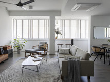
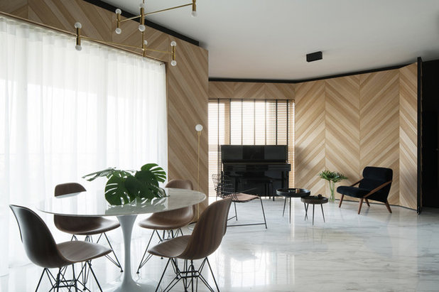
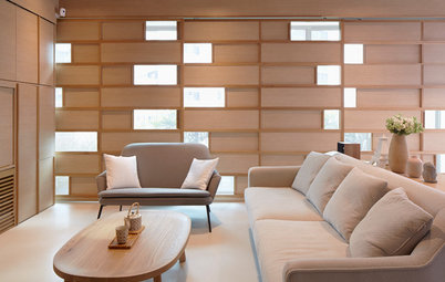
The owner’s preference for midcentury modern design is apparent in the open-plan living and dining space. “We looked into the works of [Austrian-American architect] Richard Neutra, and distilled some essential qualities of midcentury modern interior design – the use of pared-down forms, natural materials and lighting, and contemporary patterns – to create an interior that is at once modern yet warm and liveable,” explains Ng.
The screen, with its diagonal stripes of alternating shades of wood, wraps around the communal space and lends it a sense of elevation and rhythm. Curtains and blinds soften the daylight that bathes the space.
Lambert & Fils Luna floor lamp, L’abbate Attesa 01 lounge chair, Munki Wang wire chair, Mater Bowl tables: all from Inhabitant
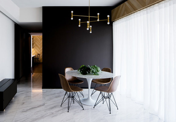
The original Volakas marble flooring in the living and dining spaces was retained. To create contrast, walls in the dining area were painted the same brown as the foyer.
Classic elegance is also emphasised in this space through iconic mid-century modern pieces, with the pairing of Eames DWSR side chairs in walnut with the owner’s existing Tulip table.
Lambert & Fils Dot Suspension lamp: Inhabitant
Classic elegance is also emphasised in this space through iconic mid-century modern pieces, with the pairing of Eames DWSR side chairs in walnut with the owner’s existing Tulip table.
Lambert & Fils Dot Suspension lamp: Inhabitant
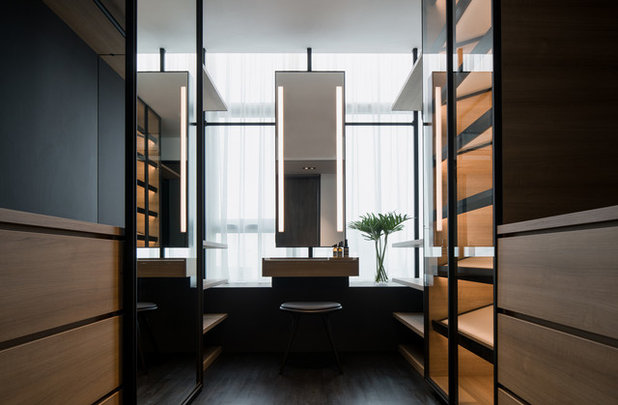
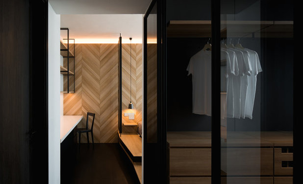
Towards the rear of the unit is the master suite. “The walk-in wardrobe was high on his wish list,” says Ng. Responding to the owner’s request, the designers transformed one bedroom into into an open-concept wardrobe where all his things are in plain view. The owner specifically requested for a shoe cabinet with integrated light, alongside a tray/pigeonhole for socks, underwear and accessories such as neckties. He also asked for high shelving to display his bags. “He wanted plenty of storage, which explains the additional hanging rods along the window in the event that the two sides of the walk-in wardrobe are filled up,” adds Ng.
The new black-stained timber strip flooring adds sophisticated flair to the space. “Cabinet backing is in a matching dark tone so that only the cabinets, in timber look-alike laminate, stand out as it gets illuminated by natural daylight from windows lining the width of the wardrobe,” Ng says.
Mater low stool: Inhabitant
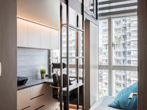
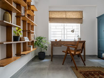
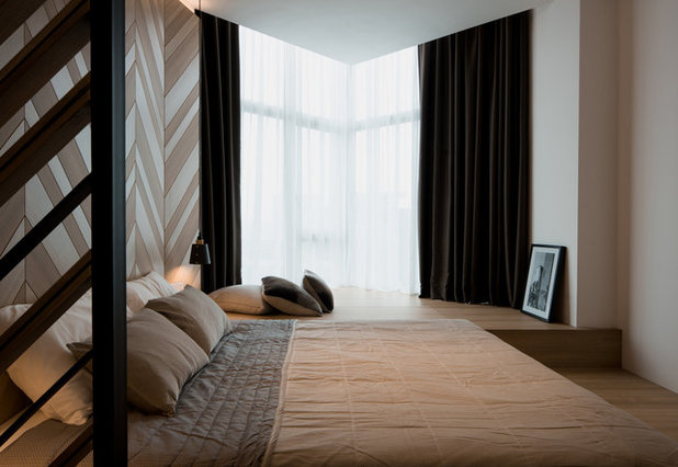
The original doorway to the master bedroom was relocated, so that the new walk-in wardrobe becomes part of the bedroom. The room opens with a study to the left, which is appointed in the same wood laminate and black metal.
L’abbate L’viv chair: Inhabitant
L’abbate L’viv chair: Inhabitant
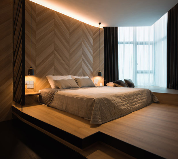
The pared down and clean aesthetic continues in the bedroom. A platform, finished in laminate that matches the screen, was built with a level for sleeping and another level for lounging. In addition to the suspended lamps that illuminate both sides of the bed, the screen also glows from above with warm cove lighting.
Another divider with diagonal slatted detailing acts as a buffer between the bed and the study.
Another divider with diagonal slatted detailing acts as a buffer between the bed and the study.
Aside from maintaining a cohesive look with the timber partition, the platform also helps mask an odd, triangular corner of the room.
Buster and Punch hooked suspension lamp, Nordstjerne ombre cushions, Sketch large cushions: all from Inhabitant
Buster and Punch hooked suspension lamp, Nordstjerne ombre cushions, Sketch large cushions: all from Inhabitant
TELL US
What did you find most striking about this home? Share in the Comments below.
What did you find most striking about this home? Share in the Comments below.
What are you working on?
Related Stories
Houzz Tours
Houzz Tour: This Penthouse Hints at Japanese Minimalist Aesthetics
Sliding panels address the privacy issues of the inhabitants without compromising on light, ventilation or the scenic view
Full Story
Houzz Tours
Houzz Tour: Singapore Colonial Meets Scandi Style in This Unit
The designers fulfilled the owners' brief for their double-storey apartment with flair
Full Story

Houzz Tours
Houzz Tour: A Compact Home That Has More Than The Eye Can See
Home to a family of three, this condo was designed to accommodate seven when it needs to
Full Story
Houzz Tours
Houzz Tour: This Condo's Colourful Geometry is Child-Friendly
This home is geared towards giving the homeowners' young daughter a cheerful and colourful environment
Full Story
Houzz Tours
Houzz Tour: Bespoke Furniture Optimises this 600 Sqft Condo
It's all about customisation to maximise the limited floor area of this apartment
Full Story
Houzz Tours
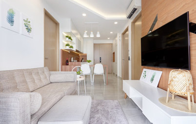
Houzz Tour: Curves Add Some Playfulness to a Monochromatic Condo
A black-and-white scheme sets the stage for this family-of-four's personal effects
Full Story
Houzz Tours
Houzz Tour: Compact Condo Looks More Spacious With its Muji Style
To optimise a limited floor area, the designer turned to the Japanese minimalist lifestyle brand for inspiration
Full Story
Houzz Tours
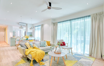
Houzz Tour: Sherbet-y Colours Pretty Up This Family Condo
Geometric blocks add a dynamic vibe to the soft and sweet colour scheme
Full Story
Houzz Tours
Houzz Tour: Black-and-White-Inspired Home is Fit for Entertaining
Their old black-and-white house ambience is replicated in this apartment so the owners can continue entertaining
Full Story
Houzz Tours
Houzz Tour: Music and Peranakan Influences Make This Condo Home
Personalised details turn this condo from standard to superb
Full Story