Condo / Apartments
Houzz Tours
Houzz Tour: Muji-inspired Apartment Keeps Things Minimalist
Two young kids and minimalism can go together as this apartment shows

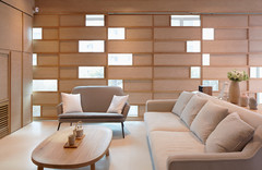
Boutique design studio Three-d Conceptwerke, led by Dess Chew, has made a name for itself in innovative interiors so it’s no surprise that this three-bedroom condo they designed is minimalist yet cosy, and boasts a feature wall that functions in a slew of other ‘secret’ ways.
The owners approached the design team with a brief that said, “Something clean and simple; Japanese minimalist; clutter-free.” The Three-d Conceptwerke designers turned to Japanese lifestyle brand Muji for visual inspiration and to their bag of design tricks for spatial solutions.
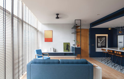
Riffing off the Muji look, the designers proposed a predominantly wood and soft-white palette, with blue and grey accents.
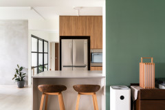
The condo has a little foyer where the owners can store their shoes and shake off the day’s grime before entering their clutter-free haven. From the main door, they can take a peek into the kitchen – with its upper-half-wall replaced with sliding glass panels – to see what’s cooking for dinner.
Riffing off the Muji look, the designers proposed a predominantly wood and soft-white palette, with blue and grey accents.
The condo has a little foyer where the owners can store their shoes and shake off the day’s grime before entering their clutter-free haven. From the main door, they can take a peek into the kitchen – with its upper-half-wall replaced with sliding glass panels – to see what’s cooking for dinner.
Cooking aromas are kept within the kitchen when the windows and accordion doors are shut.
The doors are a luscious saturated blue and match the kitchen’s glossy backsplash tiles. The blue accents the wood-and-white look, adding some depth to the walls of the small cookspace.
The half-height wall with the glass window panels enables abundant light to illuminate the kitchen space.
The doors are a luscious saturated blue and match the kitchen’s glossy backsplash tiles. The blue accents the wood-and-white look, adding some depth to the walls of the small cookspace.
The half-height wall with the glass window panels enables abundant light to illuminate the kitchen space.
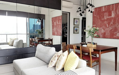
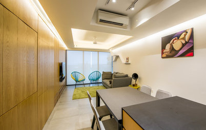
A compact dining set is located next to the kitchen and enjoys an open-plan layout with the living area. “The owners chose the furniture on their own with much care, after a greater understanding of our design concept and of what would be suitable for a space like this,” says the design team.
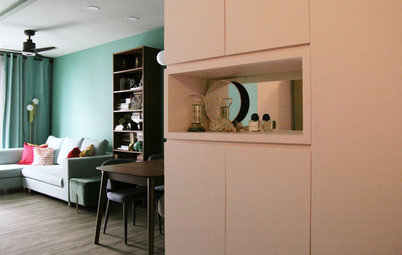
One length of the living-dining area is a white wall, on which the owners display some art. The children’s bedrooms are also on this side and announced by their bright blue doors.
One length of the living-dining area is a white wall, on which the owners display some art. The children’s bedrooms are also on this side and announced by their bright blue doors.
Facing the white wall is a feature wall clad in wood laminate. The coffered ceiling is a practical solution to a common problem.
“We embraced the electrical trunking across the ceiling and transformed it into a feature. Trunking is typically considered unsightly by most clients. This ended up looking neat and gave a unique look to the home. And because we didn’t want it to be noticeably stark, the trunking was painted white for a soft textured look”, the designers explain.
The design team adds: “The most unique thing about this home is the concealed door panel within the feature wall. In order to tie the cabinets together with the rest of the home, the flooring and cabinet laminate are similar in colour and tone. This helps the home look more natural and seamless.”
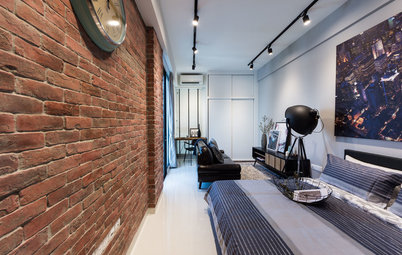
According to the design team, wood is a great way to achieve the minimal look without coming across as cold and synthetic. The coffered ceiling effect is also seen in this room.
His-and-hers washbasins were installed into the en suite master bathroom which sports a cool grey-and-white palette. Natural woven and wood elements bring warmth to this space and sits nicely with the aesthetics in the rest of the apartment.
TELL US
What do you love about this home? Tell us in the Comments below. And don’t forget to save your favourite images, bookmark the story, and join in the conversation.
TELL US
What do you love about this home? Tell us in the Comments below. And don’t forget to save your favourite images, bookmark the story, and join in the conversation.

Who lives here: Husband and wife who are in the finance industry and their two young kids
Location: Orchard/River Valley
Type of property: Three-bedroom condominium
Size: 1,324 square feet (123 square metres)
Duration of project: 3.5 months