


Comments
Houzz Tour: This Apartment Brings Light In With More Open Spaces
Removing unnecessary partitions significantly improved the light and connectivity in this old unit
Verlaine Marquez
25 January 2017
Houzz Singapore Contributor. Former editor for a home and design magazine for five years, and now a full-time freelance writer for various online and print publications for the past decade and counting. Part-time crafter, wannabe gardener, and breast cancer thriver.
Houzz Singapore Contributor. Former editor for a home and design magazine for five... More
It had been 15 years since this two-bedroom condo unit was last renovated, and the owners, who used to rent it out, decided to give the flat a much needed update before moving in with their cats. They sought the help of designers Mark Yong and Ummi Nadhirah of PIU Design for the makeover.
“The unit was dark and in need of repairs and intervention, and the design theme was still circa 1980s,” says Yong. The owners asked the design team to revamp the space in a contemporary style, and bring more natural light into the apartment. “Most importantly, [they wanted] a room for their cats to be happy in, when cat-phobic guests visit,” he adds.
“The unit was dark and in need of repairs and intervention, and the design theme was still circa 1980s,” says Yong. The owners asked the design team to revamp the space in a contemporary style, and bring more natural light into the apartment. “Most importantly, [they wanted] a room for their cats to be happy in, when cat-phobic guests visit,” he adds.
Houzz at a Glance
Who lives here: A couple who are cat lovers
Location: Tanglin Road
Size: 1,600 square feet (149 square metres)
Project duration: 3 months
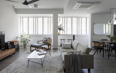
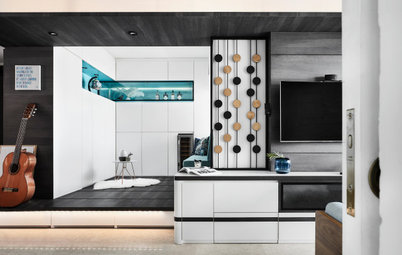
The first thing that the team did was to open up the entertaining space. A storage cabinet/divider/seat built around the steps dividing the split-level living and dining areas was removed, and the wall between the dining area and kitchen was demolished. With the new open-plan layout, the spaces look and feel more cohesive and connected. The walls were also given a fresh coat of white paint, which the design team deemed necessary as the owners prefer gallery-white walls for their present and future collection of art.
At the entryway is an old Balinese timber pillar carving made into a standee. The team also designed a solid ash bench and cement-cast block that weighs 100 kilos to act as a step down from the dining area. It also serves as additional seats for the living area.
Who lives here: A couple who are cat lovers
Location: Tanglin Road
Size: 1,600 square feet (149 square metres)
Project duration: 3 months
The first thing that the team did was to open up the entertaining space. A storage cabinet/divider/seat built around the steps dividing the split-level living and dining areas was removed, and the wall between the dining area and kitchen was demolished. With the new open-plan layout, the spaces look and feel more cohesive and connected. The walls were also given a fresh coat of white paint, which the design team deemed necessary as the owners prefer gallery-white walls for their present and future collection of art.
At the entryway is an old Balinese timber pillar carving made into a standee. The team also designed a solid ash bench and cement-cast block that weighs 100 kilos to act as a step down from the dining area. It also serves as additional seats for the living area.
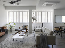
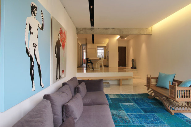
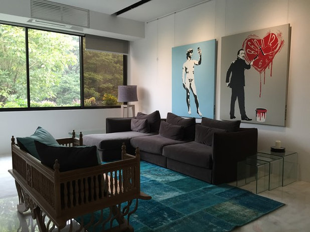
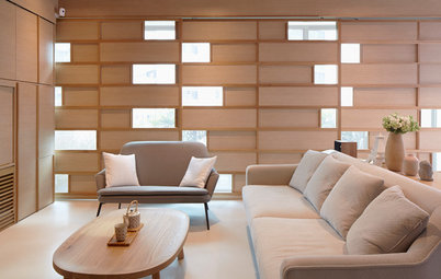
Daylight fills the living area. Here, a modern, clean-lined sofa is paired with a carved wood settee. “[The space] needed a signature piece to offset the straight lines, and the colonial, East India-style settee works nicely in this case, since the owners travel widely for leisure and work,” says Yong.
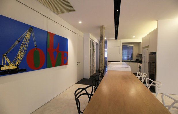
A blue rug anchors the seating and enlivens the muted palette. Derivative pop art paintings by Singaporean artist Andre Tan lend colour and act as conversation starters.
Sofa: Bo Concept; settee and carpet: Gallery 278
A blue rug anchors the seating and enlivens the muted palette. Derivative pop art paintings by Singaporean artist Andre Tan lend colour and act as conversation starters.
Sofa: Bo Concept; settee and carpet: Gallery 278
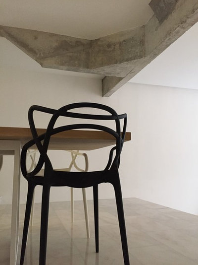
The upper level had a restricted ceiling height, so the designers freed up some vertical space by raising the false ceiling.
“The need to raise the false ceiling gave us reason to leave the exposed structural beams and columns as a design element. The 80s [look] is still there, but updated,” says Yong. He shares that the owners were initially hesitant about exposing the concrete structure because they were concerned that it might look unfinished. Seeing the final outcome erased their worries.
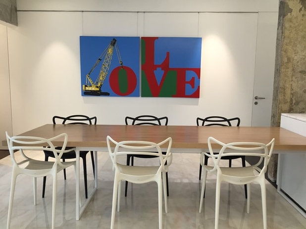
Dining chairs: Space Furniture
“The need to raise the false ceiling gave us reason to leave the exposed structural beams and columns as a design element. The 80s [look] is still there, but updated,” says Yong. He shares that the owners were initially hesitant about exposing the concrete structure because they were concerned that it might look unfinished. Seeing the final outcome erased their worries.
Dining chairs: Space Furniture
Another element that was retained is the original marble flooring in both the living and dining areas. The marble was re-polished to its former sheen.
The designers customised the solid oak dining table with a lime-wash finish. It is connected to the kitchen island, creating an eat-in kitchen concept. Another piece by Andre Tan adds a colourful statement to the neutral-hued space.
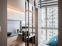
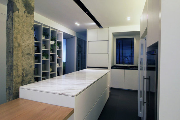
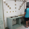
Another one of the owners’ requirements was “to have a nice, open kitchen” because they love food and cooking. The designers responded with a sleek, well-equipped space where the owners can whip up meals efficiently.
Textured powder-coated bent aluminium sheet doors were used for the cabinetry. A vertical sliding panel conceals the pantry and small appliances for a neat outlook. For subtle contrast, countertops in the L-shaped kitchen are in black polished granite, while Volakas marble was chosen for the island top. Easy maintenance is also a priority, hence the kitchen floor was replaced with matte ceramic tiles.
Textured powder-coated bent aluminium sheet doors were used for the cabinetry. A vertical sliding panel conceals the pantry and small appliances for a neat outlook. For subtle contrast, countertops in the L-shaped kitchen are in black polished granite, while Volakas marble was chosen for the island top. Easy maintenance is also a priority, hence the kitchen floor was replaced with matte ceramic tiles.
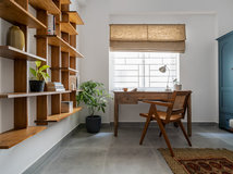
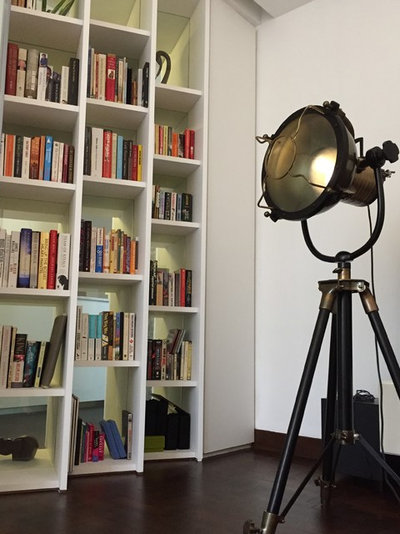
Across the kitchen is the study-cum-guest room. From outside the room, the bookshelves that are slanted at an angle add visual depth to the narrow hallway. “The angled shelves allow privacy without cutting the light off from the room,” adds Yong.
Inside the study is the nautical-inspired floor lamp, one of the owners’ treasured pieces.
Inside the study is the nautical-inspired floor lamp, one of the owners’ treasured pieces.
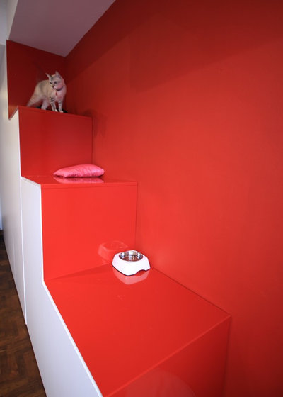
Next to the yard is the vibrantly hued cat lounge where the owner’s felines live and play. The stepped storage units are made of powder-coated aluminium sheet cladding over conventional laminated cabinetry. “It was the owner who picked the bright red,” says Yong.
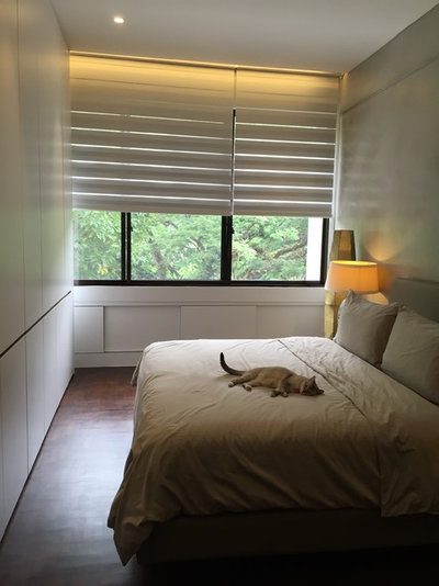
The master bedroom exudes a minimalist style. The wall behind the bed is finished in sealed cement plaster to echo the exposed concrete theme in the communal space. Additionally, “all the original teak parquet flooring was retained and repaired to minimise wastage and lower costs,” adds Yong.
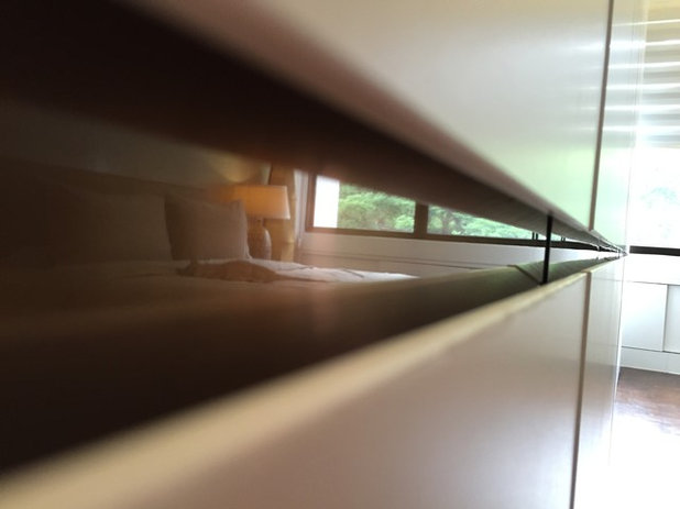
A full-height wardrobe extends across an entire wall, giving the owners ample storage space. “It is finished in dry-matte laminate handles trimmed with copper stainless steel accent,” says Yong.
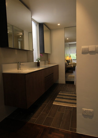
Woodgrain-look ceramic tiles demarcate the master bathroom (from the bedroom), which was redesigned with an open concept. The only enclosure here are the separate glass doors for the shower and toilet, both of which are decked in travertine-like tiles for added texture. Double vanity sinks make prep time easier and more convenient for the owners, especially during the morning rush.
TELL US
What feature did you like best in this home? Share in the Comments below.
TELL US
What feature did you like best in this home? Share in the Comments below.
What are you working on?
Related Stories
Houzz Tours
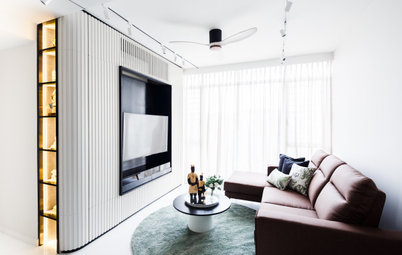
Houzz Tour: This Penthouse Hints at Japanese Minimalist Aesthetics
Sliding panels address the privacy issues of the inhabitants without compromising on light, ventilation or the scenic view
Full Story
Houzz Tours
Houzz Tour: Singapore Colonial Meets Scandi Style in This Unit
The designers fulfilled the owners' brief for their double-storey apartment with flair
Full Story

Houzz Tours
Houzz Tour: A Compact Home That Has More Than The Eye Can See
Home to a family of three, this condo was designed to accommodate seven when it needs to
Full Story
Houzz Tours
Houzz Tour: This Condo's Colourful Geometry is Child-Friendly
This home is geared towards giving the homeowners' young daughter a cheerful and colourful environment
Full Story
Houzz Tours
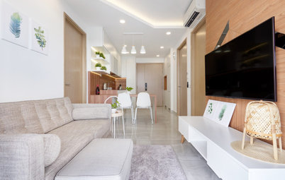
Houzz Tour: Bespoke Furniture Optimises this 600 Sqft Condo
It's all about customisation to maximise the limited floor area of this apartment
Full Story
Houzz Tours
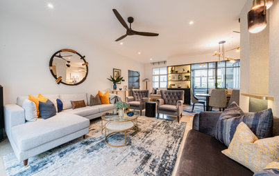
Houzz Tour: Curves Add Some Playfulness to a Monochromatic Condo
A black-and-white scheme sets the stage for this family-of-four's personal effects
Full Story
Houzz Tours
Houzz Tour: Compact Condo Looks More Spacious With its Muji Style
To optimise a limited floor area, the designer turned to the Japanese minimalist lifestyle brand for inspiration
Full Story
Houzz Tours
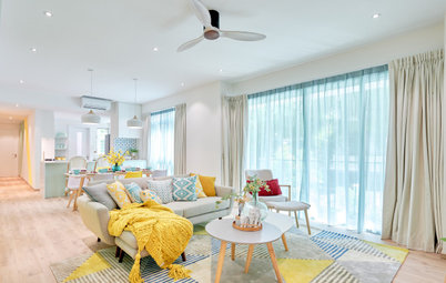
Houzz Tour: Sherbet-y Colours Pretty Up This Family Condo
Geometric blocks add a dynamic vibe to the soft and sweet colour scheme
Full Story
Houzz Tours
Houzz Tour: Black-and-White-Inspired Home is Fit for Entertaining
Their old black-and-white house ambience is replicated in this apartment so the owners can continue entertaining
Full Story
Houzz Tours
Houzz Tour: Music and Peranakan Influences Make This Condo Home
Personalised details turn this condo from standard to superb
Full Story