How to Decorate with Pantone’s Colour of the Year 2020
Browse these room ideas and see how you could use fresh, nature-inspired Classic Blue in your own home
Pantone has announced its Colour of the Year 2020 as Classic Blue. Evocative of a clear, early evening sky or a calm sea, this is a shade that clearly references nature and, as such, taps into the trend for fresh, natural colour palettes that bring the outside in. Check out these eight ideas for using it beautifully in any room.
Add a twist with tiles
Tiling the end of a kitchen island, as in this scheme by Mel Massey Studio, is a striking design move, but add a rich blue tile into the mix and you have a beautiful, statement-making feature.
These tiles have a handmade quality, with variations in the glaze lending a lovely textured finish and bringing extra depth, while the herringbone pattern adds another layer of visual interest. Similar tiles would also work nicely as a splashback.
Float it underfoot
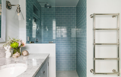
A dash of blue underfoot is an unexpected and interesting twist in an all-white scheme and it adds a pleasingly aquatic touch to this bathroom by neighbourhood studio.
Large-format tiles create fewer grout lines, which means the colour really stands out uninterrupted. A roll of bright vinyl flooring would also create the same effect, although this could only be used in a bathroom and not a shower or wetroom.
Big up panelling
Classic Blue works beautifully as a backdrop colour to showcase lighter tones and patterns. Here, vertical wall panelling has been given a coat of rich blue, which frames and showcases the floral patterned headboard and allows the bright yellow accents to shine.
A pale wall colour above the panelling and plenty of white in the bedding and furniture keeps the scheme feeling fresh and prevents the colour from overwhelming.
Highlight an architectural feature
This bold sweep of a dividing wall is a standout feature in its own right, so the designers have cleverly chosen to paint it in a deep, saturated shade of blue to draw attention to its curved shape and lofty proportions.
Highlighting an architecturally interesting wall or feature with a bold shade like this will immediately draw the eye to it and increase the impact, so only choose this shade if you want all eyes on the area in question.
Looking to update your home? Find the right professional today on Houzz.
Update traditional style
While this is a rich shade that works well in a contemporary room, it can also be used to great effect in a traditional scheme, like this dining room by Adrienne Chinn Design.
Here, a glazed dresser looks beautiful freshened with a coat of classic blue paint. It sits very comfortably against the cream walls and furniture thanks to the blue accents that have been echoed in the artwork and tableware.
Saturate a wall
If you want to dive right into an aquatic room scheme, you could pair Classic Blue with lighter and darker tones to create a fully saturated look, as shown here.
By painting the shelf the same colour as the wall, it fades into the background, allowing the white plates to really stand out.
If this look is a bit too strong for you, this technique could be used very effectively inside a glass-fronted cupboard to create a rich backdrop for displaying crockery and glassware.
Team with orange
For a strong colour contrast, pair Classic Blue with orange, its opposite on the colour wheel. To make this work effectively, choose similar tones and they will complement and lift each other.
In this room by Malcolm Duffin Design, both the orange and blue are mid tones (if they were viewed in black and white, they’d look the same), so they work beautifully together.
This is a strong combination, though, so keep the rest of the room sleek and clean to balance it out.


2019 saw a rise in dark and navy blue interiors on Houzz, particularly in kitchens and bedrooms, and Classic Blue builds on this trend, showing a progression, and a lightening, of this popular shade.
Teamed with white worktops and light walls and flooring in this kitchen by HUX London, the blue cabinets feel fresh and clean. By keeping the handles, accessories and brassware understated, and choosing fuss-free shelving and plain glass lighting, the colour is given centre stage.
Adding in a dash of contrasting colour with the orange bar stools further works to offset the colour.