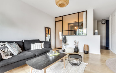
Moscow Houzz Tour: A Complete Revamp With No Structural Changes
This designer turned this Moscow apartment into a whole new space with custom furniture and a bright white palette

When this young woman bought this one-room apartment – located in a 1970s building just outside Moscow, Russia – she knew she wanted to update its dated decor and envisioned a bright, functional interior filled with memories of her beloved France. Designer Rustem Urazmetov found a way to transform the studio without changing the original layout, utilising an all-white palette complemented by colour accents inspired by avant-garde art, which the owner loves.
Photos by Alexander Volodin
Apartment at a Glance
Who lives here: A young woman
Location: Just outside Moscow, Russia
Size: About 345 square feet (32 square metres)
Interior designer: Rustem Urazmetov
Budget: About US$39,000 (2.5 million rubles), all inclusive
Apartment at a Glance
Who lives here: A young woman
Location: Just outside Moscow, Russia
Size: About 345 square feet (32 square metres)
Interior designer: Rustem Urazmetov
Budget: About US$39,000 (2.5 million rubles), all inclusive
Apartment layout
The building’s structure made it too difficult to change the layout of this apartment: The home is in a concrete slab building from the 1970s, and the only room and the kitchen are separated by a load-bearing wall. So, there wasn’t much leeway for changes to the layout. At first, they thought about making the bathroom bigger by borrowing space from the hallway, but this was quickly abandoned as it would have required permits but not presented a significant improvement.
The building’s structure made it too difficult to change the layout of this apartment: The home is in a concrete slab building from the 1970s, and the only room and the kitchen are separated by a load-bearing wall. So, there wasn’t much leeway for changes to the layout. At first, they thought about making the bathroom bigger by borrowing space from the hallway, but this was quickly abandoned as it would have required permits but not presented a significant improvement.
Urazmetov’s design centers on contrasts – right from the apartment’s entryway. The floor is tiled in a black-and-white pattern, juxtaposed against snow-white walls and the white doors of the closet. Besides a section for outerwear and shoes, the custom-made unit provides space for a washing machine and a 13-gallon (50-litre) water heater.
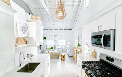
After. The owner spends little time at home – only in the evenings after work – and doesn’t have many guests over at a time. A comfortable bed was the priority, so a folding sofa was out of the question. The room was zoned into bedroom, office and storage areas. Not only the white colour scheme but also the custom-made furniture itself, which runs along two walls of the room, tie the space together.
Almost all of the furniture was custom-made for the project. Much of it was placed in one long line starting with the headboard. It incorporates a “floating” bed and hanging bedside tables at one end, turns into a bench by the window and concludes with a compact work station and storage system. It’s made of laminated particleboard.
The headboard protrudes into the room and doubles as a handy shelf where the owner displays photos from France.
The piano is the only item the owner brought to the apartment from her previous home. Thanks to its colour and minimalist design, it fit well into the rest of the space.
After. The new wardrobe occupies the same space, but now stretches from wall to wall and floor to ceiling. As its doors are the same colour as the walls, it doesn’t look too bulky.
Problem and Solution. LED strips set into the ceiling are the main light source. They use up only 35 millimetres of ceiling height – which had to be levelled anyway, as the ceiling panels were uneven.
Before renovations, the ceilings were only about 8½ feet (2.6 metres) high. The chandeliers were removed, and the sole pendant light serves as an accent above the bedside table.
Drawers under the reading nook provide extra storage. The radiator didn’t get in the way, as it was positioned under the desk. An LED strip was also placed on the dropped ceiling here.
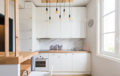
After. The walls were painted white, and the cabinets and countertop were selected to match. A significant portion of the budget went into the kitchen. The cabinet fronts were custom-made in enamelled MDF, and the countertop in artificial stone. The kitchen cost over US$6,140 (400,000 rubles), including appliances.
Backsplash tiles by LB-ceramics
The backsplash features contrasting tiles in a geometric pattern, which resembles avant-garde art. A table for two to three people stands by the window – this was the best layout for the about 75-square-foot (7-square-metre) kitchen. The table is intended to be a continuation of the kitchen counter and is even made of the same material, though it stands slightly lower in order to fit below the window.
The backsplash features contrasting tiles in a geometric pattern, which resembles avant-garde art. A table for two to three people stands by the window – this was the best layout for the about 75-square-foot (7-square-metre) kitchen. The table is intended to be a continuation of the kitchen counter and is even made of the same material, though it stands slightly lower in order to fit below the window.
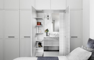
After. Not only the finishes and decor but also the layout of the bathroom fixtures have been changed: Instead of a small sink, Urazmetov managed to win back enough space for a full-fledged vanity for storing cosmetics and cleaning products.
The bathroom’s interior echoes the adjacent entryway, with the same black-and-white tiles on the floor and accent wall.
Tell us
What do you love about this home? Tell us in the Comments below. And don’t forget to save your favourite images, save the story, and join in the conversation.
The bathroom’s interior echoes the adjacent entryway, with the same black-and-white tiles on the floor and accent wall.
Tell us
What do you love about this home? Tell us in the Comments below. And don’t forget to save your favourite images, save the story, and join in the conversation.