Houzz Tours
My Houzz: HDB Maisonette Gets a Thorough Country Makeover
A couple designs their dream house with the help of specialist carpenters and contractor and Houzz

When house-proud homeowner Lingting Ko wrote in to share her renovation, we were impressed – and not just because she and husband Santosh Kumar used Houzz throughout their process. What was impressive was how they self-designed their home and worked with contractors and craftsmen to execute their ideas to the letter.
The couple was blessed with a starting point that few homeowners in Singapore have: a four-bedroom HDB maisonette, which meant ample space spanning two levels to work with. They overhauled the entire unit, although altered little of the layout on the second level where the bedrooms are – so they haven’t photographed those spaces.
House at a Glance
Who lives here: Lingting Ko, a public servant, and husband Santosh Kumar, an engineer
Where is it: Toh Yi Drive
Size: 1,560 square feet (146 square metres)
Project duration: Approximately 5 months
Designer in charge: “We didn’t have an interior designer so all the design, space planning etc was done by us in collaboration with our carpenters, Country Concept‘s Field Teo, and contractor Jensen Tan.”
In her own words, Lingting shares about realising their dream home.
Left: original floor plan; Right: reconfigured floor plan used for the renovation
Before. A makeshift mudroom at the entrance-end of the dining room.
Highlight
A customised feature we’re proud of is the mudroom-cum-shoe cabinet concept. Mudrooms may be seen as impractical by Singaporeans, because we don’t have winter coats to hang up on hooks, nor muddy boots to dust off. Santosh had the idea of customising the internal space of the mudroom into shoe storage – the centre two panels open up to shelves while the hooks double as door handles; and the two doors on each side are customised pull-out drawers on heavy-duty tracks. This gives us the best of both worlds – a beautiful entrance area, and functional shoe-storage. And to make sure every single inch of space is utilised, there is a pop-out door behind the pine-seater/below the shoe cabinet area, where we store our ironing board and foldable furniture. (There is a similar nifty little storage nook behind the big fridge to the left of the washing area, where we store a foldable table). It’s all about making every single square foot count!
The whole unit was custom-built by Country Concept, including pine seaters, drawers for storage below the benches, overhead cubbies for storing sports gear and other knick-knacks, a secret storage space for an extra bench, ironing board and ladder, and of course the shoe cabinets.
To demarcate the area, and also to give it a more entrance/foyer look, we selected these grey stone-look floor tiles from Soon Bee Huat Trading.
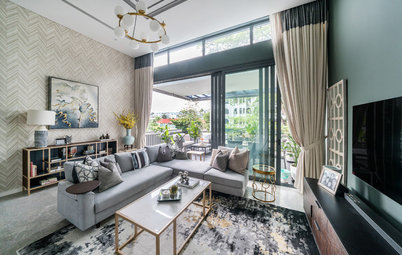
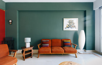
Living/dining area
We opted not to have a TV in the living room, because to us, gatherings with friends and family are much more about spending time together over good food and conversation. So the original living room is now a living/dining area, with the use of rugs to demarcate the two areas.
Interesting fact: Santosh actually attended an interior design talk hosted by Houzz during the Interior Design Festival 2017, to pick up some tips in the midst of designing our house, and one of his takeaways from the speaker, Cameron Woo, is that rugs make a space!
Our cosy living area consists of a two-seater couch (a skirted sofa is a must-have for us and Ikea was the only place we could find one, and the dimensions were just right), coffee table (we are still hunting for the perfect coffee table; what you see here is just ‘in the meanwhile’), and a custom jute rug from the US.
The star of the living area is the piano and hutch. I really wanted to have a buffet hutch somewhere in the dining or kitchen. We saw many beautiful photos of hutches on Houzz, mostly used as display cabinets to display crockery, china and other knick-knacks. Unfortunately, with the limited space we had to work with, we simply could not fit one into our house. We thought we’d reached a dead end, but then Santosh came up with the brilliant idea of a ‘piano hutch’ – a built-in hutch to house the piano, with storage on top to store piano scores and a display area. An added benefit is that the hutch helps to dampen the sound a little, so that our neighbours are less disturbed by the music. As far as we know, we haven’t seen anything else quite like this! Drawing on inspiration from photos sourced from Houzz, Santosh worked with Field to come up with the design, incorporating key elements such as the V-groove back panels and the curved accents on the woodwork, as well as the cornices. We’re delighted with how it turned out, as well as how beautifully it matches our all-white piano.
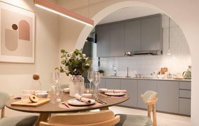
Dining area
Gathering around food is important to us, so even though we’re just a family of two right now, we went ahead and got an eight-seater, solid teak table by Ethnicraft. We saw and fell in love with the X-back chair design in many country homes on Houzz, and were delighted to find many similar designs available on Taobao. To round out the area, we found a rug with complementary tones from iRug.com.
Gathering around food is important to us, so even though we’re just a family of two right now, we went ahead and got an eight-seater, solid teak table by Ethnicraft. We saw and fell in love with the X-back chair design in many country homes on Houzz, and were delighted to find many similar designs available on Taobao. To round out the area, we found a rug with complementary tones from iRug.com.
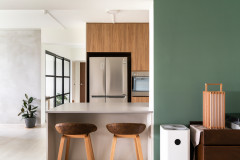
Kitchen
We wanted an overall lighter look here. I’d always pictured a white-and-wood kitchen, so it was easy enough to settle on Country Concept’s classic white Alpine Ash for the cabinetry (featuring wood veneer Shaker-style doors with V-grooves). We opted for oak for the countertop as it is strong, hardy, durable and versatile. To go with the white-and-wood look, we chose a light wood-look tile from Soon Bee Huat Trading. I’m also partial to pastels, so the walls are painted a light mint colour (Just Jade from Dulux) – not the most classic colour, but we thought it added a personal, slightly quirky touch. The appliances work together to round off this pastel-accented look – cream fridge and range, pink KitchenAid, mint and pink cookware in the cabinets etc.
We put a great deal of thought into the overall layout of the kitchen, as well as the specific uses for every single drawer and cabinet. As much as we wanted a beautiful kitchen, it mattered even more to have a functional, user-friendly kitchen where every inch of space is maximised. We are certainly no experts in space planning, so to this end, Santosh actually observed me while I baked in my previous home. He noted my movements, and timed how long I spent at each key station (i.e. sink, oven and prep area). This formed the basis for the layout, ensuring the work flow is smooth and logical. It also helped us make decisions such as including an additional sink in the island.
Drawing from my past experiences baking and cooking in my parents’ place, as well as from clever storage solutions from Houzz articles, we worked together with Field to design customised storage. The baking area (nearest the window) includes a tall unit housing the built-in oven and freestanding microwave oven, counter space for appliances and food prep, as well as storage for baking equipment. One important thing I’ve learned is that having lots of cabinets will mean that you will spend approximately 1/3 of your life squatting in front of cabinets, lifting stacks of trays out to get to the one right at the bottom. Drawers/pull-out shelves are a much better way to go. The three large drawers next to the oven take things one step further, by including (removable) partitions, for storage of baking trays, tins, racks etc. Behind the two cabinet doors are more pull out drawers for more baking equipment and appliances.
The two sets of cabinet doors flanking the range have pull-out drawers for pots and pans. The two slim units are more Houzz-inspired storage – utensil tower with canisters of varying heights and condiment tower on the right for easy access.
The top-hung cabinets store our serving ware, glasses, teapots etc, while there are various display nooks like the cubby above the fridge, and the plate rack to the right of the hood.
To the left of the fridge is a walk-in pantry, something we’d seen in Country Concept’s previous projects.
If you were to ask us what the focal point of the kitchen is, it’d be a close fight between the fabulous oak-and-ash island with the butcher block countertop and the 90-centimetre jumbo range (from Straaten) featuring a classic tiled backsplash and country-style hood.
The island is a beautiful marriage of form and function. The butcher block oak countertop is a beautifully stained with a lovely water-resistant finish. The corbels supporting the countertop and the cornices at the base add lovely detailing. The side facing the window is decorated with a quintessential farmhouse ‘X’. It seats four, and functions as a breakfast table or for cosy gatherings. There’s storage for flatware, plates and bowls, pull-out shelves for appliances and power outlets on the sides. And the front of the island contains customised pull-out wicker baskets, again inspired by Houzz, that store table linens and aprons as well as fruits and root veggies.
We searched for a while for the right tiles to give us the look we wanted for the stove backsplash – a simple herringbone subway tile with trim. Eventually, we found the elusive tile trim at An Huat Trading, and we are so pleased with how it turned out (we used the same tile trim in the guest bathroom).
The country-style hood was designed by Santosh and besides being a work of art, it also houses all the drivers and wiring for the LED lights in the top hung cabinets.
The rose gold/copper pendant lights from Carousell don’t seem very country at first blush, but we love how the copper accents work with the white-and-wood; and they go perfectly with the island faucet.
The wet area of the kitchen doubles as a laundry area. We love the apron farmhouse sink and makes washing up such a breeze. To its left is a pull-out waste disposal unit, with two bins (one for recycling). The opposite wall features floor-to-ceiling cabinets for more storage, as well as some walnut shelving for a little display nook. It’s not quite visible from the pictures, but one of our favourite elements is the floor-to-ceiling bookshelf (housing my recipe book collection), which is actually a hidden door to the bathroom. We love getting our guests to hunt for the toilet – most take at least five minutes to find it!
Other country details
Other country details
- Barn door – one of the things we noticed when we first stepped into Country Concept’s shop was a handsome set of barn doors. We decided to have something similar, and what better place than the wide entrance between the kitchen and living room? They also serve the purpose of giving us a semi-open kitchen – in fact, the doors are kept open 90 per cent of the time, contributing to a more spacious feel.
- Blinds from Oscar Furnishing – from browsing pictures on Houzz, we were set on Roman blinds for the living area, and valances for the kitchen window. We were very happy with the wide selection that Oscar’s had to offer. The living room curtains were completely customised – we selected cream and purple fabrics, and had them made, down to the thickness of the purple strips.
- Rafters – another common element in farmhouse style homes. Here, they are used to house the wiring. They’re made of solid walnut, by Country Concept as well, and it was a pleasant surprise to see how closely they matched the flooring and fans.
- Baseboard – instead of a regular skirting, we actually have a wooden baseboard running all throughout the mudroom and living/dining area, as well as up the stairs to the second floor, built by Country Concept as well. We considered having wainscotting and chair rail, but eventually settled on a baseboard to save costs. On hindsight, we actually prefer the cleaner look of the baseboard.
- Lighting – in general, lighting for the whole home is 4000K daylight. It was unexpectedly tough to source for the downlights, and we realised that this is not as common in Singapore, as most people either go for cool or warm lighting. Downlights run in the rafters throughout the mudroom, living/dining area and kitchen.
- Colours – we settled on light grey for the walls and dark coloured flooring. We’re very happy with our selections – Urban Grey from Nippon for the walls goes well with both the cooler hues of American Walnut vinyl floor and the warmer teak table. Because I’m very partial to all things lilac and lavender, we chose to use those tones as accent colours (as seen in the curtains and rug).
Decorative touches
We are Christians who hold our faith dearly to our hearts, and we desire for our home to be built on God and His Word. That’s why we’ve put up Bible verses and lines from hymns up, both as daily reminders for ourselves as well as a testimony to others that God and His Word is the centre of this home.
We’re grateful to the talented folks on Etsy from whom we custom-ordered the vinyl words in the mudroom and the wooden print on the hood.
There are also various decorative knick-knacks around the kitchen/house with verses like trivets, cutting boards, coasters and a bread basket, all sourced from Christianbook.com.
Our little knick-knacks are really from all over:
TELL US
What do you like about this home? Let us know in the Comments section. And don’t forget to save your favourite images, bookmark the story, and join the conversation.
My Houzz is an ongoing series in which we visit creative, personality-filled homes in Singapore or of Singaporeans, and speak with the people who inhabit them.
We are Christians who hold our faith dearly to our hearts, and we desire for our home to be built on God and His Word. That’s why we’ve put up Bible verses and lines from hymns up, both as daily reminders for ourselves as well as a testimony to others that God and His Word is the centre of this home.
We’re grateful to the talented folks on Etsy from whom we custom-ordered the vinyl words in the mudroom and the wooden print on the hood.
There are also various decorative knick-knacks around the kitchen/house with verses like trivets, cutting boards, coasters and a bread basket, all sourced from Christianbook.com.
Our little knick-knacks are really from all over:
- The baskets in the mudroom are from Ezbuy and Pottery Barn.
- The cast-iron pot rack from Amazon was a must-have from early on.
- The pulls and handles were from separate sellers on Taobao and we had to make sure they all matched.
TELL US
What do you like about this home? Let us know in the Comments section. And don’t forget to save your favourite images, bookmark the story, and join the conversation.
My Houzz is an ongoing series in which we visit creative, personality-filled homes in Singapore or of Singaporeans, and speak with the people who inhabit them.
From the start, the picture of my dream house in my head was a country-style cottage/farmhouse. This can be attributed in part to my time studying overseas in the UK, where the homes are so cosy and welcoming. Growing up, my family’s home also had this lovely country-style kitchen that went hand-in-hand with my mum’s home-cooked food and freshly-baked apple pie.
Country style seems to have fallen out of vogue in Singapore with most seeing it as dated/old-fashioned but to me, it’s a timeless look and also the style that most evokes warm feelings of home, family and gathering around the kitchen table to break bread together.
Design strategy
We actually started out our house-design journey by browsing endlessly through Houzz, which is honestly an amazing source of inspiration. Especially since we had a concept that is less common locally, so it was really helpful to have loads of photos of American/British homes which fit our design concept. Many of the elements in our home were dreamed up by referencing the pictures we saw on Houzz.
It was through Houzz as well that we came across Country Concept whose past projects also inspired us. We were very excited to find a local company doing country-style custom carpentry! Our first meeting with Field from Country Concept was pretty amazing, because he understood almost immediately exactly what we wanted, and he seemed just as excited as we were about building our home. Their office is also a showroom, and once we laid eyes on samples of their work, we knew they would be able to build us quality carpentry.
Santosh has some experience with CAD and did most of the design work on Sketchup. He picked up Sketchup from scratch. It helped that we had lots of reference photos from Country Concept’s portfolio as well as our Houzz ideabooks.