


Pantone's Colour of the Year 2019: Living Coral
Designers from around the world weigh in on the vibrant colour forecast for the new year
HouzzSG
6 December 2018
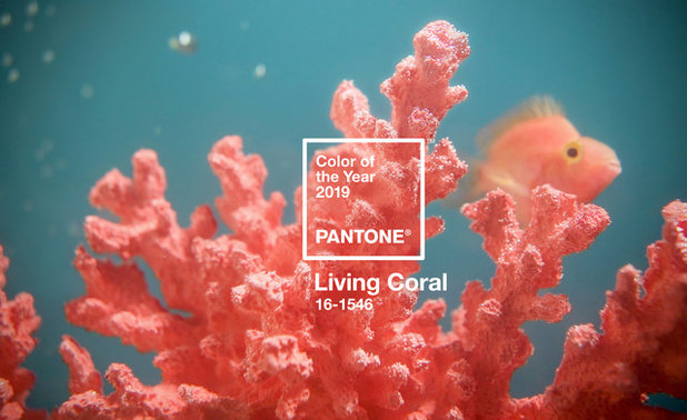
On December 6, Pantone announced their pick for 2019’s Colour of the Year: Living Coral. Describing the shade as “vibrant yet mellow”, Pantone suggests that coral is a nurturing shade that bridges the natural and digital worlds and “symbolises our innate need for optimism and joyful pursuits”.
But how do we use it in our decor? Houzz pros from around the world weigh in on how you can use living coral in your interior – and, just as importantly, what you shouldn’t do.
But how do we use it in our decor? Houzz pros from around the world weigh in on how you can use living coral in your interior – and, just as importantly, what you shouldn’t do.
A Colour for Discerning Tastes
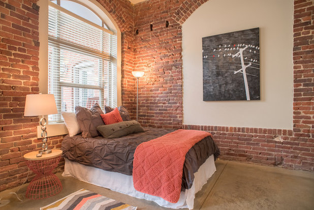
Sonia Simpfendorfer, of Australian colour consultancy Nexus Designs, says coral has the potential to be very popular. “Pink has been a dominant colour recently – pastel pink, calamine pink, dirty pink – the whole spectrum of pinks, and it’s brought some loveliness and calmness to interiors. Coral is something quite different. Strong and welcoming, its energy is warmer, more playful and inclusive,” she says. “I see coral as being a related colour to emerge from the massive resurgence of interest in red bricks, which is something that we’ve been tracking. It’s like a washed, worn, classic brick colour. Really liveable and familiar.”
“Coral has the warmth of red, the carefree sense of orange and the romance of pink,” writes Singapore-based Nikki Hunt of Design Intervention in this Houzz Singapore article 7 Ways to go Crazy With Coral.
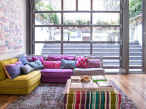
The starting point for using coral in an interior is finding good pairings. Here, natural associations step front and centre. Interior designer and Houzz Russia contributor Irina Krasheninnikova says the colour is associated with joy, warmth, holidays. In nature it can be seen in mountain ash berries, barrels of ripe apples, and wild rose. I always learn from nature – it is a brilliant colourist and the best teacher. The perfect combinations for me: Coral and grey-brown – rowan berries on bare branches; coral and juicy green – rosehip in carved foliage; coral and honey – barrels of ripe apples.”
One reason coral could be destined for greatness in 2019 is that it fits in with some of the natural schemes we’ve been looking at this year, according to some of the designers we surveyed. Beyond this, it seems that pairing coral is a matter of taste.
“Coral is an easy, natural fit with fresh white, soft greys and a small amount of black, along with lighter [woods], but it is particularly interesting when paired with pale blues and dirty purples, too,” says Simpfendorfer.
“I would mix coral with aquamarine or a pale green close to the lime tree,” French interior designer Alexandra Gorla says. “Because of its cold red character, I would also warm it with some touches of brown, yellow ocher or gingerbread. It can also work in harmony with rose or powder and nude, but it can easily be too much. It could also work with purple. And if you want to combine it with blue or green, go with blue steel – which has grey mixed in – and khaki.”
Other combinations are equally controversial. Simpfendorfer says, “Yellow could be very hard to make work and I’d give the pink and green combo a rest too. Coral could work with olive though.”
Like Simpendorfer, Italian interior designer Lia Lovisolo recommends avoiding yellows. “I recommend avoiding colour combinations with yellows.
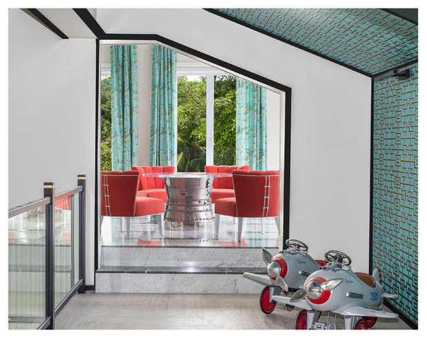
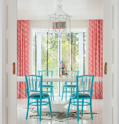
Coral and turquoise is always a beautiful pairing, whether it is fashionable or not. It’s perfect with light woods, don’t combine with amber and dark woods.”
Lovisolo says, “Coral is great if combined with greens – sage, emerald, water – even beige and rope are very good with it. Powder pink is nice too.”
Japanese colour specialist Mayumi Amimura says we should be careful when pairing it with warm colours such as red and orange that would make the coral feel too warm. “Even if you love warm colours, using too much of it will strengthen the the effect and you might not be able to relax.”
Like Simpendorfer, Italian interior designer Lia Lovisolo recommends avoiding yellows. “I recommend avoiding colour combinations with yellows.
Coral and turquoise is always a beautiful pairing, whether it is fashionable or not. It’s perfect with light woods, don’t combine with amber and dark woods.”
Lovisolo says, “Coral is great if combined with greens – sage, emerald, water – even beige and rope are very good with it. Powder pink is nice too.”
Japanese colour specialist Mayumi Amimura says we should be careful when pairing it with warm colours such as red and orange that would make the coral feel too warm. “Even if you love warm colours, using too much of it will strengthen the the effect and you might not be able to relax.”
Decorating with coral
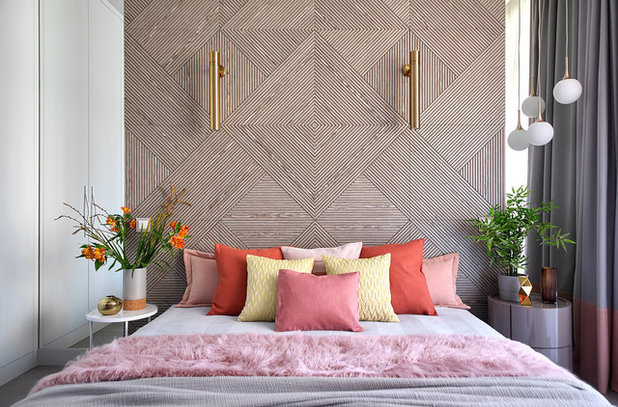
There are lots of options for putting coral touches into a room. “An easy way to integrate and play with a bright colour in a room is to start small and simple, such as through accent pillows and throws,” says Jennifer Ott, architectural colour specialist and Houzz US contributor. “These pieces offer a dash of colour that isn’t overwhelming, and they aren’t a big commitment since they are affordable enough to swap out down the road if you get tired of the colour.”
There are lots of options for putting coral touches into a room. “An easy way to integrate and play with a bright colour in a room is to start small and simple, such as through accent pillows and throws,” says Jennifer Ott, architectural colour specialist and Houzz US contributor. “These pieces offer a dash of colour that isn’t overwhelming, and they aren’t a big commitment since they are affordable enough to swap out down the road if you get tired of the colour.”
“Textiles – carpets, cushions, armchairs, and so on – lend themselves well to this colour,” Gorla says. “And instinctively, I would also combine it to ceramics, whether painted or white, because coral and ceramics remind me of the south. Finally, the coral combines well with transparent glass.”
Simpfendorfer also sees it as perfect for textiles. “Coral is easy to use in dinnerware and table accessories, and I’d also consider using it as bedlinen – in actual real, crumpled, natural linen – nothing shiny or too smooth,” she says.
“Taking in small amounts of coral as accents in the room with cushions and throws, adds the right about of warmth to a room,” Amimura says.
Ott suggests using it to underscore other features. “Because Living Coral is such a striking colour, it can be called into service to bring attention to interesting architectural elements in your home,” she says. “Keep in mind that if you attempt to make everything in a room stand out, then nothing does. So use the vivid hue thoughtfully, on only those elements worth the attention.”
Where does it go?
In advising where to use coral, many pros focus on its effect on our mood and well-being. Mayumi Amimura says coral can add a touch of happiness and warmth to the room. “Adding coral to a ‘colder’ part of the home, such as powder rooms and dressing rooms, would help add warmth. However, using coral all over the room might be too much. In those cases, placing green at eye-level would help bring out coral’s beneficial qualities”.
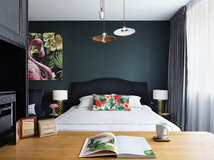
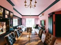
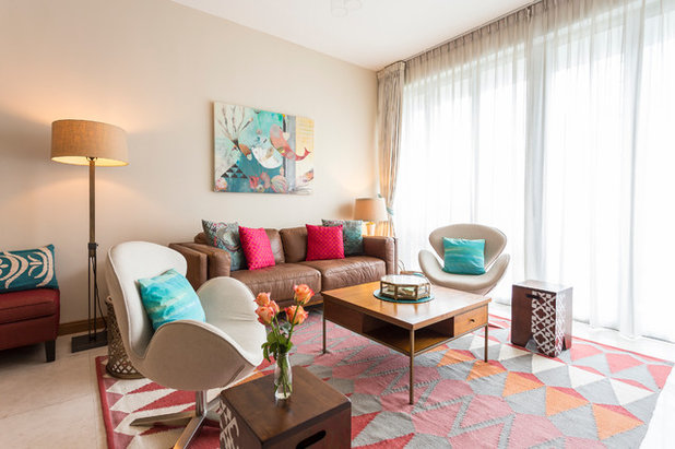
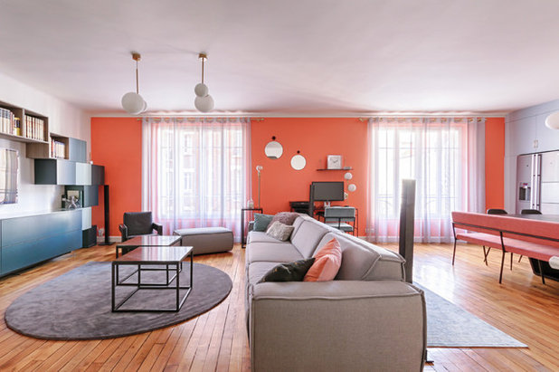
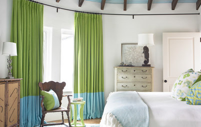
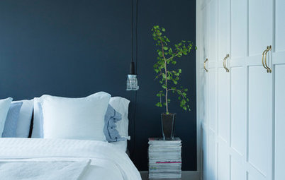
Wall coverings expert Yana Svetlova recommends the colour as an alternative for pink in teenagers’ rooms, as in the room pictured here. “[it is] a much more adult colour, which can ‘grow up’ with the mistress of the room. Coral was used here as a wall accent, the rest of the walls in this room in a calm beige.”
In advising where to use coral, many pros focus on its effect on our mood and well-being. Mayumi Amimura says coral can add a touch of happiness and warmth to the room. “Adding coral to a ‘colder’ part of the home, such as powder rooms and dressing rooms, would help add warmth. However, using coral all over the room might be too much. In those cases, placing green at eye-level would help bring out coral’s beneficial qualities”.
Wall coverings expert Yana Svetlova recommends the colour as an alternative for pink in teenagers’ rooms, as in the room pictured here. “[it is] a much more adult colour, which can ‘grow up’ with the mistress of the room. Coral was used here as a wall accent, the rest of the walls in this room in a calm beige.”
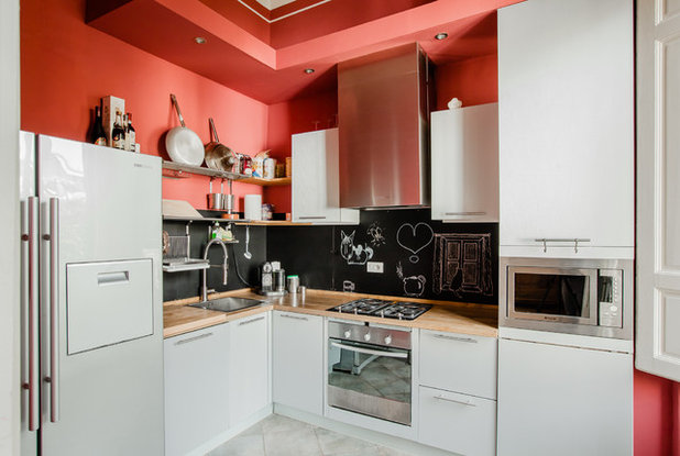
When it comes to wall colour, Sonia Simpfendorfer says the kitchen area is a contender. “Its warmth and golden undertone make it versatile, so it works well with food but it’s also a relaxing colour despite its strength.”
Japanese colour specialist Akitsu Katsuura agrees. “Coral’s reddish tone can help boost the chef’s motivation in the kitchen. However, since the kitchen is rather a small space, it is better to use just a small amount of it. Otherwise it will be too much”.
Japanese colour specialist Akitsu Katsuura agrees. “Coral’s reddish tone can help boost the chef’s motivation in the kitchen. However, since the kitchen is rather a small space, it is better to use just a small amount of it. Otherwise it will be too much”.
Expert Ursula Kohlmann, painter and owner of Verwandlung Remmers Malerwerkstätten, says
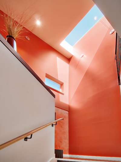
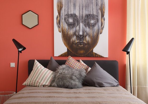
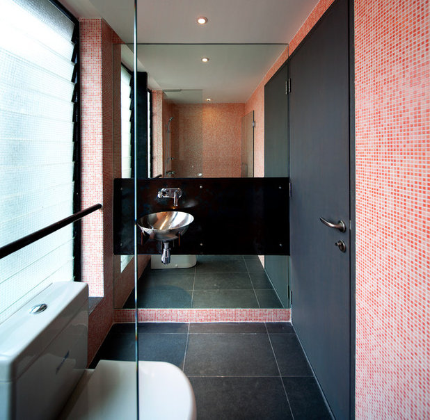
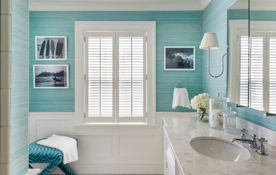
“Coral is a great colour for a bathroom: It puts you in a good mood in the morning. In living rooms, it’s a good idea for the less brave to paint one or two accent walls in coral, for example the wall behind the couch or the dining table, and the rest of the room in a grey-beige colour. In dark rooms coral is perfect for creating a bright, warm and cozy overall effect.“
“Coral is a great colour for a bathroom: It puts you in a good mood in the morning. In living rooms, it’s a good idea for the less brave to paint one or two accent walls in coral, for example the wall behind the couch or the dining table, and the rest of the room in a grey-beige colour. In dark rooms coral is perfect for creating a bright, warm and cozy overall effect.“
Gorla says, “[Coral] is best adapted to public areas: to highlight the dining area of a dining room; on the wall or sofa in a living room; and in children’s rooms.”
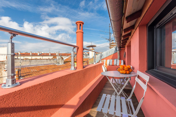
“It can also be used profitably in outdoor spaces, on a balcony or poolside, like in Mediterranean countries.” says French interior architect Anne Azoulay.
“I imagine it outside, on the walls of a terrace to evoke Spain and the warm countries,” Gorla says.
“I imagine it outside, on the walls of a terrace to evoke Spain and the warm countries,” Gorla says.
Tips and Tricks
As with most colours, a few tips and tricks can help coral put its best foot forward.
“The trick with using coral well is in the choice of gloss level,” Simpfendorfer says. “It is most desirable when kept in a matt or low gloss finish. When in high gloss it can take on a quite synthetic appearance – which could be fun, but it’s not as sophisticated.”
“By choosing a matt paint that reflects the light very softly, you can create a more gentle and calm space with a coral colour,” says Katsuura.
Russian designer Daria Kharitonova points out that the temperature of light bulbs should be taken in to account. “In cold daylight this coral becomes greener, but in the warm light of a light bulb it will be redder and cosy.”
TELL US
Love it or hate it? Have you ever used coral in own projects? Share your opinion in the comments


Related Stories
Interior Design
Does Your Home Need a Colour Consultant?
By Janet Dunn
Engaging a colour consultant could be one of the smartest moves you make, to help your home to look its best
Full Story
Interior Design
How Do I... Use Dark Paint Colours in a Small Apartment?
By Niki Bruce
You don’t have to stick to white if you have a small apartment; dark paint can add luxury and depth to tiny spaces
Full Story
Interior Design
Colour Mixing: Mix it Like You Know it
By tidgboutique
If you're tired of neutrals but lack the braves to embrace colours, then this is for you
Full Story
Interior Design
Picture Perfect: 26 Dark Blue Rooms From Classic to Contemporary
Our coffee-break escape offers you five minutes' worth of images to inspire and delight. Jump right in...
Full Story
Interior Design
How to Find Your Spirit Colours
Dressing your home in colours that embody your personality calls for reflection, inspiration and a readiness for risks
Full Story
Interior Design
8 White Paints That Show Which White is Right
By Kelly Porter
This simple colour comes in an array of tones that offer different looks
Full Story
Bathroom Ideas
10 Ways to Come on Strong With Colour in Your Bathroom
Set your bathroom apart from the rest of the pack with a shot of strong colour or pattern
Full Story
Interior Design
Colour vs Neutrals: 10 Tactics to Solve Colour Conflicts
One of you lives for colour, the other loves the safety of neutrals. Here's how to meet in the middle.
Full Story
Interior Design
A Grey Sofa is a Great Neutral That Plays Well With Others
By tidgboutique
See 11 reasons to love a grey sofa and how this neutral shade can take on anything you mix with it
Full Story
Interior Design
Does Bedroom Colour Affect How Much Sleep and Sex You Get?
The colour of bedroom walls have a surprising effect on sleep and sexy time
Full Story
What paint company can mix this color, have had difficulties finding any line that can formulate Pantone living color, please help. Have asked this question since the color came out with never a response. Online not finding anything or google. Maybe i am not searching right engines? Please advise, truly thanks in advance.