

So You're Tempted to Try Sage Green?
We asked five experts their secrets about making this nature-inspired hue work at home
Georgia Madden
14 February 2019
Sage green is experiencing something of a resurgence, as interiors embrace all things soothing and nature-inspired. The wonderfully calming hue sits somewhere between mint and greige. It’s also an incredibly versatile colour that works in just about every spot in the home, both inside and out. Here, a panel of design professionals reveals how and where to use this appealing hue.
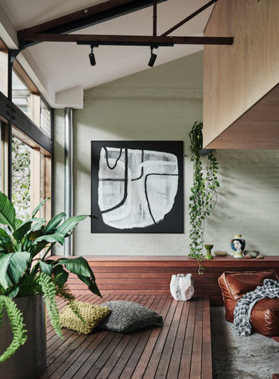
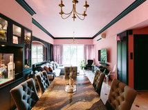
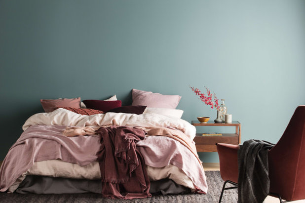
Image by Lisa Cohen
Styling by Bree Leech
What makes sage green so appealing?
“It’s a soft, natural colour that is easy to decorate with,” says Andrea Lucena-Orr, Dulux colour planning and communications manager. “It also pairs well with other popular shades, such as soft and dark grey, greiges and whites.”
“As the interest in health and wellness within the living space increases, green is emerging as a key colour in interior design,” says Sarah Stephenson, colour specialist and brand and communications manager at Wattyl. “The indoor plant movement continues to gain momentum, and what better colour to complement foliage than a soothing, soft sage. This colour mimics nature and adds a sense of calm to a space.”
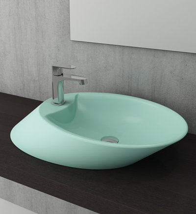
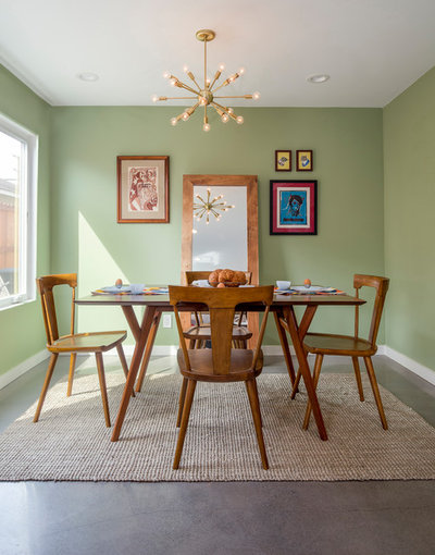
Image by Paco Jaanson
“Green connects deeply with nature and the Australian landscape, offering the perfect hue to bring the outdoors in, while appearing neutral enough to offer great versatility,” says Wendy Rennie, colour and concept manager at Haymes Paint.
“From a colour psychology perspective, the colour green relates to balance and harmony,” says colour expert Grace Garrett of Australian paint brand Taubmans. “Sage green is known as a balancer of the heart and the emotions, creating equilibrium between the head and the heart.
“This relaxing colour offers a sanctuary away from the stresses of modern living. It brings to mind escapes to the countryside, fresh air, and healthy vibes. Sage green is the ideal colour to integrate into your home to restore depleted energy.”

Is there more than one shade?
Yes, says Rennie: “Choose from pastel tones of sage that are light and airy, and deeper tones that have a more calming, intimate feel.”
Great ways to use green in its many hues
Yes, says Rennie: “Choose from pastel tones of sage that are light and airy, and deeper tones that have a more calming, intimate feel.”
Great ways to use green in its many hues
Where can I use sage green?
Lucena-Orr suggests using it in:
Lucena-Orr suggests using it in:
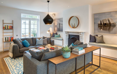
- Casual or formal living areas.
- Unexpected spots, such as on shelving or inside a wardrobe cavity.
- Outside the house – sage green sits beautifully with most of the colours of Colorbond steel.
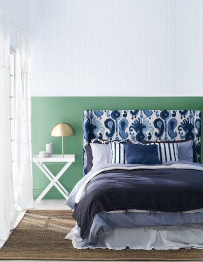
- In a bedroom to create a calming feel
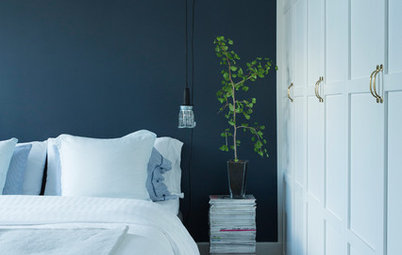
- As a contrasting wall behind a bedhead in the master bedroom, as a feature wall in a child’s room, or in the kitchen
- On a wall adjacent to your outdoor area to create a connection between the two spaces
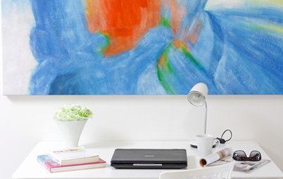
- In a study or home office – green is a colour to promote productivity, after all!
- On exterior fretwork or as the main colour on your home’s facade, accented with white
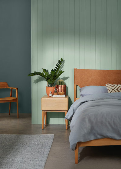
Image by Wattyl
Where else does sage green work in interiors?
“Sage green looks brilliant as a backdrop for plants,” says Garrett. “Wallpaper is another great way to add sage green to your interior.
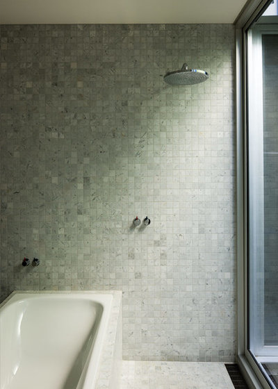
“If you choose to do a feature wall in sage green, I’d suggest using it across a fairly small area, such as a wall in the bathroom or entrance, either in paint or tiles.”
Where else does sage green work in interiors?
“Sage green looks brilliant as a backdrop for plants,” says Garrett. “Wallpaper is another great way to add sage green to your interior.
“If you choose to do a feature wall in sage green, I’d suggest using it across a fairly small area, such as a wall in the bathroom or entrance, either in paint or tiles.”

What about finishes?
“Flat matt is generally the go-to finish for sage green,” says Garrett. “But you can also choose a French wash, chalk paint, lime paint or, for a more earthy, rustic vibe, a textured paint.”
“Flat matt is generally the go-to finish for sage green,” says Garrett. “But you can also choose a French wash, chalk paint, lime paint or, for a more earthy, rustic vibe, a textured paint.”
Which colours go with sage green?
Rennie says:
Rennie says:
- Deep sage green works well with soft pink, deep burgundies and rust tones (great for a cosy bedroom look)
- Lighter sage pairs beautifully with nude tones and soft, powdery pinks
- Team sage with white and grey in open-plan areas
- Deep plum hues
- Gold and mustard
- Terracotta, black or white
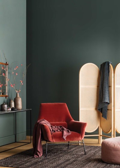
“Sage also looks good with accents of rust and gold,” says Stephenson. “Cool, soft blues work well too. Everything should be in a matt finish.”
For Cosway, a sage-pastel combination is hard to beat: “It works particularly well with pink, rose and apricot – the latter being a hot favourite colour for 2019. It also contrasts nicely with chocolate brown,” she says.
For Cosway, a sage-pastel combination is hard to beat: “It works particularly well with pink, rose and apricot – the latter being a hot favourite colour for 2019. It also contrasts nicely with chocolate brown,” she says.
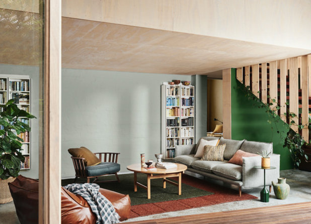
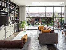
Image by Lisa Cohen
Styling by Bree Leech
Which textures and finishes go with sage green?
Stephenson suggests pairing sage green with these materials:
Styling by Bree Leech
Which textures and finishes go with sage green?
Stephenson suggests pairing sage green with these materials:
- Blonde wood
- Porous stone
- Ceramics with an uneven glaze
- Natural dyes
- Matt-gold finishes
- Sage green looks magnificent in velvet
- It also works well in linen – use it on sofas, occasional chairs or in sheer or heavy curtains
- Chrome, brass, gold and silver go well with sage green, though steer away from rose gold
Garrett suggests pairing sage with:
- Rustic beams and dark timber
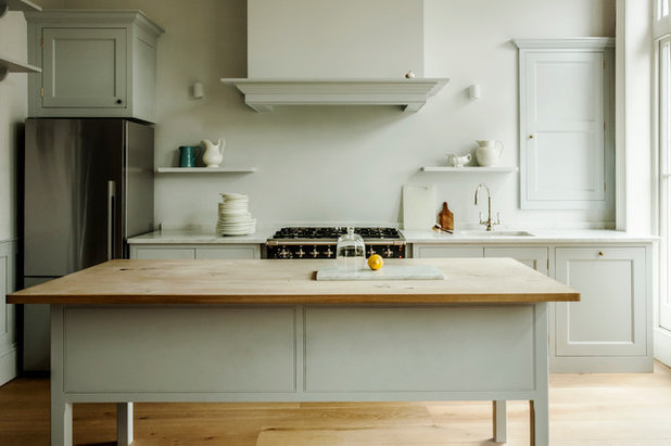
- In the kitchen, team sage-green joinery with Calacatta marble and brass hardware – it’s a match made in heaven!
Can you share any styling secrets for making it work?
“Make sure you get the hue spot on,” says Stephenson. “It should have a hint of grey in the undertone or you’ll end up with mint!
“Layer it with similarly toned colours – nothing too contrasting. And remember, less is more, so keep the styling simple. Plants are a must.”
“There are a few different interpretations of sage green, including sage with a blue or yellow base,” says Rennie. “The trick is to pair it with the right tones to emphasise the look you are going for. Softer, blue-sage works well with berry tones, while yellow-based sage tends to work better with natural materials such as timber, and colours such as mustard, grey and white.”
7 steps to an expensive-looking bedroom
“Don’t forget that you can tint and shade the colour for varying tonal effects and to add depth and contrast,” Garrett says.
And paint is not the only way to bring sage green into a room scheme, she says. “You can also introduce it through soft furnishings and accessories – think a sage-green rug, velvet sofa, medley of ceramics, or softly faded bed linen.”
And paint is not the only way to bring sage green into a room scheme, she says. “You can also introduce it through soft furnishings and accessories – think a sage-green rug, velvet sofa, medley of ceramics, or softly faded bed linen.”
TELL US
Are you a fan of sage green? Tell us how you have used it at home – or would like to – in the Comments section below. And remember to save your favourite images and like this story. Join the conversation.
Are you a fan of sage green? Tell us how you have used it at home – or would like to – in the Comments section below. And remember to save your favourite images and like this story. Join the conversation.


Related Stories
Interior Design
Does Your Home Need a Colour Consultant?
By Janet Dunn
Engaging a colour consultant could be one of the smartest moves you make, to help your home to look its best
Full Story
Interior Design
How Do I... Use Dark Paint Colours in a Small Apartment?
By Niki Bruce
You don’t have to stick to white if you have a small apartment; dark paint can add luxury and depth to tiny spaces
Full Story
Interior Design
Colour Mixing: Mix it Like You Know it
By tidgboutique
If you're tired of neutrals but lack the braves to embrace colours, then this is for you
Full Story
Interior Design
Picture Perfect: 26 Dark Blue Rooms From Classic to Contemporary
Our coffee-break escape offers you five minutes' worth of images to inspire and delight. Jump right in...
Full Story
Interior Design
How to Find Your Spirit Colours
Dressing your home in colours that embody your personality calls for reflection, inspiration and a readiness for risks
Full Story
Interior Design
8 White Paints That Show Which White is Right
By Kelly Porter
This simple colour comes in an array of tones that offer different looks
Full Story
Bathroom Ideas
10 Ways to Come on Strong With Colour in Your Bathroom
Set your bathroom apart from the rest of the pack with a shot of strong colour or pattern
Full Story
Interior Design
Colour vs Neutrals: 10 Tactics to Solve Colour Conflicts
One of you lives for colour, the other loves the safety of neutrals. Here's how to meet in the middle.
Full Story
Interior Design
A Grey Sofa is a Great Neutral That Plays Well With Others
By tidgboutique
See 11 reasons to love a grey sofa and how this neutral shade can take on anything you mix with it
Full Story
Interior Design
Does Bedroom Colour Affect How Much Sleep and Sex You Get?
The colour of bedroom walls have a surprising effect on sleep and sexy time
Full Story
I've always loved the color. To me it's almost a neutral.
@Barbara Wynd: Nice room..... I would only put one plant on the dining table, other wise it looks like you are using the table as a plant table during the winter! :)