Interior Design
The Correlation Between Colour and Well-Being
Did you know that changing the colour theme of your room can lower (or heighten) your stress levels and alter your mood? Here's how

I believe in the power of positive design affecting a person’s outlook (our design philosophy is “Creating spaces that promote well-being”), and this is backed by evidence-based design and environmental psychology, as I tell my clients. So design choices – such as colour, form, shape and layout – do have a direct impact on your stress levels and mood! Colour can give any room a new lease of life; however a poor colour choice can leave you feeling anxious or seem threatening to newcomers!
In this living room, although the pops of teal are smaller, they enhance the whites and creams (and golds!) so well.
Some varieties of the beautiful blues and greens include powder blue, light blue, aquamarine and, my favourites turquoise and teal.
Greens can be energising when they’re brighter (such as lime or emerald); and calming and balancing when they’re earthy (pistachio or drab green). This room has a lovely representation of both greens.
Don’t be afraid to use a selection of these shades in your interior as they compliment each other beautifully.
Don’t be afraid to use a selection of these shades in your interior as they compliment each other beautifully.
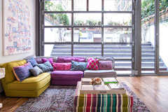
Purple adds a touch of elegance and luxury to a room. The colour is associated with royalty, which might explain why it looks fabulous paired with metals like gold, chrome and bronze!
This colour isn’t just for little girls’ rooms – why not inject some purple in your home as it’s been said to stimulate creativity and inspire positive mood?
This colour isn’t just for little girls’ rooms – why not inject some purple in your home as it’s been said to stimulate creativity and inspire positive mood?
Warm colours
Although yellow is the predominant colour in this room, the amount of white and cooler accent pieces tones it down.
White evokes a feeling of cleanliness and purity, but in excess feels cold, overly-sanitised and foreboding. Finding that balance, as this room does, can promote a sense of well-being, serenity and liveliness.
Is yellow the happiest hue?
Here’s another room that has a warm predominant hue: coral. In its most saturated form, it can energise and feel powerful, but here, it’s more pastel, and used with soft neutrals.
Texture plays a part in balancing the colours in this room too, creating interest and adding warmth.
Texture plays a part in balancing the colours in this room too, creating interest and adding warmth.
The warm oranges play accent colour in this room, allowing the neutrals – bronzes and greys – to take up more space. However, they’re still quite prominent as they are brighter and more saturated, and add energy to an otherwise neutral (and laid-back) space.
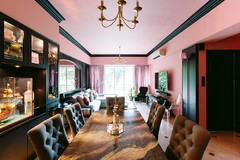
Red is wonderful for creating an energy within your home. It can be overpowering, and also evoke feelings of aggression, so I would recommend its use as an accent colour. Here, red appears on the chair backs, area rug and painting, but the grey walls help to anchor its presence.
In this room, the storage bench brings in that pop of colour dramatically, and highlights the red parts of the bolster cushion as well. A touch of gold – flecks on the wallpaper and the bedside cabinet hardware – adds elegance and balances those gorgeous reds.
TELL US
Do you notice how colour affects your mood? Share in the Comments section.
MORE
Get Inspired by Colourful, Contemporary Homes
A Townhouse is Reinvigorated With Bold Colour
TELL US
Do you notice how colour affects your mood? Share in the Comments section.
MORE
Get Inspired by Colourful, Contemporary Homes
A Townhouse is Reinvigorated With Bold Colour
Cool hues
Blues encourage relaxation and help in balancing and rejuvenation, so they’re quite ideal for bedrooms and spaces where you want to relax (for example the above-pictured living sanctuary created for our client).
Blues and greens such as teal and turquoise really compliment browns.