Living Room
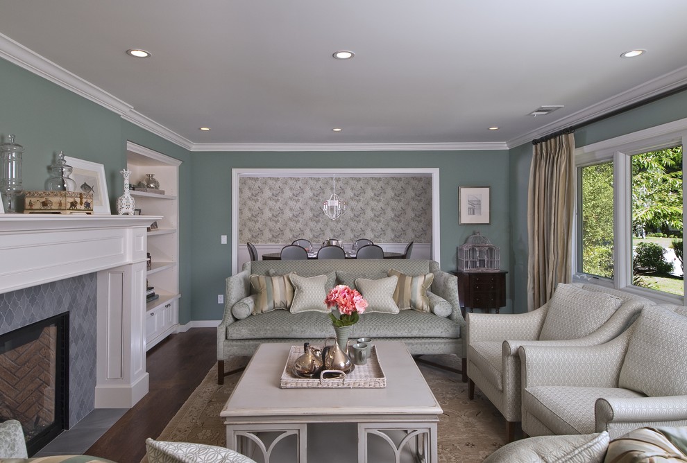
I would say that this project would be called "soft contemporary". The color palette and patterns are "contemporary"... today. I chose hues of blue for our living room direction. Even on the walls (more green blue). Lots of great light in the space that make it easy for blue. Blue is also calming, relaxing and casual. I love that we can see right into the dining room where a beautiful hand-printed Galbraith and Paul wall covering is artwork all unto itself.
Photo Credit: Rio Photo
Green wall color