


Recent Activity
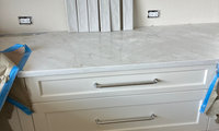


Back the heck up and take another picture. We cannot get a feel for what you are asking with what you gave us.

Coray, looks like the house has lots of positives, but if I had bought it and planned to be there long term, I would definitely plan on taking down all those coffered ceilings. What someone paid in the past for a feature in a house, shouldn't be a reason for me to keep it if I didn't love it! I think both OP's and your house would feel more airy/open and less top heavy without the coffered ceilings.
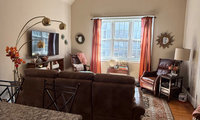
This is how I would arrange your space. If you use swivel chairs then you could have conversations with those in the kitchen too.
Install draperies that are off the window to create a larger looking window and help frame the sofa.
A round table in the center could be pulled away from the sofa enough to not interfere with the reclining sofa.
Add additional lighting to soften the look when you don’t need that much light from an overhead fixture.
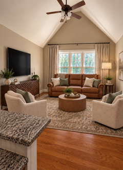
I usually try to position furniture so you can take advantage of the view out a window, but in your space I like the sofa under the window because it really opens up the room.
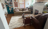
MY LR is small too and no TV I got these pieces from Wayfair they are comfy but not huge
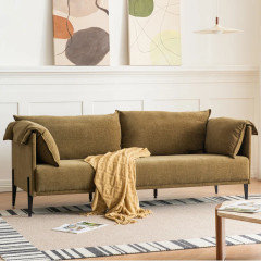
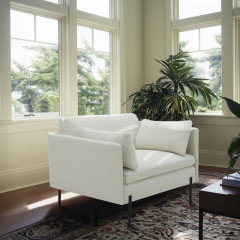
The chairs are a bit wide but fit okay even with a table between them I like sleek and minimal so worked for me .
I too like the awnings, nice home.

Unless I have a very good memory for previous posters' dilemmas, I take the current ones at face value. I didn't realize that this was an ongoing dilemma.
But after seeing the before I still think the new color looks great!
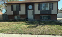
Paint the wood under the windows to match the siding, imo that is what needs the most attention. Also remove the shutters.
Take off the shutters, paint everything that light beige color. Paint the front door navy blue or sage green.
Or light trim and wood (or wood color) door?
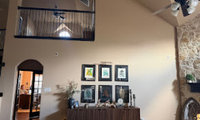
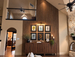
You prints get a little lost on that large wall. Consider doing a slatted wood treatment behind the console and extend it to the ceiling. It helps “lose” the opening on second floor and makes the openings and furnishings cohesive.
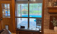
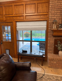
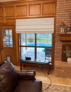
You could do an inside mount cordless Roman shade to add a bit of cream. You could also do an outside mount cordless shade which would allow you to cover more paneling above the window plus you could extend it so it covers the fact that the little trim moulding doesn’t match up above door and window. Note that the pic of the outside mount doesn’t have the shade all the way to the fireplace which it should be placed.
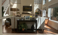

The console table would be better served with a table top light instead.
You can place the tall lights elsewhere such as a corner placement or against a wall to prevent a tripping hazard.
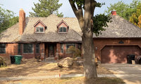

Am thinking that the change to asphalt shingles will have a dramatic impact on your home - so much so that maybe will suggest that you change the roof first and then decide which direction to go from there. Will say though that new landscaping will be very important in improving the overall look of your home.


Here is the question about the chandelier
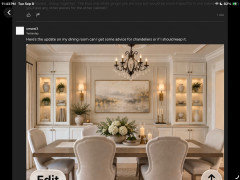
I'm confused--didn't the OP ask for advice on whether she should keep the chandelier? In the most recent post?
"Here’s the update on my dining room can I get some advice for chandeliers or if I should keep it."
I think it's a nice chandelier, but it's hung too high. I'd lower it--ideally it should be 30" above the top of the table. But I also think simplynatural's idea of a more modern chandelier looks nice too. There's no right or wrong, just personal taste.
Again, I'm confused. this is the original photo of the dining room:
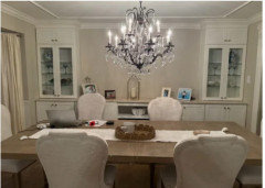
This is the most recent one, where the OP states that it is the "update":
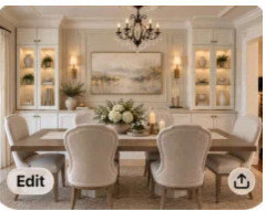
the chandelier appears bigger in the original photo, and hung at a good height. The updated photo shows a much smaller one hung too high. So which is it? Hard to give good advice with conflicting information.
Art and its placement is very subjective. There are no rules.
Art doesn't have to coordinate ... what does that mean and who would decide that rule? Based on what? Color, style, technique, subject, artist, vintage, etc?
Also whether "art pieces compete with each other", would very much depend on your personal taste and ability, or tolerance, to mix/match patterns and colors.
Some people have a few larger pieces of art scattered around the house and others have all types of art, on every wall, from floor to ceiling.
No one is going to be able to answer this for you, as you are just going to get responses with people's individual tastes and preferences.
Buy art that you love and it will work in any house that you will live in.
Modern style house with an eclectic art collection and placement.

Art is a personal expression of the people who live in the house.


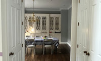

The millwork profile, continuous 2 part crown, door panels, cabinets, etc all point to a cased opening (right now it is not cased, it is drywalled) that should be bespoke around the entire house. It is a no brainer, add the return on the other side and case the opening.
It has nothing to do with what appears expensive or personal taste, it has to do with consistency in design.
I like the idea of making the opening centered on the wall by building the left side out a little, and then adding moulding around it. Gives it a finished look.
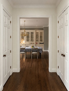
Personally I think you have enough wood in your beautiful home--flooring, beams, furniture. I'd go with painted cabinets. Perhaps with a stained island. The Shiloh walnut cabinets that Kitchen Place posted are gorgeous. I don't love any of the options you've shown. They're all too muddy/dark, and have no depth.
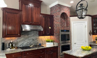
Here’s with everything in one color. I like the brick being painted.

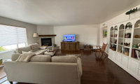

Simplynatural, beautiful and functional It feels like the TV is not the main focus. Thank you feel finished.
I love how everyone's help makes me look at the living room differently. I think I was just focused on TV viewing and forgot about enjoying the space. Simplynatural really made me rethink my home. Thank you!!
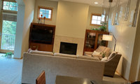

I do not think a mantel would look odd. Your biggest detriment on the fireplace is the existing tile. I would do a simple mantel in the same wood as your cabinets and replace the tile and take it up to the bottom of the mantel. If you don’t want a mantel then tile the entire wall.
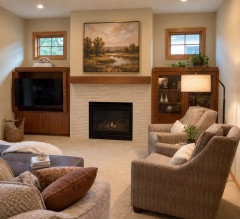
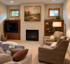
IMO the TV ruins the beautiful built ins. I would move the chairs opposite where they are now and put the TV on that wall. I think the sofa could then be moved back a bit towards the dining table. Then DIS' first picture would be lovely


I think the art is nice and size is fine. For another look - you could change the pillow cover to black, maybe velvet.


The art looks great. I like it better lowered a couple inches so the top of the art frame is level with the top of the door frame.


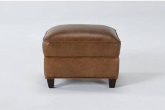
Yes - too big, and too busy. I'd replace it with a smaller, somewhat matching ottoman (like short legs). Something like this, perhaps
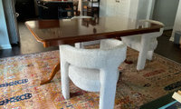
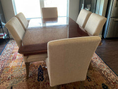
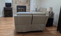
I like rugs with some color so which is more imporatnt rug or art? I assume you do not watch much TV and IMO the wine cabinet does belong there either. The fact is a space is not decorated in a vacuum so we need to see the whole space and the spaces next to it. As for art I never choose art for a client . If you are not interested in orignal art go to Art.com find a pice that makes you smile , many are available in different sizes so once you choose one post it here in a comment and we can help with size after we know the size of the space too. Are the furniture pieces recliners and if so why?

I agree with Patricia. The furniture has no color, so I would consider an interesting rug to spice up the space. Browse the rugs on Wayfair, Rugs.com, Etsy, etc. if you like certain colors, tell us and we can try to add rugs that being that color into the mix.
Art is very personal. Get the furniture organized but use the time to browse all the websites that sells art. Or go to an estate sale and see if you fall in love with something. Yard sales can have paintings on sale too.
I'd mount the TV over the fireplace rather than blocking a window any day!
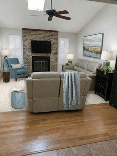
Maybe move the wine cabinet now under the TV to the corner between the sofa and loveseat? That frees the corner left of the fireplace for a chair, perhaps in a color taken from whatever art you choose. Center the loveseat on the fireplace. (If that puts the loveseat too far away from the sofa, try switching sofa and loveseat?) This shows a small round table (turquoise) beside the loveseat, but you could try the end table that the wine cabinet displaced there, if it's not too big. The recliner loveseat means you can't back it with a console table, but a throw draped over it can distract attention from the less-attractive back. You could paint the fireplace brick if you wish; I probably wouldn't. The darker color helps anchor the room, IMO.
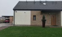

On a cloudy day it's difficult to tell but the brick looks like a golden tone. I would go with that. The cool grays or pinkish beige in your renderings is too much contrast and makes the brick look off.
They're all kinda the same except for the color difference -- choose the grey veining or the caramel veining depending on which you prefer. Either is fine.
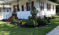

Another option for the columns would be to leave them and box them in white boards - we did this on a ranch house years ago, took a handy man 2 days and cleaned up the facade a bit (easy to reverse if desired down the road)
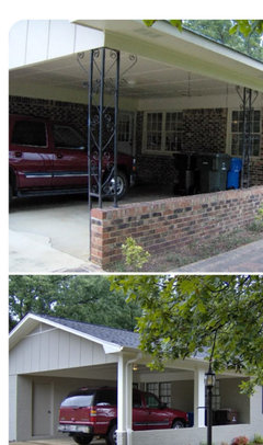

I love grey design with black windows. No cedar posts pls - they do not have any design partner over the facade, they break visual harmony.

I think Sage Green might be amazing.. Maybe build up the trim a little to create some depth. I know keeping that wall is not easy. If you could remove it that would be great but that is expensive. Of course check out the street. What other colors do you seed? What direction does your home face? Lighting is so important and you want to use that to your advantage.
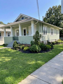

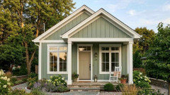
this would be great just columns but your house sits too high and could be a danger. You would need the small wall to keep people safer.
I have something different in my laundry room. Never thought about it until now, lol.
Your laundry room does not look like your kitchen; and I do not think anyone would mistake the two. Also, I think that installing Carrara marble in the adjacent laundry room, too, may take away some of the panache of the kitchen. There is such a thing as overdoing a thing - to the point of the novelty wearing off.

You have what my family calls a ”utility room”. A gem! The counters will receive a lot of use, maybe washing off muddy shoes, and you say tinker space, with perhaps glues, Goof-Off, solvents, etc. Consider countertops that will stand up to it. Like Corian or even Formica.
You can do much better than that. You need something that brings out the warmth and beauty of the wood. Your two choices fall flat. No grey.
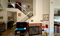
There is not much to gain by trying to throw a tv over this fireplace. Unless you are open to covering part of the L - which you say that you do not want to do. So there are not many options for a wall mounted tv there that would not look awkward.
Plus, what do you gain by a tv over the fireplace? It will make the viewing height too high - and for what?
Sometimes, putting a tv over a fireplace is a logical choice for a space, and it can work. But it is mostly not an optimal placement. And it is also not the best Feng Shui - in terms of giving the tv such a prominent position in the home; it can make the tv appear to be more important than people.
I think you need some type of proper tv console... not only for a better look for the tv setup - but also to have a better look for your entry.
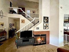
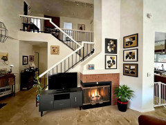

Your idea is the best one so far, I've done it many times. With your layout it is probably the best option! Good thinking
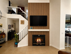
Well, i moved tv near front door. its an improvement for now new tv would prob be hung and wont need sound box (hard of hearing). i agree with pearl remodel and still feel tv hung on slat wall over FP tues room together. thanks!
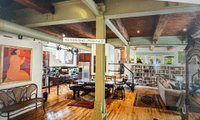
Lovely space. Live with the light green for a bit. Why highlight the beams with black when there are so many other interesting elements in the room as well?
What a great space!!
I don't like that particular shade of green (personal preference), but more than that IMO it fights with the wood ceiling. Don't like the black mock-up either -- too harsh. Maybe a rich chocolate brown. Or, pull something from your artwork. See the deeper red-brown or the rusty darker red in the picture of the naked lady? There you go. What colors do you have in your art that you can pull out and repeat on the beams?
I kind of like the green I would live with it for awhile if you like it too.

If you have floor space in the room, could you build out the soffit to the floor and then move the vanity and mirror forward to your new full height wall?
I like the minimal frame approach, I’d also mount a height adjustable mirror to the side for more flexibility
*showing this one for concept, not sure this is high quality

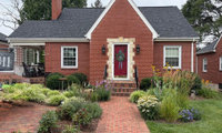

Gutters match fascia. Downspouts blend with the wall.
My fascia/soffit are dark brown and my gutters are brown/bronze.
My stucco is off-white and my downspouts are the closest off-white color the gutter company had.
You don't have brown anywhere and the very white gable trim makes brown/bronze gutters look weird on the rest of your roof.
Gray/black roof with brown/bronze gutter looks like you tried to match, but missed badly.
Keep it simple!

You have white trim, so the gutters should remain white. In your bronze pic, the white trim around the gable is so much more prominent than the barely visible white trim on the horizontal roof. Just paint the downspout to match the brick. It doesn't matter if you get an exact match, somethin pretty close will hide it. If you don't want to paint, change the downspout to bronze and leave the gutters white.

Hard to believe this was done by an architect.
Consider continuaty. Details like the way the roof is done should match, and why black and white windows?
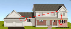
Reduce the pitch of the porch roof to raise the fascia.
Remove the roof that extends past the porch on the right.
Remove the transom window.
The rendering should be done from ground level -- what a normal person would see standing on the ground looking at the house.
Just wanted to show my backsplash. Turned out perfect.