


Recent Activity
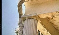

You don't need to reroute the whole thing. You just need to use the correct pieces to route it cleanly around the corner. Right now you have a rats nest of random connectors. Have a look at this video which discusses the basic types of downspout connectors. That will help guide you to the correct option.

@Patricia Colwell good point. probably best to leave downspout at existing location and just try to provide the correct connectors. I think I would probably have a small pond if I placed it where I thought it would work. ((Thought about Rain chains but not sure if they really work.

I would leave it where it is but do it correctly. The trough has to be longer to put the downpipe correctly towards the back then down using no more than 2 elbows. With your roof angles I would not put it in the corner as it will be draining two roofs which will probably overflow and go over the trough causing issues.
My shower floor is done with 3x14" matte tiles laid in a herringbone pattern. Yes, the tiles needed to be cut in what my tile setter called an "envelope pattern" for drainage. But he did it so thoughtfully that the envelope cuts enhance the herringbone.
I tell you this not because I think you should necessarily do the same, but because while choice of grout colour, tile size, primary setting pattern are important to the final look; the most important element is a skilled tile setter. Mine drew out the cutting/setting plan on paper and shared it with me so I could see exactly what I'd be getting.
My floor tiles are ceramic with a matte glaze-- easy to clean but not slippery. My wall tiles are 2x4 large format porcelain tiles in a polished finish. I considered marble, but the maintenance requirements were too high for me.

I am thinking to go with porcelain tile now!

I would do the same if I had it to do over!
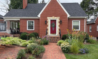

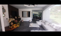
If the 2nd picture with the beige sofa is the real one, why are you getting rid of the graphic rug you already have? It's much nicer than any of the, imho, bland options you've posted.

Here are some ideas for adding a color to the room.
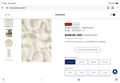
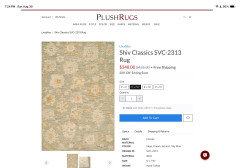
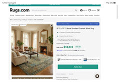

I think these patterns are fighting with the sofa pattern. I 'd preffer clear rug,
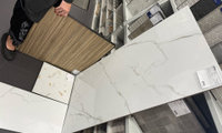
If you really want wood tile, put it on the floor. The darker colour will ground the room. Then you can choose something relatively plain for the walls.
Here are a couple practicalities to keep in mind when designing your shower and bathroom:
- more grout lines = more difficult to keep clean
- textured tile = more difficult to keep clean
- use a coved Schluter insert between the shower floor and wall to make the transition easier to clean
- if you live in a humid area, consider tiling the ceiling of your shower. Tile is much easier to keep mildew-free than wall-board
- consider using some of your tile in place of baseboards in the rest of your bathroom to give a cohesive look
- plan your shower controls so you won't get wet when turning on the shower
- consider something for resting your foot on. I had a grab bar mounted 9" above the floor and it makes cleaning feet or shaving legs much easier.
Regarding Schluter trim-- there are a lot of options. It doesn't have to look cheap. If you colour-match carefully or consider one of the metal trims, you can get a cleaner look than if you bought tile liners. This is especially true if the tile you've chosen doesn't include edged pieces in its line-up.
I've done both in my house. I used edge-finished tiles in my kitchen because the backsplash edges are at eye-level and the tile is a focal point. In my bathroom, the shower uses 2'x4' tiles on the walls, and only one edge is exposed (by the shower opening) so colour-matched Schluter was a much cleaner looking finish than trying to find a coordinating liner from another tile collection. In this case the Schluter pretty much disappears while a liner would have drawn attention to the edge.

For a bright, calm, spa-like bath, I would simplify the tile story instead of trying to make every surface carry a different idea. The wood-look tile is probably what is making the shower feel busy, not because it is bad on its own, but because it competes with the marble look and pulls the eye to the back wall. I would choose one quiet field tile for the shower walls and let the vanity, wood tones, and textiles bring the warmth.
If you are doing a curbless shower, continuing the main floor tile through the shower can work very well if the tile size and slip resistance are appropriate and your installer is comfortable with the drain layout. From a production and QC perspective, I would focus on DCOF, how the trim profile will terminate, and whether the wall and floor finishes have enough contrast to look intentional without feeling chopped up. In a space aiming for timeless, fewer tile statements usually age better.
Your cabinets are maple, stained to look like cherry. They are lovely.

The OP’s cabinets are high quality. Not in the same category as the garbage that is being manufactured today.
I am changing the floors to the tile you see at that bottom. The entire floor is changing to a lithos ceramic
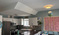

If you do a wall oven then place the microwave above it. You want a true hood both for function and aesthetics if you’re spending the money on a full kitchen remodel.
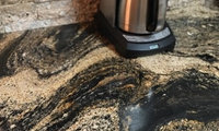
The granite is busy, but beautiful. If you got rid of the jarring tile backsplash and replaced it with a clean, normal, neutral tile, or even painted sheetrock, you might actually come to love it... :-)
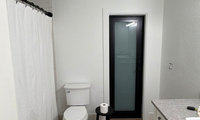
What is the feel that you want to evoke? That will guide your colour choice. And if you don't have enough light for your preferred colour choice, add more or better fixtures.
Me, I'd be painting the walls an intense hue because I like colour. I could see a deep blue or a lime green working. If you wanted something less intense, a soft pink might be nice. I'd probably find a pretty shower curtain and work from there.
You might keep the walls the current color and paint the ceiling a darker grey the coordinates with the countertop.


What are the colors in the adjoins bedroom?
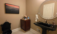
Your sink, toilet and cupboard look random. This is partly due to the high contrast between fixtures and wall, and partly due to the inadequate size and less-than useful position of the cupboard. Black fixtures are dramatic and (possibly) glamourous. Plain beige walls are decidedly not. Your mirror looks like you're aiming toward glam. If so, lean into it. Paint the walls a deep, moody colour or find some black/white/metallic wallpaper. And replace that cupboard with something is both useful and complimentary to the rest of the same.
Here are some inspo pics. If you hate them all, post up some inspirations of your own and we can try to help you in that direction.

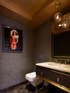
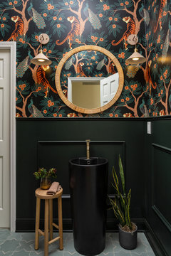
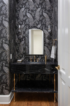


I echo that a new mirror is needed with a vanity light above it.
Artwork is needed as well as a garbage can.
Maybe shelves over the toilet.
Fluffy towels.
A cabinet with glass doors to replace what you have.
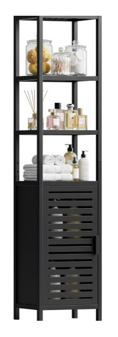
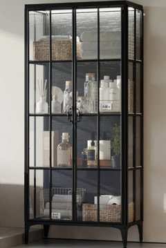

I agree that the room requires some type of tall cabinet to be placed on the wall with the toilet.
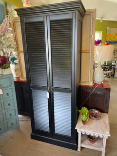
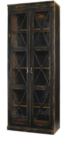
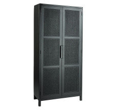
Wallpaper is the easiest way to make the room more transitional.
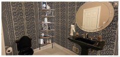
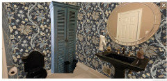
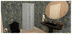
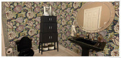


I will open my act with a quote from Matthew Henry, "None so deaf as those that will not hear. None so blind as those that will not see."
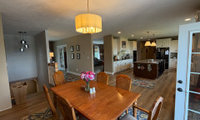
You need to think about how you use the space before you start adding dividers.
The first and most important question is where do you walk? i.e. how does traffic flow? If you put barriers up in order to visually close off spaces, will you and your family be cursing every time you have to walk around something?
Second, which parts of the "openness" bother you the most? You need to narrow down your focus before you can come up with solutions. Do you dislike seeing the kitchen from your dining area? Does it bother you that you can see the back door from the front door? Do you wish the stairs to the basement were closed off?
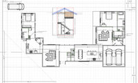
And last, to get good help on Houzz, it is very useful to include a measured floor plan. Pictures are great but they don't really express how much space there is. We could say it looks like a wall could go there but be entirely wrong because the pic stretches the view. There are lots of free floorplan tools out there, or just sit down with some graph paper, a ruler and pencil. Map out the space and put accurate measurements.
I didn’t prompt it to change the flooring or rugs.

" But they arent going to be completely accurate at this point "
But they would help more than the decsciption alone. Make some notes on the cfloor pland of what chnaged. Sketch them in.
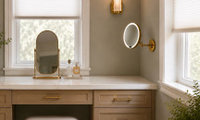
Why not just use the same fixture again but mount it vertically instead of horizontally? Repetition adds to the coherence of the look.
I had considered that, but I wasn’t sure if it would look funny having the same fixture mounted vertically and horizontally in different parts of the room. Maybe I will hold it up and see how it looks. Thanks again for the suggestion.

The room appearance would change if you painted or wallpapered.
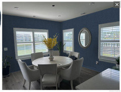
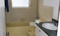
Install speakers in the ceiling and play Janis Joplin music.
Your bathroom is much the same as mine was. Here's the before:
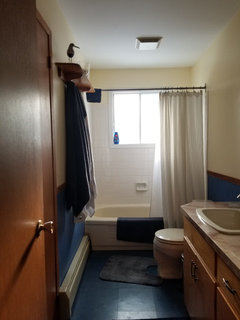
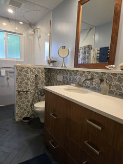
We did a lot of planning. Over and above the cosmetic, function was key. It was important not just to think about what we wanted gone, but also how we wanted to use the space. Some of my favourite features include:
- wall-mounted toilet for ease of cleaning
- large format shower tile to reduce grout lines (again, ease of cleaning)
- no barrier shower entry
- Schluter cove moulding between shower walls and floor (cleaning!)
- shampoo shelf / grab bar combo
- shower controls near the entrance to the shower so you don't get wet when you turn them on
- grab bar mounted 9" from the floor in shower to make it easy to wash feet or shave legs
- hand-held bidet sprayer, plumbed in with warm water
- drawer specifically designed to store extra toilet paper with-in reach of the toilet
And here's my after:
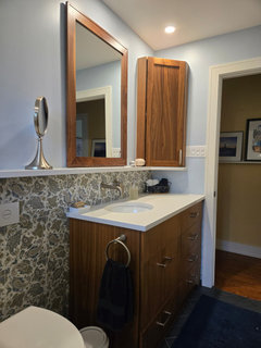
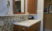
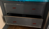
Since the top drawer doesn't pull out, get one 24" pull and use it as a towel bar. The drawer below can either do the same or use 2x 8" pulls aligned at the outside edges with the 24" pull.
For a powder bath like this, I would keep the hardware simple and scaled to the drawer width rather than trying to make the false top drawer look too different. Since the upper drawer front is decorative only, I would usually either leave it clean or give it one centered pull that visually lines up with the working drawer below. Two small knobs on a 33 1/2-inch front can start to look fussy, especially with a busy wallpaper.
For the lower drawer, a longer pull is usually the safer functional choice because wide vanity drawers get heavy fast. I would mock up painter's tape in a few lengths before drilling, but something in the 10-12 inch range often feels balanced on a drawer that size without overpowering the vanity. From a hardware manufacturing perspective, also check projection, grip comfort, and how the finish reads against your faucet and wallpaper. Those details matter as much as raw length.
The top drawer doesn't have storage due to plumbing. I hav e tons of storage so it isn't a deal breaker for me. The bottom drawer will hold toilet paper and cleaning supplies without any trouble. I love everyone's suggestions! I will do the painter's tape mock up - great idea!