


Recent Activity

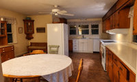

If possible and budget allowed:
- suggest taking out what’s behind the fridge/to window and add a counter depth fridge facing the opposite wall.
- Where bench is (wasted space), a stand alone cabinet would be ideal facing the dining area.
- Once you start..it’s most likely that they/you will find that other things could do with an update. If interested, consider lightening up the wall color, and new window treatment.

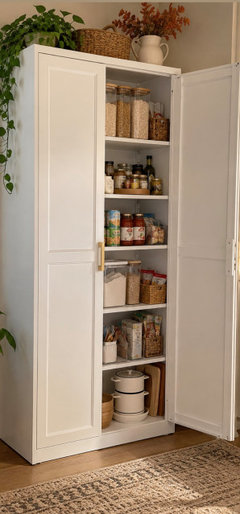

With 56 inches of space behind it, I'd be wary of pushing the fridge back into the corner — that deep pocket tends to turn into a dust and lost-item trap that's hard to reach. A middle option is to wrap the fridge in a full-depth cabinet surround with a tall end panel, then turn the area behind it into an open nook facing the room, like a coffee station, drop zone, or a small built-in bench. Before you commit, check that the fridge doors still open fully and that the surround leaves the ventilation clearance the manufacturer calls for. I work with The Great House, a remodeling company in McLean — happy to help or take a look if useful.

What going on with the ceiling? It looks like it is about to fall? I’m looking above the stove area long that wall.

Two linen roller shades might do the trick.
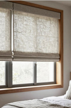
Given the width of the walls on the sides, a lot of drapery will be resting on the window, so you may lose some light and having to slide them back and forth can be a nuisance.
Inside mount Duette shades with top-down/bottom-up option.
Order in white, so they match/blend with the window trim color.

I'd use top-down, bottom-up cellular shades. You pull them up from the bottom for privacy and keep the top open, so you still get light and the trees. Since the frame sticks out, mount them outside, on the wall above the trim. Split the 120" into two or three shades so they're easy to move.
If planning on a new dining set in the not too distant future, I’d hold off replacing for now as the table should dictate its size and style.

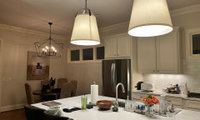
What was glaring to me was not only its size, but its placement. If open to having the electrical moved (placing a plate over or repair ceiling), it would be a priority for me. No matter what you choose will never be flattering.

Vs
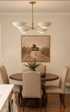
If you want to complement the island’s lighting:
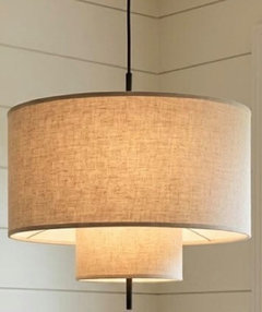
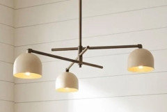
I like the cream drum idea, and I wouldn't worry about it feeling repetitive — it will read as intentional and cohesive with your pendants. To keep it from being too matchy, I'd just go a bit smaller in scale than the island pendants and pick a shade with a subtle texture. That way the nook feels connected to the kitchen without competing with it.

Thank you all for your comments - they are immensely useful. I do like the drum idea Robert.
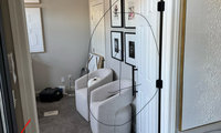
Assume you are considering these two walls, as your desk will be opposite the doorway? Without the floor plans’ dimensions, it‘s hard to get a feel for the space. I think placing it on either of these walls, it will feel squeezed in, akward, and lose its impact. The doors especially are the issue.


I’d take advantage of the interrupted(?) wall to create more impact and balance. The chairs in this picture won’t fit I assume, but if the configuration and ideas are possible, it would my choice. Consider as well how it‘s accessorized and its paint color.


Second on Maureen's comment. What is on the other wall that you do not have shown?
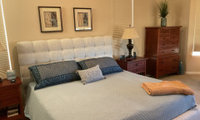
I just finished redoing our master and it took a lot of testing/returning until I was happy. If interested…can you return the shams as they are not working with the bed cover and feel so dark.
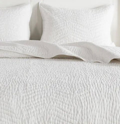
Consider a lighter, more layered combination and a coverlet isn’t expensive/will not be heavy. Try HomeSense/Marshalls, Target and Amazon.
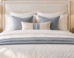
When budget allows, consider new lamps and three larger art prints, which will pull the room together and add needed color.
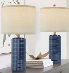
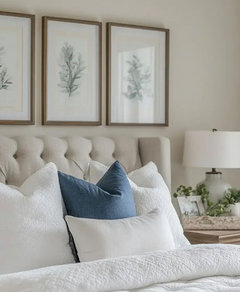
Consider high boy and chair accessorizing and think about how you want room to feel.
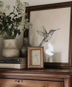
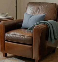

When you get the new quilt, try the other art above the bed. It looks like the blue in the art could work and you would see it more.

Love the balance Emily created, The intensity of the darker blue balances with the area rug and roman shades. I'd be careful to not be too matchy matchy. The two little picture above you bed look out of proportion. If they are special to you, consider using them elsewhere. This will end up a focal point, so choose something a bit more prominent either in size or texture. The curtains matching your headboard color makes things that more cohesive. I'm thinking a textured fabric art piece playing with the dark green of the plants might be a way to punch things up a bit. Consider a botanical print. Or consider something that contains some metal for an unexpected texture. For added texture maybe a pillow with faux fur or velvet in a strong darker green. Here are some ideas. Lovely room!
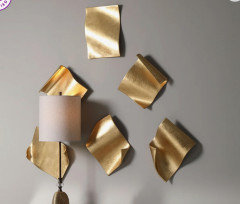
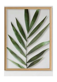
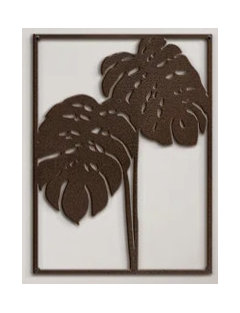

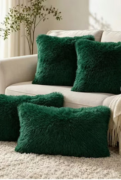
Good Luck!
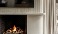
They are Tambour panels and if you Google you’ll see lots of suppliers. Here’s a link to one site, if you’d like to read up on them. https://www.thewoodveneerhub.com/collections/flutto-flexible-tambour-wood-panels

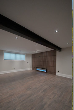
Here's one of our fireplaces with a different version of panelling.

Because they're rounded at the surface, they appear to be half dowels that were spaced out and added to the wall and then painted.
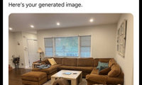

Adding another color, as Beverly suggested will give the room more character. You can do that with pillows. Found these on Etsy. The rug and drapes she suggested would be a good start.



If choosing another paint color, be sure it will work with the adjoining spaces. Oftentimes purchasing a rug first is an easier way to narrow down colors and be sure to test/look at during different times of the day.
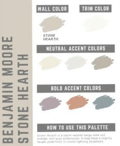
If you are fine with the color, I think with the right accessories, the room could be transformed. Look on line for ideas and try Pinterest/search ”stone hearth living room with rust sectional” and note how room is pulled together.
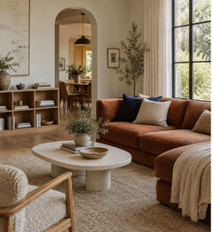
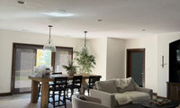
I agree with changing color of tv wall. I also agree on a bigger rug. I have two small sofas - did you see the pot I did right before yours? Can you elaborate on your thoughts of furniture placement. For some reason this is hard for me and shouldn't be! LOL
Test both layouts/live with each for a while and you’ll see what works best for your family. Visually they are both fine. Hold off adding art as the seating will have an influence both size and placement wise.
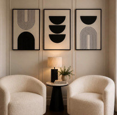
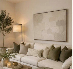
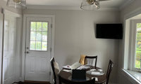
Consider creating an inviting dining area by adding wallpaper, a coordinated roman blind, and some plants on the ledge. Think about how much color intensity you want or if you prefer to work with your color scheme.


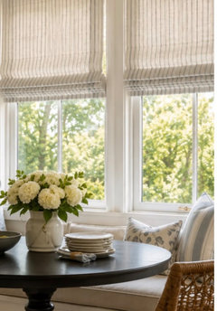

Suggest a set of prints on this wall and be sure to tape out to help you decide on the size/number of the grouping (lean larger).

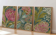
If you want vibrancy, add with your art choice.
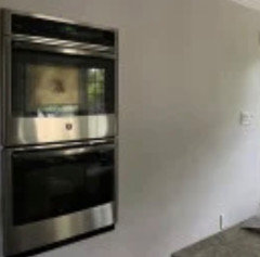
I do like the look of shelving but anything sticking out from either wall will not work because of walking and dining space.
Grey kitchens are the easiest to warm up with artwork because nothing competes with it. The two walls give you options, one could be a larger statement piece and the other a smaller cluster.
A framed map is one that works well in kitchens, The Unique Maps Co. does restored antique ones that add colour without being a big abstract print everyone else has. Pick somewhere that means something rather than decorative.
If the walls are narrow, a vertical piece or a small group of three works better than one wide frame that leaves awkward gaps.
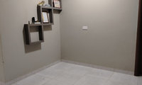
Could you advise how this space relates to the LR and/or kitchen as that might have an influence as to the look you might want to go with. If it‘s more of a hall/walk through, it’s going to need to feel connected.
Not sure how much space you actually have with knowing dimensions so I’m showing this with four and six chairs. You could use a console under the stairs or do custom built-ins.
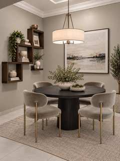
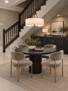
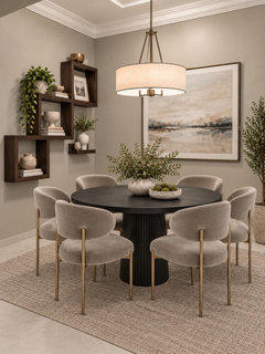
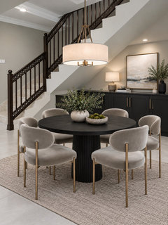

I'd go with Warm Modern - Wood & Earthy Tones!

I just saw my gandsons’ new bathroom and because it‘s small + they wanted to avoid lots of grout, they used a larger tile similar to below on bath’s walls and on the floor. For the fun factor, you could use a colored vanity and even wallpaper.


I used a white fish scale tile on the tub/shower surrong in my daughters' bathroom.

Herringbone on the tub walls will look great, and the grout concern is easy to manage. A few things that help:
Choose a grout color that matches the tile as closely as possible; the pattern still reads, but the lines disappear and you don't notice every joint. Use a high-performance or epoxy grout (Mapei Flexcolor CQ or Laticrete SpectraLock are common ones); they resist staining and mildew and don't need sealing. And go with a longer plank, something like 4x12 or 3x12 instead of 2x8, which cuts the number of grout lines by about half while keeping the herringbone look.
Since it's a kids' tub wall, the splash zone is mostly the lower few feet; a simple, good exhaust fan and a quick squeegee or towel-down after baths will keep the grout clean for years. Keep the floor simple and matte for contrast so the walls stay the feature. It will be a sweet bathroom.
Have you considered adding film…much less trouble and inexpensive.


a film is quicker and you can change it out with the seasons for some interest.
Privacy glass is available for example Marvin Essentials fiberglass frame windows.

How do you want to use this space and what’s your wish list?
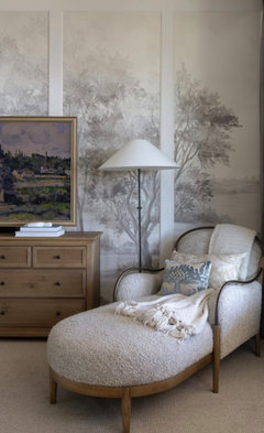

A lounge corner on that wall is a lovely idea, and it's a very doable one. Two comfortable chairs angled slightly toward each other with a small round table between them (about 20 to 24 inches tall) and a floor lamp behind one is the classic version. If you'd rather stretch out, a small loveseat or a chaise around 60 to 70 inches wide works too.
Because the ceiling slopes, keep the pieces low-backed and put the lamp on the taller-wall side so nothing fights the angle. Anchor the grouping with a 5x8 rug and hang one large piece of art or a big mirror above it; in a mostly white room with gray carpet, that's what makes the corner feel like a destination instead of leftover space. Keep the fabrics soft and the colors close to your bedding so the room reads as one.
If you post a wider photo with rough measurements, I'm happy to sketch out a layout for you.
So much depends on the room’s style and table’s size, your taste and how you’d like the vignette to feel. Did you want it to complement something in particular (say on the wall). I find testing different combinations is the best method as balance and height are key and a grouping of 3 works well. Maybe look on line for inspiration.
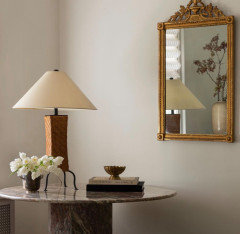
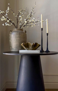
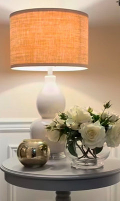
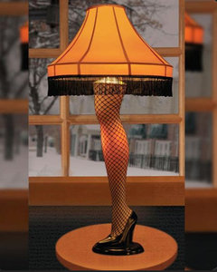
With no information and In the spirit of the approaching holiday season ... I'll go with this!
LOL
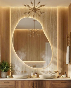
If wanting a Zen feel…not sure if light wood + black accessories + gold sink and trim, in addition to the flooring, fixtures and hardware choices(?) is the way to go. There are ways to add ”fun”, but if you‘re not careful it could be overwhelming vs Zen.
Maybe try ChatGPT and enter the info you provided to get some idea of the result. Are you working with anyone for advice, as there’s no going back if you’re not happy/having spent a lot of money? Perhaps looking on line at Zen bathrooms with saunas will help and the ”fun” can be added with less permanent choices: paint color, wall treatment, accessories, and lighting.

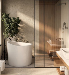
Just read your comments that room is 8x8. You are going to have squeeze out every square inch, allowing for a free standing tub + single sauna + vanity and toilet. Have you calculated and figured out their placement?
Black, white and wood will feel calm. It really comes down to all the elements working well with each other. The more inspiration rooms you look at might help with different decisions.


Your move to a white sink sounds like a useful simplification. With the sauna and tub already providing the room’s character, I’d let those be the features and add personality through something easy to change—art, towels or a small accessory.
Before buying the remaining pieces, have your designer check the measured layout against the exact sauna and tub specifications, including door movement, required clearances and access for cleaning. In a compact room, comfortable use deserves as much attention as fitting everything in.
Which sauna model have you selected, and could you share the scaled sketch you mentioned? That would help focus suggestions on the space you actually have.

I love the direction you're going with this! The light oak, matte black, and thin gold accents could make such a beautiful combination, especially with the sauna.
For the fun feature, I'd consider a small section of vertical wood-look slat tile or a textured accent wall. Something that adds personality through texture rather than introducing another bold color.
We did a zen bathroom at our old house and here's what we put on our list, some we used, some we didn't
Mirror https://link.amazon/B0aFrDzSE
Slats https://link.amazon/B00fIOCsC
Teek Stool https://link.amazon/B0fatHw4t

Suggest patterned roman blinds - 1 large or 2 small on each window. Hard to suggest though, given the walls look different in the pictures and not seeing the room in its entirity.
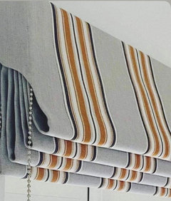
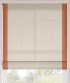
I think drapery will cover too much of the window given the narrow space next to fireplace. The other side will have to mimic…losing light and also appreciation of the view.
I would do solar shades if heat and UV are an issue and then drapes for night time privacy and the shades allow you to see outside all day

I prefer the second and a bamboo blind will help tie everything together. Suggest a semi flush light and consider its size no matter what style you choose (the ones you show are too small and the amount of light will be minimal). Consider painting the shelving area the same color as the walls.
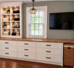
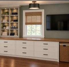
We are also considering backing it with bead board matching the paint color, or filling the shelf space with bins.
I like the bead board idea!
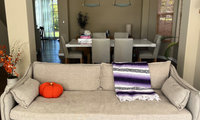
Cut different sizes of Kraft paper and tape to wall and height is important as well. Ignore the content, only providing to help with visualizing a balanced vignette.
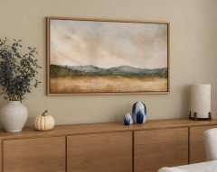

If you do not want beige, avoid all the suggestions for beige and go with what you wanted which was something colorful/ blue and mountain_/ocean related. Something sentimental. A
As Norwood Architects said, just choose whatever you want that is a reminder of your trips/memories. If you are set on the two you found in your OP, the first one is nice and framed can look good. Adding blue accents might be all you really need to tie in the space.
There's 1000s upon 1000s of different paintings that can fit your criteria, so finding one that is sentimental to you, I think is key.
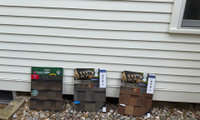
I wouldn’t be deciding based on the door. First decision is lighter vs darker and if still having a hard time deciding on these three, can you hold off and research a different line. It’s a big commitment both visually and financially and you should get a positive gut reaction and know it’s right.
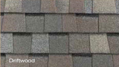
If you come again with any issue keep the issue to all one post please , duplicate posts do not get better help they just irritate

👍🏻!
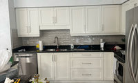
I think it’s important to consider the big picture (especially with the open concept) and suggest waiting until the flooring is updated as it will have a big influence. You may even find the black counters could suit, are you keeping the backsplash? Before making any changes to the cabinetry, look on line for kitchens that appeal to you. Painting the cabinets/walls would then be the last decision.


Thank you! I don’t see a checkerboard floor in my future, but appreciate the thought. Especially with
Sorry but the first thing to do is get proper lighting . I see no improvement in adding molding to that very ugly soffitt which I am sure could be made less obtrusive .The same engineered as the rest of the house but that will require a huge amnount of work since the tile will have to be removed , so maybe in that time also open the soffitt see what can be done to lessen it and raise the upper cabinets 3 " to lessen the bulk above. Then all one color for walls and cabinets and some new pulls if you must. Remove the tile and just keep the counter and the 4" splash
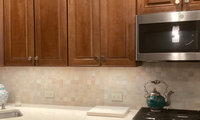
The best way forward is to look on line for combinations you like and decide on your budget/priorities and where the biggest impact could be. For instance, keeping the flooring (which is nice) will save a lot of money so you could put elsewhere.
Could you provide a picture of the entire space, including the dining area, so as to receive more comprehensive advice. It could feel quite different just by changing the counters and/or backsplash, painting walls, and updating lighting and hardware.
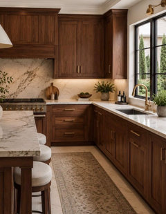

Yes definetely cabinets would look better with new brushed brass harware and glass doors.
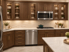
You can get quotes for refacing the cabinets. If you don’t like wood, you won’t feel better about this kitchen with “new knobs”. Do some research and figure out if you can save for a kitchen you love.
It can be done in stages, but price everything you want and then make a plan.
I asked my sister how they are dealing with her husband falling a few times and she mentioned he now wears a SmartWatch.


Define "Senior"
Mobile? How senior in age? Frail? Sturdy? Mentally vibrant? Social? Isolated and a more retiring sort?
A daily are you alive and feeling well.......is different than the possible what if's.
If a check in the am, what of a fall mid day or in the dead of night? Will she wear and use a simple wrist monitor? Would you be far better off in the long run with security cameras in strategic places, where YOU can monitor from any distance on your phone? Not to pry, or invade privacy, just to know she/he/they are safe.
A wake up moment leaves a lot of "other" time.

The article didn’t identify the name. When looking, consider Caesar Stone and keep in mind what you’ll be using for the backsplash and test against the flooring.
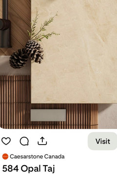
If having a hard time, perhaps look for a cream vs yellow and paint the walls to suit.

Great suggestions all - thanks so much! The search for quartz continues!


And if you would paint that wall register the same color as your wall it would not fight with the chandelier as much, at least from the view the the photo was taken from. I like the second chandelier, your choice, as Freedomplace showed, for your foyer, seems to coordinate well with the dining room one.
Thank you! The suggestions are so needed and appreciated. I didn't even notice that. That should be an easy fix!
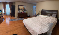
Are you replacing any furniture, drapery, bedding or art? These will have the most impact in creating a beautiful/cozy/organized feel. By providing a detailed drawing with measurements/doorways, etc you’ll get more helpful advice. If making decor changes, what’s your style and color preferences and what do you want to keep. The more info you provide, the better advice you’ll receive.
With a room this size, furniture placement is mostly a question of measurements, which is why the panoramic photo makes it hard for anyone here to help. A simple plan of the room as it is today answers most of it: wall lengths, where each door and window sits and which way the doors swing, outlet and vent locations, and the footprint of the bed, the dresser and the armchairs.
From that, a few rules settle the layout quickly:
1. Leave about 30" beside the bed on the sides you use, and about 36" for any main walkway.
2. A seating group reads best facing the window, on a rug large enough that the front legs of each chair sit on it.
3. Two rugs work when the two zones are separated by at least a walkway width.
Disclosure: I'm with RemodelSet, we draw floor plans. If you send a few photos of each wall plus a tape measured sketch, we can draw the room to scale so you and everyone here can compare arrangements on paper: https://remodelset.com/contact?src=houzz&code=FIRSTPLAN
Celery's is lovely
No
Yes


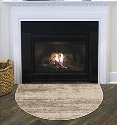
Just because it's gas and may never spark, doesn't mean a fire couldn't start outside of the fireplace if a flammable material were too close. Gas fire is still fire. It's the same issue as having combustible materials near a gas cooktop.

I have a gas fireplace, and while I'm not worried about my area rug under my seating not too far away, it wouldn't occur to me to put a rug *at* the fireplace. What would be the reason to do such a thing?
For the cost to repair and paint ceiling (maybe get a few quotes to help you decide), but I’d head in that direction. It would be a shame to add a medallion as it will draw attention away from your new chandelier and look also odd.
thanks @RNmomof2 zone 5 my ceiling is plain drywall 8ft. I appreciate your input. I did try looking for simple ceiling medallions and what came up was more like to cover a recessed light, or not at all attractive.
If you see this can you share some examples ( or even link the search you did). If I did find a nice medallion that goes with the home thatwoudl be great. I'm thinking at this point aht just repairing the ceiling is they to go---------especially since @palimpsest suggested it would not be much of hole ( not much ofa project).
On a PC, I just entered "Simple Ceiling Medallions". I do know that you get different hits with a PC over a phone. Many of the pictures on the first page were nice plus they gave you sites to shop from.
Here is a link for one I liked Medaillion
Since you have a flat ceiling, I would be tempted to just make the repair unless their is some reason why an electrician would tell you otherwise.
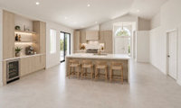
Suggest waiting until room is furnished and accessorized and how you treat the adjacent wall especially should help you narrow down.
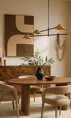
Be sure to read articles for size/shape recommendations and also keep in mind the large space and ceiling’s height. Suggest a linear style, which I think will create more volume and balance visually.

Thanks @RedRyder and @Maureen I like more the linear
Google linear fixtures till you find one you love. Make sure it’s the right size for your space since photos are deceptive.
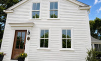

These are pretty close and I’d look keep looking until you’re 100% happy with the choice.
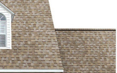
fyi: how they would look

Will you be replacing the house shingles, if not I’d use the same or very similar.

Since you already have sample boards, I would take those outside beside the Alabaster siding and the front door before narrowing the choice. View them in sun and shade, then step back to roughly the distance from which you see the house from the street. Ask the roofer to show the samples safely at a similar angle to the roof too.
That should help you judge the red or rust tones you want to avoid without relying on the indoor photo. GAF also cautions that screen colours can differ from actual shingles. Compare the same final choice against both the house and the garage rendering, and confirm that the sample matches the exact shingle product being quoted.
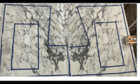
A big no…instead of adding it will detract.
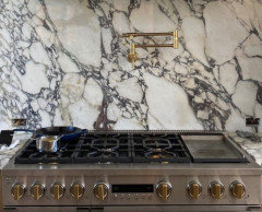
Suggest using one piece only and hopefully you have the option of where on the slab it is cut.
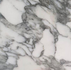

Beautiful stone. Glad your not going with a pot filler.
@chispa I see a pelvis too.
Do you really want to cook in front of a giant pelvis?
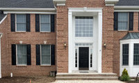
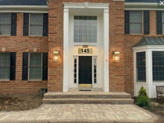
If your budget allowed, I’d be visually breaking up the entrance/ overpowering window, in order to create a more welcoming facade. Lighting issue would be resolved as well.

If interested, look into its possibility/ask if the two story pillars could be removed without damaging the brick. I think your home would be transformed!

I love this entrance and your improvements in the second image.
I think the black address plaque is nice and is enough black...I like that it's the same width as the door. Everything else looks very nice in white.
I'm not sure the wall lamps are too big, they balance a very large entryway, although they look farther apart than the current fixtures. The lightbar is a nice modern touch with clean lines that echo the window above it.
What about dressing it up with some brass features?
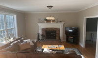
Just place on a lighter piece of furniture so that corner doesn’t feel as heavy and I think that’s the best choice/will also add to the room.
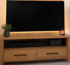
It’s important that the other side of fireplace feels balanced.

Because the room has a label, because it is wide open to kitchen locale and is THE ONLY FIREPLACE......it is probably fruitless so suggest a different locale for tv.
Answer is to close mostl or all of that right hand wall. Give the tv a new spot in the same room.
If ......you add all dimensions for all below - walls, windows openings, passages......
to this?
More concrete answers and help may be forthcoming
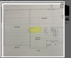
The mantle is to high and wide. A combination of Judy’s bottom pic and Emily’s would work.
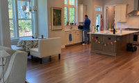
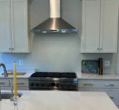
Your kitchen is lovely. Suggest adding tiles from end to end (vs just over stove) so that the effect won’t feel patchy.
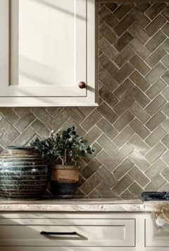
You could add more interest in this area and keep the 4”trim.
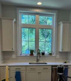
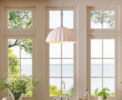
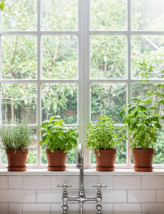
@chispa in a lighter shade, that would count as interesting but not busy! You are right, I will go to a small store. The chandelier def needs to be lower and we will do that when we buy one. The art is centered at 5'4" (i.e. me!)
@Patricia Colwell the counter is silestone Et Calacatta Gold.
@Maureen I love those photos, i need to replace the recessed light witha pendant, that would be pretty. The builder recommended 3 windows, it would have been lovely! But, I like my upper cabinets there over the dishwasher, laziness won over prettiness. I will get some nicer matching pots and move the cactus elsewhere, the plants will help a lot.
Well you already have the 4” backsplash, so you’d want to remove that first if you add a backsplash to all of the counter areas. but yes, you should do something something just behind the range or youll be cleaning your painted wall constantly!

I think you are trying too hard to add height; maybe focus on balancing the corner. In ChatGPT, I asked for the wall items to be on the small wall with lamp (which wasn’t done). See the difference below and imagine the wall items arranged differently/to the left of the lamp. The space becomes a vignette vs feeling random. Hope this helps as you‘ve been really trying.
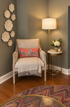
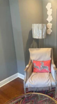
I love that one. Did u see the one I put in the photo? Maybe I have to move it a bit? I like the shade
You are so right. It gets busy very quickly and I have been. Removing clutter

I do love coral, but I also love an iguana green with gray.

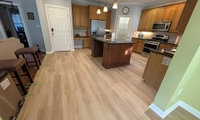
Maybe think big picture. In addition to suiting the flooring and black counter, you may want to consider the adjoining space(s). Also, leaving the island as is, it could narrow down options (decide when cabinets are finished).
- What is your backsplash like/will you be updating?
- Do you plan on painting the walls in kitchen (and in the connecting open areas as well)?
- What decor color schemes are being used in those spaces?
If interested in more robust suggestions, providing the additional information would be very helpful.
Look on line for combinations and save your favorites. Be prepared to having to update other things; ie: stools and hardware).
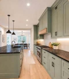


I like the green that Emily has selected in her rendition but will suggest that you also paint the island the same color as the rest of the cabinetry. That will help eliminate the difference between cabinetry and flooring altogether.

Emily’s AI image removed the cherry toned wood floors in the adjacent area. I think it’s going to look like 2 different homes unless you either continue the same flooring like Emily’s image or you keep some cherry toned wood in the kitchen. Either way, it’s not ideal to have fake wood floor right next to real wood.
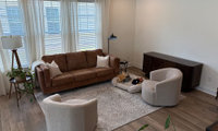
I toured a lottery home yesterday that Sarah Baeumler (interior designer) and her husband Bryan (builder) were heavily involved in its design. I kept noticing all the curves (counters, arches, furniture) and when I saw your room, I remembered the coffee table and how it softened the room.

Maybe consider curves of some sort and a larger rug will allow for more table options and sizes. The table below feels off (too small/low), but I hope it helps.

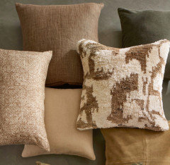

In such a small space, I prefer a glass top coffee table.
A large cocktail ottoman is more multifunctional and fits with current family uses.
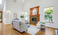
Measure the room (what’s the right side of room like?), consider the type of seating you prefer and test dimensions on line or on graph paper - TV on left wall and start there.
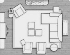
Less chairs and a sectional facing tv. Could use two couches instead. Exchange plant and chair. Decide how you’d like to accommodate TV.
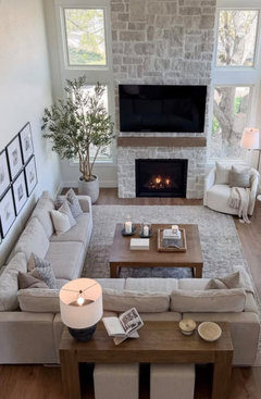
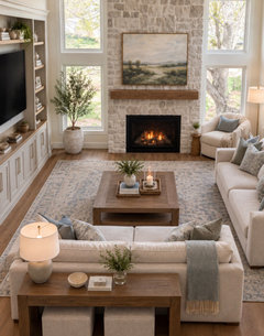
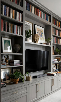
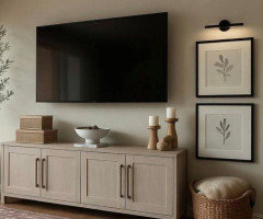
If you decide to place the TV above the fireplace, be sure to check the FP install instructions. We were told that the fireplace has to be recessed 8" to prevent heat from damaging the television. But if there is a mantel above the fireplace, then it will protect the TV and then the FP doesn't need to be recessed (or at least not as much).
Yes, thanks Katie, I would want to put a mantel above the fireplace. It seems the logical place to put the TV on the wall between sconces, I just like having the wall hanging and glass/bamboo console together and I think it would look great there. Maureen, I like the idea of having stone around the fireplace all the way up to the ceiling, with the mantel and tv.

Both the art and the chest are lovely, but the vignette as a whole doesn’t give either of them credit. Is there another place near the dining room (or in dining room) where the art will be more appreciated and you could enhance further by framing and even adding a light.

Below is an example of good proportions/balance and the chest will pop. Testing different items is the best way to find the right combination

Seems to me that the chest and artwork seem to be jamb packed into this small space. Might suggest a table with an open bottom instead of the chest to give this spot a more open and airy feel.
I feel like the chest is very heavy for this spot. But if you are not keen on moving it, then I would not keep the art there. I am sure it can be placed in a more suitable spot. I would replace it with a mirror to give depth to the space. Because you don't have much space due to the stairs, move the mirror over to the right side and balance it with a plant on th left side.
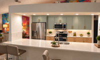

100 percent remove
I’d remove in a heartbeat…will be less dated, but more importantly feel more spacious. Consider adding pot lights, as well as pendants over the island (both on dimmers).
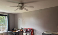
There are lots of pictures on Pinterest..search “plants over small desk” which may help. What has to be considered though is how much there is already squeezed in. If plants are small and limited and will make you happy..aim for a more minimal injection. Maybe you could store some of the items on your desk in a basket on the floor and the shelves/plants will be more appreciated.

Take advantage of the window ledge..if interested.
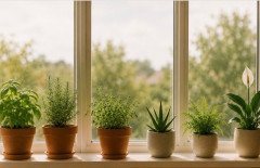
Consider adding in other rooms and simple groupings are more interesting visually.
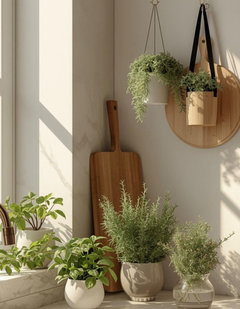

^ agree, it’s easy to add lots of smaller storage/display pieces when 1 larger one does the job and feels less cluttery
PLants need light so if plants are a must so is the light . IMO maybe wait until you can have plants in the perfect place for them.
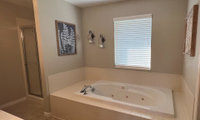
With your husband demolishing, the first thing I’d do is get quotes on install/labour and also start looking into costs (tiles, flooring, tub, hardware). Decisions will be much easier when you have a ballpark figure and can adjust your wish list if needed.
1st priority is the tub/shower decision and suggest the configuration below with grab bars and look for a tub with a lower profile. If/when mobility is difficult, a curbless shower entry will be important.

Sounds like you like the idea of a W/D where shower is and if wide enough, add a storage cabinet for your towels and laundry needs. Consider buying second hand to save a lot of money.
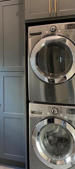
Since you won’t be starting for a while, maybe look on line for inspiration design/color wise and save your favourites. Your husband lol can always repaint the vanity to suit if you find tiles on sale and also opens up more choices.
It sounds like a bathtub is very important to you, so look into options. How about the walk-in tub? One of my aunts had the same passion and the walk-in tub was a good solution for her. She had MS, so walking became difficult. My arthritis has become a lot worse since I turned 80 and I never thought it would be like this, so a tub is definitely out for me. A shower with the short grab bars is fine. I didn't want grab bars that said an old lady lived there! My toilet is next to the vanity and I have a short bar on the side of the vanity in case I have problems, again, hidden. I went through a lot of "what ifs" when I designed a remodel, even in the kitchen. The only cabinet I have is under the sink. The rest of the storage is drawers. No crawling on hands and knees for something. Also, being on the short side, I have open shelving which is hung a bit lower and I can actually use the second shelf! Have fun designing!
I was not looking at Houzz when you first added your post, but saw it this morning when you replied.
Reading through the post I am questioning some of the advice.
You are retiring, so yes, starting to think about the future and our limitations is reasonable, but we also may have many good years ahead before we reach the stage where we need a walker or wheelchair to navigate our homes.
You have stated that you currently live in a 2 story home and this bathroom is on the second story. If you can walk up a flight of stairs, you can safely navigate a shower curb. What are your plans for the future when you do need assistance with walking (walker, cane, wheelchair). Will you sell your two story home and downsize to a single story or will you move the master to the first floor and leave the second floor for guests, children, grandchildren or will you install an elevator or chair lift to get you to the second floor?
Only if you plan on installing an elevator or chair lift do you need to worry about the shower curb.
Do you currently enjoy bathing or do you take showers most days?
A master with a big shower is acceptable for resale if you have another bathroom with a tub.
A master with a big shower and a nice soaker tub is also acceptable for resale - you don't need a giant, jetted tub, but something a bit bigger and deeper gives the bath a more luxurious feel. This is the brand soaker tub I used in my home, opting for a 36" width and 20" depth to give me that luxury soak. https://maax.com/product/exhibit-6036-ifs-afr-acrylic-alcove-bathtub/106173/106173-l-000-001
If you replaced the current platform tub with an alcove tub, you would have all that excess platform space to add to the width of the shower. An additional foot makes a huge difference is the feel of a shower. I can't tell for sure, but it looks like you would gain at least 1 foot, maybe 2 feet of extra room for the shower.
If the sink and cabinets work for you, I wouldn't change them. Like you, I opted for single sinks and additional counter/cabinet space. Never understood the "need" for 2 sinks.
I have given thought to the walk in tubs and may consider one someday, but I have the ideal single story home for aging in place. Your reality it that you have a 2 story home with the master on the upper floor. If mobility becomes an issue you will be moving or doing major renovations to relocate the master.
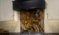
Suggest picking up on the rusty shade in the granite and along with copper lightening, the kitchen will feel more cohesive.
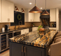
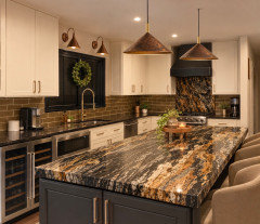
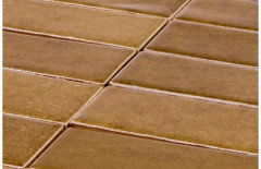
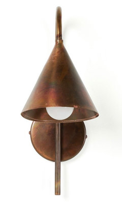
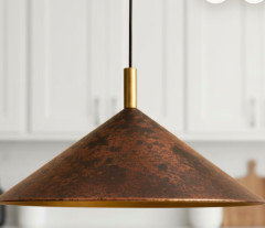

You could remove the white tile and paint the wall in any color you like. You already have something behind the range. And the granite has a lot of visual interest, by itself. If you paint the backsplash area in an eggshell finish, that makes it cleanable/wipeable.
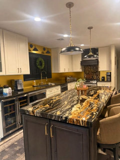
Easy. You save on tile and tile installation. Plus, when and if you want another look, you can just paint another color.
Will suggest that you pick a mid-tone of the granite and use that color as a backsplash.
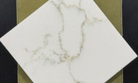
From experience, hold off choosing the backsplash until the end. When we were installing our tiles….hated the look and luckily were able to return. I don’t think glare is an issue in that area, but test both (tape a few of each to wall) and compare during the day and when the lights are on. Wouldn’t hurt to test other tiles also and keep in mind the flooring as well.
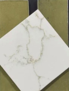

You could alternate matte and glossy.
I like the cabinet suggestion by Design Interior south. i think the greige cabinets would not give the room a light feeling.
I agree with other posters - find a local glass shop to see if they can make your custon sized mirrors. Would not recommend having them made elsewhere and having them shipped.
I’d be worried about it being damaged in shipping given its size (if you can even find a supplier). Suggest having a mirror cut locally and to customize, this link might be of interest and there are lots of options.
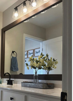
https://framemymirror.com/products/upton-dark-walnut-sample?variant=43321843482858
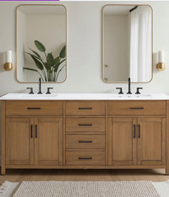
Another idea, if the vanity has two sinks consider using matching mirrors that could be sourced locally.
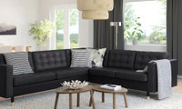
Since it‘s going to be your primary seating, more comfortable backs and lower arms might be better options.
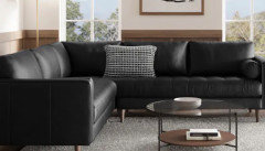
Also leather’s quality and construction are key to comfort (and longevity). Hope you hear from someone who has owned for some time.

If you can stretch your budget, compare construction and materials with others. For instance:

Thanks for the link—that's the MORABO 5-seat corner sectional. IKEA lists GRANN leather on the contact surfaces, but BOMSTAD coated fabric on other panels, and the cover isn't removable. So I'd check those seams and surfaces in person rather than treating it as all-leather.
On comfort, your own test is more useful than the photo or reviews of a different IKEA sofa. If it felt firm, I'd go back and sit in both a straight seat and the corner for 20 minutes in the posture you'd use for TV. Check lower-back support and where your legs naturally land; I wouldn't order it assuming the foam will soften enough to change a fit you already dislike. The model's buyer feedback is mixed, so I can't honestly predict long-term comfort for you. Black can simplify some cleaning, but dust and scuffs may still show—I'd choose it only if the comfort test works first.
I like the tufted detail on the Morabo. I guess I'd replace the poly foam with medium weight latex foam from Sleep On Latex.
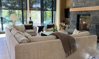
The mantel is about 5” deep
With your modern room and the lovely stone, I’d add not too large art on the mantle and some pottery. Testing will really help you decide.
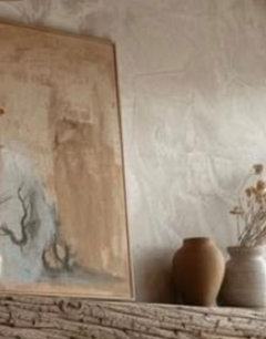
Other than wanting to leave walls/doors as is, a classic non cluttered look..it’s hard to suggest. Define your budget (suggest tables, good lighting, comfortable moveable seating, art, cushions and rug). If budget is limited, start with the rug as yours is really holding you back from achieving a light/classic feel. Have a color scheme in mind before you start.
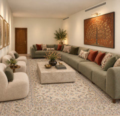
Maureen has shown that it is possible to make the living room look better and be more livable. Would definitely suggest you go in the direction she has provided.

You can introduce a classic touch through furniture, lighting and textiles while keeping the walls and doors as they are. I’d choose a few pieces with clear roles: a coffee table sized to leave comfortable walking space, a shaded table lamp, and one substantial framed artwork instead of several small decorations.
For an uncluttered look, keep the rug, cushions and curtains within a coordinated colour palette, and let just one of them carry the main pattern. You don’t need every piece to be ornate for the room to feel elegant.
I made a video showing the same living room transformed into four different design concepts. The Modern Classic version may be especially relevant to the direction you described, with ideas you could adapt through furnishings and lighting: https://youtu.be/R-2ZyyBc6EY

Basically painting the front door or garage doors, and improving landscaping and lighting might help, but will not be game changers.
Hard to suggest paint colors, but I’d choose a color for the garage that blends in so it’s not the first thing that is noticed. Test a few colors on the front door and create a welcoming feel.
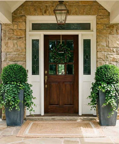
Make sure it is super clean, inside and out. Fix what's broken. That's it.
The first thing I would notice is all of the old shrubbery that I would have to tear out and replace. I’d get rid of all the shrubs and just put down mulch. As others have said put the garbage cans away and power wash the concrete.
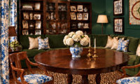
The lighter green allows the couch to stand out, creates another layer, and breaks up the dark hole on that side of room. I also think the dark ceiling might feel a bit oppressive after a while.
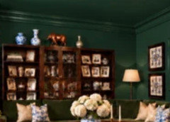
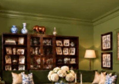
The lighter green will also allow colors and patterns to play a more prominent role.
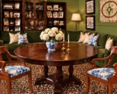
I would look for a fabric that has just a touch of green in the pattern/colorway, to tie it into whatever green you choose for the walls.
The darker green, but with a different color ceiling.
I think a moody paint color would pull the patterns together and look deliberate! Could be stunning. What is the the flooring like?
Consider removing the entire window, as it will be too small to provide much light and will give you more flexibility when accessorizing.
I think it's really beautiful.
You can hang a mirror centered above the sink and it would look just fine with the current window.
Some contrast with the wall color will let the two stone materials unite.
Something like this?:
For starters you need to visually link the objects you have assembled in this room. The right gray paint on the wall should help you do that.