
Block 71 Seng Poh Road, Singapore
From being habitués to becoming residents, this couple has cottoned on to the charm of Tiong Bahru neighborhood.
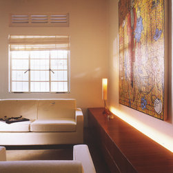
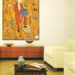
There is, within this benign interior, a sinister undercurrent. It is largely emanated by an untitled life size painting in the living room. Its creator Jane Hammond had depicted a po-face man, possibly a ventriloquist, holding up a dummy, around them are images from such disparate sources as magic, alchemy and exotica. This picture, the first that greets the visitor when he enters the flat, is disturbing. 'The painting is the anchor for the living room', says owner Nicholas King. 'In a room of this small scale and simplicity, we wanted something that would grab your attention. And you would need something pretty big and bold to do that'. King, a property developer, lives here with his wife Zee, a graphics director.
While shocking in its effect, the painting, displayed in this particular context, is exciting, provocative. This 'context' refers to the Tiong Bahru estate, one of Singapore's first prototypes for public housing conceived in stages between the 30's and 50's. What are the factors that lured the Kings to this neighborhood?
"We visited this area many times in the past, so it wasn't by chance that we moved here. We like Tiong Bahru because of its history and its character - the Art Deco architecture, the market, the sundry shops and food stalls', says King. 'Given the choice of a new condominium apartment with the same floor area, we would still prefer this older unit. It has a much more logical layout of space'.
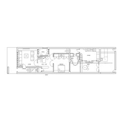
With the help of the designers from Poole Associates, the flat is planned in a flow of elegant interconnecting spaces, yet fulfilling the function that the Kings demanded of each specific room. 'We wanted to do some fundamental re-work to the home without feeling guilty', says King. 'If you buy a new condominium and start knocking down walls, you don't feel there is the opportunity to do as much. In a place like this one, it didn't matter if we change the layout around. The freedom in creating new spaces presented itself to be rather attractive'.
The aim therefore, is to retain the character of existing structures and rooms, New perfunctory elements are extravagant only in terms of form and texture. Modern services such as conduits, aircon units, wiring and plumbing are as far as possible, concealed within HBD requirements. The overall interior design while respectful of the building's history, is also cognizant of its relevance to a 90's home.
Says King: 'This being our first place together, Zee and I wanted to simplify things. We wanted a home which was architectural and had the fundamental elements of the right surfaces, spaces and functions'. To that end, the designers have shown resourcefulness in creating ample storage space. About the credenza (a long, low cabinet) in the living room, King says: 'It's a combination of surface veneer, storage and for lighting. It's something you couldn't achieve by putting a piece of furniture in its place. The same goes with the bar cabinet where all the glasses are stored'.
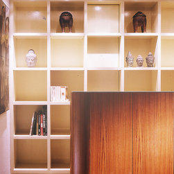
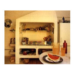
A long cabinet 100mm deep, begins near the entry door and connects through to the bar counter. It acts as a 'mantelpiece'. This mantel is exploited to the fullest, providing multiple function as glassware storage, a drink-rail during entertaining and a ledge for art pieces. Says King: 'We wanted the space to serve many purposes. We wanted to pack as much as possible and yet keep it as simple as possible. Putting in the bar counter gave us storage for glasses and bottles, and this adds meaning to the spaces. 'This space-saving thinking originated from the hotel room system. I have always envied hotel rooms for the thought and level of detail that go into designing them. Usually in an apartment, you just get bare walls and put in furniture. That need not be the most efficient way to use space. We wanted efficient use of space and we didn't want clutter. So we were absolutely ruthless in getting rid of knick knacks and odds and ends'.
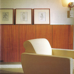
One investment that the Kings have saved is their art collection. These paintings give color to a primarily restful off-white interior. Apart from the Jane Hammond painting, there are also Paul Klee lithographic prints from a series of 50 that were purchased when King studied at Harvard in Boston. The corridor to the kitchen features Indian prints.
With the existing concrete floor pitted and cracked, new flooring material was installed to enhance the character of the house. The new floor is made from pulverized quartz crystal, mixed with yellow and pale lavender dye. It gives the look and color of very old and worn concrete, but when polished, elicits a finish that is smooth as glass.
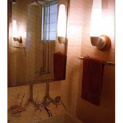
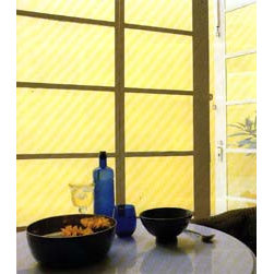
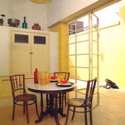
The toilet, a tight little adjunct space along the corridor, also shows great space-saving idea. It has a utilitarian trough basin and with tile work in a brick pattern. Period light fittings give this tiny toilet character. The kitchen is installed with collapsible glass-paned doors that maintain a sense of openness within an enclosed area. Says King: 'Its quite wonderful how much light comes into the kitchen. And with light bouncing off the yellow wall in the backyard, the place has a nice, warm, sunny sort of feeling'.
There is, within this benign interior, a sinister undercurrent. It is largely emanated by an untitled life size painting in the living room. Its creator Jane Hammond had depicted a po-face man, possibly a ventriloquist, holding up a dummy, around them are images from such disparate sources as magic, alchemy and exotica. This picture, the first that greets the visitor when he enters the flat, is disturbing. 'The painting is the anchor for the living room', says owner Nicholas King. 'In a room of this small scale and simplicity, we wanted something that would grab your attention. And you would need something pretty big and bold to do that'. King, a property developer, lives here with his wife Zee, a graphics director.
While shocking in its effect, the painting, displayed in this particular context, is exciting, provocative. This 'context' refers to the Tiong Bahru estate, one of Singapore's first prototypes for public housing conceived in stages between the 30's and 50's. What are the factors that lured the Kings to this neighborhood?
"We visited this area many times in the past, so it wasn't by chance that we moved here. We like Tiong Bahru because of its history and its character - the Art Deco architecture, the market, the sundry shops and food stalls', says King. 'Given the choice of a new condominium apartment with the same floor area, we would still prefer this older unit. It has a much more logical layout of space'.
With the help of the designers from Poole Associates, the flat is planned in a flow of elegant interconnecting spaces, yet fulfilling the function that the Kings demanded of each specific room. 'We wanted to do some fundamental re-work to the home without feeling guilty', says King. 'If you buy a new condominium and start knocking down walls, you don't feel there is the opportunity to do as much. In a place like this one, it didn't matter if we change the layout around. The freedom in creating new spaces presented itself to be rather attractive'.
The aim therefore, is to retain the character of existing structures and rooms, New perfunctory elements are extravagant only in terms of form and texture. Modern services such as conduits, aircon units, wiring and plumbing are as far as possible, concealed within HBD requirements. The overall interior design while respectful of the building's history, is also cognizant of its relevance to a 90's home.
Says King: 'This being our first place together, Zee and I wanted to simplify things. We wanted a home which was architectural and had the fundamental elements of the right surfaces, spaces and functions'. To that end, the designers have shown resourcefulness in creating ample storage space. About the credenza (a long, low cabinet) in the living room, King says: 'It's a combination of surface veneer, storage and for lighting. It's something you couldn't achieve by putting a piece of furniture in its place. The same goes with the bar cabinet where all the glasses are stored'.
A long cabinet 100mm deep, begins near the entry door and connects through to the bar counter. It acts as a 'mantelpiece'. This mantel is exploited to the fullest, providing multiple function as glassware storage, a drink-rail during entertaining and a ledge for art pieces. Says King: 'We wanted the space to serve many purposes. We wanted to pack as much as possible and yet keep it as simple as possible. Putting in the bar counter gave us storage for glasses and bottles, and this adds meaning to the spaces. 'This space-saving thinking originated from the hotel room system. I have always envied hotel rooms for the thought and level of detail that go into designing them. Usually in an apartment, you just get bare walls and put in furniture. That need not be the most efficient way to use space. We wanted efficient use of space and we didn't want clutter. So we were absolutely ruthless in getting rid of knick knacks and odds and ends'.
One investment that the Kings have saved is their art collection. These paintings give color to a primarily restful off-white interior. Apart from the Jane Hammond painting, there are also Paul Klee lithographic prints from a series of 50 that were purchased when King studied at Harvard in Boston. The corridor to the kitchen features Indian prints.
With the existing concrete floor pitted and cracked, new flooring material was installed to enhance the character of the house. The new floor is made from pulverized quartz crystal, mixed with yellow and pale lavender dye. It gives the look and color of very old and worn concrete, but when polished, elicits a finish that is smooth as glass.
The toilet, a tight little adjunct space along the corridor, also shows great space-saving idea. It has a utilitarian trough basin and with tile work in a brick pattern. Period light fittings give this tiny toilet character. The kitchen is installed with collapsible glass-paned doors that maintain a sense of openness within an enclosed area. Says King: 'Its quite wonderful how much light comes into the kitchen. And with light bouncing off the yellow wall in the backyard, the place has a nice, warm, sunny sort of feeling'.
Project Year: Pre-2005
Project Cost: $500,001 SGD - $750,000 SGD