It's been a colourful year so far, inside and outside!
We've been so inspired by the many articles and work of interior designers and stylish DIYers about which interior colour palettes are in this year, but we wanted to know what you felt was the most on-trend interior colour palette for this year. The top four we keep seeing are:
Mixed Material
Mixtures of woods, cement/stone, glass and warm metals to give a natural yet modern and industrial feel.
(
source)
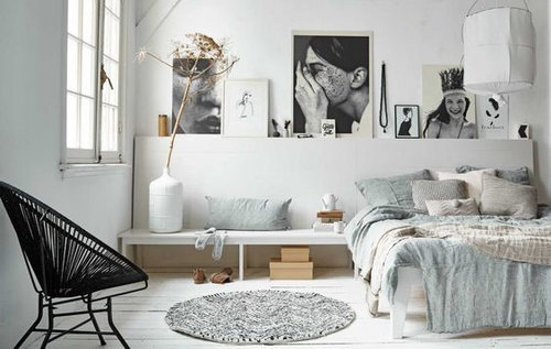
Greys and tonals
Implementing a variety of grey-based tones with slight accent colours, juxtaposed against black and white.
(
source)
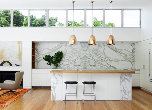
Metallic Accents
Adding more light, glamour and intrigue to your space.
(
source)
High contrast moody colours
Whether using pastels or deep, rich greens and blues the aim of this style is to throw you back in time or suit your indulgent moods.
(
source)
(
source)


KCreative Interiors
Feliz Home
Paul Redding Photographer
Lisa Frances Judd Artist