4 Lessons I Learned About Color in 2017
Toss out the rulebook and consider this designer’s insights into choosing and combining color at home

Whether you fancy yourself a color lover or not, I hope these four lessons that I learned in 2017 will help you see color with fresh eyes and inspire you at home in 2018.
1. There are no rules when it comes to color pairing. One of the biggest insights I gleaned from 2017 is that literally all colors can “go together” in the right context. To some, this idea might be counterintuitive or downright outrageous, but hear me out.
I spent a lot of time in nature in 2017, and I’ve been deeply inspired by the way bright, hot and bold colors blend beautifully with more muted, pale and earthy tones.
I spent a lot of time in nature in 2017, and I’ve been deeply inspired by the way bright, hot and bold colors blend beautifully with more muted, pale and earthy tones.
Through my interactions with nature, I’ve gained a deeper understanding of how seemingly different shades and temperatures of color can work together. I look forward to applying that idea to more home designs in 2018.
Pastel colors are soft and light and give off a playful feel. Bold colors are energizing and create warmth, richness and an overall invigorating feel. Neutral colors are calming and soothing and help ground other colors in the design.
The beauty of pairing different types of color is that you can capture many feelings in one space.
The beauty of pairing different types of color is that you can capture many feelings in one space.
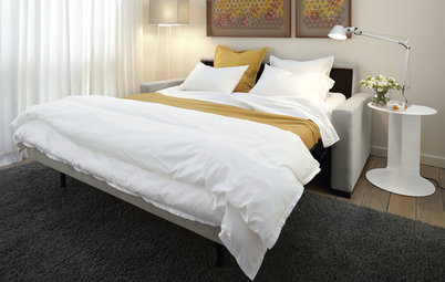
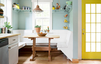
By mixing pastels with bright shades, you can make a living room feel calm, comfortable and soothing, as well as fresh and energizing. In this case, pink and yellow accents pep up a gray-and-white room.
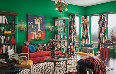
Though I love bold colors, I realize they aren’t for everyone. But if you adore vibrant shades, explore looks by mixing bold colors until the room comes to life for you.
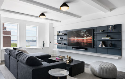
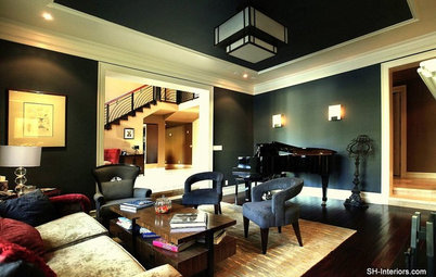
This living room design pulls together a bunch of bold colors, creating a statement wall.
This living room design pulls together a bunch of bold colors, creating a statement wall.
If you lean toward neutrals, enliven your space by testing out accent colors. Patterned fabrics, rugs and art are great items to swap out to introduce color into your space.
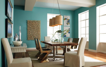
If you aren’t sure about a lot of color, start with a calm, comfortable color, such as blue.
If you aren’t sure about a lot of color, start with a calm, comfortable color, such as blue.
If you’re feeling more adventurous and are up for my challenge that anything can “go together,” pair your earth-toned room with a vibrant color, such as hot pink. This will instantly make the neutral space feel joyful and energized.
2. Don’t rule out dark colors. I find that a lot of clients shy away from dark colors in their home design, especially on the walls.
It’s important to remember that using rich and dark colors doesn’t mean your space will look dark. Instead consider how a dark color can make your space feel warm, rich and dramatic.
The key to using dark colors in design is being mindful about the shade you choose, as well as how you feature the color in the room.
Choosing the perfect color is an art. You have to consider not only how you want to feel in your space but also what’s practical for it.
Choosing the perfect color is an art. You have to consider not only how you want to feel in your space but also what’s practical for it.
First, think about how much natural light enters the room. Take a look at where the light is coming from: directly through the windows, indirectly through a doorway or not at all.
If there’s loads of natural light, painting your walls a rich, dark shade of gray, blue, purple or even black can create a space that feels light and welcoming.
Basically, the more light you have, the more comfortable you can be with making a dark choice.
How to Choose a Paint Color You Can Live With
Once you’ve decided on a dark wall color, consider pairing it with light flooring, which will brighten and balance the space. This might involve installing new flooring or simply rolling out a light-colored rug.
If you already have light-colored floors throughout your home, dark walls can up the lushness of the room and ground the space.
If you already have light-colored floors throughout your home, dark walls can up the lushness of the room and ground the space.
You can also highlight one wall or part of the wall, such as the area above the wainscoting in your dining room.
If you feel that dark walls still might be too dramatic for your taste or if you don’t have much natural light, you can choose dark furniture or frame a feature of the room in a dark color, such as the fireplace.
See What You Can Do With a Black Feature Wall
See What You Can Do With a Black Feature Wall
3. Pale colors can make a statement too. Pastel colors have definitely made a comeback, and I’ve learned that they’re perfect for people who want to incorporate color but don’t want their home to come across as bold.
While pastels will come across as fresh and vibrant, they still maintain an overall calming, comfortable and more neutral vibe.
While pastels will come across as fresh and vibrant, they still maintain an overall calming, comfortable and more neutral vibe.
Paler colors like yellow, green and blue can be a fabulous first step when exploring color for your home, as they aren’t too far removed from more neutral and earthy tones.
For many years, it seemed as though pastels were really used only in children’s rooms and other kid-friendly spaces. That’s not the case anymore.
The resurgence of paler colors used in contemporary ways offers up fresh ideas for these happy and playful colors in your non-kid-centric living spaces.
The resurgence of paler colors used in contemporary ways offers up fresh ideas for these happy and playful colors in your non-kid-centric living spaces.
The softer feel of these light and airy tones also nicely balances out a room that has a dark element, such as a piano or dark piece of furniture.
One way to add in a pastel color is with furniture, but if that’s too much of a dramatic change, try pastel drapes. They’re a wonderful way to add color and freshness in your space. They create a soft, warm and welcoming feel without making too much of a statement.
4. Color isn’t an all-or-nothing affair. When I meet with clients, color is usually the one area of home design they feel the least confident about. They are unsure about choosing and pairing colors, and they think they have to choose either a colorful space or no color at all.
My advice for them: Don’t worry, because color isn’t an all-or-nothing option.
My advice for them: Don’t worry, because color isn’t an all-or-nothing option.
Instead, it’s about finding the right mix that reflects who you are and how you want your home to feel.
There are infinite options in that big, beautiful color spectrum, and trust me when I say that you can find a wide array of colors that will work in your home design — if you take the time to explore.
There are infinite options in that big, beautiful color spectrum, and trust me when I say that you can find a wide array of colors that will work in your home design — if you take the time to explore.
Your home doesn’t need to be stacked with color for you to feel the effects. Placing one colorful furniture piece in a predominantly neutral room can make a beautiful difference in the feeling and overall design of your space, while still keeping your overall palette simple.
5 Daring Sofa Colors to Make Your Living Room Come to Life
5 Daring Sofa Colors to Make Your Living Room Come to Life
Or pick several smaller items like throw pillows, art or books and make them a fresh new color. These changes also affect the room’s look without creating a permanent color addition.
In choosing your color focal pieces, you can go as bold or as soft as you like. You don’t have to have a technicolor dream, unless you want to.
I always tell my clients that there really are no right or wrong choices when it comes to color. It’s all about creating a space that brings a smile to your face. And I can’t wait to see color making people happy in 2018.
Your turn: What did you learn about color in 2017? Share your thoughts in the Comments.
More
Will These 10 Colors Be Big in 2018?
Read more stories about color
Other Resources on Houzz
Find an interior designer to help with your next project
Find home decor

I’ve always been a lover of big and bold color. But color can sometimes have a bit of a bad reputation. People often think that creating a colorful home means it needs to look like a technicolor dream, but the truth is, color can be bold or muted, neon or pale, rich or neutral, and anything in between.