6 Powerful Living Room Colour Couples
Create a dynamic living space by decorating with hues that sit on opposite sides of the colour wheel

If your living area’s feeling a bit lacklustre, switching your safe, humdrum colour scheme for an eye-catching, clashing palette is a surefire way to transform it into a space that wows. For those who aren’t sure what hues work well together, let the colour wheel be your guide. Complementary colour pairings – that is, contrasting hues that sit opposite each other on the colour wheel – are the some of the easiest to create, and they pack the biggest visual punch. Here are six tried-and-tested complementary colours that will work a treat in your living space.
If a lively pink and green palette is a little too loud for your taste, opt for dustier renditions of the hues instead, like the muted teal and blush pink tones used in this elegant living room. Although the scheme is more restrained in style than the previous one, it still makes a bold statement, while infusing the area with an air of sophistication.
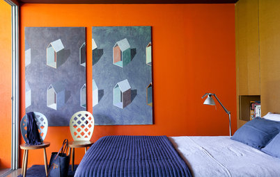
2. Blue and orange
While these two hues are definitely an odd couple, they’re actually a match made in colour heaven, as they seem brighter and more intense when paired together. In this chic living room, the blue tone oozes cool, moody style, while orange adds zest and a playful vibe.
If you desire a brighter, bolder look, switch it up and make orange your base colour instead. Just be sure to add slicks of black, white and/or neutrals to the space, to cut through the high-voltage colour and provide balance.
Gumamela plain pillow: The Pillow Collection
To tone the intensity of your pairing down a notch, opt for one shade that’s loud and proud and team it with the pastel version of its complement colour. Varying the intensity of the hues will add another layer of contrast to the scheme, plus it will ensure the striking space doesn’t look too out-there.
Rug: Dash and Albert; armchair: Designers Guild; ottoman: Barclay Butera,
Rug: Dash and Albert; armchair: Designers Guild; ottoman: Barclay Butera,
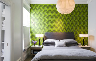
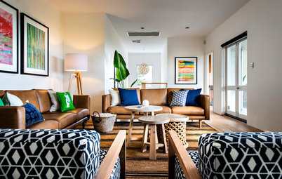
3. Purple and yellow
If you had any doubt that a cheerful yellow and purple combo would work, this ultra-modern living zone will surely convince you otherwise. This dramatic pairing not only makes a bold design statement, but also enhances the atmosphere of the area, as both hues are uplifting, spark creativity and promote happiness.
One downside of this dynamic combo is that it can sometimes take on a cutesy and childish look. A simple way to prevent this is to use a deep, rich purple as your base colour and accessorise with sunny or citrusy yellow accents.
21 ways with the colour purple
4. Red and green
While many people tend to steer clear of this Christmassy colour combo, it’s a pairing that can work a treat, if done right. The trick to pulling off the striking scheme is to use a white or neutral backdrop, along with hearty lashings of black to tone down the Yuletide vibe. You should also avoid using sparkly or metallic accents, as they will make any red-on-green palette take on a festive air, too.
Red and green – should always be seen?
Another trick that will help you pull off this tricky combo with aplomb is to pair a look-at-me red with an earthy, slightly dirty green or visa versa – think ruby red and olive (which is used in this eclectic living space) or emerald and rust. This will ensure the colour combo exudes subtle sophistication and a mellow vibe, rather than appearing Christmasy in style.
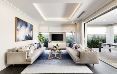
5. Blue-violet and yellow-orange
Struggling to chose between a blue and orange, or purple and yellow palette? The easiest solution is to enjoy the best of both worlds. Here, an arresting blue violet accent wall and cheery yellow-orange Eames chair work in tandem to add depth, character and energy to the otherwise monochrome space. Take note of how pops of blue violet are peppered around the room to tie the look together.
Struggling to chose between a blue and orange, or purple and yellow palette? The easiest solution is to enjoy the best of both worlds. Here, an arresting blue violet accent wall and cheery yellow-orange Eames chair work in tandem to add depth, character and energy to the otherwise monochrome space. Take note of how pops of blue violet are peppered around the room to tie the look together.
6. Teal and tangerine
A blue and orange combo with a twist, teal and tangerine are another great high-drama duo. If these stop-and-stare brights threaten to overpower your living space, take a leaf out of this contemporary living room’s playbook and introduce neutrals and punchy patterns, with generous lashings of white to help temper the colour-charged scheme.
Or you might prefer a scheme that’s more soothing in style. If so, a chalky turquoise and coral palette is a great alternative, especially if you live on the coast or have a beachy-style abode.
Teal chair: World Market
See more of this living room
TELL US
What’s your favourite complementary colour combo? Share your thoughts in the Comments.
MORE
5 Fool-Proof Steps to a Spot On Colour Scheme
How to Style a Colourful Couch
8 Mesmerising Colour Palettes for Living Rooms
What’s your favourite complementary colour combo? Share your thoughts in the Comments.
MORE
5 Fool-Proof Steps to a Spot On Colour Scheme
How to Style a Colourful Couch
8 Mesmerising Colour Palettes for Living Rooms

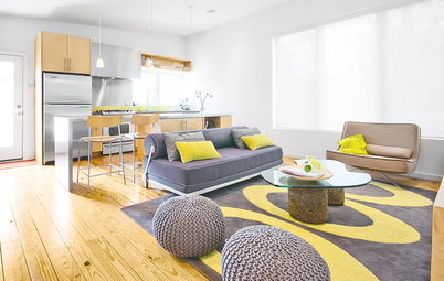
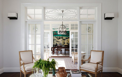
One of my favourite complementary colour match-ups – an eye-popping pink and green palette – will instantly energise any living zone. Emerald and hot pink are my shades of choice, but as you can see here, lime works just as well and pops nicely against the lipstick-like hue.
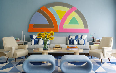
If you’re feeling daring, take cues from this striking living area and add a punch of cheerful orange to your pink and green space. This is an example of a split-complementary scheme, created by pairing your base hue (green) with the two colours (pink and orange) that sit next to its complement (red) on the colour wheel.
Decorate with pink for a grown-up look