Before and After: 3 Kitchen Remodels That Kept the Same Footprint
See how pros transformed these kitchens without changing their sizes or layouts

Sometimes a kitchen works well but looks dated, or its cabinets or appliances are worn beyond repair. Or sometimes moving plumbing or walls simply isn’t in the budget. Whatever the reason, often it’s sensible to keep a kitchen’s size and shape essentially the same as the original during a renovation — but that’s not to say it can’t feel like an entirely new room. Read on to see three renovations that illustrate the point.
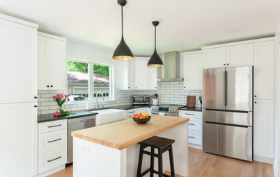
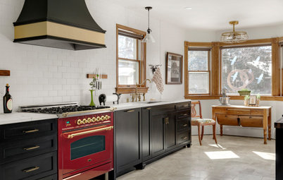
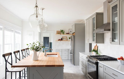
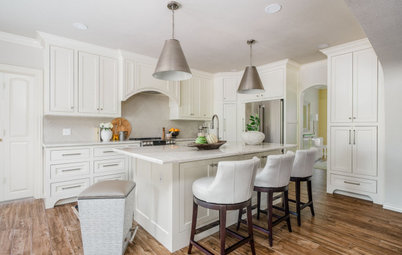
After: Getter had the perimeter cabinets, walls, ceiling and trim painted a warm white (Chantilly Lace by Benjamin Moore) and the island base a neutral warm gray (Dorian Gray by Sherwin-Williams). The slightly darker color on the island gives it depth and makes it a focal point, Getter says.
The island paint also ties in well with the gray veins in the marble-look quartz countertops. Granted, the “before” snapshot isn’t as well lit as this pro photo, but the new mostly white counters really do give the room a much brighter overall look.
Five-inch pulls better fit the scale of the largest drawer fronts and 3-inch pulls are scaled appropriately for the smaller drawers and cabinets. The hardware’s honey bronze finish coordinates with the hand-rubbed antique brass finish of the new pendant lights. The large cone-shape lights better fit the scale of the room and make a modern but not overpowering statement.
Shop for kitchen and cabinet lighting
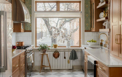
Another relatively small change with a big payoff was swapping out the flat, oversize subway tile on the backsplash for 4-by-4-inch white zellige tiles with a warm gray grout. Their irregular, handmade quality and luminous finish add a lot of character while keeping the light, bright color scheme.
Getter suggested the modern bar stools with transparent seats seen in the previous photo since they don’t compete with the tile or the leather chairs in the adjacent dining room.
Read more about this remodel
Getter suggested the modern bar stools with transparent seats seen in the previous photo since they don’t compete with the tile or the leather chairs in the adjacent dining room.
Read more about this remodel
Photos by Stacy Zarin Goldberg
2. Bland to Blue
Kitchen at a Glance
Who lives here: A family of five
Location: Capitol Hill area of Washington, D.C.
Size: 220 square feet (20 square meters)
Designer: Sara Swabb of Storie Collective
Before: When the new owners of this Washington, D.C., row house hired interior designer Sara Swabb, they were prepared to rip out the home’s modern-farmhouse-style kitchen, which neither fit their personalities nor the house’s Victorian architecture.
But Swabb saw a lot of potential in the recently renovated kitchen, whose layout worked fine for the family. And she felt saving the cabinets and appliances would be a more sustainable choice too.
Find an interior designer on Houzz
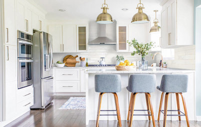
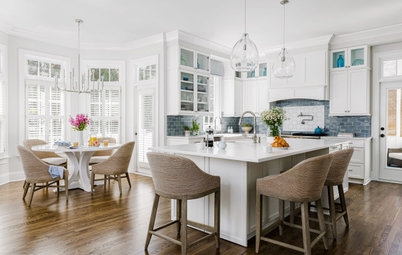
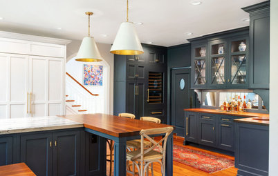
After: In addition to wanting the kitchen’s style to honor the home’s architecture, the homeowners wanted it to reflect modern European and California influences.
Swabb refreshed the cabinets with Farrow & Ball’s Oval Room Blue and installed new honed marble countertops. She replaced farmhouse-style cabinet hardware with more era-appropriate aged brass handles and pulls, and new light fixtures made of milk glass and antique brass nod to the Victorian era too.
She also replaced the reclaimed-wood cladding on the peninsula with a custom fluted surround painted to match the cabinetry.
To add some earthy California vibes, Swabb chose rattan counter stools for the peninsula and replaced the flat, oversize subway tile with a mix of square and rectangular hand-formed, hand-painted terra-cotta tiles from Clé.
Shop for kitchen cabinet and drawer hardware
The new custom hood also has a natural texture thanks to its plaster limewash finish.
They kept the other existing appliances and donated the old vent hood, as well as the faucet, cabinet hardware and countertops, to charitable organizations for reuse in other homes.
Read more about this remodel
They kept the other existing appliances and donated the old vent hood, as well as the faucet, cabinet hardware and countertops, to charitable organizations for reuse in other homes.
Read more about this remodel
“After” photos by Sean Carson Photography
3. Knotty to Nice
Kitchen at a Glance
Who lives here: A professional couple and their dog
Location: Riverbank, California
Size: 165 square feet (15 square meters)
Designer: Lindsay Kjellberg of LHK Interiors
Builder: Scott Monday of Kitchen & Bath Crate
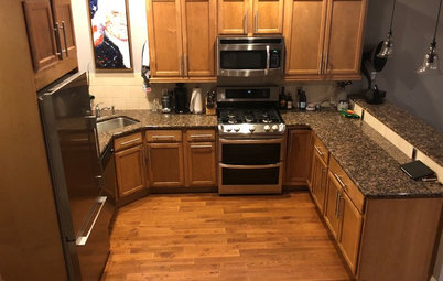
Before: When purchasing their home, the owners of this 1990s kitchen fell for its copper hood. But they wanted to replace the aging appliances and just about every finish, from the difficult-to-clean brick flooring and knotty oak cabinets to the clashing red walls and laminate countertops.
They hired builder Scott Monday and designer Lindsay Kjellberg to give the room a clean, contemporary look.
3. Knotty to Nice
Kitchen at a Glance
Who lives here: A professional couple and their dog
Location: Riverbank, California
Size: 165 square feet (15 square meters)
Designer: Lindsay Kjellberg of LHK Interiors
Builder: Scott Monday of Kitchen & Bath Crate
Before: When purchasing their home, the owners of this 1990s kitchen fell for its copper hood. But they wanted to replace the aging appliances and just about every finish, from the difficult-to-clean brick flooring and knotty oak cabinets to the clashing red walls and laminate countertops.
They hired builder Scott Monday and designer Lindsay Kjellberg to give the room a clean, contemporary look.
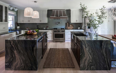
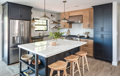
After: Like the two previous projects featured here, this kitchen kept its existing footprint, walls and layout, and its sink, hood, cooking surface and dishwasher locations remained the same.
But unlike the others, it was stripped of everything but its hood. Then the remodeling team installed more space-efficient custom Shaker-style cabinets, painted in tones that complement the copper hood: green-gray (Adaptive Shade by Sherwin-Williams) for the lowers, light gray for the uppers ((Worldly Gray by Sherwin-Williams) and dark green on the island base (Rosemary by Sherwin-Williams). They paired the green with warm red oak flooring, creamy walls, a white quartzite countertop and a white zellige tile backsplash.
But unlike the others, it was stripped of everything but its hood. Then the remodeling team installed more space-efficient custom Shaker-style cabinets, painted in tones that complement the copper hood: green-gray (Adaptive Shade by Sherwin-Williams) for the lowers, light gray for the uppers ((Worldly Gray by Sherwin-Williams) and dark green on the island base (Rosemary by Sherwin-Williams). They paired the green with warm red oak flooring, creamy walls, a white quartzite countertop and a white zellige tile backsplash.
The kitchen’s major appliances also were upgraded and, in a couple of cases, relocated. For example, the team swapped the gas cooktop for a 36-inch standard-depth stainless steel dual-fuel range and installed a paneled 36-inch French door refrigerator in a spot previously occupied by wall ovens (not pictured). There’s also a new microwave and warming drawer in the island and, hanging above it, pendant lights with hammered copper shades.
Read more about this project
More on Houzz
Read more kitchen stories
Browse kitchen photos
Hire a kitchen remodeler
Shop for kitchen products
Read more about this project
More on Houzz
Read more kitchen stories
Browse kitchen photos
Hire a kitchen remodeler
Shop for kitchen products

1. Heavy to Light
Kitchen at a Glance
Who lives here: Rob and Elizabeth Shands and their two young children
Location: Austin, Texas
Size: 330 square feet (31 square meters)
Designer: Cameron Getter Design
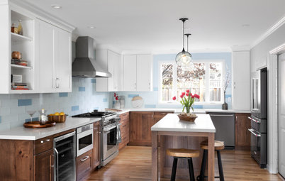
Before: This “before” photo of Rob and Elizabeth Shands’ modern-farmhouse-style kitchen may look like an “after,” and in fact they really liked most of its big-ticket elements, including its reclaimed-wood ceiling beams, vertical shiplap walls, engineered wood flooring and top-level appliances. But the white cabinet paint was chipping and peeling and the family felt the matte black countertop looked too heavy. Plus, the small pendant lights and cabinet hardware weren’t the right scale for the space.
The couple hired designer Cameron Getter, who made subtle but impactful changes that would correct the proportions and lend personality and texture to the kitchen.