Decorating With Tertiary Colours
Tertiary colours can be bold and exciting, and when paired with a complementary colour, create a striking impression

Some of my favourite hues are tertiary colours. There are a couple of schools of thought on how they are made: one is that they are colours produced by mixing two secondary colours together, producing colours with names such as olive/khaki, russet/brown and teal/slate; the other definition is that they are colours achieved by mixing a secondary and an adjacent primary on the colour wheel. This classification has six colours; they are vermilion (red-orange), amber (yellow-orange), magenta (red-violet), indigo (blue-violet), teal (blue-green) and lime (yellow-green). These are also sometimes referred to as intermediate colours, and are what I am focusing on here.
You need a little bit of confidence when using tertiary colours to decorate your home, but as long as you remember the ‘less is more’ rule, these exciting colours can be used to inject life into an otherwise drab interior, or at least one that is too dependent on neutrals. Check out these six bold and beautiful tertiary colours and see how you can work with them, the next time you update your decor.
You need a little bit of confidence when using tertiary colours to decorate your home, but as long as you remember the ‘less is more’ rule, these exciting colours can be used to inject life into an otherwise drab interior, or at least one that is too dependent on neutrals. Check out these six bold and beautiful tertiary colours and see how you can work with them, the next time you update your decor.
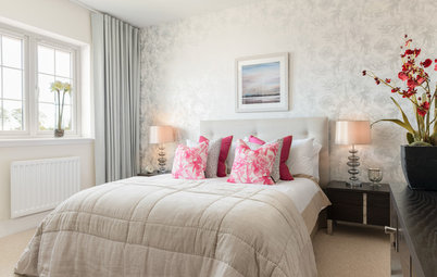
Pair it with: To make a room that features coral more masculine, consider using coral and navy together, with finishes, fixtures or furniture in wood or metal. Conversely, enhance the colour’s softer, more feminine side by teaming it with aqua and white for a fresh and relaxing look, particularly in a bedroom.
More decorating duos to pair up
More decorating duos to pair up
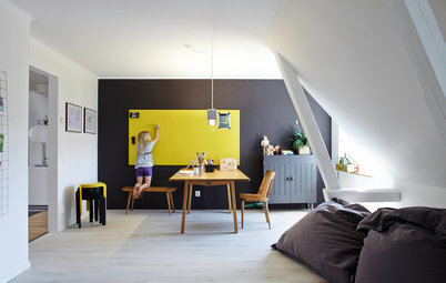
Amber
If you’re a fan of mid-century style interiors, then you’ll be no stranger to amber. It’s created when yellow and orange are mixed, although some also call this colour mustard. But colour theorists might argue that mustard has a dash of black or grey in the mix.
As with all tertiary colours, when it comes to this hue, less is often more. Amber is a very strong colour that can be overbearing and loud if it’s not used in the right way. Using a yellow-orange is a great idea in a lounge area or in a home office space, as warm colours, such as red, yellow and orange, are mentally stimulating hues that get people thinking and talking.
Pair it with: Pairing amber with a cooler neutral, such as grey, will help to subdue its intensity. Look for ambers with a golden, almost creamy, tone for something a bit easier on the eye. In a monochrome setting, pair warm amber, or its dirtier cousin mustard, with cool-coloured teal. Use both as accent colours for incidental homewares and accessories, such as throws, cushions and lamps.
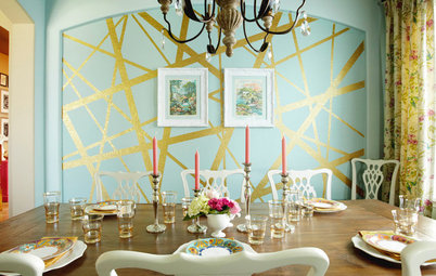
Magenta
Mixing the secondary colour of violet with primary colour red will create a deep vibrant pink called magenta. This is a dramatic yet fun colour that can be used to create a daring impact, as seen here when used to paint a front door. If the effect is too much, dampen down the intensity with a neutral such as grey, as in this door frame, cream (the house colour) or with black.
Mixing the secondary colour of violet with primary colour red will create a deep vibrant pink called magenta. This is a dramatic yet fun colour that can be used to create a daring impact, as seen here when used to paint a front door. If the effect is too much, dampen down the intensity with a neutral such as grey, as in this door frame, cream (the house colour) or with black.
Pair it with: I love an interior that features vibrant colour, so if like me you like the intensity of warm colours, team magenta with bright yellows and oranges for a striking, somewhat exotic look.
More bold colour schemes
More bold colour schemes
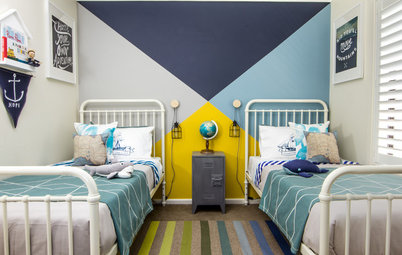
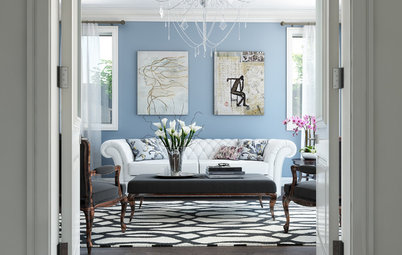
Indigo
This is a luxurious, spiritual and relaxing colour. When we think of this hue, we think of its historical associations with royalty, wealth and prosperity.
Indigo works great in almost any room, but particularly as an accent colour. Balance its intensity with monochromes, such as black and white, and gold accents, to create a dramatic and moody feeling as seen here.
Pair it with: To add instant sophistication to indigo, add golden-toned accents for an even more regal look.
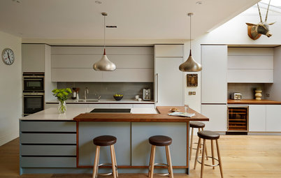
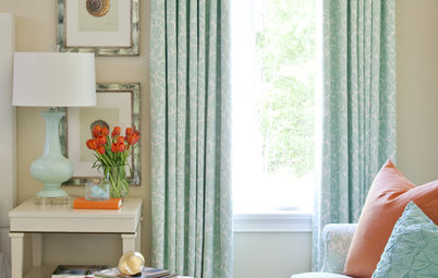
Teal
As the colour blue is known for its peaceful and tranquil qualities and green symbolises nature and new beginnings, these two colours combined as the tertiary colour teal produce a most agreeable effect when used in the home.
Teal is muted, sophisticated and relaxing. It brings to mind calm tropical waters and is often a colour of choice in bathrooms. When teamed with white towels and marble tiles, it can create a clean and fresh look.
Pair it with: To create a tranquil and relaxed living space, combine teal with natural timbers, tan leathers and dove grey textiles.
Living room colour couples
Living room colour couples
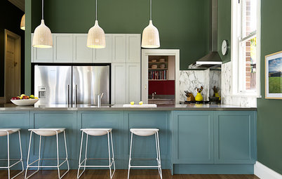
Lime
The colour lime, which gets its name from the citrus fruit, is a tertiary colour achieved by mixing yellow and green together. The colour green makes us feel safe and has a calming affect, while yellow is energising, happy and warm. When mixed together, the result is lime: a fresh, fun yet calming tertiary colour.
The colour lime, which gets its name from the citrus fruit, is a tertiary colour achieved by mixing yellow and green together. The colour green makes us feel safe and has a calming affect, while yellow is energising, happy and warm. When mixed together, the result is lime: a fresh, fun yet calming tertiary colour.
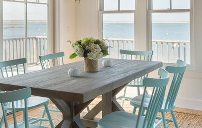
Pair it with: Add warmth by positioning lime green alongside natural wood tones, as pictured in the cabinetry of this kitchen here. Or combine lime with crisp bright white to create a refreshing look. You can also offset the acidic impact of lime green, by adding beachy blues to produce a coastal feel.
View a gallery of beach style photos
View a gallery of beach style photos
Pair them all together
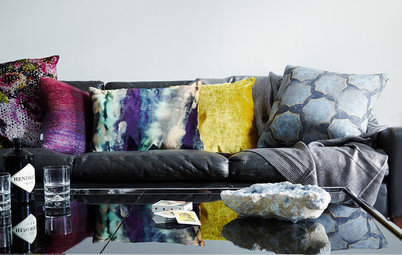
Tertiary colours are bold, bright and fun, and are even more interesting when mixed together. Seen above, lime green and magenta make perfect partners, but there are also touches of indigo and teal in the mix.
TELL US
What do you think of tertiary colours; would you use them in your home or are they too bold for your home’s colour scheme? Tell us in the Comments.
MORE
How to Be Truly Confident With Colour
Colour Metamerism: When Colours Are Not What They Seem
Does Your Home Need a Colour Consultant?
Vermilion is an example of a red-orange tertiary colour which is a mix of orange and red in equal measure. A more subtle and more commonly seen version of vermilion is coral, which is a welcoming colour that radiates positive energy. Depending on the shade of the coral used or the lighting in the room, it can appear more pink or orange. It’s quite a cheery colour too, which makes it ideally suited to be used in both contemporary or traditional decorating schemes.