Houzz Tour: A 1960s Terraced House is Given a Fresh New Makeover
An ex-council terraced house is redesigned and reinvigorated for modern family life

When architects Emily and Frederik Rissom moved into their compact house on this 1960s resident-managed ex-council estate, it was in an acceptable state, but needed a thorough interior re-think and a reconfigured front extension to adapt it to 21st-century living.
“It was in a liveable condition, but over the course of the years we wanted to undo DIY improvements and refurbish starting back at the core,” explains owner and architect Frederik Rissom of R2 Studio Architects Ltd. “The 1980s PVC windows had reached the end of their performance, ventilation was poor and the fittings were starting to fail. So a big overhaul was needed.”
“It was in a liveable condition, but over the course of the years we wanted to undo DIY improvements and refurbish starting back at the core,” explains owner and architect Frederik Rissom of R2 Studio Architects Ltd. “The 1980s PVC windows had reached the end of their performance, ventilation was poor and the fittings were starting to fail. So a big overhaul was needed.”
At the front of the house, there had originally been an external storage shed for coal.
“The previous owners had converted this into an internal space, but it was cold and cramped with a narrow entrance porch and a 1.9m ceiling height. Being almost 2m tall this really didn’t work for me in particular,” smiles Rissom.
The solution was to enlarge the front space by just six square metres, and extend it upwards to the ceiling height of the rest of the house, matching the existing concrete feature lintels on the outside.
“We were clear that the alterations had to work with the grain of the existing house to be successful,” he adds. “We needed planning permission, as well as approval from the Dulwich Estate [the charity that own the freehold of the estate], who are essentially acting as a local conservation organisation.”
When they moved in, the house wasn’t insulated, and given its exposed location at the end of the terrace, it lost significant heat.
The original front porch was so poorly built that it was demolished in just one day.
“When we took the existing windows out, we noticed they hadn’t been screwed in, having only been fixed by building foam,” recalls the architect. “According to our builder, this was quite common in the cowboy days of double-glazing in the 1980s.”
“When we took the existing windows out, we noticed they hadn’t been screwed in, having only been fixed by building foam,” recalls the architect. “According to our builder, this was quite common in the cowboy days of double-glazing in the 1980s.”
The reconfigured new entrance is tall and bright and provides space for a much-needed studio, cloakroom and utility area, hidden behind an oversized sliding door.
Now there is space for the young family to store prams, scooters, school bags and other family essentials.
“The entrance is flooded with light through an oversized flush roof light,” says the architect. “The external walls were repointed and insulated internally, while new slim-frame windows maximise daylight.”
Orange rubber flooring, Dalsouple.
A bespoke open shelf lets in daylight from the hall, while screening the kitchen from the entrance.
The hall cupboards were built from Ikea base units with bespoke full-height, ash-veneered plywood doors.
The large, modern windows allow natural light to flood into the house.
“We had purposefully been looking for a midcentury house as we are keen on the bright spaces these houses offer, and the more open-plan arrangement suits our lives better,” he adds.
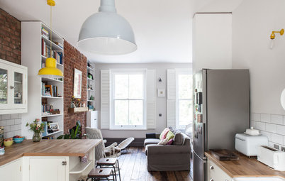
Peek inside this 1960s terrace with a Scandi makeover
The hall cupboards were built from Ikea base units with bespoke full-height, ash-veneered plywood doors.
The large, modern windows allow natural light to flood into the house.
“We had purposefully been looking for a midcentury house as we are keen on the bright spaces these houses offer, and the more open-plan arrangement suits our lives better,” he adds.
Peek inside this 1960s terrace with a Scandi makeover
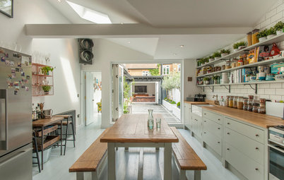
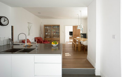
The view from the entrance into the modern, open-plan dining and kitchen area and through to the living zone. The space was originally 44 sq m, but is now 50 sq m with the new entrance.
“We love how by creating a more generous entrance space, the overall area now feels larger, and as a result, the kitchen has now moved into the centre of the open-plan space (despite not actually moving!),” says Rissom. “Overall, the project tied all the different areas of the house together better.”
The bespoke shelf creates a place for shoe and coat storage, while allowing a glimpse into the kitchen behind.
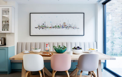
Bright red Eames DCW dining chairs by Herman Miller are paired with a bespoke bench, based on the design of the famous Polo chair by Robin Day in the 1970s.
“We originally had two of these Polo chairs with their distinct pattern of holes and matched the bench to them.”
Bulkhead lights illuminate the large roof light, turning it into a lantern at night.
“We love how by creating a more generous entrance space, the overall area now feels larger, and as a result, the kitchen has now moved into the centre of the open-plan space (despite not actually moving!),” says Rissom. “Overall, the project tied all the different areas of the house together better.”
The bespoke shelf creates a place for shoe and coat storage, while allowing a glimpse into the kitchen behind.
Bright red Eames DCW dining chairs by Herman Miller are paired with a bespoke bench, based on the design of the famous Polo chair by Robin Day in the 1970s.
“We originally had two of these Polo chairs with their distinct pattern of holes and matched the bench to them.”
Bulkhead lights illuminate the large roof light, turning it into a lantern at night.
The boldly-coloured yellow kitchen forms the heart of the home and makes reference to the original period of this 1960s house.
“Emily was the main driving force with the colour concept,” explains the architect. “There seems to be a myth that people expect neutral colours as they are afraid that their taste might change. We bought a green sofa 12 years ago and still love it as much as we did then. This gave us the confidence that we can live with a yellow kitchen. This is complemented by more chromatic blues and natural wood surfaces. Life is too short to be beige!”
Kitchen, In-toto. Caravaggio pendant lights, Lightyears.
The U-shaped kitchen layout creates a natural peninsula, which is used on a daily basis for preparing food and family cooking. It also doubles as a breakfast bar.
White quartz worktops – with a practical, integrated upstand that extends up the wall – bounce daylight around the kitchen.
Worktops, Silestone.
White quartz worktops – with a practical, integrated upstand that extends up the wall – bounce daylight around the kitchen.
Worktops, Silestone.
A mix of Siemens and Neff built-in appliances maintain the streamlined vibe.
Discover why you should add a splash of yellow to your interior
Discover why you should add a splash of yellow to your interior
The yellow colour-block units are set against a blue panelled wall, which hides a pantry.
“We hollowed out the chimney breast and inserted a walk-in larder, which also houses the boiler,” says Rissom. “It was all about making use of every cubic inch in the house, as the plot only offers limited potential for extensions.”
The Fresnel ceiling lamps are by Oluce and designed by Joe Colombo in the 1960s – a subtle nod to the original architecture of the house.
The eye-catching geometric-print splashback, made from encaustic tiles handcrafted in Spain, adds a decorative accent to the colour-blocking.
Tiles, Alhambra Home.
Tiles, Alhambra Home.
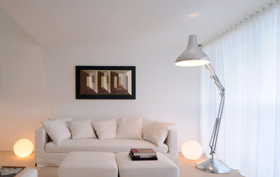
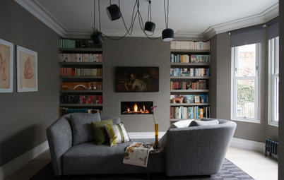
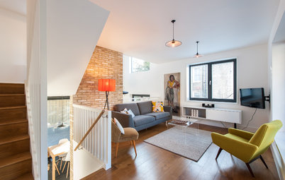
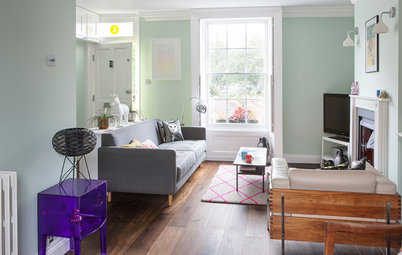
The open-plan living room seamlessly connects to the dining area and kitchen.
“The original 1960s open-riser stairs were painstakingly refurbished, and the original concrete shelf exposed and sealed,” says Rissom.
“We made the ceiling light ourselves using a coloured cable, hooks from B&Q, cable clips and a simple, porcelain lamp holder.”
Green sofa, Hitch Mylius.
“The original 1960s open-riser stairs were painstakingly refurbished, and the original concrete shelf exposed and sealed,” says Rissom.
“We made the ceiling light ourselves using a coloured cable, hooks from B&Q, cable clips and a simple, porcelain lamp holder.”
Green sofa, Hitch Mylius.
The family living room has been overhauled with large, modern windows and over-sized French doors stretching 2.4m high.
“These connect to the compact garden and patio area, which in the summer acts as an additional living room,” Rissom says.
“The previous owners installed the oak flooring, but we sanded it to take the yellow lacquer off and remove the chamfered edges. We then stained it with Oslo oil and gave it a clear matt non-yellowing oil top coat. The result is a darker floor, which gave us better colour contrast.”
Windows and doors, Velfac. Purple Bird chair designed by Harry Bertoia for Knoll.
The open-plan ground floor can be glimpsed through the original open-riser stairs.
“We completed two neighbours’ houses and gave advice to a handful more,” adds the architect. “This was a result of consulting estate-wide (there are 115 houses) with the aim of finding design solutions that fit in with the original architecture, which we love.”
“We completed two neighbours’ houses and gave advice to a handful more,” adds the architect. “This was a result of consulting estate-wide (there are 115 houses) with the aim of finding design solutions that fit in with the original architecture, which we love.”
White walls and oak floors create a neutral backdrop and enhance the fluidity of the space.
“The biggest challenge was that we were not able to move out during the works and did not have a lot of capital to spend, so we had to carefully break down the refurbishment and extension project into separate stages,” explains Rissom. “Initially, we landscaped the garden, then the upper landing and one of the bedrooms. This was followed by the bathroom and the other bedrooms, then the windows at the rear, before finally starting the larger project around the entrance and kitchen.”
“The biggest challenge was that we were not able to move out during the works and did not have a lot of capital to spend, so we had to carefully break down the refurbishment and extension project into separate stages,” explains Rissom. “Initially, we landscaped the garden, then the upper landing and one of the bedrooms. This was followed by the bathroom and the other bedrooms, then the windows at the rear, before finally starting the larger project around the entrance and kitchen.”
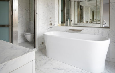
The family bathroom was modernised but retains a 1960s feel with a monochrome scheme.
Dark matt vertical tiles contrast with small-scale white hexagonal mosaics.
Tiles, Walls and Floors.
Dark matt vertical tiles contrast with small-scale white hexagonal mosaics.
Tiles, Walls and Floors.
A bright and fun-filled child’s bedroom is all set up for playing and relaxing in.
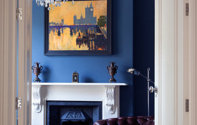
The main bedroom has a yellow feature wall and a bespoke fitted shelving unit. A backdrop of geometric-print wallpaper is based on the original carpet pattern for the Royal Festival Hall.
“We were honoured to have been awarded the New London Architecture ‘Don’t Move Improve’ award for best Historic Intervention for our house,” says Rissom. “It is nice to see your design work recognised in this way, but especially as the award recognised the value of mid-century houses, which are coming of age now and being taken seriously as needing conservation.”
Net & Ball wallpaper, Southbank Centre Shop.
What do you think of the reconfiguration of this 1960s terrace? Share your thoughts in the Comments below – and please remember that you’re discussing someone’s home!
Who lives here Architects Emily and Frederik Rissom and their young children, aged two and six
Location south London
Property 1960s end-of-terrace house
Size Three bedrooms and one bathroom
Architect Frederik Rissom of R2 Studio Architects
The Rissoms were keen to retain the original character and fundamental layout of the 1960s terrace. They had designed for identical houses before, so knew their options from the outset.
“These 1960s houses are now over 50 years old and had become subject to conservation works,” explains architect Frederik Rissom. “In this case, the structural elements survived in good condition, yet the building needed an environmental performance upgrade as well as adaptations to modern living.
“Rather than fundamentally changing the layout, the approach has been one of small interventions, with the aim to retain the original feel of modernism.”