Houzz Tour: A Petite Flat is Made Fit for a Family of Four
Clever reconfiguration created extra rooms in this cramped flat, allowing its long-time owners to stay rather than move

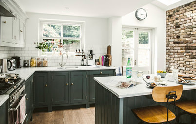
A couple had lived in this two bedroom, one bathroom flat for 10 years, during which time their family had outgrown the space. But they loved the location, in a fairly central part of London, and to move somewhere bigger they’d have had to leave the area. “The brief was about allowing them to stay there,” architect Tim O’Callaghan of Nimtim Architects explains.
His challenge? To turn this small urban flat into a comfortable home with three bedrooms, two bathrooms, and a living space the family could all enjoy for years to come – no mean feat considering the entire floorspace was just 85 square metres. See how he did it…
His challenge? To turn this small urban flat into a comfortable home with three bedrooms, two bathrooms, and a living space the family could all enjoy for years to come – no mean feat considering the entire floorspace was just 85 square metres. See how he did it…
A full-width extension was also not an option, largely because there were more restrictions around the boundaries on one side than the other. “It’s a very urban context and quite enclosed,” Tim explains, and the boundaries on the right-hand side are the backyards of commercial properties. “So we could extend on one side much further, as it wouldn’t entail a loss of light or overlook neighbours,” he says.
This photo shows the resulting, L-shaped extension from the outside.
You can see into what is now a dining space behind the large glass doors on the left. Next to this is a full-height window at the end of a corridor that has bedrooms off it. The large window on the right belongs to one of the children’s new bedrooms.
“We always spend a lot of time talking to clients about how they live and how they might live in the future,” Tim says. During these conversations, he and the family determined that what they needed was a family space that was open, but that also had defined zones within it, giving family members a sense of their own space. “With kids on the cusp of adolescence, this seemed especially relevant,” he says.
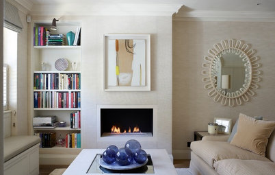
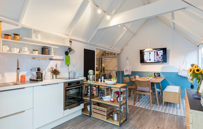
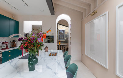
The original house (not including the old extension) ended roughly at the point where the vertical wood details are now. The living area is on the left, while the kitchen begins with the island, which forms the central hub in the room. The owners have since added bar stools, so it works as a seating area.
Because it’s such a small space (the communal area covers 35 sq m), Tim and the owners worked with a limited palette to keep the backdrop uncluttered. White forms the background, with the rich timber accents and striking green concrete worktops gently breaking things up.
Pale cork flooring throughout the open-plan section of the house creates a calm, unified effect. Tim also had underfloor heating installed, which means there’s no need for radiators, which take up valuable floor space.
Camada Corka cork floorboards, The Colour Flooring Company. Bespoke worktops, Mortise Concrete.
The kitchen units comprise, from left to right, a fridge-freezer; the oven; cupboard storage; a hob with an extractor above it, and more cupboard storage top and bottom. The kitchen units are bespoke and feature stylish triangular handles.
Whether to have a sink or a hob on an island is very much a personal decision, Tim says. “Everyone has different requirements for their kitchen.” He also explains that the sink is positioned on the island partly because the extractor and, therefore, the hob needed to go against the wall.
Splashback tiles in Timeless Lake, Bert & May.
The corridor to the left of the double doors provides access to the children’s bedrooms, as well as being an opportunity to introduce more light, with the window at the end, and a sense of space.
The idea for this, and for the arch in the ceiling, came from Japanese architecture, Tim explains. “That glazed corridor is typical,” he says. “But this is a reinterpretation for a colder climate; they’d often have an overhanging roof and a threshold between the inside and outside. We also wanted it to feel semi-external, partly so those rooms would feel separate from the rest of house.”
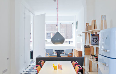
The homeowners have also since added a dining table in front of the garden doors, which fits perfectly beneath the pendant light.
The idea for this, and for the arch in the ceiling, came from Japanese architecture, Tim explains. “That glazed corridor is typical,” he says. “But this is a reinterpretation for a colder climate; they’d often have an overhanging roof and a threshold between the inside and outside. We also wanted it to feel semi-external, partly so those rooms would feel separate from the rest of house.”
The homeowners have also since added a dining table in front of the garden doors, which fits perfectly beneath the pendant light.
The newly configured living space already had glazed rooflights and a linear window, which Tim replaced with new ones. The glass bricks are also an original feature.
Find the perfect architect or building designer for your project in the Houzz Professionals Directory.
Find the perfect architect or building designer for your project in the Houzz Professionals Directory.
The first door on the left leads into one of the two children’s bedrooms. Previously, this room only had an internal window (this, visible here, is now timber-framed and frosted); Tim added a roof light and a high-level window to the bedroom to bring in daylight.
To save space, both rooms have sliding pocket doors.
To save space, both rooms have sliding pocket doors.
This provides a glimpse into the room, which is now lovely and bright. The wardrobe seen here is part of the bespoke bed design, which you can see in the next photo.
This is the inside of the second child’s bedroom, the one visible from the garden window.
The bed is positioned against the wall that separates the two children’s rooms and the layouts mirror one another. The raised bed, designed by Nimtim, is made from a combination of birch and melamine-faced plywood. “It’s not too high up,” Tim explains. “It can be accessed by climbing up the shelves, but the children can pretty much leap up there.”
It includes cupboards on wheels that can be pulled out when access is needed. One half has shelves for shoes and so on, while the other has a rail for hanging clothes.
The flooring is engineered oak.
Walls throughout painted in All White, Farrow & Ball.
This joinery sketch for the design of the children’s beds shows how they work and the storage inside.
Tim designed a new family bathroom, which is off the hallway at the front of the house, next to the master bedroom and its en suite. “It didn’t have much daylight,” he says, “so we added these glass blocks [on the left] to form an internal window onto the living space [pictured].”
The family bathroom. You can just see the internal glass-block window on the right.
Slotted between the family bathroom and the master bedroom is an en suite shower room. In the master bedroom, the team created a wall of storage (just seen) from the same melamine-faced ply used for the children’s beds.
The before and after floorplans show how the team carved out the new rooms. Originally, the two front rooms (on the left) were bedrooms, the second one having no external window; the slim space centre top of the plan was a study, and the room below it was the living room.
The original family bathroom (previously the sole bathroom) was at the end of the original side return, looking onto the garden. “We relocated it because it was where you’d want to put a window and it made the living room really dark,” Tim says.
“In the end, we didn’t really add that much floor space,” he adds, “we just elongated it and completely reconfigured the internal layout.”
Another part of the brief was to make the garden work better in relation to the house. So Tim designed this raised patio within the arms of the ‘L’, creating a space that can seamlessly become an extra room in warmer months.
Planning restrictions prevented the extension from filling much of this space, but, Tim says, “It’s also an extension, just an external one. That’s why it’s raised up to the same level as the house.”
Instead of using London stock bricks for the extension, like the original house, Tim suggested a complementary brick instead. “Rather than trying to make it match, this is distinctly different,” he says.
This before photo shows the hallway from the front door to the back part of the house as it was. The two rooms on the left are now, respectively, the master bedroom suite and the family bathroom.
Here’s the same hallway, seen from the other end, after its revamp. Repainting the walls and adding a new, lighter floor has transformed it.
Tim also commissioned new joinery to add storage under the stairs.
Walls and woodwork painted in All White, Farrow & Ball.
Tim also commissioned new joinery to add storage under the stairs.
Walls and woodwork painted in All White, Farrow & Ball.
The flat no longer feels cramped and provides enough space for the whole family – and guests, too.
Tell us…
What do you like most about the reconfiguration of this flat? Let us know in the Comments section.
Tell us…
What do you like most about the reconfiguration of this flat? Let us know in the Comments section.
Who lives here? A family with two children, aged 10 and 12
Location Vauxhall, south London
Property A ground-floor, purpose-built Edwardian flat
Size Three bedrooms and two bathrooms
Designer Tim O’Callaghan of nimtim Architects
Photos by Megan Taylor
When Tim originally met the homeowners, this is how the back of their flat looked. An existing extension was dark and the whole layout didn’t really provide the space they wanted as a family of four.
The owners had historic approval for a basement conversion. However, when it came to technical assessment of the idea, Tim found it wasn’t feasible, both for budgetary reasons and due to the position of a main sewer beneath the building.