Houzz Tour: An 18th-Century Ruin is Brought Back to Life
A derelict property in County Kildare has been revamped and refreshed with a rich, dark palette and sleek, streamlined styling

When Paul and Linda Murphy bought their home, it was in desperate need of a complete refurbishment. “Paul remembered an old, overgrown ruin that he’d known as a teenager, so he took Linda to see it and they both loved the place,” says Keith Fennelly of Woodale Designs. “They managed to track down the owner and finally bought it.” The house had lots of rooms added to it in the 1960s, but they’d been designed badly and had stood derelict for years. “With the help of architects Aughey O’Flaherty, Paul and Linda added a contemporary timber-clad extension,” says Fennelly. “They then approached us to design the new kitchen and also asked us to tender for fitting it out with furniture.”
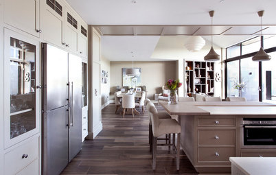
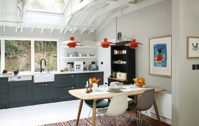
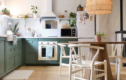
The elegant kitchen is around 8m long by 4.5m wide and located at the front of the house, to the left of the main entrance hall. It’s a galley-style layout with a contemporary central island. There are double doors at one end and a bay window with shutters at the other, so the space is filled with light.
“Paul and Linda wanted a modern kitchen, which was bespoke inside and out,” says Fennelly. “They wanted to create something they’d not seen before.”
“Paul and Linda wanted a modern kitchen, which was bespoke inside and out,” says Fennelly. “They wanted to create something they’d not seen before.”
The owners had always wanted to use black in their kitchen, so they painted the unit doors a dramatic dark shade in a matt finish.
“The kitchen cabinets are oak and the doors are a moisture-resistant board with a slim, solid poplar wood frame around the outside,” says Fennelly.
“Part of the reason for this frame was to help us with the handle design and to decide how to incorporate it into the door itself,” adds Fennelly. “The original spec was for a finger-pull design along the tops or sides of the units, but this evolved into a bespoke design created in conjunction with the owners.”
Units painted in Off Black, Farrow & Ball.
Fancy something moody? Take a look at these stylish dark-hued kitchens
The sculptural island unit is made from American white oak with a white oiled finish. It’s topped with a 125mm thick polished grey concrete worktop, with pebbles embedded throughout.
“The concrete was poured in situ to give the best results and the thickness was achieved by building it up in layers,” explains Fennelly.
“We made the doors in solid wood and added a finger-pull handle machined into the top.”
The island is as functional as it is beautiful, and houses a large bin for waste and recycling, a dishwasher and general storage. There is also an overhang to provide a neat space for casual dining.
The trio of bright yellow pendant lights adds a dash of spirited colour.
Verner Panton-style flowerpot lights, eBay.
One side of the kitchen features tall, full-length units with banks of appliances either side of a glazed and tiled alcove. There are ovens on one side and refrigerators on the other.
The alcove shelving breaks up the expanse of units and features half-height sliding glass doors. It’s used to store glassware and crockery that can be easily accessed.
“The subway tiles run from countertop level to the tops of these units and act as a back,” says Fennelly. “We fitted LED rope lighting to the shelves to create as much light as possible.”
Single ovens and refrigerators, all Miele.
Every unit in the kitchen has a clever storage solution.
“At Woodale Designs, whatever we design, we can make,” says Fennelly. “We designed the cutlery inserts to Paul and Linda’s specification, and we added decorative pull-out shelves to the cabinets, so they don’t need to move things around to reach something at the back.
“While we wanted to make the storage practical, we were also keen to make it look really good.”
Low units sweep across the opposite side of the kitchen and feature an array of storage solutions. These include drawers with solid oak cutlery and utensil inserts, and pegboards for storing crockery. There are also pull-out spice and oil holders either side of the hob.
“The hob wall is my favourite part of the kitchen,” says Fennelly. “I love its subway tiles and double arches. I think it’s such an important feature, and what makes it extra special is that it was part of the original build of the house. The architects deserve credit for this, for having the vision to make it work with the design.”
The built-in cooker hood fits unobtrusively into the original wall of the house, above the gas hob.
Cooker hood, Elica.
A view into the kitchen from the entrance hall.
The dining room forms part of the new extension and is accessed through a door to the right of the hob and archway area. A utility room and loo are located off this room too.
French engineered oak herringbone floors sweep throughout the downstairs space, creating a cohesive feel. The floors have been smoked, brushed, limed and finished off by hand with three coats of oil.
Missouri French oak herringbone floors, Trunk.
French engineered oak herringbone floors sweep throughout the downstairs space, creating a cohesive feel. The floors have been smoked, brushed, limed and finished off by hand with three coats of oil.
Missouri French oak herringbone floors, Trunk.
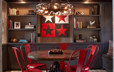
With a keen design eye, the owners upcycled the dining table by painting it a vibrant turquoise shade. They paired it with online buys for an eye-catching, individual look.
The blast of bold colour lifts the industrial wood and metal chairs, which were bought on eBay, and the pretty chandelier above.
Dining table painted in Arsenic, Farrow & Ball.
Want to create some drama in your dining space? Here’s how
The blast of bold colour lifts the industrial wood and metal chairs, which were bought on eBay, and the pretty chandelier above.
Dining table painted in Arsenic, Farrow & Ball.
Want to create some drama in your dining space? Here’s how
A view of the original 18th-century building, with just a glimpse of the new timber-clad extension to the left.
The main entrance hall has been panelled for a classic, elegant feel.
The picture window at the far end of the corridor makes a striking feature and allows a view of the original wall and rear gate.
“The left-hand side of the hallway is panelling, but the right-hand side is actually storage,” explains Fennelly. “If you look closely, you can see that the centre panels on the right actually open. This side of the hall had an alcove, which allowed us to fit 350mm of storage behind the panelling.
“This whole wall is used to store coats and shoes, with shelves for general storage.”
The panelled storage is finished off with invisible push-to-open mechanisms. The internal carcasses are made of American walnut.
Panelling painted in Strong White, Farrow & Ball.
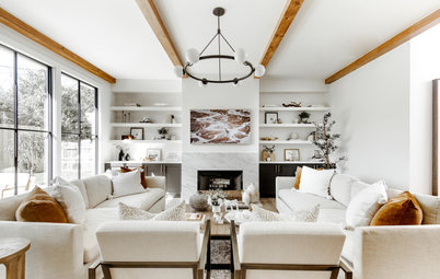
A view from the panelled entrance hall into the living space.
“I’d love to take credit for this property but it was a team effort,” says Fennelly. “Paul and Linda put years of work into the preparation of their home. We spent hours looking at design options and details for every room and piece of furniture. Their architect played a huge role in the design of their home and worked closely with them for over a year before I came on board.”
“I’d love to take credit for this property but it was a team effort,” says Fennelly. “Paul and Linda put years of work into the preparation of their home. We spent hours looking at design options and details for every room and piece of furniture. Their architect played a huge role in the design of their home and worked closely with them for over a year before I came on board.”
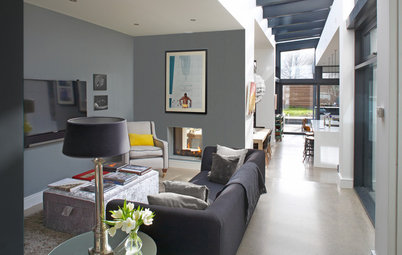
Woodale Designs also designed and built the library and media unit in the living area.
This space (located to the right of the main entrance hall) offers the same sophisticated tempo and considered use of colour as the rest of the house. A classic brown Chesterfield sofa complements the walls and units which are painted grey with a dead flat finish.
A row of chic copper pendant lights from the Danish Design Store help to lead the eye to the window at the back.
Walls and units painted in Moles Breath, Farrow & Ball.
The units and walls are painted in the same rich colour for a seamless, architectural look.
“The library-media unit also has push-to-open door storage behind the centre panels,” says Fennelly.
“The library-media unit also has push-to-open door storage behind the centre panels,” says Fennelly.
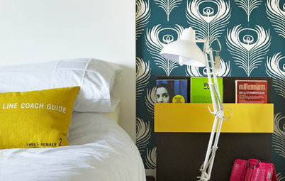
The elegant main bedroom is in the original part of the house and features windows allowing views in three directions.
Skylights were added to enhance the natural light that pours though the bay windows. Metal beams were a structural necessity and were left visible to add an industrial accent.
Want a metallic touch to your bedroom? Check out these chic schemes using mixed metals
Skylights were added to enhance the natural light that pours though the bay windows. Metal beams were a structural necessity and were left visible to add an industrial accent.
Want a metallic touch to your bedroom? Check out these chic schemes using mixed metals
A bespoke, walk-in wardrobe adds a luxurious touch to the main suite.
Woodale Designs worked on three bathrooms in the property, including the chic main en suite.
“All the designs are the same,” says Fennelly, “and include solid oak bar tops with a lacquer finish to protect the wood against water and toothpaste spills. They also have flush-fitting drawer fronts.”
The neat vanity basin unit sits on a wall that discreetly hides the shower and toilet.
Bathroom fittings, all Ideal Bathrooms. Tiles, Mosaic Assemblers.
A second bedroom lies in the original part of the house next to the main suite, and features sleek, unobtrusive storage.
“We designed and made this wardrobe,” says Fennelly. “It has a simple door style to complement the rest of the house and the other furniture we made. The doors are handleless and open with a machined finger grip.”
An en-suite bathroom is tucked in behind the wardrobe.
“We designed and made this wardrobe,” says Fennelly. “It has a simple door style to complement the rest of the house and the other furniture we made. The doors are handleless and open with a machined finger grip.”
An en-suite bathroom is tucked in behind the wardrobe.
Located upstairs in the new extension, the light-filled main bathroom features a luxurious bath tub.
There are also two smaller guest rooms to the rear.
There are also two smaller guest rooms to the rear.
With its sleek fittings and light, fresh feel, the main bathroom mirrors the clean lines and classic modern silhouette of the other bathrooms in the property.
TELL US…
What do you think of this 18th- century restoration? Share your thoughts in the Comments below.
TELL US…
What do you think of this 18th- century restoration? Share your thoughts in the Comments below.


Who lives here Paul and Linda Murphy, a young professional couple
Location Naas, County Kildare, Ireland
Property An 18th-century detached house
Size 4 bedrooms, 4 bathrooms
Designer Keith Fennelly of Woodale Designs
Architect Aughey O’Flaherty
Photos by Infinity Media
The classic, streamlined kitchen is a far cry from the run-down ruin that the Murphys originally set eyes on. The style sets the tone for the entire interior with its bespoke cabinetry, natural materials and rich colours.
“I’d worked on a friend’s house and this was a referral,” explains Fennelly, director of Woodale Designs. “We have a studio which displays some of our work, and we manufacture all of our designs. So we have full control from start to finish, which Paul and Linda wanted for this project. They didn’t have an interior designer, but they have a keen creative eye and had a vision for their home from the first day I met them.”