Kitchen of the Week: Modern Cottage Style in 88 Square Feet
Mixing traditional and edgy elements creates a space that’s classic yet dramatic, cozy yet crisp

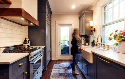
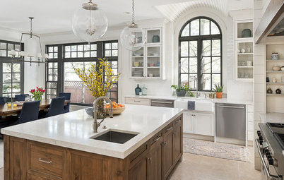
Dinner Party-Worthy Views
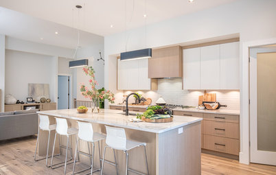
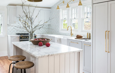
“The kitchen is basically in the dining room,” the designer says. To create a kitchen that was up to par with the dining room, she elevated the design with certain elements.
“These pendant lights are not in your face, but they are dramatic and conversation-worthy,” she says. The brass finish ties into the elegant modern chandelier in the dining room (catch a peek of it in the top right corner). For the Roman shade, she found a fabric full of circles that play off the pendant’s globes. “It has yellows in it that pick up on the brass, and yellow is just such a happy color,” she says. Elegant walnut Cherner counter stools add warmth, and the waterfall countertop on the peninsula creates a clean, dramatic line.
Find brass globe pendant lights in the Houzz Shop
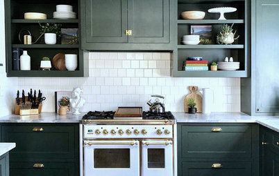
A Two-Tone Scheme
Also making the kitchen a pleasing view from the dining room is the sharply contrasting color palette of crisp white and dark navy. “Navy blue grounds the base cabinets and creates a more furnished look than an all-white kitchen would have,” Milner says. “And because it opens up to the dining room, I did not want it to look like a stereotypical kitchen. The two-tone scheme gives it more drama.”
The lower cabinets and peninsula paint are Hale Navy, and the white upper cabinet and wall paint is Chantilly Lace, both by Benjamin Moore. The same white extends throughout the public spaces of the compact house, which makes it feel larger, as well as unified and airy.
Before, the countertops were black granite. “I didn’t want the kitchen to feel like a dark hole behind the dining room,” she says. “This white quartz is serene and subtle, and the waterfall counter makes it more modern.”
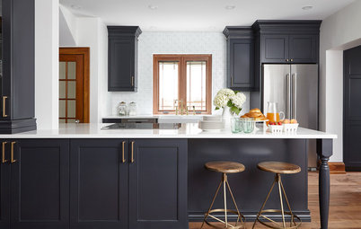
Bringing Restaurant Kitchen Style Home
The appealing industrial style of restaurants also influenced the design and the relationship between the dining room and the kitchen. “Think of bistros where you can see the chefs working in the kitchen from your table and admiring those spaces. We enjoy those kinds of spaces when we’re out, so why not bring it home?” the designer says. Elements inspired by bistro kitchens include the stainless steel range, vent hood and refrigerator, the matte black bar faucet, pot filler and hardware and subway tile that extends all the way to the ceiling.
Range and vent hood: Bertazzoni
Browse stainless steel ranges on Houzz
“I cover kitchen walls in tile whenever I can,” Milner says. “It makes the ceiling feel higher because the wall isn’t broken up by a backsplash. This keeps the eye moving around and prevents the kitchen from feeling chopped up.” She even continued the tile on the walls behind the glass-front cabinets. The shelves inside are glass, and she stuck with white and clear glass for the items on display. But she notes that should her clients desire more color in the kitchen, adding colorful items to the display cabinets would be an easy but impermanent way to add it.
The cabinets ride the line between cozy cottage and urban modern. They have a classic Shaker profile but are inset and adorned by streamlined matte black and chrome hardware. The floors also suit cottage and modern styles. They are hand-scraped engineered white oak, which is traditional. But their lighter tone leans modern.
Learn the Lingo of Cabinet Door Styles
Balancing Airiness and Functional Storage
“Because it was important to keep the room feeling open and airy, I did not put any cabinets on the range wall. It looked too boxed in covered with upper cabinets before,” the designer says. “This move can be a risk because of loss of storage, but it makes us realize how much stuff we have that we don’t need. There’s plenty of space for everyday essentials, and the move was worth it aesthetically.”
To make up for some of that lost upper-cabinet space, she opted for customized cabinets that could make the most of every inch. Without the cabinets wrapping the corner, she was able to extend the upper cabinet to the range wall and incorporate two countertop drawers beneath it. Another part of this renovation was finishing the basement, which gained a storage area for seasonal and seldom-used items.
A Hidden Washer-Dryer
On the kitchen-facing side of the peninsula is pots-and-pans storage and a washer-dryer. The unit is ventless and goes from wash cycle to dry cycle automatically. It’s a handy appliance to have in the kitchen for the tea towels and bibs and muddy clothes of kids coming in to the kitchen from the backyard. The peninsula is a handy spot for folding clothes.
On the kitchen-facing side of the peninsula is pots-and-pans storage and a washer-dryer. The unit is ventless and goes from wash cycle to dry cycle automatically. It’s a handy appliance to have in the kitchen for the tea towels and bibs and muddy clothes of kids coming in to the kitchen from the backyard. The peninsula is a handy spot for folding clothes.
One element not marked on this floor plan is the glass door to the backyard. It is on the left side of the plan, just past the refrigerator.
Takeaways
More on Houzz
Drool-Worthy Design Features to Borrow From Commercial Kitchens
Read more Kitchen of the Week stories
Find a kitchen designer near you
Shop for kitchen products
Takeaways
- Look to a two-tone cabinet scheme when seeking dramatic contrast.
- Elevate a few elements such as light fixtures and textiles when a kitchen is within view of another room.
- Steal ideas to bring home from your favorite bistros, cooking shows or restaurant-centric movies. (Try No Reservations, Chef, It’s Complicated, Chocolat or The Hundred-Foot Journey).
- Tile to the ceiling for a continuous look that will make ceilings appear higher. Showing off the tiles behind the glass cabinet doors was an especially neat trick used here.
- If storage is tight, cull through everything and perform a ruthless purge. Give away unused items, toss out expired food and consider stashing seasonal and rarely used items elsewhere.
More on Houzz
Drool-Worthy Design Features to Borrow From Commercial Kitchens
Read more Kitchen of the Week stories
Find a kitchen designer near you
Shop for kitchen products

Kitchen at a Glance
Who lives here: A young couple with a newborn son
Location: Toronto
Size: 88 square feet (8 square meters); 11 by 8 feet
Designer: Barbara Milner, founder and principal of South Hill Interiors
This small Victorian-era house is located in the park- and tree-filled neighborhood of Casa Loma in Toronto. The homeowners, a couple with a new baby, asked interior designer Barbara Milner to modernize the kitchen but maintain a warm, family-friendly, comfortable vibe.
“Although this house is centrally located in the city, it has a cottage-like setting with a beautiful backyard that backs up to conservation land. I wanted to bring that feeling of freshness and airiness into the kitchen,” says Milner. Also, the kitchen is open to the dining room, so it needed to provide a view that would be pleasing during a dinner party.
Taking cues from the home’s country-in-the-city setting, Milner balanced classic and edgier industrial pieces in the renovation. She kept the existing U-shaped layout in place because it functioned well and because using the same electrical and plumbing infrastructure left room in the budget for more exciting purchases. The result is a modern cottage-style kitchen with elements borrowed from charming commercial bistro kitchens.
Find a local kitchen designer on Houzz