London Houzz: Transforming Two Old Terraces Into One Grand Home
Modern lines blend with original features in this Edwardian property, which converted two terraces back into one home

When the owners bought this Edwardian property, the original home had been converted into two terraces. They commissioned Paul Conibere of Conibere Phillips Architects to turn it back into a single house, then asked Beth Dadswell of Imperfect Interiors to help them design a contemporary home that reflected the owners’ tastes.
The couple’s brief was simple: create a beautifully designed, bespoke home where they could relax, away from their busy jobs, surrounded by the art and furniture they’d collected together.
The couple’s brief was simple: create a beautifully designed, bespoke home where they could relax, away from their busy jobs, surrounded by the art and furniture they’d collected together.
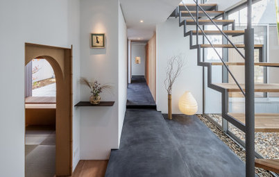
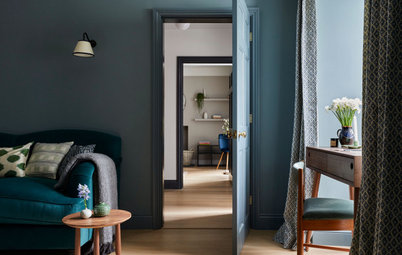
The hallway had the potential to feel dark, as there were no windows in it when the building was converted into separate terraces.
The glazed front door helps brighten the space now, but Dadswell also pulled light in from the living room. “We widened the entrance to the room and fitted a sliding pocket door,” she says. “When it’s open, the light from the living room floods in.”
Searching for an interior designer? Find one near you on Houzz
The ground floor powder room is decorated with a botanical-print wallpaper and dark blue-painted skirting boards, architraves and ceiling, bringing a little drama to the tiny space.
“This room doesn’t have any natural daylight,” says Dadswell. “The owners were happy to embrace that, so we went very dark and bold and added brass taps and a large mirror for a bit of glamour.”
“This room doesn’t have any natural daylight,” says Dadswell. “The owners were happy to embrace that, so we went very dark and bold and added brass taps and a large mirror for a bit of glamour.”
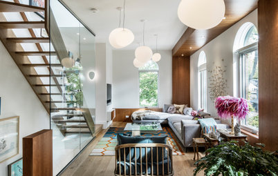
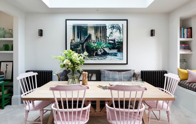
The living room is at the front of the house and opens onto a dining area and kitchen at the back. “The owners wanted this to be a place to entertain guests and somewhere that would be full of colour and bold shapes,” says Dadswell.
She used cushions for colour, contrast and texture – bright designs for the sofa and more tonal versions for the mid-century-style black leather armchairs. Bespoke Roman blinds in a mustard-printed fabric contrast with the flooring – custom-stained engineered-oak boards that feature throughout the ground floor.
She used cushions for colour, contrast and texture – bright designs for the sofa and more tonal versions for the mid-century-style black leather armchairs. Bespoke Roman blinds in a mustard-printed fabric contrast with the flooring – custom-stained engineered-oak boards that feature throughout the ground floor.
The dining area towards the back of the house leads off the living space and features a bespoke shelving unit.
“The owners had already designed these floor-to-ceiling units with Paul, the architect,” says Dadswell. “Inlaid brass trims were added and carried through to the kitchen island beyond. To tie in, I chose a black pendant fitting with brass detailing for the dining table and a mix of brightly coloured dining chairs.
“Paul designed a clever pivoting door to separate the dining area from the kitchen when required,” says Dadswell. “When it’s open, it becomes part of the bespoke joinery unit.”
He also integrated some beautiful wooden louvred screens into the glazing at the side of the house (seen here on the left).
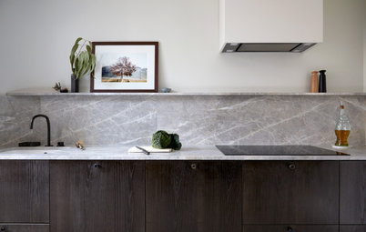
“The full-height glazing and door at the back of the house make the garden visible from every room on the ground floor, including the kitchen,” says Dadswell. “We kept the spaces uncluttered by furniture and lighting so the views could be fully enjoyed.”
White walls highlight the dark island and the black-framed glazing.
White walls highlight the dark island and the black-framed glazing.
There’s a second living room on the first floor at the front of the house, which has a less-formal feel than the downstairs entertaining space.
“It’s a comfortable and light-filled room where the owners can put their feet up, read a book or listen to music,” says Dadswell. “We added velvet sofas, mid-century-inspired cushions and bookshelves, a sisal carpet and bespoke Roman blinds.”
“It’s a comfortable and light-filled room where the owners can put their feet up, read a book or listen to music,” says Dadswell. “We added velvet sofas, mid-century-inspired cushions and bookshelves, a sisal carpet and bespoke Roman blinds.”
The main bedroom has views of neighbouring trees. The owners were keen for the space to feel like a calm oasis.
“We chose a deep blue for the walls, which felt cosy, but still grown-up,” says Dadswell. “We complemented that with a deep blue-grey velvet headboard.”
A mix of coral and indigo linen bedding adds the colour, while a rattan chair, which the owners already had, brings in a little texture.
“We also added a pair of metal wall lights for a touch of industrial glamour,” says Dadswell.
In the ensuite, a walk-in shower has a floor-to-ceiling glazed window at one end that brings masses of light into the space.
“The deep indigo chevron tiles add a graphic and dramatic element to what’s otherwise quite a simple space,” says Dadswell. Storage is provided by a double vanity unit.
Browse more beautifully designed bathrooms to inspire your own
“The deep indigo chevron tiles add a graphic and dramatic element to what’s otherwise quite a simple space,” says Dadswell. Storage is provided by a double vanity unit.
Browse more beautifully designed bathrooms to inspire your own
More storage is concealed behind mirrored doors above the vanity unit. Inlaid brass strips echo the bespoke joinery downstairs, while brass hardware and a wall-mounted towel rail continue the limited palette used throughout the house, making the space feel elegant and contemporary.
There are two guest bedrooms in the property and this one is on the first floor. The room only has one small, high-level window, which could have made the space dark.
“To mitigate that, we painted the room a very vibrant shade of mustard to make it feel as if it was filled with sunshine,” says Dadswell. “We added an indigo velvet bedhead and a black bedside table to stand out against the wall colour. One of the owner’s existing pieces of art ties all the shades together.”
The sisal carpet, used throughout the first and second floors, adds warmth and texture.
The guest bathroom is at the top of the house and, like the ensuite, was carefully designed to include hidden storage behind mirrored cabinet doors. The pitch of the roof has been cleverly utilised to create display space.
“A composite solid surface material was chosen for its ability to be cut and fashioned into seamless wall-mounted vanity units and worktops,” says Dadswell of the Dekton vanity from Cosentino.
“A composite solid surface material was chosen for its ability to be cut and fashioned into seamless wall-mounted vanity units and worktops,” says Dadswell of the Dekton vanity from Cosentino.
“This bathroom is naturally light and bright,” says Dadswell, “but we prevented it from feeling too clinical by adding brass hardware and touches of warm pink around the storage areas.”
Your turn
What’s your favourite room in this renovated Edwardian home? Share your thoughts in the Comments below, like this story, save the images, and join the renovation conversation.
More
If you enjoyed reading about this home, you’ll love this Japan Houzz: A Curvaceous Home & Workshop for an Odd-Shaped Site
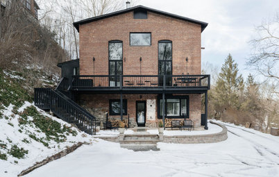
House at a Glance
Who lives here: A couple
Location: London, UK
Property: A three-storey Edwardian house
Size: Three bedrooms and two bathrooms
Designer: Beth Dadswell of Imperfect Interiors
Architect: Paul Conibere of Conibere Phillips Architects
To meet the brief, Dadswell was keen to bring together the homeowners’ love of contemporary furniture with the mid-century pieces they were also drawn to, while keeping the vibe comfortable and lived-in.
In the hallway, white walls and a pale runner help lighten the space and provide a contrast to the dark timber floor. A slim marble console fits neatly against the wall, while sconce lights on either side create a focal point. The powder room can be seen at the end of the hallway.
“We painted the staircase in black to take the eye up through the house,” says Dadswell.