Paint Power: How to Create Impact With Colour Accents
A few carefully placed pops of colour could be just the thing to bring your interior up to date, according to the pros

Feeling the urge to add some colour to your home, but also a little nervous about it? Rather than painting huge expanses, why not start with a few small colour accents – you may be surprised at how powerful these little touches can be, says Andrea Lucena-Orr, Dulux‘s colour and communications manager.
We asked Lucena-Orr and two leading interior stylists to reveal where and how you can create the maximum impact with colour accents. Read on to find out more.
We asked Lucena-Orr and two leading interior stylists to reveal where and how you can create the maximum impact with colour accents. Read on to find out more.
Which colours work best?
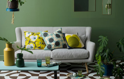
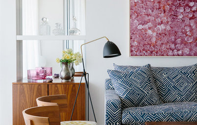
“Colours that you are naturally drawn to, but wouldn’t necessarily decorate a whole room with, are the perfect choices for accent colours – such as a splash of gold on a feature wall or a piece of furniture,” says Nette King.
“Colours that you are naturally drawn to, but wouldn’t necessarily decorate a whole room with, are the perfect choices for accent colours – such as a splash of gold on a feature wall or a piece of furniture,” says Nette King.
How far should you go?
“Colour accents work wonderfully when you use them throughout your whole home – doing this creates visual continuity and can help make your overall colour palette look intentional rather than accidental,” says Nette King.
“It can also be fun to swap dominant and accent colours from room to room,” she says.
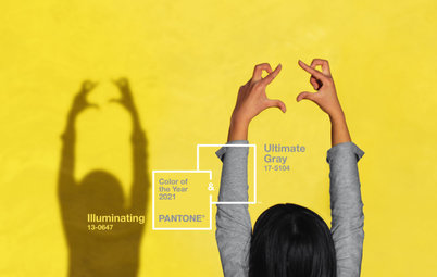
And which colours are trending?
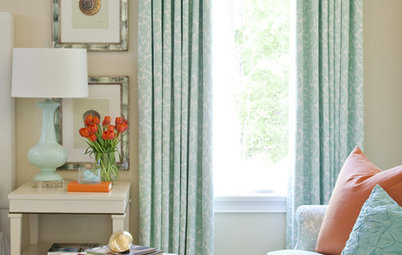
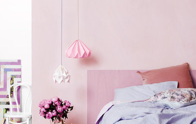
“Soft greys with a greenish undertone and neutral pinks are huge for 2018. We’re also seeing mint greens and playful pinks coming through,” says Lucena-Orr.
Interior designer and stylist Bree Leech concurs, adding, “We’re seeing pink combined with deep red and burgundy – it’s a real ’80s feel but interpreted in a fun, modern way. A more minimal look is also emerging, with warm neutral hues, layers of texture and plenty of natural materials”.
See more contemporary living rooms
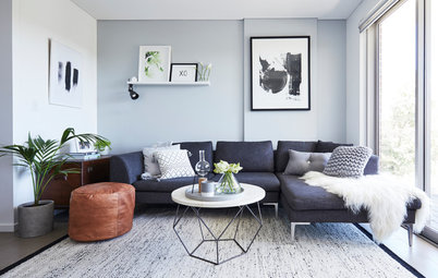
Rather than contrasting colours, think tonal accents
“I think we’re moving towards more tonal accents and harmonious colour schemes,” says Leech. “Tonal colour can create subtle depth in your interior without dominating it. You can also use a tonal approach to create interest within one colour range that you particularly love.”
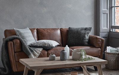
“Using tonal accents on furniture can also be very effective,” adds Nette King. “You could, for example, paint a set of dining chairs in four similar blues, then set them against a pale wooden table in an otherwise neutral room for a simple yet dramatic look.”
“I think we’re moving towards more tonal accents and harmonious colour schemes,” says Leech. “Tonal colour can create subtle depth in your interior without dominating it. You can also use a tonal approach to create interest within one colour range that you particularly love.”
“Using tonal accents on furniture can also be very effective,” adds Nette King. “You could, for example, paint a set of dining chairs in four similar blues, then set them against a pale wooden table in an otherwise neutral room for a simple yet dramatic look.”
What are the most common mistakes people make with colour accents?
“Choosing a hue with an undertone that clashes with their existing colour scheme, or choosing a colour under different lighting to what they have at home, and then finding that it looks completely different than they expected once it’s painted,” says Leech.
“To avoid this, check the colour on large A4 swatches under the same lighting in your home, and once you’ve narrowed down your choices, get a sample pot and paint them across a large section,” she says. While some people suggest painting directly onto the wall, Leech suggests otherwise. “Use a big piece of cardboard, as this allows you to move the colour around and view it against different finishes in the room.”
“Remember – work with the undertones you have rather than trying to work against them,” Leech advises.
From Zesty Citrus to Lapis Lazuli: Spring’s Hottest Hues
From Zesty Citrus to Lapis Lazuli: Spring’s Hottest Hues
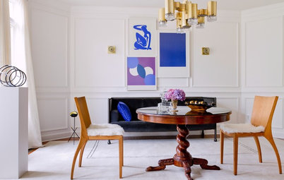
What are some great spots to put colour accents?
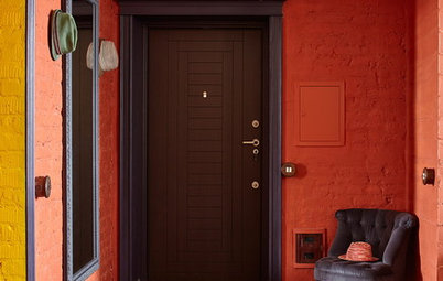
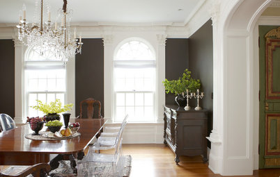
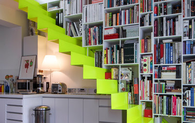
“Around the edges of doors so you get a fun surprise when you open them,” says Leech. “The inside or outside edges of window frames; the inside edge of archways or openings to other rooms; or inside cabinets. Also awkward corners – accent colours are a great way to turn these into quirky features.
“And ceilings! Always amazing and under-utilised.”
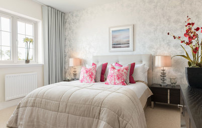
Think beyond just walls
“I’ve never met a surface I didn’t want to paint, be it a wall, a piece of furniture, a floor or decorator pieces such as vases or frames,” says Nette King. “I generally buy a litre of the colour I’m crushing on at the time, such as blush pink or emerald green, and have some fun with it.
“If you’re unsure about painting a wall in an accent colour, paint a small grouping of inexpensive items such as a vase, a candlestick and a bowl – sit them together and they’ll have real impact,” she says.
It’s not just about colour
Specialist paint finishes, which are more about texture than colour, are another way to create arresting accents, according to Nette King. “Concrete, metallic and rusted effects are like the icing on a beautiful interior,” she says. Like colour accents, the trick is to use them in small doses; “Use them to complement and enhance the dominant colours in a room without overwhelming it.”
Specialist paint finishes, which are more about texture than colour, are another way to create arresting accents, according to Nette King. “Concrete, metallic and rusted effects are like the icing on a beautiful interior,” she says. Like colour accents, the trick is to use them in small doses; “Use them to complement and enhance the dominant colours in a room without overwhelming it.”
Tell us
Are you planning on injecting colour into your home? Tell us about it in the Comments section below. And while you’re at it, don’t forget to like, bookmark or share this story. Join the conversation.
More
Read more decorating stories
Are you planning on injecting colour into your home? Tell us about it in the Comments section below. And while you’re at it, don’t forget to like, bookmark or share this story. Join the conversation.
More
Read more decorating stories

Styling by Bree Leech
Why colour accents?
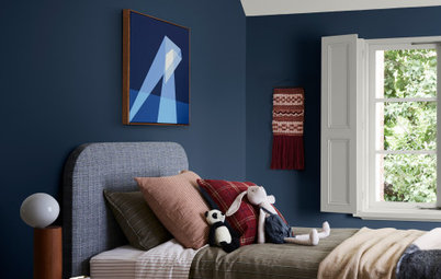
“They’re a fabulous way to introduce a small amount of colour into your home, and to help you feel more confident about using colour overall,” says Lucena-Orr. “Painting small spaces such as a study nook, chimney breast or entry wall can give a beautiful feel to a space without overwhelming it. Even adding colour behind a bed or a favourite painting will make a big difference, giving a room a focal point and creating a new mood.”
Interior stylist and writer Heather Nette King agrees, adding, “Accent colours can help resolve room schemes by linking threads of colour and creating continuity”.
How to Choose the Right Colour Combination