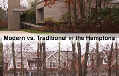
Renowned Architects Give Artworks a Minimalist New Home
A New York museum takes up residence in a newly built minimalist structure, and its architectural features offer lessons for homeowners

The Parrish Art Museum has moved into a new building in Water Mill, New York, roughly triple the space of its previous home nearby. The new building, which opened in November 2012 and was designed by Swiss architects Jacques Herzog and Pierre de Meuron with local architect Douglas Moyer, stands out in the context of its Long Island location due to its size, form and materials. While strictly a museum with support facilities, the building is nevertheless very homelike, as will be explored here. My tour of this "home for art" hopefully offers a few lessons for homeowners, in terms of both its architecture and interiors.
The first homelike impression of the museum, which is set back from a large grassy field on the Montauk Highway, comes when one moves past the east end of the building to reach the parking lot behind it. Here one sees the double gables that run the full length of the building. While also barnlike in the way these roofs overhang beyond the concrete and dark wood walls, the gable form, as we'll see, is a motif that helps arrange the interior spaces and give the galleries a suitable scale for the art.
Another first impression is how long the museum is: 615 feet, to be precise. The building, which runs east–west, hugs the ground tightly and appears to be more roof than wall; the former is dotted with skylights that give a subtle hint at what is happening inside.
Before we get closer to the building, it's good to point out the landscape next to the parking lot, which incorporates two parallel swales for storm water management. Not only do the swales reduce runoff into the sewer, but their layout echoes the building in the long paths they cut across the site. Bridges traverse the swales to allow access from the parking area to the building.
The west end of the building is similar to the east end — with the twin gable protruding beyond the walls — but it also features a porch that immediately serves the café and auditorium on this remote end of the building. Evident on these ends is the inspiration of vernacular architecture in the region, such as agrarian structures, as well as more abstract domestic forms.
The porch is fairly substantial, but given the length of the building, it's entirely appropriate. My visit to the museum was on a rainy day, but I could take shelter under the roof and enjoy the surrounding landscape, which includes a winery on the west side.
The roofs overhang along the long north and south sides, not just the east and west ends. These overhangs align with the concrete pad upon which the museum sits. Visitors walk along these sheltered walkways after making their way from the parking lot to the building. Underneath these zones, the inexpensive construction of the building is apparent: rough concrete, exposed wood structure and corrugated metal on the underside of the roof.
An exception to the "cheap" exterior is the continuous bench that runs along the base of the concrete walls. Also made of concrete but in a much better finish than the wall above, the bench is an inviting surface that is particularly suited to warm days (not the cool and rainy day when I visited).
The entrance is subtle except when the viewer is situated on axis with it, as in this photo. An outdoor space is cut into the 615-foot-long building, and parallel glass walls give a view to the other side.
Here is a view from inside the lobby looking back toward the parking lot. The entrance porch beyond the glass wall is very homelike, acting as a sheltered transition between the public outdoor realm and the indoor private realm. The actual entry is through the black door visible on the wall at left, meaning this glass wall is purely for views and natural light.
The built-in seating outside is carried through to the lobby, but it is executed in wood instead of concrete here. These benches are not as well integrated into the wall as the ones outside, but they are welcome nevertheless.
Also, the lobby is the visitor's first glimpse of how the two gables come together — the V form of the wood structure is the lowest point inside.
Also, the lobby is the visitor's first glimpse of how the two gables come together — the V form of the wood structure is the lowest point inside.
The spine along the middle of the building is broken down by X-shaped steel bracing that occurs every so often. This corridor, which feeds the galleries on either side, does not extend the whole length of the building (offices are on one end, and event spaces are on the other), but it still feels long. Therefore the cross bracing gives a rhythm to the walk that is not as relenting as the wood members.
One commendable aspect of this hallway of sorts is how it's used as a gallery in its own right; it is not just a corridor for the galleries on either side. The paintings are mounted at eye level and are small enough that they don't require a large space for someone to stand back and take them in. People can stand close to the art and let others walk by.
On either side of the central corridor/gallery are the main galleries — eight of them; they occupy anywhere from one to four bays, defined by the skylights overhead. These galleries are centered on the high point of the gable roofs that run the length of the building. The gallery shown here is the largest, putting on display the horizontal brace halfway down the space. (In the other rooms, the walls cover this little bit of structure.)
Even on a rainy day the galleries are bathed in natural light, meaning that on bright days the fluorescent lights running beneath the wood joists could potentially be turned off. Yet these lights serve a design purpose, especially in the corridor/gallery: Perpendicular to the wood structure, they reinforce the building's long plan and draw one's attention to the gable form at the end of the room.
Even on a rainy day the galleries are bathed in natural light, meaning that on bright days the fluorescent lights running beneath the wood joists could potentially be turned off. Yet these lights serve a design purpose, especially in the corridor/gallery: Perpendicular to the wood structure, they reinforce the building's long plan and draw one's attention to the gable form at the end of the room.
About halfway down the stretch of the central spine between galleries is one large exhibition space that extends from the outer wall on the north to the one on the south. This would be the equivalent of the museum's great room. It is the only space in the museum where one can take in the full width of the building and its zigzag profile. Some skinny windows draw visitors to either side of the large space.
Here is a view inside one of the smaller galleries (two bays), where the homelike form is most apparent. Herzog and de Meuron, who have executed a number of buildings with pared-down gable forms, were influenced by the studios of artists living on Long Island. After visiting the studios of artists like Jackson Pollock, the architects tried to re-create their qualities — the gable form and abundant natural light (most of it northern light, but screened southern light also occurs) are their means of tying where the art is displayed to where it was made.
The museum, as should be obvious by now, is very minimalist, even though its structural components (steel columns and beams, wood joists, concrete walls) are all exposed. White walls and a polished concrete floor let the art come to the fore. My favorite architectural detail is a large wood handle on the black doors (at the entrance, café and offices). The handle is accompanied by its negative on the adjacent wall, a pocket that allows the door to be opened fully without damaging the wall or requiring a door stop that would have run counter to the minimalist aesthetic.