Room of the Week: An Airy Parents' Retreat That Spells Serenity
This incredible light and bright space is a hidden retreat from the chaos of family life for two fortunate parents

In a Q&A format, we talk to the designers – and examine the creative thinking – behind some of Houzz’s most loveable rooms.
Brief
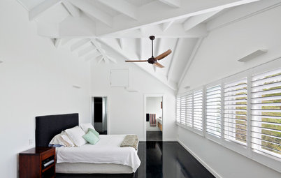
The owners of this project came to Dalecki Design with the vision of creating a private master suite where they could seek refuge from busy family home. The interior of the addition was to be flooded with natural light, taking in views of the backyard wherever possible. The master suite was to be a light, bright space, while still maintaining the feeling of a peaceful hidden retreat.
On the contrary, the exterior of the addition was to have a ‘cool’ design aesthetic, with a bold, dark colour palette, inspired by the laneways of Melbourne. As avid readers, the owners also wanted the additions to incorporate a dedicated reading and sitting nook where they could escape to enjoy time alone with a book.
A secondary aspect of the project brief was to create space for secure off-street parking to the rear.
Starting point
The starting point of the interior was to blend in with the exterior; that’s why we included materials such as the Cemintel cladding. The ceiling line also followed the external roof rake/form. Additionally, we ensured views were provided to the outside while ensuring privacy was preserved.
The exterior of the addition was to reflect a ‘laneways of Melbourne’ aesthetic. An important factor of the design was being respectful to the original 1900s red-brick garage structure on the site that needed to be demolished to make way for the new addition.
Find a building designer near you on Houzz to revamp your layout and home
The new master-suite floor plan
Key design aspects
Colour and materials palette: The overall design of the addition utilised a simple but striking form to contrast the original home and surrounding built environment.
We utilised a bold colour and materials palette, contrasting modern black cladding with traditional red brick to create the cool, Melbourne laneway-inspired aesthetic the clients were seeking.
In order to pay respect to the original red-brick garage, we incorporated red brick into the materials palette, choosing to combine it with black mortar and raked joints for a modern take on the classic material.
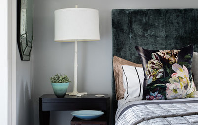
Key pieces of furniture/fittings:
The Cemintel-clad feature in the centre of the room serves as both the bedhead on one side and houses cabinetry for the wardrobe on the other side.
We chose not to close off the wardrobe, and instead included it in the main zone of the bedroom to make the overall room feel more spacious. We incorporated a bulkhead detail over the wardrobe and bedhead to create a sense of privacy in this zone.
The walk-in wardrobe space behind the bedhead
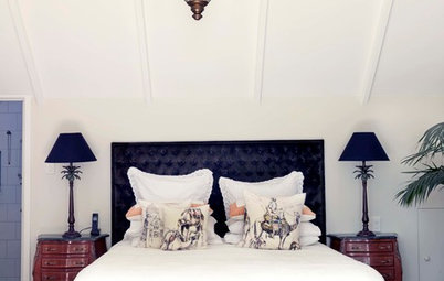
- Bedhead/walk-in wardrobe: Cemintel cladding.
- Scone lights on bedhead: Radiant Lighting.
- Bedside tables: custom-made.
- Chair: Arrival Hall.
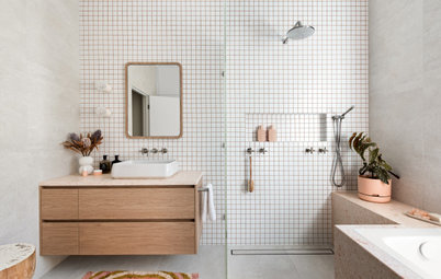
- Stoneway Grey 600 x 300-millimetre floor tiles and Perth Tumbled black-matt wall tiles in ensuite: TileCloud.
- Round mirrors in ensuite: custom-cut.
- Basins: Parisi.
- Vanity benchtops: Caesarstone in Rugged Concrete.
- Bookshelf in reading nook: Polytec in Prime Oak.
The master ensuite
Challenges you worked around
There was an extremely small parcel of land available on the block to house the addition. In order to overcome this, we opted for a two-storey addition, with the master suite and ensuite housed above the secure garage.
Challenges you worked around
There was an extremely small parcel of land available on the block to house the addition. In order to overcome this, we opted for a two-storey addition, with the master suite and ensuite housed above the secure garage.
Why do you think this room works?
Housing the master suite and ensuite on the second storey of the addition – combined with the use of a reading nook as a buffer zone from the main living wing of the home – created a sense of privacy and isolation. This allowed the new master wing to truly have the feeling of a retreat, where the adults can seek refuge from the hustle of a busy family home.
Housing the master suite and ensuite on the second storey of the addition – combined with the use of a reading nook as a buffer zone from the main living wing of the home – created a sense of privacy and isolation. This allowed the new master wing to truly have the feeling of a retreat, where the adults can seek refuge from the hustle of a busy family home.
The custom-designed bookshelf in the reading nook
Your turn
What do you love about this parents’ retreat? Tell us in the Comments below. And don’t forget to save your favourite images, like this story and join the conversation.
More
Craving more great interiors? Take a look at our last week’s Room of the Week: A Hamptons-Style Living Area Alive With Colour
Styling by Matt Biocich
Answers by Janik Dalecki of Dalecki Design
Who lives here: A couple and their two children
Location: North Perth, WA
Room purpose and size: 4.9 x 5.4 metres including the wardrobe. The parents’ retreat was part of a larger project that encompassed an enclosed garage, with the master suite, walk-in wardrobe and ensuite positioned above it. A reading nook was included to bridge the existing home and new addition.
Budget: Approximately $250,000.