Trending Color Palettes for 2022 at Maison & Objet
Houzz France editors share four key color schemes for interiors at the iconic trade fair in Paris

The iconic Maison & Objet decor and design fair was held in March for the first time this year, having been postponed from its usual January date due to COVID-19 restrictions. The Houzz France editorial team was on site at the Paris trade show to glean the latest interior design trends and see new products.
We begin with the four most popular color palettes this year. Moving away from uniform and monochrome decor, combinations of contrasting shades are bringing some fun into interiors.
We begin with the four most popular color palettes this year. Moving away from uniform and monochrome decor, combinations of contrasting shades are bringing some fun into interiors.
Mira side tables by Thomas Dariel. Maison & Objet
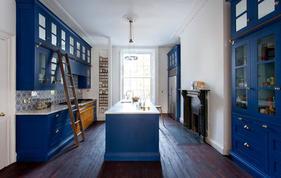
Klein blue. Pop style is also famous for playing up contrasts and daring combinations of vibrant colors. Therefore yellow, however radiant, is readily combined with shades as present and pronounced as Klein or electric blues.
Shop for furniture and decor on Houzz
Klein blue. Pop style is also famous for playing up contrasts and daring combinations of vibrant colors. Therefore yellow, however radiant, is readily combined with shades as present and pronounced as Klein or electric blues.
Shop for furniture and decor on Houzz
Pouenat. Maison & Objet
Blood red. Red strides boldly into this palette and becomes one of the protagonists of designers’ contrasts. After first making a timid appearance at the September 2021 edition of Maison & Objet, it is now a marked presence in this year’s palettes.
Maison & Objet 2021: Trending Colors for the Coming Year
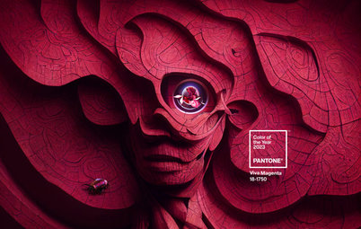
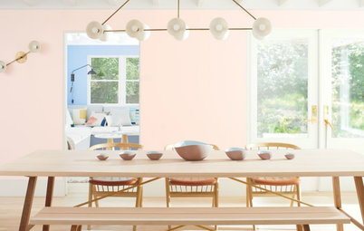
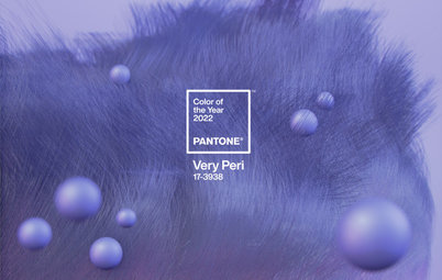
Mauve. We should have known. Pantone selected Very Peri, a periwinkle with a violet undertone, for its color of the year for 2022. Mauves are also increasingly present in this year’s collections. Never used alone, they also mix well with other vivid shades like orange or yellow to create pop decor worthy of the name.
Pantone Picks a Periwinkle Blue for Its 2022 Color of the Year
Pantone Picks a Periwinkle Blue for Its 2022 Color of the Year
Orange. Nostalgia for the ’70s has already come up in this pop palette, but it is even more evident in compositions mixing khaki and burnt orange. The latter creates a lasting retro ambiance associated with vintage furniture and iconic design pieces.
Also noteworthy is the way these shades are combined in geometric color blocks with simple contours.
40 Home Design Trends That Will Shape 2022
Also noteworthy is the way these shades are combined in geometric color blocks with simple contours.
40 Home Design Trends That Will Shape 2022
Popus. Maison & Objet
Pastel Palette
Maison & Objet trend watcher Elizabeth Leriche told Houzz that starting this season there will be an increase in pastel colors, particular in the mauve to violet spectrum. Our trips through the design trade fair confirmed the pronounced presence of pastel tones this year.
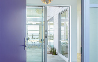
Violet. Violet is everywhere among the new products on the stands this year, like a vernal iteration of the aforementioned mauve. It is also used in contrasting palettes alongside pinks and pastel yellows, but this time much more softly.
Pastel Palette
Maison & Objet trend watcher Elizabeth Leriche told Houzz that starting this season there will be an increase in pastel colors, particular in the mauve to violet spectrum. Our trips through the design trade fair confirmed the pronounced presence of pastel tones this year.
Violet. Violet is everywhere among the new products on the stands this year, like a vernal iteration of the aforementioned mauve. It is also used in contrasting palettes alongside pinks and pastel yellows, but this time much more softly.
Green. Pinks and purples are perfectly matched with all pastel greens. Celadon, lime and sage are the big winners of this chromatic spectrum.
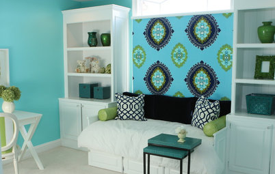
Blue. The French favorite par excellence, blue obviously also figures to soothe this pastel palette even more. We saw it especially in icy shades like azure or sky blue.
Khaki. Natural though this palette may be, it also plays with the contrasts that are so trendy this year. So, earth tones are perfectly matched with botanical greens like moss, sage, fir and lichen.
Beiges and browns. As though to soften the marriage of contrasts, sand, brown and beige tones insert themselves perfectly between two bold colors. They are the final aspect of this palette, a nod to the natural materials that have seduced so much of the decor world at the moment. They are likewise soothing in these troubling times.
Neutral Palette
Refined, comforting decor in dark colors and neutral materials is everywhere in the design world at the moment. It is therefore not surprising that the final palette we spotted at the fair is made up of neutral and pleasant tones that lend themselves to a timeless ambiance.
Refined, comforting decor in dark colors and neutral materials is everywhere in the design world at the moment. It is therefore not surprising that the final palette we spotted at the fair is made up of neutral and pleasant tones that lend themselves to a timeless ambiance.
Ecru. Alongside white, we notice another spectrum revolving around ecru, which gives a bit more depth in refined decor. It works well as a base for natural materials and fibers.
Your turn: What colors do you gravitate toward for your home? Share your thoughts in the Comments.
More on Houzz
Read more design event coverage
Find home professionals
Shop for home products
Your turn: What colors do you gravitate toward for your home? Share your thoughts in the Comments.
More on Houzz
Read more design event coverage
Find home professionals
Shop for home products


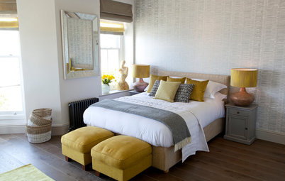
The first palette that caught our eye at Maison & Objet was without a doubt inspired by pop culture. A wave of nostalgia that plunges us back in the ’70s and ’80s has seized decor, furniture and a variety of finishes.
Yellow. Easy to spot, this palette dares bright and tart colors. So, yellow, which has been forgotten a little over the last few years, makes a marked return with sunny, almost fluorescent shades.
Find home design and remodeling professionals near you