Houzz Tour: Dramatic Contrast in Montreal
Contemporary style, clean lines and simple materials support a family’s casual lifestyle

This family was at the point of fight or flight with their outdated, dark and chopped-up 1980s split-level home. After looking for another house to buy, they realized that they loved their neighbors and their walkable neighborhood, and that no matter where they went, they’d still probably have to renovate something. So they decided to work with what they had. They hired an architect and an interior designer to renovate the house and add on a master suite. The result is an open-plan home full of sharp contrast and contemporary style that suits their modern tastes.
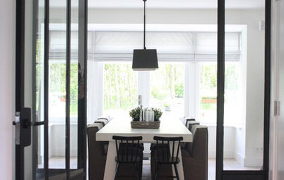
The second set of doors helps keep out the chill of Montreal winters when the front door opens. “These are not expensive doors, but painting them black and using attractive hardware makes them look more expensive and custom,” Stothers says. The house is full of deep contrast between lots of white and black accents and charcoal walls, with rich walnut providing warm wood tones.
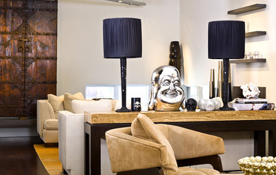
Just inside, a faux-concrete bench adds an industrial touch. “Benches are great for versatile seating. They pull this into the dining room when they have a large group over for dinner, and they also use it outside when they need extra seating out there,” Stothers says.
Bench: CB2; painting: Catlin Stothers
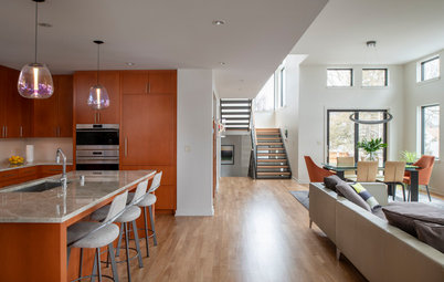
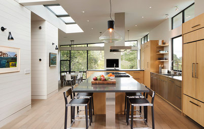
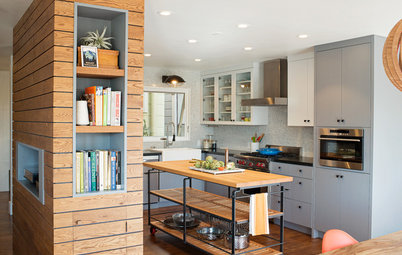
The home was divvied up into small dark rooms, so a major part of the renovations was taking down walls and adding larger windows. The large picture window in the kitchen is new. All the windows, new and old, are tied together with black trim. “Outlining all of the windows in black makes them very graphic,” Stothers says. “This window functions like a painting and was a big opportunity to bring nature inside.”
To update the existing maple floors, she used a dark matte finish that gives them a smoky gray color. “The matte finish on the floors was a good way to hide imperfections and was a big budget saver over replacing them,” the designer says. The kitchen floor is 2-by-2-foot tile that looks slightly distressed to resemble concrete. She used subtle industrial touches like this throughout the design to tie the rooms together.
Formula counter stools with sled base: Area Declic
There are lots of matte finishes all over the house. The charcoal cabinet wall is coated in a lacquer that has just a 15 percent sheen. “The result is that it looks very velvety, muted and is nonreflective,” Stothers says. “With all of the windows in here, it would have been too busy if it had reflected everything and wouldn’t provide such a strong contrast.”
To install a coordinating refrigerator without splurging on a built-in, she ordered a panel-ready free-standing refrigerator, and had the cabinetmakers add panels and handles that coordinate with the rest of the charcoal wall.
Paint: Wrought Iron (refrigerator wall) and Chantilly Lace in eggshell finish, both Benjamin Moore
AFTER: Another large window brings in more color and nature from outside.
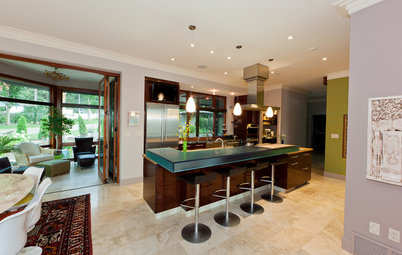
The island stools are soft yet durable and can stand up to kids. “My client really wanted the cooktop to be on the island so that her kids can sit and snack or color here while she cooks,” Stothers says. Three sculptural pendants mark the dining area. The family eats most of their meals together here.
“The way they live is very casual. Don’t let the modern style fool you — nothing in here is too precious,” she says. For example, the counter stools are upholstered in a neoprene-like fabric that can withstand spills, and the quartzite countertops are very durable.
“The way they live is very casual. Don’t let the modern style fool you — nothing in here is too precious,” she says. For example, the counter stools are upholstered in a neoprene-like fabric that can withstand spills, and the quartzite countertops are very durable.
The client wanted the cooktop on the island, but Stothers didn’t want to block the view with a bulky vent hood. The solution? A Bosch stove with a downdraft vent that pops up when needed, then disappears out of view when not in use.
Tucking the appliances out of view smooths the transition between the kitchen and dining room. “The walnut on the island matches the walnut dining table my clients already had, so the island takes on the look of another piece of furniture, like an oversized sideboard,” Stothers says.
The brass light fixture allows for a view through it as well. “We had the manufacturer customize one of their existing chandeliers a bit; it has a deconstructed architectural look, and it’s also very sculptural,” she says.
Mikado chandelier: Lambert et Fils
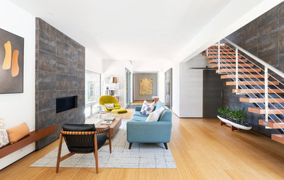
A few steps down from the kitchen is the family den, which is cozied up with kids in mind. Across from the sofa are a fireplace and TV. She chose a soft fabric for the sofa that feels and looks like felt, with thick piping that goes with the scale of the substantial pieces of furniture throughout the house. “It’s also great because it has one long cushion on the seat, so five or six kids can sit across it comfortably,” she says. “With the long ottoman that tucks in right next to the chaise, it functions like a giant chaise for six kids.”
The artwork is a collection of family photos arranged in a loose gallery formation. “My clients had picked a yellow frame and wondered if we could use it here.… It adds a great pop of color,” she says. “They also already had the walnut side tables, which were proportioned just right for this room.”
Runner: West Elm
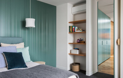
In the new master bedroom suite, the charcoal didn’t have to be the same shade as the one in the kitchen, but it wound up that way. “We played with several shades in here, and I even had her do a blind test, but she always picked the same color we’d used in the kitchen,” Stothers says.
Keeping furniture low makes the ceilings seem higher.
Tundra bed: CB2; Pebble side table: West Elm; painting: Catlin Stothers
Keeping furniture low makes the ceilings seem higher.
Tundra bed: CB2; Pebble side table: West Elm; painting: Catlin Stothers
“With all of the stark contrast, we needed a little bit of bling,” Stothers says of the Egyptian hammered-metal light fixture. “The fact that it’s imperfect keeps it organic, and the little pinholes cast beautiful light patterns all around the room; it’s kind of like a disco ball.”
Tip: Give a ready-made closet system a custom look. The entire system is from Ikea but is outfitted to look built in. When measured out and centered, there were just 3 inches left over on each side of the system. “I bought a few extra door panels in the high-gloss white, and the contractor was able to use them to fill in the extra area,” she says. By saving on this part, they had some splurge money leftover for high-end monopoint lights overhead.
Pax closet system: Ikea
The new master bathroom uses another strong accent wall. Tiles with a metallic pewter finish compose a stunning backdrop that reflects the light from the skylight. The shower stall and vanity are tucked out of view from the bedroom, allowing that wall and curvy silhouette of the bathtub to create a beautiful and inviting focal point.
The black metal sconces add that same contrast and bring in a bit of industrial style. A white-and-walnut vanity and walnut shelves continue the use of the organic material through the suite.
Sconces: Lambert et Fils
Sconces: Lambert et Fils
The 2-by-2-foot porcelain floor tiles resemble marble with very light veining. “Using this large size meant fewer joints, which results in a less busy look,” the designer says. She continued the same tile up the shower walls but in the 2-by-1-foot size. The shower floor is a coordinating small-scale Carrara marble mosaic.
She used minimal hardware and framing on the shower, again keeping the look as unfussy as possible. “With this kind of base, you can bring in interest with the accessories,” she says. For example, the orange Kartell stool injects a little color into the monochromatic scheme.
She used minimal hardware and framing on the shower, again keeping the look as unfussy as possible. “With this kind of base, you can bring in interest with the accessories,” she says. For example, the orange Kartell stool injects a little color into the monochromatic scheme.
“The tiles have a pewter gunmetal finish. They aren’t perfect, so they have this wonderful handmade look, yet they still bring in a hint of industrial style,” Stothers says. Again, a strong contrast makes the space.
Finding the right tub took a thorough search. “They are big bath people. One of my clients and the kids spent a lot of time lying in tubs and testing them out before choosing this one,” she says. “Form is important but not as important as function.” That philosophy is why the design for the whole house has been such a success for their family.
Caicos bathtub: Aquabrass; floor-mounted tub filler with hand shower: Baril; tile: Stone Tile
Browse more homes by style: Apartments | Barn Homes | Colorful Homes | Contemporary Homes | Eclectic Homes | Farmhouses | Floating Homes | Guesthouses | Homes Around the World | Lofts | Midcentury Homes | Modern Homes | Ranch Homes | Small Homes | Townhouses | Traditional Homes | Transitional Homes | Vacation Homes
Houzz at a Glance
Who lives here: A young family of four
Location: Montreal
Size: 2,700 square feet (251 square meters); four bedrooms; three bathrooms
Designers: Interior designer Catlin Stothers and architect Michel Villeneuve
“My clients love modern style, and they live a casual lifestyle with kids,” says designer Catlin Stothers. “But you don’t have to give up one for the other.” By keeping everything from feeling too precious, they can enjoy the minimalism and strong contrast they love while maintaining a family-friendly home.
“We wanted to have fun with the entry; because the rest of the house is now so light, we just went with the dark and moody,” she says. Hexagonal tiles in a pattern by the designer pick up on the deep charcoal hue on the walls. A walnut-framed mirror adds warmth and hints at what awaits inside.
Mirror: Ikea