Interior Design
How to Decorate with Pantone's 2018 Colour of the Year
Pantone names Ultra Violet as the new "it" colour – Houzz pros share how and where to use it in our homes

Earlier today, the Pantone Color Institute announced their 2018 colour of the year: PANTONE 18-3838, Ultra Violet – “a dramatically provocative and thoughtful purple shade,” as the official press release has it.
Will it be Popular?
Pros say that the colour can be divisive. As Australian architectural colour consultant Jacquelene Symond of The Colour Agency, puts it, “violet is one of those colours that you either like or dislike – there’s no in-between.”
Sophie Mouton-Brisse, Houzz France contributor and author of DécoBox: Colours and Well-Being, says, “Even if its profound symbolism ‘gels’ with the surrounding ambiance, violet is not an easy colour. Many people do not like it … For others, this is a colour that recalls the “hippie” period, with its patchouli haze. For all of these reasons, it stands to reason that it will be more difficult to market than other colours.”
On the other hand, pros also highlight its great potential for interiors and, like the Pantone Color Institute, point to its meaningful associations.
Stefan Nilsson, Swedish design and interior trend forecaster, says, “I am surprised, and yet not surprised, to hear that ultra violet will become colour of the year. In my travels to fairs in Paris, Milan and New York, I have seen all sorts of reds – from dusty pink to burgundy – in the interior colour scheme for 2018, but this purple has more blue in it, more than I expected. But I like being surprised. Violet, to me, stands for elegance and exclusivity. It is also a serious colour tone, since it is traditionally associated with royalty and the Christian church.”
Stefan Nilsson, Swedish design and interior trend forecaster, says, “I am surprised, and yet not surprised, to hear that ultra violet will become colour of the year. In my travels to fairs in Paris, Milan and New York, I have seen all sorts of reds – from dusty pink to burgundy – in the interior colour scheme for 2018, but this purple has more blue in it, more than I expected. But I like being surprised. Violet, to me, stands for elegance and exclusivity. It is also a serious colour tone, since it is traditionally associated with royalty and the Christian church.”
A Colour for the Brave
German pro Markus Altvater of The Inner House says, “Violet has been a trend for a couple of years now. However, I would not consider it a ‘mainstream true-love’ colour for German designers and homeowners. Ranging somewhere between warm (=red) and cold (=blue) on the colour wheel, violet’s tremendously majestic and chic appearance may just be a little bit too opulent for the majority of Germans – who generally prefer more subtle tones and shades.”
German pro Markus Altvater of The Inner House says, “Violet has been a trend for a couple of years now. However, I would not consider it a ‘mainstream true-love’ colour for German designers and homeowners. Ranging somewhere between warm (=red) and cold (=blue) on the colour wheel, violet’s tremendously majestic and chic appearance may just be a little bit too opulent for the majority of Germans – who generally prefer more subtle tones and shades.”
Russian designer Taras Bezrukov of TS Design says, “Ultra Violet is not a colour that could become ‘the new beige’ or ‘the new grey’ for Russian audiences. It’s a colour of boldness and decisiveness, for self-assured people who are confident in their choices. On the other hand, beige is the colour for neutral solutions for warm and cosy interiors. I’d say it’s for people who have a different mindset. If we look at the amount of beige interiors in Russia – and these have been dominating – we’ll probably deduce that completely Ultra Violet interiors are hardly to be expected in Russia.”
What colours match Ultra Violet best?
Russian interior designer Daria Kharitonova says, “Ultra Violet suggests loads of great palettes. Turquoise, green, crimson – these go wonderfully with it. It also goes perfectly with a dusty orange and accentuates the warmth of brass.”
Russian interior designer Daria Kharitonova says, “Ultra Violet suggests loads of great palettes. Turquoise, green, crimson – these go wonderfully with it. It also goes perfectly with a dusty orange and accentuates the warmth of brass.”
For Altvater, “Violet delivers great value when combined with other bright colours such as red, orange or pink. For a more modern colour scheme, combine violet with neutral tones like white and grey. If you would like to achieve an extravagant statement look, you can pair [it] with a dark olive-green. Pastel tones like pale rose and light blue create a very harmonious look in combination with violet.”
Nilsson says, “I think purple, together with grey, beige and minty green will become a smash hit in the Scandinavian market. Oh, and why not add a dash of a dark foresty green. Lovely.”
Symond says, “The easiest way to work out which colours will work with violet is to look at a colour wheel. Focus on the three colours that sit to either side of violet – these are called analogous colours, and will give you a beautiful, harmonious palette. In this instance, you’ll most likely be looking at red purple, blue and blue-purple. Alternatively look for the complimentary colour to violet – the colour that sits directly opposite it on the colour wheel, which in this case is yellow. Rich metallics such as gold, silver and bronze also sit beautifully with violet.”
Symond says, “The easiest way to work out which colours will work with violet is to look at a colour wheel. Focus on the three colours that sit to either side of violet – these are called analogous colours, and will give you a beautiful, harmonious palette. In this instance, you’ll most likely be looking at red purple, blue and blue-purple. Alternatively look for the complimentary colour to violet – the colour that sits directly opposite it on the colour wheel, which in this case is yellow. Rich metallics such as gold, silver and bronze also sit beautifully with violet.”
How to use Ultra Violet
A dominant colour which can even overpower other elements in an outfit or an interior, Ultra Violet demands decent company and well-thought-out coordination.
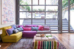
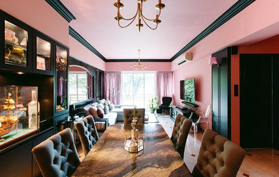
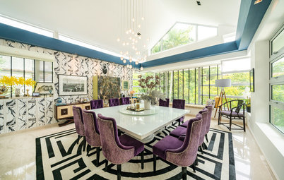
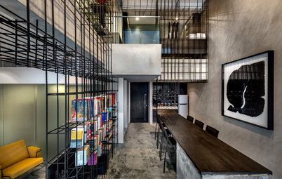
Stas Samkovich, designer and co-founder of TS Design, says: “Magazines are bound to push the fact that Ultra Violet goes well with shades of green. Which is true. For me, though, it only works under one condition – the hues should be rich and solid. Using them both in lighter, washed-out shades … seems unacceptable to me. It would look depressing. Ultra Violet goes very nicely with “dirty” shades [as in the photo above], which should appeal to the those looking for a brutalist interior. In this case, the colours of such an interior should be as solid as the violet, so that the overall look will be coherent.”
Mouton-Brisse also thinks that small details are where purple can shine. “There could be a tendency towards violet in little touches within the decor – cushions, curtains, lamps, objects. Purple also conveys the meaning of rarity and luxury, which could favour its development in the world of upscale design.”
A dominant colour which can even overpower other elements in an outfit or an interior, Ultra Violet demands decent company and well-thought-out coordination.
Stas Samkovich, designer and co-founder of TS Design, says: “Magazines are bound to push the fact that Ultra Violet goes well with shades of green. Which is true. For me, though, it only works under one condition – the hues should be rich and solid. Using them both in lighter, washed-out shades … seems unacceptable to me. It would look depressing. Ultra Violet goes very nicely with “dirty” shades [as in the photo above], which should appeal to the those looking for a brutalist interior. In this case, the colours of such an interior should be as solid as the violet, so that the overall look will be coherent.”
Mouton-Brisse also thinks that small details are where purple can shine. “There could be a tendency towards violet in little touches within the decor – cushions, curtains, lamps, objects. Purple also conveys the meaning of rarity and luxury, which could favour its development in the world of upscale design.”
Russian interior designer Mike Shilov says: “If you’re aiming towards a calm and homey interior, Ultra Violet calls for greyish, deep and ‘dusty’ shades that would add depth. In this case, the greys and violets should be balanced by warm tones – not ones that are adjoining on the colour wheel, but complementary colours. For example, grey walls and violet curtains or furniture can be visually softened by warm wood flooring and wooden furniture in natural shades.”
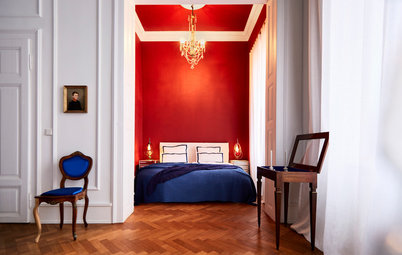
Photo by Jonny Valiant
Australian pro Sonia Simpfendorfer, creative director at design firm and colour consultancy Nexus Designs says, “Use ultra violet to punctuate an otherwise neutral scheme – think warm white walls, oak floors and natural linens. Adding in some yellow is a nice touch – this is violet’s complementary colour on the colour wheel. You can help work intense violet into an otherwise neutral scheme by using supporting shades from the purple family, such as a muted purple sofa with vivid violet scatter cushions.”
Australian pro Sonia Simpfendorfer, creative director at design firm and colour consultancy Nexus Designs says, “Use ultra violet to punctuate an otherwise neutral scheme – think warm white walls, oak floors and natural linens. Adding in some yellow is a nice touch – this is violet’s complementary colour on the colour wheel. You can help work intense violet into an otherwise neutral scheme by using supporting shades from the purple family, such as a muted purple sofa with vivid violet scatter cushions.”
Singapore interior designer Nikki Hunt from Design Intervention recommends a base palette of soft violet, cool blues and gentle greys: “These colours provide a cooling backdrop to which we have added stronger hues and patterns to give depth to the design.”
Shilov says: “If you’re using Ultra Violet to create a vigorous look, you can add lime and chartreuse to the palette for an intriguing contrast. It’s better to use saturated colours in smaller doses or on different surfaces, so as not to overdo it.”
Italian architect Pierpaolo Iannone says: “I think violet fits perfectly with classic colours, like white or grey, or bolder ones like yellow and green. I’d love to style a violet-coloured wall with white furniture, such as a sofa or kitchen cabinets, even in classical style.”
Italian architect Pierpaolo Iannone says: “I think violet fits perfectly with classic colours, like white or grey, or bolder ones like yellow and green. I’d love to style a violet-coloured wall with white furniture, such as a sofa or kitchen cabinets, even in classical style.”
The Importance of Lighting
Ultra Violet looks different, depending on whether it is exposed to natural or artificial lighting. It all depends on the warmth of the bulbs you’re using – artificial lighting can be warm, neutral or cold. For residential interiors, warmer lighting – labeled 2700K (a measure of colour temperature) – is usually used, and these lights add a notable yellow tinge.
Kharitonova says: “At its core, Ultra Violet is a mix of blue and red. One of the two then becomes dominant, depending on the lighting. [The yellow of ] warmer lighting brings the red to the forefront, making the colour closer to a magenta shade. Colder illumination brings out the blue. These things should be taken into account when planning interior lighting.”
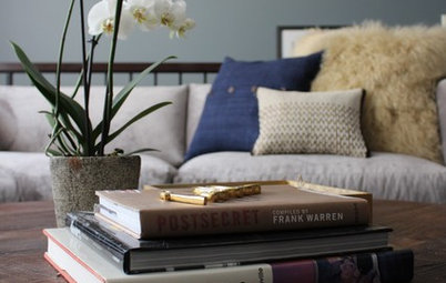
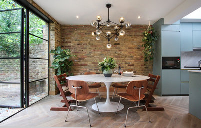
Notice the carpet fringe in this photo: this is a great way to add a micro dose of Ultra Violet to an interior.
Where Would it Work in the Home?
Bolder colours are usually recommended where people don’t spend as much of their time, including hallways, entry halls and guest bathrooms.
Simpfendorfer suggests: “It would work in any room, but I’d use it in light-filled living spaces in preference to bedrooms or kitchens or bathrooms. Inky blues and denim shades can be very calming and luxurious in a bedroom, but ultra violet and purple have an intensity that might work against sleep – they’re too dramatic.”
“Bathrooms need to have a very flattering light, and if you were to use a lot of violet or purple, it could create a blue-tinged light that might make you look a little queasy. Kitchens can take really deep, dark colours on joinery [cabinetry], but once again it’s about the overall effect of the colour on the light. Food needs quite natural light and reads best against a more neutral background.”
Mouton-Brisse agrees, but sees a role for it in bedrooms as well. “Purple has a very specific energy, which likewise explains why it is often tied to the worlds of spiritual and sacred things. It is an extremely soothing colour, nearly hypnotic in certain very dark shades. It is calming and soporific. I therefore naturally advise using dark shades in adult bedrooms and lilac – a lighter but very effective shade – in children’s rooms.
“In public spaces, like living rooms, it brings in a lot of elegance, and its rarity makes it an asset in a refined and personalized ambiance.”
Altvater says: “The use of any colour depends on the client’s taste, of course. In general, given its boldness, I’d recommend using violet as an accent colour and on fabrics. A sofa or a single wall in a deep berry-toned violet, for example, would make a great focal point in a living room. A violet chest of drawers or armchair are nice accent pieces.
“If you are unsure whether you really love violet, you can give it a try with pillow cases first. If you want to go all-out, keep violet’s spiritual connotations and its effect when combined with other colours in mind. If you happen to have a meditation room or spa in your home, for example, a dark violet used throughout would achieve a very dramatic look.”
Tip: you can also test out Ultra Violet using LED lights to emulate the paint.
Symond, says: “Violet is a strong colour, so unless you’re completely obsessed with it, it’s best used in small doses as an accent colour so that it doesn’t overwhelm a space.”
Symond, says: “Violet is a strong colour, so unless you’re completely obsessed with it, it’s best used in small doses as an accent colour so that it doesn’t overwhelm a space.”
Ott says: “Last year’s selection, Greenery, while also a bold choice, was much easier to integrate into the home. It almost works as a neutral. It’s important to point out that these colours are not a call to redecorate one’s home in the latest trendy hues. Few of us have the budget or wherewithal to redo our decor every year. But my advice to those who are drawn to a particular colour is that it will become easier to find furnishings and decorative accessories in the chosen hue. So that means 2018 will be a good year to stock up on all things purple, if you love the colour.”
Tell us
Love it or Hate it? Have you ever used utlra violet in own projects? Share your opinion in the comments
Love it or Hate it? Have you ever used utlra violet in own projects? Share your opinion in the comments
Ultra Violet is by no means Pantone’s first purple shade – in September 2017, they launched Love Symbol #2 (Pantone PQ7448C) as a tribute to pop-star Prince. As this year’s press release points out, purple is also linked to David Bowie and Jimi Hendrix, who famously turned to shades of violet to express their individuality.
Besides creativity, Pantone notes that Ultra Violet is associated with mindfulness practices, and has an overall mystical and spiritual quality that offers a refuge from today’s over-stimulated world.
So will it be the next “it” colour? And where and how can you use it in your home? Houzz pros weigh in.