How to Test Paint Colours
Whether you're choosing a rich neutral or a super-saturated colour, paint needs a special ingredient to come out right – the pros weigh in

It’s a common image: Someone selecting a wall colour paints several sheets of paper or sample boards and hangs them on the wall to compare colors. It looks artistic and even a bit hip, but it may not be the most accurate way to vet wall paint. We talked to five pros, including painters and designers. Here’s what they suggest instead.
Tip: If you’re hiring a paint company, see if it will provide free sample cans of the colours you’re considering. Many companies do. Remember, once you’ve had the paint tinted (mixed), you can’t get your money back. Even if you have to pay for them yourself, sample cans (typically $3 to $8) are well worth the expense.
Paint Two Coats
That’s the amount of coverage you’ll typically need on any wall. The second coat usually makes a big difference in the way the paint reads. Also, paint large swaths — at least 30cm x 30cm, and even larger is better. The 5-centimetre swatches won’t give you a good sense.
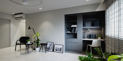
Here, in a white room with white floorboards, the designer used a plain white base.
That’s the amount of coverage you’ll typically need on any wall. The second coat usually makes a big difference in the way the paint reads. Also, paint large swaths — at least 30cm x 30cm, and even larger is better. The 5-centimetre swatches won’t give you a good sense.
Here, in a white room with white floorboards, the designer used a plain white base.
For Certain Rich Colours, Use a Primer
A small selection of deep paint colours can be created only in conjunction with specific primers. The paint deck will show which colours are in this category. (Pictured here are four by Sherwin-Williams, clockwise from top left: Lemon Twist, Hyper Blue, Daredevil, African Violet.)
For these specific colours, you probably won’t be able to get a sample size in the paint, though you may be able to in the primer, says J.T. Trainor, owner of Freshcoat Painting, a paint company in the Phoenix metro area.
Paint Multiple Walls
The colours you’re testing will read differently depending on the amount of light that hits them. “We recommend you paint on a wall that doesn’t get direct sunlight and one that does,” Trainor says.
The colours you’re testing will read differently depending on the amount of light that hits them. “We recommend you paint on a wall that doesn’t get direct sunlight and one that does,” Trainor says.
In the above photo, notice how much darker the grey on the right side of the room is than on the left. In the photo of the orange room, the color appears much deeper at the back wall, where it is in shadow, and less intense on the left and right walls, where more light hits.
Also, landscaping outside a window can colour the light streaming through it and change how a paint looks on the wall as well. In the above photo, where the green trees can be seen through the window, they’ve tinted the grey on the right side of the room a greener hue. See it, in the corner?
As you view the colours, make sure you consider what time of day you’ll most often be in the room. You want to like how the colour looks at that time.
Place Lighting Before You Test
It’s simple, but true: It’s better to use the lighting that fits your needs than try to select your lighting to complement your paint colours. “You wouldn’t want to pick a lightbulb that looks good with your paint colour, but you can’t read in the room,” says Jennifer Ott, a San Francisco-based colour consultant and interior designer.
Here, the overhead lighting is casting a yellow glow throughout the room, warming the colour of the off-white paint toward a pale shade of honey.
Make sure your lighting is in place as you’re considering colours. They may look quite different in bright bulbs that you prefer for nighttime use — or softer yellow-hued ones, if that’s what you’re going for — than they do during daylight hours. Having the right fixtures and bulbs in place can help you decide which shades will work for you.
If you’re not yet sure what lighting you prefer, you can use the time examining your samples to experiment. “Even changing out lightbulbs is a good thing to do,” says Carl Mattison, an interior designer in Atlanta. “Like any colour in the world — just like your eyes or your hair or your skin tone — things will change in different light.”
Here, the yellow light from the chandelier and sconces warms up the cooler white of the walls.
TELL US
Have you painted the wrong hue on your wall before? What tip from the above do you think you could have used? Share in the Comments section.
MORE
See Stylish Singapore Homes
Find a Paint Professional Near You
Colour Guide: How to Identify the Paint Shade You Want
TELL US
Have you painted the wrong hue on your wall before? What tip from the above do you think you could have used? Share in the Comments section.
MORE
See Stylish Singapore Homes
Find a Paint Professional Near You
Colour Guide: How to Identify the Paint Shade You Want
This is true for interiors as well as exteriors: You’ll get the best sense of how the colour will really look if you paint it directly on the wall. Each of the five pros we spoke with agreed. “If they use a board, I feel like it just doesn’t saturate the same way,” says interior designer Keith Wardlaw of Plus Modern Designs in Kansas City, Missouri.
Kelly Porter, an interior designer in the Washington, D.C., area, explains the problem with using boards: “The texture is really not representative. It’s not the same as what’s on your wall, and that can really affect the look,” she says.
In this image, the colours are not samples, but intentional horizontal stripes in a finished room. The paint colours are Benjamin Moore’s Arctic Blue, Palladian Blue and Blue Bonnet.