
Interior Design
Is Grey In or Out for 2018?
We fell for it when it was the new neutral and we’ve stuck with it ever since, but have we finally reached peak grey?

Once upon a time – OK, around seven years ago – grey started its ascent to the interiors throne. What began as a daring choice soon became a staple and grey is still a hugely popular colour, whether we’re talking wall paint, sofas or kitchen cabinetry. But has the time come for grey to relinquish its crown, or is there life in the old shade yet? Let’s read the runes and find out.
The colour: Pinky-grey
Why it’s a contender: It’s grey, plus warmth
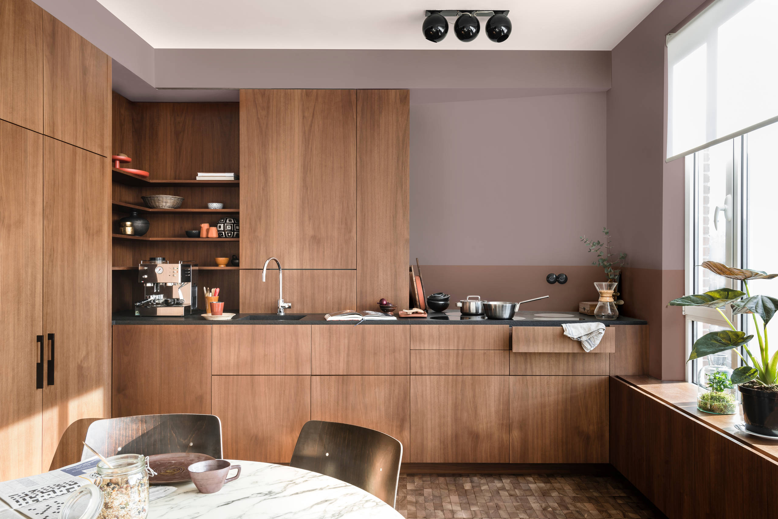
Dulux’s Colour of the Year 2018 is Heart Wood and this, plus other mauves and heathers, are for decorators who’ve fretted about grey looking too cool. The pink element means that threat is avoided, but the tint doesn’t stray into candy territory.
This teaming of wooden cabinetry with pinky-grey is a combination to note if you’re after a kitchen with maximum warmth.
Why it’s a contender: It’s grey, plus warmth
Dulux’s Colour of the Year 2018 is Heart Wood and this, plus other mauves and heathers, are for decorators who’ve fretted about grey looking too cool. The pink element means that threat is avoided, but the tint doesn’t stray into candy territory.
This teaming of wooden cabinetry with pinky-grey is a combination to note if you’re after a kitchen with maximum warmth.

Here’s another take on pinky-grey. The shade on this shelving is paler – an ultra-sophisticated blush – but like other more mauvey tones, it creates gentle and appealing heat.

The colour: Green
Why it’s a contender: It’s straight from nature
The green on the wall of this dining space is a subtle olive tone, but it has more colour than a neutral such as grey, so it makes an impact as a backdrop to the pared-back scheme.
Try green in rooms that lead directly to the garden and have bifold or sliding doors or generous glazing to subtly blend the colours of indoor and out. Quieter shades like this are better for a whole wall, but upholstered furniture also looks good in foliage tints.
Why it’s a contender: It’s straight from nature
The green on the wall of this dining space is a subtle olive tone, but it has more colour than a neutral such as grey, so it makes an impact as a backdrop to the pared-back scheme.
Try green in rooms that lead directly to the garden and have bifold or sliding doors or generous glazing to subtly blend the colours of indoor and out. Quieter shades like this are better for a whole wall, but upholstered furniture also looks good in foliage tints.

The colour: Purple
Why it’s a contender: It’s on trend for 2018
Pantone, standards provider to the design industry, picked Ultra Violet, aka PANTONE 18-3838, as its colour of the year for 2018. Set that alongside its recent unveiling of a standardised purple to represent rock icon Prince, and you can be sure this shade is going to be a big deal next year.
Ultra Violet is a purple as punchy as they come, but it’s not to everyone’s taste, so how about a softer take on the colour as shown here? It’s a complement to grey – check out the backsplash tiles – so you could introduce it to update a painted kitchen without having to change every element of your scheme. Alternatively, follow this example and use it to differentiate an island from the surrounding cabinetry.
Why it’s a contender: It’s on trend for 2018
Pantone, standards provider to the design industry, picked Ultra Violet, aka PANTONE 18-3838, as its colour of the year for 2018. Set that alongside its recent unveiling of a standardised purple to represent rock icon Prince, and you can be sure this shade is going to be a big deal next year.
Ultra Violet is a purple as punchy as they come, but it’s not to everyone’s taste, so how about a softer take on the colour as shown here? It’s a complement to grey – check out the backsplash tiles – so you could introduce it to update a painted kitchen without having to change every element of your scheme. Alternatively, follow this example and use it to differentiate an island from the surrounding cabinetry.

The colour: Teal
Why it’s a contender: It’ll do the feature wall job
White walls all round in a large room can feel stark, and grey’s become a go-to as a feature wall shade to make big spaces feel more intimate. Go for teal and you can get the same effect plus more visual interest.
Why it’s a contender: It’ll do the feature wall job
White walls all round in a large room can feel stark, and grey’s become a go-to as a feature wall shade to make big spaces feel more intimate. Go for teal and you can get the same effect plus more visual interest.

Its not just for single walls. Jewel-like teal can give any scheme a lift and provides a rich depth when used on walls all over or dotted around in soft furnishings.
So, are we really saying goodbye to grey?
There’s no denying the decorative qualities of the alternatives to grey. However, there are also some persuasive arguments for keeping it as part of your palette…
1. It lets colour shine
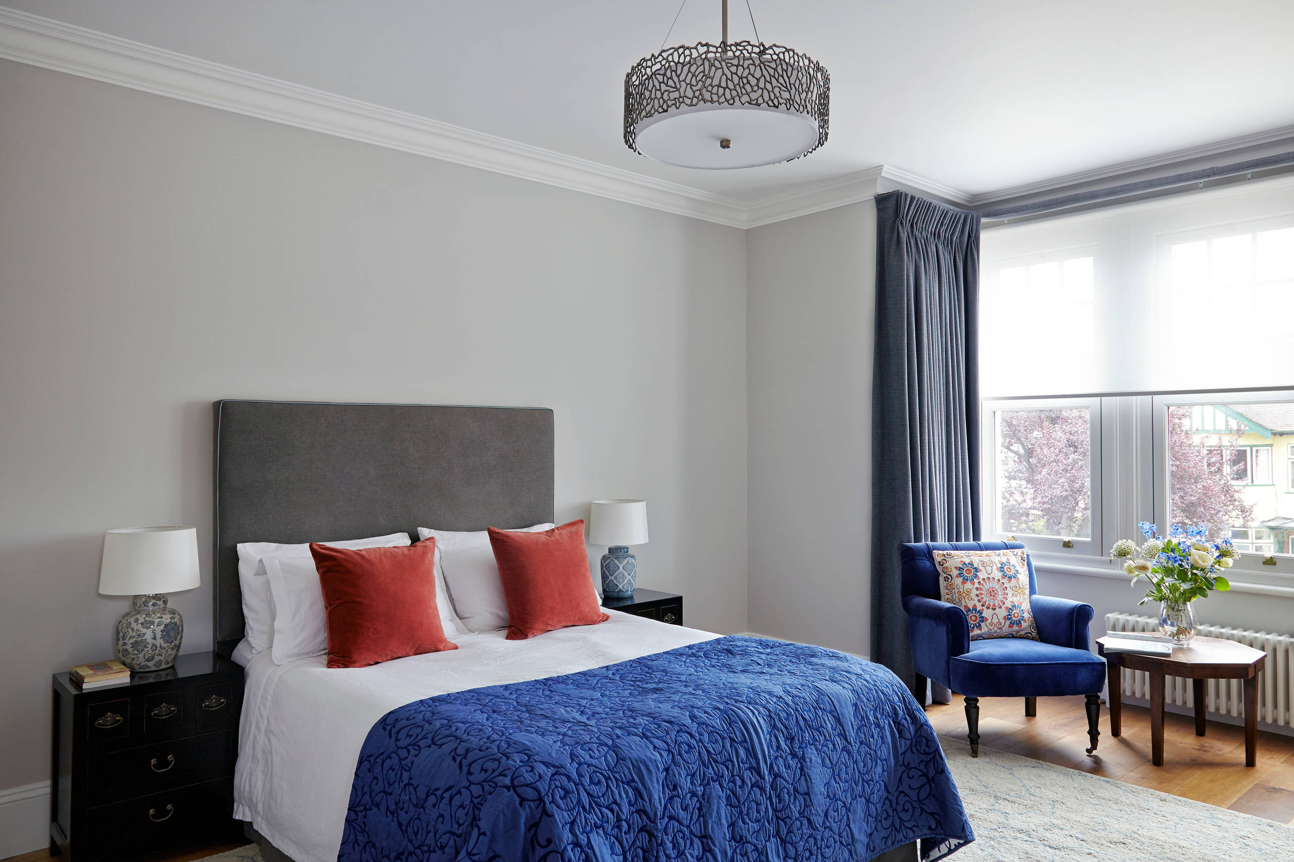
Looking for a backdrop that allows other shades to stand out? Grey is a natural. This pale grey wall and darker headboard are quiet enough to let blue and orange do the talking where white might be distractingly bright or stark.
There’s no denying the decorative qualities of the alternatives to grey. However, there are also some persuasive arguments for keeping it as part of your palette…
1. It lets colour shine
Looking for a backdrop that allows other shades to stand out? Grey is a natural. This pale grey wall and darker headboard are quiet enough to let blue and orange do the talking where white might be distractingly bright or stark.

2. It’s instantly contemporary
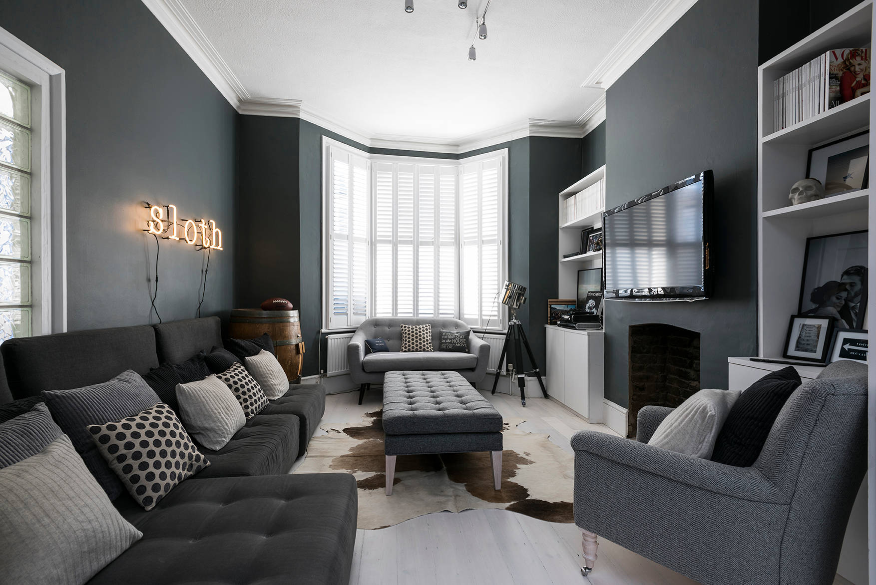
If black sounds too gothic for your taste, charcoal grey will come to your rescue and create a scheme that’s striking and modern. Team it with fluoro shades, like this coffee table, or let metallics such as gold or brass sparkle.
If black sounds too gothic for your taste, charcoal grey will come to your rescue and create a scheme that’s striking and modern. Team it with fluoro shades, like this coffee table, or let metallics such as gold or brass sparkle.
3. It flatters period features
Is your home blessed with the elegant detail of Victorian or Edwardian house building? If so, it will stand out beautifully when painted white against a grey wall, focusing attention on the room’s assets. The prominence of this room’s high skirting board and cornice shows how grey avoids getting into a fight for attention.
Is your home blessed with the elegant detail of Victorian or Edwardian house building? If so, it will stand out beautifully when painted white against a grey wall, focusing attention on the room’s assets. The prominence of this room’s high skirting board and cornice shows how grey avoids getting into a fight for attention.
4. It works with stone
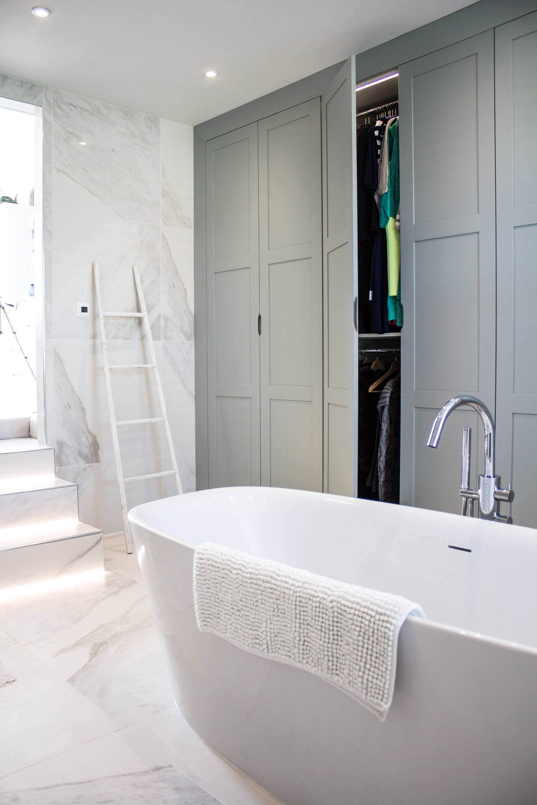
A grey-veined stone paired with a grey paint create a pleasing harmony, whether you’re taking a cue from tiles in the bathroom or a worktop or backsplash in the kitchen.
In this bathroom, the greeny-grey on the cabinetry – Little Greene’s Pearl Colour Dark – is a perfect partner to the grey-toned tiles on the floor and walls.
A grey-veined stone paired with a grey paint create a pleasing harmony, whether you’re taking a cue from tiles in the bathroom or a worktop or backsplash in the kitchen.
In this bathroom, the greeny-grey on the cabinetry – Little Greene’s Pearl Colour Dark – is a perfect partner to the grey-toned tiles on the floor and walls.
5. It looks great as a block
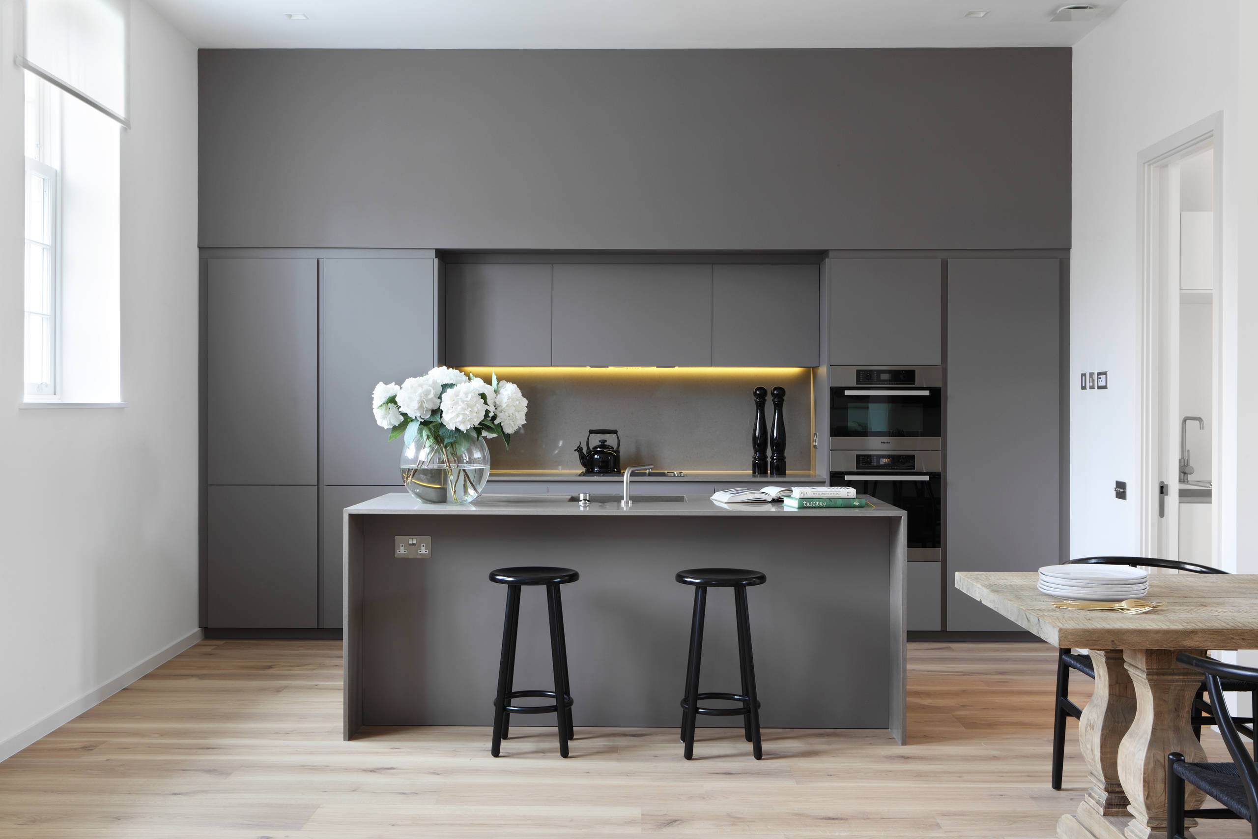
A wall of super-sleek kitchen cabinetry in grey draws the eye, but could have looked overbearing in a bolder colour. This is a warm version that gives the high-ceilinged space a welcoming atmosphere. A wooden table and flooring bring in organic warmth, too.
Tell us
Is grey still a decorating favourite for you? Or has it had its moment? Share your thoughts in the Comments section.
A wall of super-sleek kitchen cabinetry in grey draws the eye, but could have looked overbearing in a bolder colour. This is a warm version that gives the high-ceilinged space a welcoming atmosphere. A wooden table and flooring bring in organic warmth, too.
Tell us
Is grey still a decorating favourite for you? Or has it had its moment? Share your thoughts in the Comments section.

Sponsored
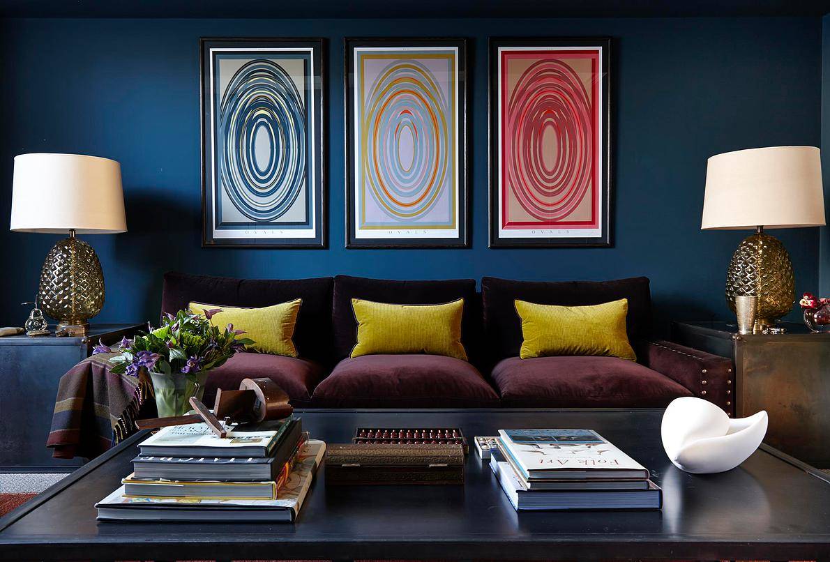
The colour: Indigo blue
Why it’s a contender: It’s cocooning
For a room that welcomes you like a hug, a deep, rich blue is hard to beat. It pulls off dark grey’s trick of making a space feel cosy and it’s a calming colour that invites relaxation.
Concerned about the longevity of this trend? Walls in this shade have already proven they’re no fly-by-night fancy, so you won’t have to get the paintbrush out again for a while if you decide to take the plunge.