Moscow Houzz Tour: Minimalist Industrial Apartment Goes Graphic
Visit this family apartment for its kitchen-bar, stay for the graphic patterns and minimalist decor

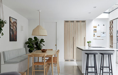
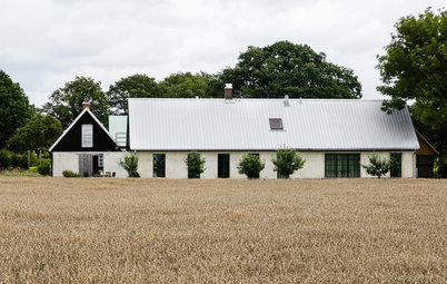
Apartments in old buildings present both a challenge and myriad possibilities for an architect. When renovating the interior of this hundred-year-old building on the central and historic Sretenka Street in Moscow, architects Sergey Kolchin and Nadezhda Torshina faced numerous technical difficulties, but also had the opportunity to play around with graphic elements and modern reinterpretations of its classic past. In the process, they preserved the old parquet, exposed bricks and incorporated the utility staircase into the kitchen layout.
Photos by Polina Poludkina
Houzz at a Glance
Who lives here: A family with two kids
Location: Moscow, Russia
Size: About 1050 square feet (98 square metres)
Year built: 1913
Architects: Sergey Kolchin and Nadezhda Torshina of Le Atelier
Houzz at a Glance
Who lives here: A family with two kids
Location: Moscow, Russia
Size: About 1050 square feet (98 square metres)
Year built: 1913
Architects: Sergey Kolchin and Nadezhda Torshina of Le Atelier
When the owners first bought it, the apartment looked like it hadn’t been renovated once since the building was built. The layout also lacked any logic: In Soviet times, huge apartments in what were known as “revenue houses” – a style of construction originating in the 18th and 19th centuries, involving large multi-dwelling homes where units were designed to be rental properties from the outset – were sub-divided arbitrarily.
The ceiling posed another problem. It is made of wood-fibre reinforced cement composite slabs, which had to be strength tested before any changes could be made to the layout.
The ceiling posed another problem. It is made of wood-fibre reinforced cement composite slabs, which had to be strength tested before any changes could be made to the layout.
Apartment Layout: 1. entrance; 2. Living room; 3. hallway; 4. kitchen; 5. bathroom; 6. children’s bedroom; 7. master bedroom; 8. walk-in closet; 9. bathroom
Luckily, the ceiling turned out to be in acceptable condition. Having secured permission for the renovation, the architects got started on dramatically changing the space.
The owners had come to them with one special request: A large home bar where they could entertain guests. All the designs the architects came up with centred on that one element. The layout they went for has two entrances, one of which opens directly onto the bar area. Guests enter through here, and the owners also use this staircase to bring groceries directly into the kitchen.
Another of the owners’ priorities was to spruce up the interior brickwork.
Tall cabinets with yellow-and-green fronts – yellow is a recurring motif in the apartment – stand against one of the walls in the main entrance hallway.
Tall cabinets with yellow-and-green fronts – yellow is a recurring motif in the apartment – stand against one of the walls in the main entrance hallway.
The designers were able to partially preserve the hundred-year-old parquet. They first removed the original finish, and then took the boards to their workshop to clean them.
Unfortunately, many of the boards had to be thrown away, as they were broken or too worn to be salvaged. There were only enough pieces left for the living room and dining room, so the architects had to find something similar for the other spaces. However, the old boards can easily be distinguished, as a hundred-year-old parquet has a distinctive texture and feels like stone to the touch.
Unfortunately, many of the boards had to be thrown away, as they were broken or too worn to be salvaged. There were only enough pieces left for the living room and dining room, so the architects had to find something similar for the other spaces. However, the old boards can easily be distinguished, as a hundred-year-old parquet has a distinctive texture and feels like stone to the touch.
Cocktails are appreciated in the home bar, where the owners often mix drinks for their guests. Therefore, the kitchen was set up in a comfortable square room with lots of storage space and an island with a bar counter.
Pictured: Exit to the utility stairs
The kitchen is made up of modified Ikea cabinets, with a custom-made countertop and bar.
The kitchen is made up of modified Ikea cabinets, with a custom-made countertop and bar.
The kitchen walls are finished in inexpensive tile. However, some of these have been cut to create a playful visual effect, as though they had cracked over time.
A line of pendant lights illuminates the bar counter.
An interesting detail: The client had the foresight to insist that all the light fixtures in the apartment should have the same lightbulb bases. Now the owners can use the same kind of bulb to replace any of the lights in the house.
Tiles: Kerama Marazzi
A hallway leads from the kitchen-bar to the living room. A glass door with a transom that reaches to the ceiling separates the latter from the kitchen, in order to let in as much light as possible.
The bathroom in this hallway is decorated with a patterned mosaic with yellow crosses: This was an inexpensive way to liven up this space.
There are no superfluous items in the living-dining room, though the storage unit is embellished with vertical stripes. This minimalist tendency was a practical choice as much as aesthetic one: One of the owners is allergic to dust.
Six Thonet 14 chairs surround the dining table. Each chair is made up of six parts. Here, a different part of each chair has been painted a bright color.
Six Thonet 14 chairs surround the dining table. Each chair is made up of six parts. Here, a different part of each chair has been painted a bright color.
Problem and solution. The master bedroom and children’s bedrooms are on either side of this living-dining space, but their entrance doors are not aligned.
The yellow paint on one door, which looks like it just slipped a bit down the wall, indicates where the door should have been, were it directly opposite its pair.
The “normally” painted second door is in fact an antique dating to the 19th century. It was bought in St. Petersburg.
The yellow paint on one door, which looks like it just slipped a bit down the wall, indicates where the door should have been, were it directly opposite its pair.
The “normally” painted second door is in fact an antique dating to the 19th century. It was bought in St. Petersburg.
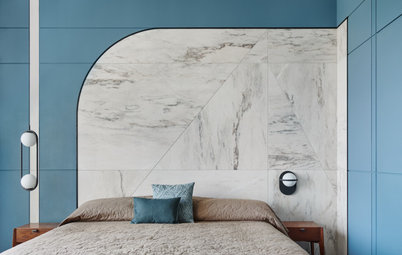
The interior of the master bedroom was particularly influenced by the owner’s taste. She wanted classical motifs, hence the traditional moulding on the wall. The architects suggested adding geometric shapes as a humorous touch.
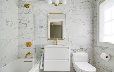
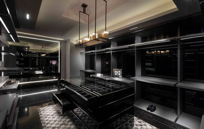
A walk-in closet, which is separated from the bedroom by a metal-framed glass partition, leads to the en suite bathroom. The key accent in the latter is its finish – the original brick was painted blue, while the wet areas are covered in neutral-coloured porcelain stoneware.
TELL US
What do you love about this home? Tell us in the Comments below. And don’t forget to save your favourite images, bookmark the story, and join in the conversation.
TELL US
What do you love about this home? Tell us in the Comments below. And don’t forget to save your favourite images, bookmark the story, and join in the conversation.