Interior Design
Think Pink! 10 Not-a-Dollhouse Ideas to use the Colour
Live in pink – or rose-tinted glasses, as the song goes – in a space that's tastefully rosy

While many identify pink as a little girl’s colour, there’s no denying this eye-catching hue’s grown-up appeal. It’s the colour of Barbie dolls, Hello Kitty, Legally Blonde and other pop-culture phenomena, not to mention, one of Pantone’s Colours of 2016. It’s the colour of wellness ("in the pink of health"), and an offspring of red, which is the hue of passion. It’s cheery and light, even in its most saturated version. However, pink is easily misused – a tad too much, or a shade too pink and you risk a space looking like a dollhouse or drenched in bandung or antacid medication (we’re looking at you, Pepto-Bismol). Thankfully, these Singapore projects demonstrate how to use pink winningly.
2. Contrast solid-hued laminates with printed neutrals
The bold use of patterned and pink laminates in this kitchen hits a sweet note – it makes a statement, and at the same time is easy to live with.
The bold use of patterned and pink laminates in this kitchen hits a sweet note – it makes a statement, and at the same time is easy to live with.
3. Use different shades of pink as furniture
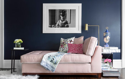
A light pink sofa is commitment enough to this happy colour. The Scandi-style wood elements balance it well, while the darker pink ottoman adds a touch more fun.
A light pink sofa is commitment enough to this happy colour. The Scandi-style wood elements balance it well, while the darker pink ottoman adds a touch more fun.
4. Draw out the palest of pinks with designer furniture in a stronger shade
Pantone Colours of 2016 Rose Quartz and Serenity coexist beautifully in this shared study room.
Take the Houzz Tour
Pantone Colours of 2016 Rose Quartz and Serenity coexist beautifully in this shared study room.
Take the Houzz Tour
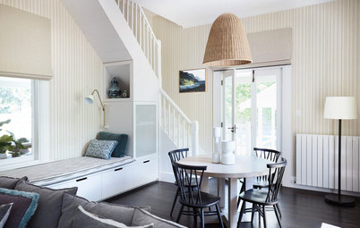
5. Tone it done with lots of white and a pop of contrasting blue
One chair and one cushion of each Pantone Colour of 2016, emphasised by the light turquoise kitchen cabinets, make enough of an impact in this white-and-beige space.
One chair and one cushion of each Pantone Colour of 2016, emphasised by the light turquoise kitchen cabinets, make enough of an impact in this white-and-beige space.
6. Match your wall to the lightest shade on your upholstery
The soft hue is punctuated by the bolder ikat pattern on the chairs, but doesn’t distract from the framed Japanese art on the walls.
Take the Houzz Tour
The soft hue is punctuated by the bolder ikat pattern on the chairs, but doesn’t distract from the framed Japanese art on the walls.
Take the Houzz Tour
7. Bring it in with soft furnishings
A cushion and a rug enliven this mostly-white study.
A cushion and a rug enliven this mostly-white study.
8. Accessorise to match the palest soft furnishings
A little girl can never have enough pastel pink especially when it comes in the cutest forms, such as a piggy bank and a lampshade!
A little girl can never have enough pastel pink especially when it comes in the cutest forms, such as a piggy bank and a lampshade!
9. Add a pop of bright pink to a dark interior
The pink pouffe draws out the rosy hues of the patterned cushions and throw in this black-white-and-grey living room.
The pink pouffe draws out the rosy hues of the patterned cushions and throw in this black-white-and-grey living room.
10. Be subtle with a sheer curtain
This chain curtain makes a soft statement as a room divider for this open-plan kitchen and dining area.
This chain curtain makes a soft statement as a room divider for this open-plan kitchen and dining area.
TELL US
How do you do pink in your decor? Share a photo in the Comments section.
How do you do pink in your decor? Share a photo in the Comments section.
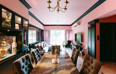

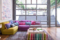
Wood-grained surfaces bring the double-height pink feature wall down to earth, while dark lines add a masculine balance to this space.