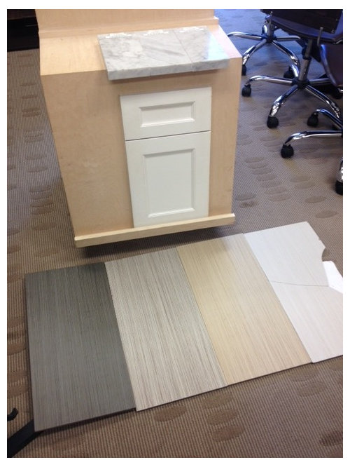
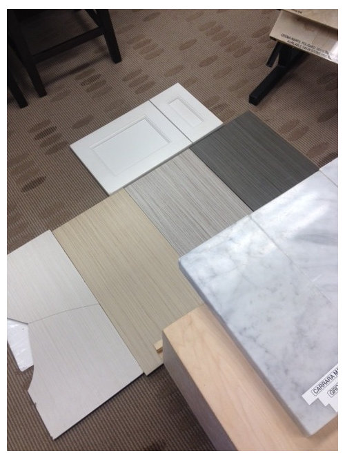
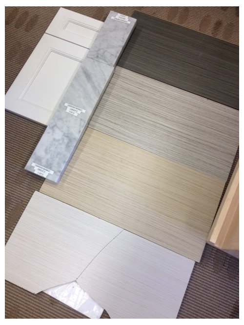
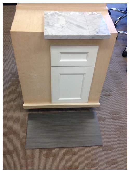
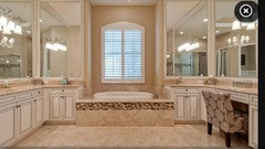
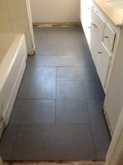
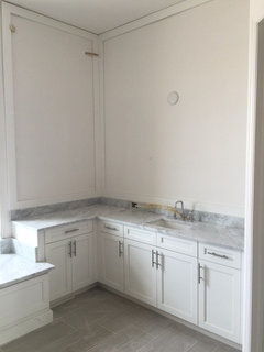
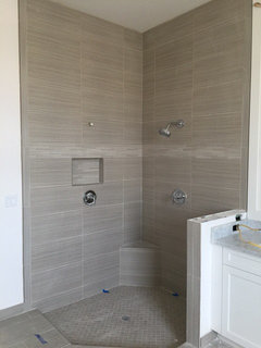
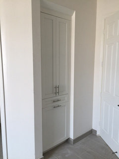
Which tile to chose? Please help?
hhuang2620
9 years ago
Featured Answer
Sort by:Oldest
Comments (96)

hhuang2620
9 years ago
gmarie
9 years agoRelated Discussions
HELP: Small L-shaped kitchen with refuse chute on wall!
Comments (10)Are you saying that cooking next to the chute would gross you out even if its covered? Andd to use it for its intended purpose? In the first picture, it looks like the stove is directly underneath the chute, but I can see in other pics that it is not. I think it is far enough away. If everything is bagged properly, it shouldn't be that bad. You will have to check on local code regarding having the stove next to the window. Code may make your decision for you. People usually just put shorter cabinets above that type of range hood. I would recommend doing so because you need all the storage you can get. The hood--being different from the bank of cabinets--will provide relief to the eye. With cabinets above, it'll still feel balanced. And, as for covering the chute, do you want to cover it and restrict access or do you still need to use it for its intended purpose and just want to camouflage it? To help the room feel pleasant, cheery, and light, I recommend using a glass tile. Even though it's applied to a wall, the translucency still shows and evokes a sense of the adjectives above. I think it would help keep things light. Consider a slightly higher toe-kick underneath the lower cabinets. It helps to create a lighter-footed feeling. You could also consider cabinets that have furniture style feet. for a more open feeling. Your kitchen seems like an ideal room to use modern, lacquered cabinets. I don't know if you like the super-modern look, but I think it could be nice. Maybe just for the uppers. Use a medium-to-light toned wood on the bottom. A limestone floor might be nice. Or you can do wood or laminate. You could go with dark or light. I think it's mostly about preference....See MoreNeed help in designing Foyer Area
Comments (28)Hi Few points: 1. It's not an independent residential apartment. It is a flat in a 25storey block 2. I have attached the floor plan for reference. The entrance is not too huge. 3. It's good to know that you guys have liked the Bathroom & kitchen design. The tiling work is in progress and it has come out well. I will take few snaps and post 4. When I say resort look - I understand and mean a simplistic natural looking design. More towards wood, nature, green, matt finish etc... Hope i am not confusing anyone here 5. Do you think the bathroom & kitchen design gels with what I mean by resort look. 6. The foyer area is a small (not too big) entrance. It's like a passage as you can see in the pics I posted earlier. When you enter you don't see the entire living room rather you see the wall (kitchen wall), where we intend to keep our dining table. Some thoughts on designing that wall is also requested Thanks!...See MoreAwkward Blind Corner in Kitchen--Cabinet Solution?
Comments (16)Thanks, lefty47. This is an older home, and just as One Plan guessed it is a soil stack from the upstairs bathroom. You are probably right that the cost of a custom solution may outweigh the benefits. Another idea I had, along the lines of the worktop bin suggested by One Plan, is a recessed spatula and long-handled utensil holder. I found out that Lee Valley sells motorized tv lift kits like the one used in the video above. It would be a matter of getting the contractor to build the box to go on the lift. I'm still a bit hung up on the idea, though it probably falls into your cost-outweighs-benefit category! I may bring this photo around with me when interviewing prospective contractors, just to see how they answer!...See MorePls help, mosaic doesn't match with wall tiles, how can I salvage this
Comments (13)Hi Rubypumps. Unfortunately you have made the common mistake of mixing undertones. I see this a lot as a colour consultant. Mistakes with your hard finishes are the worst kind because they are very costly to change. Right now your walls have a pink undertone and your walls behind the tub and counter are clearly blue grey. Since blue is complementary to pink, it brings out the pink in the tile even more and the clean blue makes the tile look dirty. It may be hard for you to see this, but this is what's happening and this is probably why you don't like your bathroom. Since you chose such a busy mosaic, it has become the boss (and focal point) of the room and I would now keep your other finishes as simple as possible. If you can, down the road, change the beige tile. Because unfortunately, there is no magic colour combination that will make it disappear. Working with what you have, I would most likely go with a more neutral cabinet like Uniboard G21 Viva Walnut. It will help warm up the space. Black is too stark for this bathroom....See Moreleelee
9 years agoneeddechelp
9 years agohhuang2620
9 years ago PRO
PRORebecca Mitchell Interiors
9 years agolast modified: 9 years agohhuang2620
9 years ago PRO
PROsstarr93
9 years ago- PRO
Rebecca Mitchell Interiors
9 years agolast modified: 9 years ago 
flopsycat1
9 years ago PRO
PROhhuang2620
9 years agorocketjcat
9 years agoLee Weber
9 years ago
beachlily
9 years agohhuang2620
9 years ago- PRO
sstarr93
9 years ago hhuang2620
9 years ago- PRO
sstarr93
9 years ago gmarie
9 years agogmarie
9 years ago
Natalie
9 years agolast modified: 9 years ago
Kivi
9 years agohhuang2620
9 years agoamolphanse
9 years agoleelee
9 years ago
diyher
9 years agolast modified: 9 years ago PRO
PROMattBell Fountain Care and Repair
9 years ago
Chantal Rochat
9 years agoIlana Buchsbayew
9 years ago PRO
PROInterior Affairs -- Vickie Daeley
9 years ago
asquithoatley
9 years ago
Connie Bundy
9 years agoConnie Bundy
9 years ago
LORDON Lane
9 years agocdpearman
9 years agorocketjcat
9 years agohhuang2620
8 years agomblues18
8 years agohhuang2620
8 years agoLORDON Lane
8 years agohhuang2620
8 years ago
Rhonda Engala Furno
8 years agoLORDON Lane
8 years ago
Maraly Wagner
8 years agomozzie73
8 years ago
Shredder
8 years agohhuang2620
8 years ago


Sponsored
Natalie