Houzz Tours
Houzz Tour: Putting on a Box Gave This Home More Open Space
A unique facade gives this semi-detached house pockets of lounging and entertaining spaces both outside and in

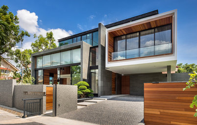
“The owners lived here for awhile before they decided to redo the house. The brief was to design a private, understated and intimate house for a growing family,” says architect Kee Jing Zhi, co-founder of Freight Architects. “They like the colonial look and feel of black and white bungalows in particular, yet still prefer something modern.”
The clients did not need to maximise the allowable built-in area for the semi-detached house, but instead leaned towards a more open concept. “We suggested having a compact house and adding an external porous shell over the rooms to create in-between spaces between the interior and the outdoors,” says Kee. Save for some existing structure, the house was completely revamped to make way for roomier spaces that translated into a modern classic style that also addresses climactic considerations.
The clients did not need to maximise the allowable built-in area for the semi-detached house, but instead leaned towards a more open concept. “We suggested having a compact house and adding an external porous shell over the rooms to create in-between spaces between the interior and the outdoors,” says Kee. Save for some existing structure, the house was completely revamped to make way for roomier spaces that translated into a modern classic style that also addresses climactic considerations.
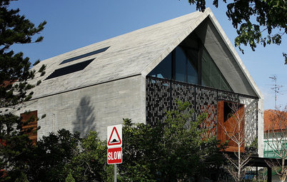
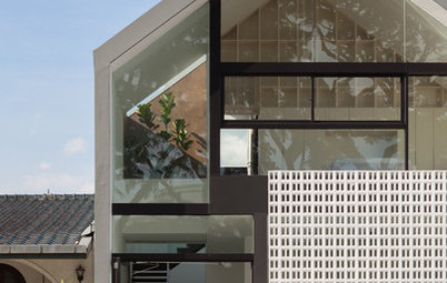
The old house was wrapped with a concrete vent block veil, known as brise-soleil or sun baffle. It extends over the existing facade forming transitional spaces – the veranda, outdoor dining area, and balcony – that are sheltered from the elements, Kee says. The vent blocks provide excellent protection from the sun’s heat and glare, and at the same time allow welcoming breezes to pass through.
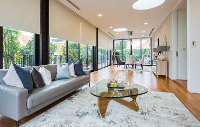
The timber-decked front veranda, aptly furnished with cosy woven-fibre seating, is connected to the living room. There is a shift in ceiling height, though, from the veranda, which is about two-and-a-half levels high, to the living room, which has low headroom because of the existing second storey slab. Nonetheless, this shift creates an expansive feeling, especially when stepping out, so it feels like one extended area dedicated to relaxation and lounging. “The owners particularly like how the indoor spaces are extended outwards to a sheltered space before the garden,” Kee says.
The timber-decked front veranda, aptly furnished with cosy woven-fibre seating, is connected to the living room. There is a shift in ceiling height, though, from the veranda, which is about two-and-a-half levels high, to the living room, which has low headroom because of the existing second storey slab. Nonetheless, this shift creates an expansive feeling, especially when stepping out, so it feels like one extended area dedicated to relaxation and lounging. “The owners particularly like how the indoor spaces are extended outwards to a sheltered space before the garden,” Kee says.
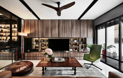
Timber battens were added to the ceiling in the living room to continue the feel of a black and white house. These battens also became the base for the recessed lights.
Metal-framed folding glass doors not only frame the greenery and serve as access to the outdoor spaces, but also demarcate the living area from the dining space.
Furniture: Galanga Living
Metal-framed folding glass doors not only frame the greenery and serve as access to the outdoor spaces, but also demarcate the living area from the dining space.
Furniture: Galanga Living
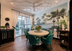
Enhancing the rustic feel in the communal areas is the flooring in cement screed with dark timber strips forming the grid lines. Furniture pieces are in dark wood tones to maintain a visually cohesive space. Kee also opted for a ceiling-mounted candle shelf as lighting for the dining area. “It looks modern, but still feels nostalgic in a certain way,” he says.
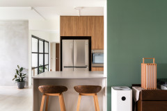
The open kitchen was designed for the family to cook and entertain at the same time. Its black, white and stainless steel scheme stands out against the earthy browns of the rest of the entertaining space. Countertops are in black polished granite, while cabinets are in white veneer. The backsplash and pantry wall are finished in white bevelled subway tiles with black grout. The pantry and wine cellar are hidden away and accessed via a tile-clad concealed door beside the ovens.
The dining area and kitchen extends out to the al fresco dining area. “To create a classic yet modern look, we decided to have a panelled ceiling to give the outdoor space more presence,” says Kee. “The wood is actually laminate that is detailed to look like solid timber.” Continuing the modern classic motif is the dining table, which is an old timber door with a glass top, and the Peranakan tiles used for flooring.
Lush landscaping, including tall trees, borders the side of the house. “Space is tight as it is a semi-detached house, so we had to create something that provided privacy,” Kee says.
Dining table: Galanga Living
Lush landscaping, including tall trees, borders the side of the house. “Space is tight as it is a semi-detached house, so we had to create something that provided privacy,” Kee says.
Dining table: Galanga Living
Just like in the kitchen, the kids’ bathroom and the powder room both sport white subway tiles and black grout. Different marble countertops lend a distinct feel to these two spaces. The pale marble with fine grey veins suits the light and airy atmosphere of the bathroom upstairs, while the dark marble with bolder veining ties with the Mutina Azulej designed by Patricia Urquiola floor tiles to create a more cocooning and intimate feel in the powder room.
Floor tiles: RICE; bathroom fittings and accessories: Sansei; lights: Lightcraft and Sunlight
Floor tiles: RICE; bathroom fittings and accessories: Sansei; lights: Lightcraft and Sunlight
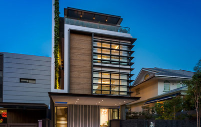
The attic is a new addition to the original two-storey structure. The music room-cum-library here enjoys plenty of daylight streaming in from glass partitions and exposed roof rafters. The very high ceiling also adds to the airiness of the space.
TELL US
What did you find most striking in this home? Share in the Comments below.
TELL US
What did you find most striking in this home? Share in the Comments below.

Houzz at a Glance
Who lives here: A young family
Location: MacPherson
Size: 340 square metres (3,660 square feet)
Project duration: 1 year