Interior Design
Spotted! Colour Blocking Trend Updated With Pastels
The current crop of pastel colours has a muted edginess due to hints of grey – and today's homes are loving it

A couple of years ago we spotted mild-to-wild colour blocking in local homes. They were a fresh spin on the usual “pop of colour”, from pastel statement pieces of furniture to bright feature walls. With majority of homeowners still clamouring for the Scandinavian style, and designers seeking for ways to freshen it up, it looks like the combination of pastels and colour blocking is here to stay. What we’re seeing in the newest homes and renovations is a more sophisticated spin on colour-blocked pastels: It’s muted, toned down by hints of grey (thankfully a far cry from the candy colours of the 1980s!) to create a temperature-cool effect on the eye.
Bubbling up with fun
A warm grey feature wall demarcates the dining table from the multi-purpose bar (which is also demarcated by a colourfully tiled floor). It’s darker hue contrasts with the bright whites of the open-plan living-dining area and the sprightly blue of the kitchen, while the painted bubbles on the wall echo the honeycomb tiles at the bar area and the coloured backsplash in the kitchen.
A warm grey feature wall demarcates the dining table from the multi-purpose bar (which is also demarcated by a colourfully tiled floor). It’s darker hue contrasts with the bright whites of the open-plan living-dining area and the sprightly blue of the kitchen, while the painted bubbles on the wall echo the honeycomb tiles at the bar area and the coloured backsplash in the kitchen.
The softest hint of sky and sea
At first glance this home looks like several shades of grey artfully layered to highlight architectural features such as the door and the beam. A closer look shows that what appears to be different shades of grey are a pale blue-grey on the walls of the bomb shelter and a light mint-grey in the living area. The fresh colours are offset by the darker greys of the door, beam and backsplash and the different wood finishes.
At first glance this home looks like several shades of grey artfully layered to highlight architectural features such as the door and the beam. A closer look shows that what appears to be different shades of grey are a pale blue-grey on the walls of the bomb shelter and a light mint-grey in the living area. The fresh colours are offset by the darker greys of the door, beam and backsplash and the different wood finishes.
Something to grow into
A dusky blush wall is paired with pale sage green cabinets, and accented with light coral and grey storage boxes in this kids’ room. It’s a sweet combination that will easily see the children through their pre-teen years because it can be styled in a more sophisticated way as they grow up.
A dusky blush wall is paired with pale sage green cabinets, and accented with light coral and grey storage boxes in this kids’ room. It’s a sweet combination that will easily see the children through their pre-teen years because it can be styled in a more sophisticated way as they grow up.
No ombre for this hombre
In this boy’s room, shades of green are brought together on the walls – but they’re not applied in a graduated manner. Instead the boldest green is used as a chair rail-style stripe, almost creating the illusion that the wall is three different shades of green where the white ceiling casts a lighter glow on the upper portion, while the parquet floor casts a yellowish glow on the lower portion.
In this boy’s room, shades of green are brought together on the walls – but they’re not applied in a graduated manner. Instead the boldest green is used as a chair rail-style stripe, almost creating the illusion that the wall is three different shades of green where the white ceiling casts a lighter glow on the upper portion, while the parquet floor casts a yellowish glow on the lower portion.
Framing spaces
Bold black lines create a graphic effect in this bedroom, but it’s the grey elements that frame the ensuite bathroom and separate it visually from the sleep space.
Bold black lines create a graphic effect in this bedroom, but it’s the grey elements that frame the ensuite bathroom and separate it visually from the sleep space.
Dreaming of blue tonight
A soft steel blue-painted feature wall is contrasted by the oversized cushioned headboard in this room; furniture and accessories complement the soothing shade. Even if sky isn’t blue outside, this room is a cool, restful retreat with treetop views.
TELL US
What’s your favourite pastel combination? Tell us in the Comments below. And don’t forget to save your favourite images, bookmark the story, and join in the conversation.

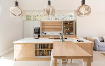
Matt grey (with a sage undertone) on the wall panel and beam frames and softens the sitting area of this living room. The matt grey wall panel overlays the marbled finish of the TV feature corner, indicating a shift of function. The colour treatment is a clever way to create a more intimate mood when there is a huge window behind the sofa.