Interior Design
The Language of Colour
Here's how to harness the power of colour that is perfect for you

Do certain colours make you feel happy while others seem to put a damper on your spirits? Colours can evoke powerful emotions or affect choices – you wouldn’t necessarily choose blue-coloured food, would you? Colour is also a powerful communicator – just think of the universally understood red, amber and green of traffic lights.
Hence, when it comes to choosing the ‘right’ colours for your home, you’d really want to make sure that your choices are expressions of who you are and also how they will support you in creating a home that is perfect for you and your family. But where do you start?
Let’s take a walk through the seven colours of the rainbow and check out what each of the colours means, and how you can apply them (in any shade or tint depending on what you’d like to achieve with them) to your home.
Make it a feature wall
Paint an alcove space red and add spot lighting to highlight. You’ll get the punch of colour without it being too jarring to the senses.
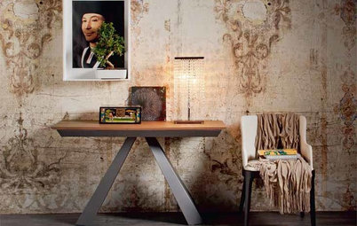
If the fire engine red is the one you want, then choose smaller pieces of furniture in that hue or decorate with movable objects like a vase…
Paint an alcove space red and add spot lighting to highlight. You’ll get the punch of colour without it being too jarring to the senses.
If the fire engine red is the one you want, then choose smaller pieces of furniture in that hue or decorate with movable objects like a vase…
…or a painting…
… or even a bowl of bright red blooms; it will do wonders to lift the spirits or add a touch of colour to a space.
Perks of red
On the other hand, red’s vibrant hue helps to raise energy and strength of, say, the elderly in your family, shares Diamond. A cushion or two in a warmer shade of red will work well.
What cushions can do for a look or a space
On the other hand, red’s vibrant hue helps to raise energy and strength of, say, the elderly in your family, shares Diamond. A cushion or two in a warmer shade of red will work well.
What cushions can do for a look or a space
ORANGE
Zest for life
This subtler cousin of red is suitable for dining area and living room, says Diamond. It’s a colour that supports social connections and it’s a good colour for introverts as it encourages their desire to connect with others.
However, it’s a colour that promotes the appetite too, so balance it out with cooler colours (pictured) like the icy blue-grey-coloured dining chairs and white trims on the walls, if you decide to use this colour on the walls of your dining room.
Take it a notch down
This energising colour is definitely not recommended for the bedroom or for rooms, which are used mainly by those who are hyperactive, or get nervous or excited easily, reminds Diamond.
But a softer-toned shade can add a cosy feel to an otherwise cool palette. Here, oranges and lemons are paired together in washed-out tones that gently hold the space in a warm hug.
What the colour orange can do for a space
Spot the colour
Whimsical lighting makes for conversation fodder over dinner…
Whimsical lighting makes for conversation fodder over dinner…
… while a slick of mustard yellow holds your crockery to attention…
… and a flash of citrus marks the underbelly of floating shelves, giving a colour zap to an otherwise purely utilitarian space.
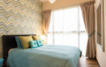
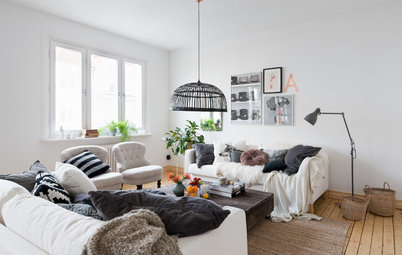
A favourite pairing
While blue and yellow are not quite complementary on the colour wheel (they’re more like close cousins), they pair well together and is a popular colour combination for homes.
“Using both colours (together) intrinsically helps one find an inner balance (within). Psychologically, it helps promote clarity in our thinking process,” Diamond explains, drawing from his knowledge of Aura-Soma, a form of colour therapy.
And when rendered in softer tones, this colour pairing exudes a calmness that permeates the space it’s applied to.
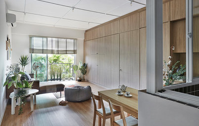
GREEN
An all-rounder
It is a colour that “helps one to rest and relax mentally and physically,” says Diamond. This colour is suitable for all types of rooms, particularly the study room and the living area –depending on the green tone, it can aid in helping one ‘chill’.
It is also a good colour for the entrance to a home as the energy of green carries the element of abundance and prosperity.
BLUE
Softly does it
“Colours greatly influence the ambience and atmosphere of spaces, because of their ability to lend visual weight and balance,” says Jeremy Rowe, managing director of Decorative Paints at AkzoNobel.
Rowe recommends cool blue or light purple shades, which create a serene atmosphere for relaxing and resting.
Adds Diamond, “Blue in general has a soothing effect and it can help lower blood pressure.”
Photo credit: AkzoNobel, manufacturer of Dulux paints
Diet-friendly
According to US colour theory professor Jill Morton, aka Color Matters, blue is an appetite suppressant (note the invigorating colours of red and yellow that are used by fast food companies).
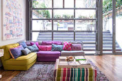
This tie-dye rug shot through with blue is an interesting foil for the rest of the earthy shades in the eclectic decor of this space.
According to US colour theory professor Jill Morton, aka Color Matters, blue is an appetite suppressant (note the invigorating colours of red and yellow that are used by fast food companies).
This tie-dye rug shot through with blue is an interesting foil for the rest of the earthy shades in the eclectic decor of this space.
A jolt of colour
Paired with zingy orange in the stripes and patterns, and in small doses, it’s ideal for a teenager’s room.
Paired with zingy orange in the stripes and patterns, and in small doses, it’s ideal for a teenager’s room.
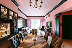
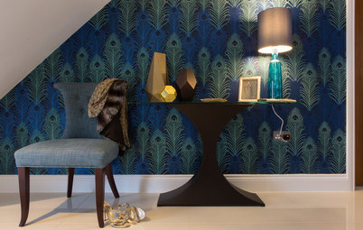
INDIGO
Heads up!
The inky deep blue of this visually engaging wall-to-ceiling feature gently pulls together the rest of the decor in the room – just keep the rest of the lines in the room clean and spare.
Here are other ways to incorporate dark colours into your home decor
Heads up!
The inky deep blue of this visually engaging wall-to-ceiling feature gently pulls together the rest of the decor in the room – just keep the rest of the lines in the room clean and spare.
Here are other ways to incorporate dark colours into your home decor
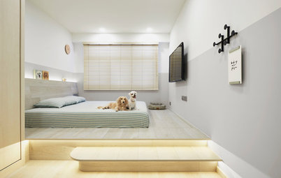
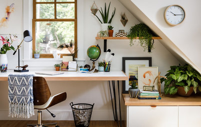
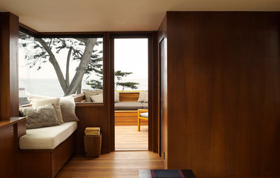
Me space
It’s the perfect shade of blue for a home office space; a quiet, spare spot for contemplative work.
It’s the perfect shade of blue for a home office space; a quiet, spare spot for contemplative work.
VIOLET
In small doses
According to Diamond, purple is a suitable colour for all rooms “but not for an entire room”. Colour practitioners caution that the excessive use of violet/purple could suppress emotions and might even bring about a sense of disquiet, listlessness or at the extreme, depression.
In small doses
According to Diamond, purple is a suitable colour for all rooms “but not for an entire room”. Colour practitioners caution that the excessive use of violet/purple could suppress emotions and might even bring about a sense of disquiet, listlessness or at the extreme, depression.
Choose accent pieces
“In China, the colour purple is employed in the treatment of epilepsy as it has a tranquillising effect on the brain,” says Diamond. Thus, it is not a suitable colour for those who have depressive tendencies or those who are indecisive by nature.
“In China, the colour purple is employed in the treatment of epilepsy as it has a tranquillising effect on the brain,” says Diamond. Thus, it is not a suitable colour for those who have depressive tendencies or those who are indecisive by nature.
Quiet moments
Hence, purple is a colour best suited for a meditation space or prayer room, and in small doses.
TELL US
What is your favourite colour(s) and how have you incorporated that in your home? Share with us in the Comments below.
MORE
Does Your Home Need a Colour Consultant?
5 Fool-Proof Steps to a Spot On Colour Scheme
This is a colour that speaks of vitality, energy and focus (or concentration).
The power of one
It is not recommended to paint all the walls [in a room] red, shares Diamond Huang of Heliosphere, who uses colour therapy in his work as a metaphysics practitioner and facilitator. “Just one wall is OK, and a darker shade of red is preferred.”
This is because the fiery colour is not suitable for people with aggression tendencies or those with high blood pressure, he explains. So take a look at your household members before you decide to splurge on red.
How to effectively use the colour red