Interior Design
This is Why Petrol Blue is the Interior Colour Trend to Try Now
Deep, cool and calming, petrol blue is the colour of the moment

These things keep showing up every time I scroll through Instagram looking for some interior design inspiration: White, pale wood, more white, a bit of brass, white, millennial pink, and of course, more white.
Then there’s this beguiling shade of gritty blue called petrol blue.
Then there’s this beguiling shade of gritty blue called petrol blue.
One of the coolest new colours popping up internationally in interior design schemes is a gorgeous shade of petrol blue. Pantone 18-4733 TPX Enamel Blue is a perfect example – a strong colour that mixes true blue and green.
“Petrol blue is a stunning colour which is definitely trending at the moment,” says Jas Jhol from Singapore interior design firm Sugarbakers.
“I have always loved a splash of blue/green in my interiors and have always suggested it to my clients, as I feel that it is a cool colour that also represents deep waters and the sky,” says Jhol.
Is it blue or is it green?
Petrol blue is just one name that’s being used to describe this trending new paint colour. Pantone calls it Enamel Blue; others just refer to it as bluish green, aqua, cyan or turquoise.
Petrol blue is just one name that’s being used to describe this trending new paint colour. Pantone calls it Enamel Blue; others just refer to it as bluish green, aqua, cyan or turquoise.
Turquoise, or blue-green, is a colour that is refreshing, calming, sophisticated and creative. It is also thought to bring good luck, wisdom and positive energy – all attributes of the colours blue and green!
“I think blue is always trendy regardless of the tone and hue. It is almost as versatile as grey. It can be really soft and sweet for a nursery and really sexy when it’s dark like in midnight blue tones,” says Singapore interior stylist Priscilla Tan from Styledbypt.
“Petrol blue is a unique tone that is more like teal, which many of my clients identify with. I think it is wonderful paired with grey and rose gold or paired with wood tones and a bright red accent colour.”
Image: Louis Porfirios for Styledbypt
“Petrol blue is a unique tone that is more like teal, which many of my clients identify with. I think it is wonderful paired with grey and rose gold or paired with wood tones and a bright red accent colour.”
Image: Louis Porfirios for Styledbypt
Use petrol blue everywhere
The most common way I’m seeing petrol blue being used is as a wall colour. It might sound a little extreme to those of us used to white or grey walls but as you can from this image, the rich shade looks fantastic when taken all the way up a wall, and plants, wood furniture and brass light fittings and fixtures really pop when set against it.
The most common way I’m seeing petrol blue being used is as a wall colour. It might sound a little extreme to those of us used to white or grey walls but as you can from this image, the rich shade looks fantastic when taken all the way up a wall, and plants, wood furniture and brass light fittings and fixtures really pop when set against it.
Tip: In order to get richness of depth with your walls, you need a good undercoat before painting. Make sure your wall is as smooth as possible, drips and chips show up more easily on darker walls.
When you start painting, you will need to make the first coat as thick as possible – use the best quality paint brushes you can afford. You will also find that you will need to do at least three coats, and sometimes four coats, to get the best possible result.
10 designer tips for painting walls
When you start painting, you will need to make the first coat as thick as possible – use the best quality paint brushes you can afford. You will also find that you will need to do at least three coats, and sometimes four coats, to get the best possible result.
10 designer tips for painting walls
Use as an accent colour
If you really can’t bring yourself to do your entire room in petrol blue, think about using it on a feature wall, as an accent colour in a neutral palette, or in a powder room or small bathroom.
If you really can’t bring yourself to do your entire room in petrol blue, think about using it on a feature wall, as an accent colour in a neutral palette, or in a powder room or small bathroom.
“I personally love petrol blue, as it is a great way to jazz up an interior scheme,” says Singapore stylist Nicole Wong, “but it has to be done carefully. If not it could look tacky.
“Use it on an accent wall, or try it on a sofa; that would be a good way to trial the colour in your home.”
“Use it on an accent wall, or try it on a sofa; that would be a good way to trial the colour in your home.”
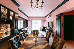
The petrol blue beam in this room is echoed in the chair at the head of the table and the backboards on the built-in shelving.
Tip: If using petrol blue as an accent colour to highlight an architectural feature, consider an enamel paint version to add gloss and sheen.
Tip: If using petrol blue as an accent colour to highlight an architectural feature, consider an enamel paint version to add gloss and sheen.
Tip: If you are tired of an all-white kitchen but don’t want to overhaul, think about getting the doors of your cabinets done in a gloss enamel spray, and retain the countertops, fixtures and fittings.
Calming colour for your bathroom
It looks fantastic in a bathroom with white fixtures and a touch of wood for a more natural feel.
It looks fantastic in a bathroom with white fixtures and a touch of wood for a more natural feel.
Alchimia Blue
Get the look: Paint in the bathroom is out of the question so look for coloured tiles like this to use as a feature wall.
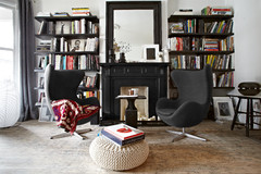
Minimal accents
This apartment has just a few touches of colour to create a calm oasis, while not detracting from the simple minimalist aesthetic.
This apartment has just a few touches of colour to create a calm oasis, while not detracting from the simple minimalist aesthetic.
Singing Bird Oxidated
Get the look: I love this Singing Bird in an oxidised finis. It’s a super affordable way to add petrol blue to your decor.
Lindon Marine 45X45CM
Get the look: You can’t imagine how many petrol blue cushions are available right now. This Lindon Marine version has a lovely texture to it.
Mix with other shades of blue
One of the great things about petrol blue is that it looks great with other shades of blue and green. In this example, touches of bright blue have been combined with white and the feature wall to add depth and texture.
One of the great things about petrol blue is that it looks great with other shades of blue and green. In this example, touches of bright blue have been combined with white and the feature wall to add depth and texture.
Indigo Block Print Rug
Get the look: Indigo, or bright true blue, looks fantastic with petrol blue and white. This block print rug will tie in nicely with a blue-on-blue interior theme.
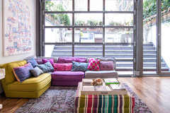
Add furniture
This indoor-outdoor space has been refreshed with touches of petrol blue and turquoise via the statement furniture. The colour echoes the water feature outside, bringing the calming nature of water in beautifully.
This indoor-outdoor space has been refreshed with touches of petrol blue and turquoise via the statement furniture. The colour echoes the water feature outside, bringing the calming nature of water in beautifully.
Side Tables
Tip: If you don’t want to invest in larger pieces of furniture, look for smaller ones like this side table.
TELL US
Let us know what you think about adding petrol blue to your home or share a photo in the comments below if you already use it. And don’t forget to save your favourite images, bookmark the story, and join in the conversation.
Let us know what you think about adding petrol blue to your home or share a photo in the comments below if you already use it. And don’t forget to save your favourite images, bookmark the story, and join in the conversation.