Paris Houzz Tour: A One-Bedroom Unit's Space-Smart Renovation
Graphic contrasts, multi-use units and some tweaks to the layout turned this dated flat into a functional space

This 33-square-metre flat is perched on the fourth and top floor of a brick building Paris, France, and enjoys an unobstructed view of the Eiffel Tower. The owners live in the suburbs, and rent out several flats in the city. This two-room property hadn’t been renovated for fifteen years when the couple decided to revamp it for their adult daughter. To bring it up to date and improve the layout, they called on Deborah and Avinoam Bettan of Lagom Architects. As a result, this now contemporary and bright space has a sleek design with a focus on functionality and comfort while playing with colour contrasts.
After. They preserved the floor and all of the mouldings in order to maintain the flat’s charm and history. To zone the entrance hall and create a strong contrast with the kitchen, the owner went all black – on the walls, MDF furniture and dropped ceiling.
“We had originally planned for the kitchen to be placed against the back wall only. We had not planned for it to wrap around to where we now find the fridge, a fixed table and a low cupboard for storing the toaster, among other things,” Bettan says. The change makes it possible to visibly separate the kitchen from the entrance. Likewise, “this configuration has produced a large kitchen area to seat guests and make good food.”
Find a renovation professional in Singapore on Houzz, see images of their work, and read client reviews
Before. The original bar counter had cut the room in half, significantly reducing the size of the living room.
After. The owner opted for a contemporary style and a restrained greyscale palette that brings out contrast: the back wall of the kitchen, for example, features black, white and a touch of grey. This colour scheme runs throughout the flat.
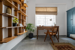
“To enhance the kitchen, we came up with an oak veneer frame that transforms into a bookcase with black powder-coated metal supports,” the interior designer says. This structure is the central decorative element in the uncluttered space.
This multi-functional shelving unit covers a whole wall and was the starting point of the entire layout. The fixed table, shelves and bench in the living room were designed to match it.
“The supports were originally curtain rods that have been given a new function. This lightweight support system fits well into a small place. It brings an interesting graphic rhythm,” Bettan says.
They kept the old internal window, but moved it from the entrance hall to the wall between the living room and bedroom.
Before. The previously about 11-square-metre bedroom area was reduced to about 8.5 square metres. “We started with a completely open space, and originally thought about using a box to create the sleeping area. But the young woman preferred a separate bedroom. So, we shifted the partition and created an internal window that allows for a view of both of the exterior windows,” Bettan says.
After. The wallpaper can be seen from the living room as well, through the internal window. This trick adds character to the flat. The forest design also creates the feeling of depth, to balance out the room’s diminutive dimensions.
Behind the bed is a large floor-to-ceiling wardrobe. Its black MDF facades echo the look of the entrance hall.
Behind the bed is a large floor-to-ceiling wardrobe. Its black MDF facades echo the look of the entrance hall.
The owner sometimes works from home, and needed a desk. The designers went for an oak-veneer headboard that doubles as a desk and includes storage and lighting.
Before. Here you can see the old bathroom with the toilet door on the left. The water heater was between the toilet and the bathroom. It has been replaced by a smaller but equally powerful model to save space.
In the bathroom, a double window was replaced with a window without internal frames, which brings in more light.
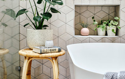
After. The 6.15-square-metre bathroom now has a shower, basin and toilet as well as a laundry area.
This minimalist bathroom has been decorated entirely in black and white. The black mosaic shower is juxtaposed against white marble-effect tiles and a white resin vanity unit. The black column is made of Valchromat wood fibre paneling, and houses the washing machine, dryer and water heater.
Tell us
What do you love about this home? Tell us in the Comments below. And don’t forget to save your favourite images, save the story, and join in the conversation.
More
Find a renovation professional in Singapore
Browse more Singapore photos for design inspiration

Who lives here? A 22-year-old woman
Location: 15th arrondissement of Paris, France
Size: 33 square metres
Duration of work: Three months
Budget: 38,000 euros
Interior designer: Lagom Architectes
Before. The door pictured here on the left had previously led to the bedroom. Behind the kitchen were the bathroom and toilet rooms, which were combined during the renovation.
The flat’s layout needed improvement. The kitchen was originally too big, and took too much space away from the living room.
“We didn’t change the configuration of the space completely, but we did take down all the partitions. The size of the bedroom was reduced as much as possible to expand the living area,” the interior designer says.