Interior Design
How to Decorate with Heart Wood, Dulux's 2018 Colour of the Year
Creating soothing sanctuaries in a tough, unstable world is the main objective of this comforting palette

Millennial pink had us all blushing in 2017, and from the looks of it, this colour trend has staying power in 2018. And for good reason – the soft hue evokes a fresh, calm vibe. It has also become gender-neutral, which gives it wide appeal.
Putting a cosy twist on millennial pink, AzkoNobel, maker of Dulux paints, names Heart Wood, a beautiful warm pink as its Colour of the Year for 2018. This warm neutral sits between smoky taupe and ashy mauve. “Heart Wood is a subtle and warm grown-up pink that embodies comfort and ease, inspired by the warm tones of leather and wood,” says Heleen van Gent, Creative Director of the AkzoNobel Global Aesthetic Centre. In a time where unpredictability is at its peak, and with access to more information and choices than ever, “we need our homes to be the places where we feel comfortable, where we invite and where we can play,” she says. Heart Wood was chosen to reflect the common yearning to transform the home into a true sanctuary.
Putting a cosy twist on millennial pink, AzkoNobel, maker of Dulux paints, names Heart Wood, a beautiful warm pink as its Colour of the Year for 2018. This warm neutral sits between smoky taupe and ashy mauve. “Heart Wood is a subtle and warm grown-up pink that embodies comfort and ease, inspired by the warm tones of leather and wood,” says Heleen van Gent, Creative Director of the AkzoNobel Global Aesthetic Centre. In a time where unpredictability is at its peak, and with access to more information and choices than ever, “we need our homes to be the places where we feel comfortable, where we invite and where we can play,” she says. Heart Wood was chosen to reflect the common yearning to transform the home into a true sanctuary.
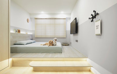
Restful scene
Interior stylist Caroline Chin-Geyler of Arete Culture loves the softness and versatility of the colour, and thinks it would look good in a bedroom. “Complementing the wall colour with grey tones will bring out its duskiness and lend a cosier vibe,” she says.
Interior stylist Caroline Chin-Geyler of Arete Culture loves the softness and versatility of the colour, and thinks it would look good in a bedroom. “Complementing the wall colour with grey tones will bring out its duskiness and lend a cosier vibe,” she says.
For kids, too
Chin-Geyler also thinks this colour will work especially well in a child’s bedroom, “because they can grow with the colour – it’s soft but not child-like, so there is longevity in the colour.”
Chin-Geyler also thinks this colour will work especially well in a child’s bedroom, “because they can grow with the colour – it’s soft but not child-like, so there is longevity in the colour.”
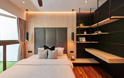
Warm contrast
Arjan Nijen Twilhaar of Aiden T is another interior designer who is into the dusty pink/blush palette. “I am doing more homes in a warm neutral colour – and a slight blush undertone is quite on trend. Heart Wood offers a contemporary backdrop that offers some depth and interest,” he says.
In one of his projects, he used a similar dusty pink tone in a powder room. “I tiled the wet areas with subway tiles and kept the walls in the dry area painted in this hue. Mixing it with soft metals like oil-rubbed brass, it creates warmth and elegance,” he shares.
Enhance the cocooning feel
To go with Heart Wood, Dulux suggests three palettes. Its first complementary palette is The Comforting Home, featuring blush pink and clay. The warmth of these colours, as seen in this bathroom, puts emphasis on cosiness. The addition of black and stainless steel details also imparts a slight industrial feel.
To go with Heart Wood, Dulux suggests three palettes. Its first complementary palette is The Comforting Home, featuring blush pink and clay. The warmth of these colours, as seen in this bathroom, puts emphasis on cosiness. The addition of black and stainless steel details also imparts a slight industrial feel.
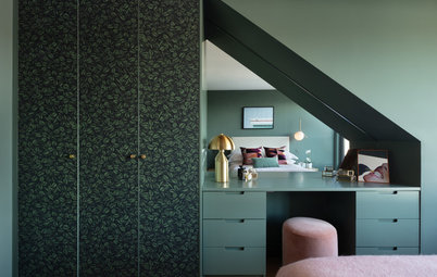
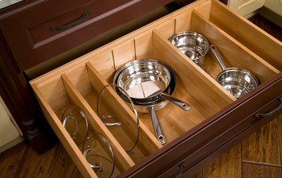
Wood wonders
You can never go wrong with mixing this colour with well-defined woodgrain. In this kitchen that is almost dominated by full-height wood cabinetry, the dusky Heart Wood is complemented by a rich cocoa shade for a homey ambiance.
You can never go wrong with mixing this colour with well-defined woodgrain. In this kitchen that is almost dominated by full-height wood cabinetry, the dusky Heart Wood is complemented by a rich cocoa shade for a homey ambiance.
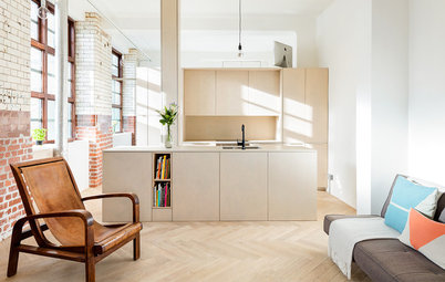
Make it inviting
Cool shades of blue, together with neutrals and sea-greens, make up the second complementary palette called The Inviting Home. This brings effortless style to any space for those who naturally see the home as a space to entertain in and connect with others.
This corner demonstrates how a two-toned wall of muted pink and green can ground a space.
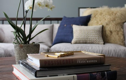
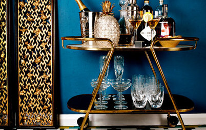
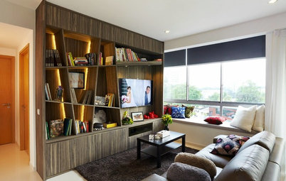
Cool connection
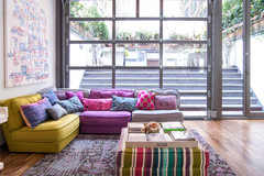
Blue is a universal soothing colour that appeals to a lot of people; case in point: Dulux named Denim Drift as Colour of the Year for 2017. It’s nice to see how the colour collection flows beautifully from this year to next. And as this living area shows, the common greyish base of both colours make for a wonderful combination to enliven a seating area, while still channeling a sense of calm.
Chin-Geyler agrees that blues go well with the warm neutral pink. “You can pair it with jewel tones (blues and purples) for an equally cosy but richer feel,” she says.
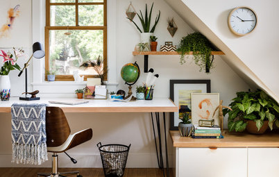
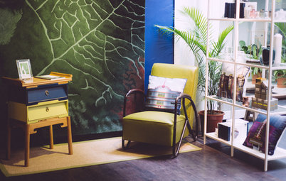
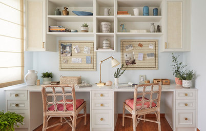
Bring energy to a creative spot
The third complementary palette is called The Playful Home. With this colour scheme, you can create focal points using warm pink and bolder shades such as mustard yellow and dark or yellow-toned greens to spark energy and recharging.
This palette works particularly well for a study such as this. The splash of colour makes this open space conducive for working or studying, to help you feel energised and focus on the tasks at hand.
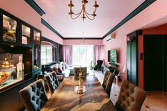
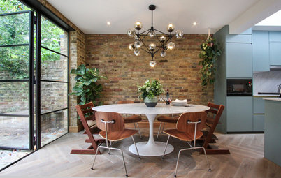
Casual dining
How about pink and green for your dining space? Green may not be the typical go-to colour for a dining area, as it is often thought to be an appetite-suppresing hue, but with the right shade, it can easily bring vitality to a communal area.
This dining room demonstrates how to capture nature and play with creativity in an open space.
TELL US
Is this warm neutral pink something you’d use in your home? If you have a pink space you’re particularly fond of, we’d love to see photos, too!
MORE
How to Decorate with Pantone’s 2018 Colour of the Year
Is this warm neutral pink something you’d use in your home? If you have a pink space you’re particularly fond of, we’d love to see photos, too!
MORE
How to Decorate with Pantone’s 2018 Colour of the Year
Welcome home
This palette centres around the comforting quality of Heart Wood, “combining the gentle shades of grey-pink and blues, nourishing warmth of natural wood and soft cocoa, and flowing into deeper, bolder shades of ink blue and purple,” says van Gent.